Power Apps Visual Compare: Enhancing UI Testing with PowerFx
Introduction
Power Apps Visual Compare can be a powerful tool designed to streamline the process of UI testing by comparing visual elements within your applications.
This by making use of the PowerFx formulas like Assert(Preview.VisualCompare("//*[data-control-name='locator'", "some-control.png", Table()).Similarity>=0.7) you can ensure that the visual elements match a reference control image with a specified percentage of similarity.
This article will delve into the approaches for visual comparison, the challenges faced, common patterns of comparison, and the importance of visual checks for accessibility.
Approaches for Visual Comparison
Visual comparison in Power Apps involves comparing the visual elements of a UI against a reference image to ensure consistency and accuracy. The PowerFx formula used in Visual Compare allows developers to specify a locator for the UI element and a reference image. The formula then calculates the similarity percentage between the two, ensuring that the visual elements meet the desired criteria.
Challenges in Visual Comparison
One of the primary challenges in visual comparison is dealing with variations in UI elements due to different screen resolutions, device types, and user settings. These variations can affect the accuracy of the comparison, leading to false positives or negatives. Additionally, dynamic content and animations can pose challenges, as they may change the appearance of the UI elements during the comparison process.
Common Patterns of Comparison
Common patterns of comparison include checking for consistency in layout, color schemes, and element positioning. For instance, ensuring that buttons, text fields, and images are aligned correctly and maintain their intended design across different devices and screen sizes. Another pattern is comparing the overall color scheme to ensure that the application’s visual aesthetics remain consistent.
Role of Blur and Colors
Blur and colors play a significant role in visual comparison. Blurring can be used to focus on the overall structure and layout of the UI elements rather than the fine details. This approach helps in identifying major discrepancies without getting distracted by minor variations. Colors, on the other hand, are crucial for maintaining the visual identity of the application. Ensuring that the colors match the reference image helps in preserving the brand’s visual consistency.
Visual Checks for Accessibility
Accessibility is a critical aspect of UI design, and visual checks for accessibility ensure that the application is usable by individuals with visual impairments. This includes checking for sufficient color contrast to make text readable, ensuring that colorblind users can distinguish between different elements, and verifying that the UI is navigable using screen readers. Implementing these checks helps in creating an inclusive user experience.
Structural Analysis and Polygon-Based Comparison
In addition to pixel-by-pixel comparison, structural analysis and polygon-based comparison are essential for a comprehensive visual comparison. This approach involves identifying and comparing the geometric shapes and structures within the UI elements. For example, using algorithms to detect edges, contours, and shapes such as triangles, rectangles, and circles can provide a more robust comparison, especially when dealing with dynamic content or varying resolutions.
Comparison Types and Algorithms
Several algorithms can be used for visual comparison, each with its strengths and weaknesses:
- Edge Detection: This method uses algorithms like Canny to detect edges in the image, which can then be compared to the reference image. It is useful for identifying structural changes but may be sensitive to noise.
- Image Simplification: Techniques like Gaussian Blur can simplify the image by reducing noise and smoothing color blocks, making it easier to compare the overall structure.
- Color Mapping: Applying color maps to grayscale images can highlight differences in color schemes, aiding in the comparison of visual aesthetics.
- Feature Extraction: Using algorithms like SIFT (Scale-Invariant Feature Transform) to detect keypoints and descriptors, which can then be compared to identify similarities and differences in the visual elements.
- Fourier and Cosine Transforms: These methods transform the image into the frequency domain, allowing for the comparison of patterns and textures that may not be apparent in the spatial domain.
Filter Types: Pros and Cons
| Filter Type | Pros | Cons |
|---|---|---|
| Edge Detection | Effective for structural changes | Sensitive to noise |
| Image Simplification | Reduces noise, highlights major differences | May lose fine details |
| Color Mapping | Highlights color differences | May not capture structural changes |
| Feature Extraction | Identifies key features, robust to transformations | Computationally intensive |
| Fourier Transform | Captures patterns and textures | Complex to interpret |
| Cosine Transform | Similar to Fourier, useful for compression | May not capture spatial details |
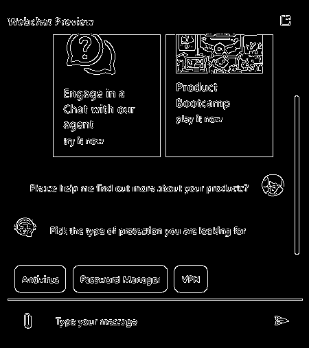
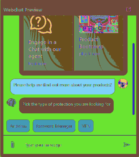
Examples
Using the following PCf control that similuates a web chat.

Edge
Assert(Preview.VisualCompare("//*[data-control-name='locator'", "some-control.png", Table({type:"edge"})).Similarity>=0.7)
Color
Assert(Preview.VisualCompare("//*[data-control-name='locator'", "some-control.png", Table({type:"color"})).Similarity>=0.7)

Simplify
Assert(Preview.VisualCompare("//*[data-control-name='locator'", "some-control.png", Table({type:"simplify"})).Similarity>=0.7)

Feature
Assert(Preview.VisualCompare("//*[data-control-name='locator'", "some-control.png", Table({type:"feature"})).Similarity>=0.7)

Color Simplify
Assert(Preview.VisualCompare("//*[data-control-name='locator'", "some-control.png", Table({type:"colorsimplify"})).Similarity>=0.7)
Cumulative Effect of Multiple Filters
Applying multiple filters can enhance the accuracy and robustness of the visual comparison. For instance, combining edge detection with image simplification can help in identifying structural changes while minimizing the impact of noise. Similarly, using feature extraction in conjunction with color mapping can provide a comprehensive comparison of both structural and aesthetic elements.
Similarity Process Explained
When we talk about the similarity process in Power Apps Visual Compare, we’re essentially comparing how similar two images are. This is done using a metric called the Structural Similarity Index (SSIM). Now, SSIM gives us a value between -1 and 1 to indicate how similar the two images are.
1: This means the images are identical. Imagine looking at two copies of the same photo; they match perfectly in every detail. 0: This indicates no similarity at all. It’s like comparing a picture of a cat to a picture of a car; there’s no common ground between them. -1: This suggests the images are completely dissimilar. It’s like comparing a black-and-white photo to its negative; every light area in one is dark in the other, and vice versa.
So, when you get a value close to 1, it means the images are very similar. A value close to 0 means there’s little to no similarity, and a value close to -1 means the images are opposites in terms of their visual content.
Conclusion
Power Apps Visual Compare is an invaluable tool for ensuring the visual integrity of your applications. By leveraging the PowerFx formula, developers can automate the process of visual comparison, addressing challenges, and maintaining consistency in UI design. Additionally, incorporating visual checks for accessibility ensures that the application is usable by a diverse audience, enhancing the overall user experience.