G3000 Electronic Checklists
Introduction
The G3000 supports an electronic checklist feature that allows checklists to be viewed and completed within the avionics. Using this feature, the user can view checklists on any of the MFD or PFD display panes. The user can also check off individual items in checklists and the system will track which items and checklists have been completed. Checklist interaction is handled via the GTCs.
By default, the electronic checklists feature is disabled in the G3000. In order to enable the feature in an airplane installation, there are two things that must be done:
- Create an XML file that configures the checklists that are supported by the installation. For more information, see the next section.
- Point the G3000 to the checklists XML file using the
<Checklist>panel.xmltag.
Creating a Checklist XML File
Checklists are configured using an XML file. The XML file defines the checklists included in the installation, how they are organized, and the contents of each checklist.
The checklist XML file must be placed within the coui://html_ui/ directory or one of its subdirectories. If the file is placed in another directory, the G3000 will not be able to access it.
It is best practice to place the checklist XML file in an aircraft-specific directory, for example:
coui://html_ui/Airplanes/My_Airplane/checklist.xml
This greatly reduces the risk of file conflicts within the sim's virtual file system.
The Root <Checklist> Tag
Like all XML files, the checklist XML file must contain a single root tag. This tag must be named <Checklist>. All other tags in the file are placed within the root <Checklist> tag.
Groups
Checklists are organized into groups. Each group contains one or more checklists. In the GTC Checklist page each group has its own associated tab and the user can browse checklists in different groups by selecting different tabs.
Additionally, the user can advance through checklists within a group in order. When the user reaches the last checklist in a group, the option to advance to the next checklist is disabled.
Groups are defined in the XML file with <Group> tags placed directly under the root <Checklist> tag:
<Checklist>

  <Group name="Normal Procedures">
  </Group>

  <Group name="Abnormal Procedures">
  </Group>

  <Group name="Emergency Procedures">
  </Group>

</Checklist>
The order of the <Group> tags determines the order in which their tabs appear in the GTC Checklist page. The G3000 supports up to seven groups. If more than seven groups are defined in the XML, only the first seven will be displayed in the GTC Checklist page.
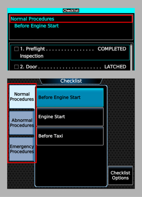
The name of each group will be displayed at the top of the Checklist pane when a list from that group is selected (image, top). Additionally, the GTC Checklist page uses each group's name to label its corresponding tab by default (image, bottom).
You can choose to specify a different tab label for a group without changing its name by using the tab-label attribute on the <Group> tag:
<Group name="Normal Procedures" tab-label="NORMAL">
</Group>
Lists
Lists represent individual checklists. Each list belongs to a checklist group and contains one or more checklist items and zero or more branches. The user can select and display one list at a time in the Checklist pane.
Lists are defined in the XML file with <List> tags placed directly under the <Group> tags of their parent groups:
<Checklist>
  <Group name="Normal Procedures">

    <List name="Before Engine Start">
    </List>

    <List name="Engine Start">
    </List>

    <List uid="before-taxi" name="Before Taxi">
    </List>

  </Group>
</Checklist>
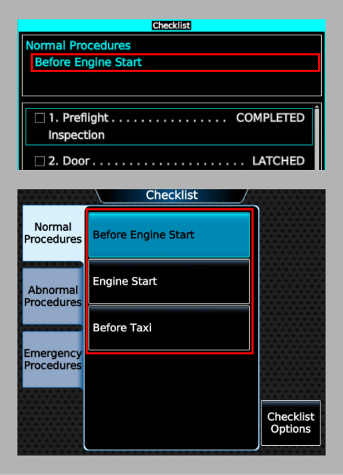
The order of the <List> tags within a <Group> tag determines the order of the corresponding lists in the group. The name of each list will be displayed at the top of the Checklist pane when the list is selected (image, top) and also appears in the GTC Checklist pane when the user is browsing through checklists (image, bottom).
The uid attribute on the <List> tag is optional and is used to define a unique ID for the list that can be referenced by link items.
The unique ID assigned to a list, if one exists, must be unique across all lists and all branches.
Branches
Branches represent optional sub-lists within checklists. Each branch belongs to a checklist list and contains one or more checklist items. The user can select and display one branch at a time in the Checklist pane.
Branches are defined in the XML file with <Branch> tags placed directly under the <List> tags of their parent lists:
<Checklist>
  <Group name="Normal Procedures">

    <List name="Engine Start">

      <Branch uid="engine-start-branch-normal" name="Normal Conditions">
      </Branch>

      <Branch uid="engine-start-branch-cold" name="Cold Weather Conditions">
      </Branch>

    </List>

  </Group>
</Checklist>
Each branch must be assigned a unique ID that can be referenced by branch items and link items.
The unique ID assigned to a branch must be unique across all lists and all branches.
The name of each branch will be displayed at the top of the Checklist pane when the branch is selected.
The order of the <Branch> tags within a <List> tag does not matter. They can even be interspersed with the list's <Item> tags.
Items
Checklist items represent the "content" of checklists. There are six different types of items:
| Type | Example | Description |
|---|---|---|
| Actionable |  | A selectable item describing a checklist step that can be completed. |
| Branch | 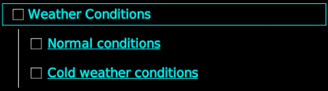 | A selectable item with a completion state that can depend on the completion state of zero or more linked branches in the same list. Can also be overridden to force completion regardless of the completion state of its linked branches. |
| Link |  | A selectable item that links to another list or branch. Cannot be completed. |
| Note | 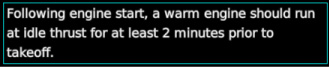 | A selectable item that provides informational content. Cannot be completed. |
| Title | 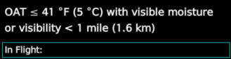 | A non-selectable item that represents a section title. Uses a larger font size than actionable or note items. |
| Spacer | N/A | A non-selectable item that inserts empty space into the rendered version of the checklist. |
Selectable items can be selected by users as they scroll through a list and will be highlighted with a cyan border when selected. Non-selectable items cannot be selected - they are skipped when the user scrolls through the list.
Actionable items have a completion state. The user can toggle the completion state of actionable items from not completed to completed and vice versa. When an actionable item is completed, it is rendered in lime and a green checkmark appears beside it.
Branch items also have a completion state. Unlike actionable items, however, the completion state of branch items can depend on the completion state of its linked branches (please see this section for more information on how to configure a branch item's completion state logic). Branch items also have an override state that can be toggled by the user similar to how an actionable item's completion state can be toggled. When a branch item is overridden, it is always considered completed regardless of the completion state of its linked branches.
A list must contain at least one item, but there is no minimum requirement for any specific type of item. Nonetheless, it is recommended that a list contain at least one selectable item.
Items are defined in the XML file using <Item> tags placed directly under the <List> or <Branch> tags of their parent lists/branches. Items that are placed directly under the <List> tag are considered to be members of the base list and do not belong to any branch. The order of the <Item> tags within their parent tag determines the order of the corresponding items in the list/branch.
Defining Actionable Items
To define an actionable item, use an <Item> tag with a type attribute of actionable:
<Item type="actionable">
  <LabelText>
    1. Preflight Inspection
  </LabelText>
  <ActionText>
    COMPLETED
  </ActionText>
</Item>
The <LabelText> child tag is required and defines the text that describes the item's topic. The <ActionText> child tag is optional and defines the text that describes the action to be taken for the item. When <ActionText> is defined, then the action text is rendered to the right of the label text, and the first lines of the label and action texts are connected with a string of dots.
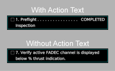
The presence or absence of action text does not affect whether an actionable item is completable. All actionable items are completable.
Actionable items can have different indentation levels. Supported indentation levels range from 1 (the default) to 4. It is recommended to only use indentation level 4 for items without action text. To specify an indentation level, use the indent attribute on the <Item> tag:
<Item type="actionable" indent="2">
  <LabelText>
    a. Fuel Quantity
  </LabelText>
  <ActionText>
    CHECK
  </ActionText>
</Item>
Actionable items can be rendered with different text colors. The default color is white. To specify a text color, use the text-color attribute on the <Item> tag:
<Item type="actionable" text-color="cyan">
  <LabelText>
    a. Fuel Quantity
  </LabelText>
  <ActionText>
    CHECK
  </ActionText>
</Item>
Actionable items are always rendered with lime text when they are completed, regardless of the specified text color.
Defining Branch Items
To define a branch item, use an <Item> tag with a type attribute of branch:
<Item type="branch" uid="weather-conditions">
  <Branch logic="sufficient">engine-start-branch-normal</Branch>
  <Branch logic="sufficient">engine-start-branch-cold</Branch>
  <Text>
    Weather Conditions
  </Text>
</Item>
Each <Branch> child tag defines a single linked branch (the text content of the tag is the branch's unique ID) and the logic to apply to the linked branch's completion state when determining the completion state of the branch item. The logic attribute can be either none (the default if the attribute is omitted), sufficient, or necessary. The branch item is considered completed when at least one linked branch with the sufficient logic type is completed or all linked branches with the necessary logic type are completed. Linked branches with the none logic type do not affect the branch item's completion state.
The <Text> child tag is required and defines the item's text.
The uid attribute is optional and is used to define a unique ID for the item that can be referenced by branch item links. Unlike unique IDs for lists and branches, branch item unique IDs only have to be unique among branch items within their containing branch or base list.
By default, branch items are rendered with a checkbox. Branch items with two or more linked branches (at least one of which has a logic type that isn't none) have the option to omit the checkbox. To do so, use the omit-checkbox attribute on the <Item> tag:
<Item type="branch" uid="weather-conditions" omit-checkbox="true">
  <Branch logic="sufficient">engine-start-branch-normal</Branch>
  <Branch logic="sufficient">engine-start-branch-cold</Branch>
  <Text>
    Weather Conditions
  </Text>
</Item>
Branch items without a rendered checkbox cannot be manually overridden by the user.
Branch items can have different indentation levels. Supported indentation levels range from 1 (the default) to 4 for items with checkboxes or from 0 (the default) to 4 for items without checkboxes. To specify an indentation level, use the indent attribute on the <Item> tag:
<Item type="branch" uid="weather-conditions" indent="1">
  <Text>
    Weather Conditions
  </Text>
</Item>
Branch items can be rendered with different text colors. The default color is cyan. To specify a text color, use the text-color attribute on the <Item> tag:
<Item type="branch" uid="weather-conditions" text-color="silver">
  <Text>
    Weather Conditions
  </Text>
</Item>
Defining Normal Link Items
To define a link item, use an <Item> tag with a type attribute of link:
<Item type="link">
  <Target>before-taxi</Target>
  <Text>
    Go to Before Taxi checklist.
  </Text>
</Item>
The <Target> child tag is required and defines the unique ID of the link's target list or branch.
The <Text> child tag is optional and defines the item's text. If the <Text> tag is omitted, then the item's text will default to the name of the target list or branch.
Normal link items can have different indentation levels. Supported indentation levels range from 0 (the default) to 4. To specify an indentation level, use the indent attribute on the <Item> tag:
<Item type="link" indent="1">
  <Target>before-taxi</Target>
  <Text>
    Go to Before Taxi checklist.
  </Text>
</Item>
Normal link items can be rendered with different text colors. The default color is cyan. To specify a text color, use the text-color attribute on the <Item> tag:
<Item type="link" text-color="white">
  <Target>before-taxi</Target>
  <Text>
    Go to Before Taxi checklist.
  </Text>
</Item>
Defining Branch Item Link Items
In addition to the normal link item described above, you can also define a special type of link item that is associated with a branch item. These branch item links target the branches linked by a parent branch item and must immediately follow the parent branch item with no intervening items that are not other branch item links. To define a branch item link, use an <Item> tag with a type attribute of link and a link-type attribute of branch-item:
<Item type="branch" uid="weather-conditions">
  <Branch logic="sufficient">engine-start-branch-normal</Branch>
  <Branch logic="sufficient">engine-start-branch-cold</Branch>
  <Text>
    Weather Conditions
  </Text>
</Item>
<Item type="link" link-type="branch-item">
  <Target branch-item="weather-conditions">0</Target>
  <Text>
    Normal conditions
  </Text>
</Item>
<Item type="link" link-type="branch-item">
  <Target branch-item="weather-conditions">1</Target>
  <Text>
    Cold weather conditions
  </Text>
</Item>
The <Target> child tag is required and defines the link's target branch via the parent branch item. The branch-item attribute on the <Target> tag defines the unique ID of the parent branch item. This attribute is optional; if it is omitted, then it will default to the unique ID of the closest preceding branch item in the same base list or branch as the link item. A branch item must have a unique ID in order to be the parent of a branch item link. The text content of the <Target> tag defines the zero-based index of the link's target branch within the parent branch item. For example, index 0 would target the first branch linked by the parent branch item (engine-start-branch-normal in the above example), index 1 would target the second branch (engine-start-branch-cold in the above example), and so on.
The <Text> child tag is optional and defines the item's text. If the <Text> tag is omitted, then the item's text will default to the name of the target branch.
Branch item links are rendered with the same text color as their parent branch items. The indent level of branch item links are also set to be one greater than the indent levels of their parent branch items.
Branch item links can also be automatically generated for a branch item using the optional auto-link attribute on the branch item tag:
<Item type="branch" uid="weather-conditions" auto-link="true">
  <Branch logic="sufficient">engine-start-branch-normal</Branch>
  <Branch logic="sufficient">engine-start-branch-cold</Branch>
  <Text>
    Weather Conditions
  </Text>
</Item>
When automatic link generation is enabled, one branch item link item will be created and inserted immediately after the branch item for each branch linked by the branch item. The order of the generated link items is determined by the order of the linked branches defined by the branch item. A branch item must have a defined unique ID in order to use the automatic link generation feature. The text of each automatically generated link item defaults to the name of item's target branch.
Defining Note Items
To define a note item, use an <Item> tag with a type attribute of note:
<Item type="note">
  <Text>
    Following engine start, a warm engine should run at idle thrust for at least 2 minutes prior to takeoff.
  </Text>
</Item>
The <Text> child tag is required and defines the text that is rendered for the item.
Note items can have different indentation levels. Supported indentation levels range from 0 (the default) to 4. To specify an indentation level, use the indent attribute on the <Item> tag:
<Item type="note" indent="1">
  <Text>
    If in RVSM Airspace:
  </Text>
</Item>
Note items can be rendered with different text colors. The default color is white. To specify a text color, use the text-color attribute on the <Item> tag:
<Item type="note" text-color="red">
  <Text>
    WARNING: Do not fly aircraft if brake pedals on either side feel soft or spongy.
  </Text>
</Item>
Note items can be rendered with different text justification. The supported values are left (the default), center, and right. To specify a text justification, use the justify attribute on the <Item> tag:
<Item type="note" justify="center">
  <Text>
    Rolling takeoffs are permitted and will increase takeoff distance.
  </Text>
</Item>
Defining Title Items
To define a title item, use an <Item> tag with a type attribute of title:
<Item type="title">
  <Text>
    Descent
  </Text>
</Item>
Title items can have different indentation levels. Supported indentation levels range from 0 (the default) to 4. To specify an indentation level, use the indent attribute on the <Item> tag:
<Item type="title" indent="1">
  <Text>
    Wing/Stab IPS ON:
  </Text>
</Item>
Title items can be rendered with different text colors. The default color is white. To specify a text color, use the text-color attribute on the <Item> tag:
<Item type="title" text-color="gray">
  <Text>
    Limitations
  </Text>
</Item>
Defining Spacer Items
To define a spacer item, use an <Item> tag with a type attribute of spacer:
<Item type="spacer" />
By default, a spacer item's height (not including the padding and margin applied to all items) is equal to the line height of an actionable or note item. You can specify a different height using the height attribute, where the attribute value defines the height in multiples of the default height:
<!-- A spacer with height equal to the default height. -->
<Item type="spacer" height="1" />

<!-- A spacer with height equal to half the default height. -->
<Item type="spacer" height="0.5" />

<!-- A spacer with height equal to twice the default height. -->
<Item type="spacer" height="2" />
Supported Text Colors
The following table lists the supported text colors for checklist items.
| Color | text-color Attribute | Hex Code | Example |
|---|---|---|---|
| white | white | #ffffff | |
| silver | silver | #c0c0c0 | |
| gray | gray or grey | #808080 | |
| navy | navy | #000080 | |
| lime | lime | #00ff00 | |
| green | green | #008000 | |
| yellow | yellow | #ffff00 | |
| olive | olive | #808000 | |
| red | red | #ff0000 | |
| maroon | maroon | #800000 | |
| magenta | magenta | #ff00ff |
Text Formatting
All standard text formatting conventions for XML files must be respected when creating the checklist XML file. In particular, this means that certain characters must always be escaped when they appear in the text content for a tag:
<(less than): escaped with<&(ampersand): escaped with&
Text rendered for all item types are formatted to automatically wrap to new lines when necessary while preserving whitespace characters (including newline characters). Text parsed from the various text tags in the XML file preserves all whitespace characters (including newline characters) except leading and trailing whitespace, which are entirely removed. Enclosing the text in quotes (either single or double) causes the text within the quotes to be parsed as a JSON-formatted string (after any XML-escaped characters are resolved).
To preserve leading and/or trailing whitespace in a text tag, use a JSON-formatted string:
<Text>
  "  The spaces before and after this sentence will be preserved.  "
</Text>
To insert a forced line break, use a JSON-formatted string with an escaped newline character (\n):
<Text>
  "This text will have a line break...\nafter the ellipsis."
</Text>
To prevent text from automatically wrapping to a new line at a specific space character, use the non-breaking space character instead. The non-breaking space character can be used directly in XML without escaping. However, it is recommended to escape the character (with  ) to make it obvious where non-breaking spaces are used:
<Text>
This text will not automatically wrap... after the ellipsis.
</Text>
Default Checklist
When the user first opens the GTC Checklist page to select and view a checklist, the first checklist in the first group is automatically selected. To change this default checklist, use the default-group-index/default-group-name and default-list-index/default-list-name attributes on the <Checklist> tag.
The index attributes define the zero-based indexes of the group containing the default checklist and of the checklist within its parent group. The name attributes define the names of the group containing the default checklist and of the default checklist. If both the index and name attributes are specified, the index attributes take precedence. If multiple groups or checklists within a group share the same name, then using the name attribute will select the first group/list with the specified name.
The following examples show how to define the Before Engine Start checklist in the Normal Procedures group as the default checklist, using the index attributes and the name attributes, respectively:
<!-- Define default checklist using indexes -->
<Checklist default-group-index="2" default-list-index="1">

  <!-- Group index 0 -->
  <Group name="Emergency Procedures">
    <List name="Engine Fire">
    </List>
  </Group>

  <!-- Group index 1 -->
  <Group name="Abnormal Procedures">
    <List name="Failed Engine Start">
    </List>
  </Group>

  <!-- Group index 2 -->
  <Group name="Normal Procedures">

    <!-- List index 0 -->
    <List name="Preflight Inspection">
    </List>

    <!-- List index 1 -->
    <List name="Before Engine Start">
    </List>

    <!-- List index 2 -->
    <List name="Engine Start">
    </List>

    <!-- List index 3 -->
    <List name="Before Taxi">
    </List>

  </Group>

</Checklist>
<!-- Define default checklist using names -->
<Checklist default-group-name="Normal Procedures" default-list-name="Before Engine Start">

  <Group name="Emergency Procedures">
    <List name="Engine Fire">
    </List>
  </Group>

  <Group name="Abnormal Procedures">
    <List name="Failed Engine Start">
    </List>
  </Group>

  <Group name="Normal Procedures">
    <List name="Preflight Inspection">
    </List>

    <List name="Before Engine Start">
    </List>

    <List name="Engine Start">
    </List>

    <List name="Before Taxi">
    </List>
  </Group>

</Checklist>