

Windows MIDI Glass is the Windows MIDI Services app for building your own touch control surface. You put knobs, faders, pads, and buttons on a page, tell each one what MIDI to send, and play it with a finger, a pen, or a mouse.
Two things decide what you see. A layout says what’s on the page: where each control sits, how big it is, what it’s called, and what it sends. A theme says how the page looks. Put a different theme on a layout and every control keeps its place, its name, and its messages. Only the look changes.
This article is about themes: the theme file, where it goes, and how Windows MIDI Glass turns each setting into what’s on the screen. It doesn’t cover building layouts. For that, see Windows MIDI Glass layout files, a guide for AI agents.
Windows MIDI Glass is a preview app. The theme file described here is version 1. Later versions can add settings, and a theme file written for an older version keeps loading when they do.
For AI agents: This article is written so you can design a theme for someone without reading the Windows MIDI Glass source code. Read it once from start to finish. Then use Designing a theme for someone else as your process and Every key in a theme file as your reference. Notes marked For agents point out mistakes that are easy to make and hard to see, because you usually can’t look at the result yourself.
On this page:
| A theme decides | A layout decides |
|---|---|
| Six colors, and one neutral that means “no color” | Which of those colors each control uses |
| The deck: the page’s background, its texture, and anything laid over it | Where each control is, and how big it is |
| How each kind of control is drawn: its body, outline, light, shadow, cap, and lamp | Each label’s text, font, and size |
| Where labels go, unless a control says otherwise | Any single control that should look different from the theme |
| How controls light up when you touch them or when MIDI arrives | What each control sends, and what it listens for |
A theme never picks a font. A theme that changed fonts would reflow the labels on a page that somebody laid out carefully around them. Fonts belong to the layout.
The default look, and the starting point for most themes, is four ideas:
One rule holds these together: a control uses one color, and that color shows only in its rim, its value, and its glow. Nothing is bright when nothing is happening. That’s what keeps a page of a hundred controls readable, and it’s why switching themes is a color swap rather than a redesign.
The light themes add a second idea: what you press is raised, what shows a value is sunk into the surface, and what does nothing is flat. A fader cap stands up off its slot, an XY pad’s field is cut in, and a control whose device is missing is dimmed.
Several shipping themes bend these rules on purpose. Jove’s buttons are solid color at rest, Airy System keeps every knob lit, Groovy draws every outline at full strength, Off-world Colonies puts rain and stains on the page, and Insert Coin’s buttons show their color all the time. Each theme that bends a rule says what it costs in the theme gallery, so you can decide before you take it on stage.
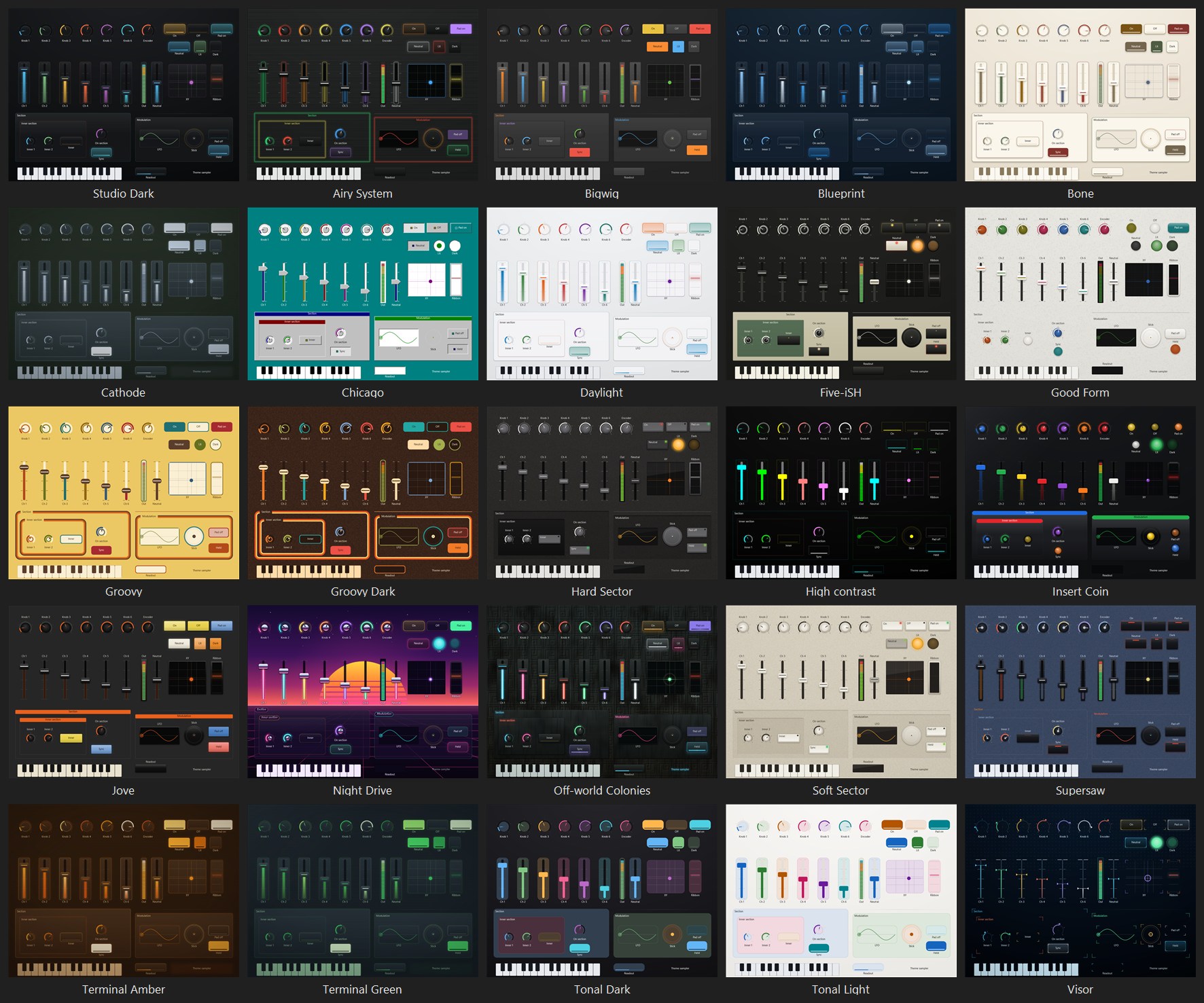
A theme has six colors, called hue slots. A control doesn’t store a color. It stores a slot. Change the theme and every control on slot 3 changes together, so a row of mute buttons still matches, and still stands apart from the row of solo buttons next to it.
#FF0000. A literal color ignores the theme, so it’s only for the rare control that has to be one exact color.If you’re designing a theme for layouts that already exist, keep each slot’s job. On Studio Dark, slot 1 is blue, 2 is green, 3 is amber, 4 is orange red, 5 is purple, and 6 is cyan. A customer who put all their drums on slot 4 will expect slot 4 to stay the warm one.
For agents: Ask the customer what each color means on their layouts before you change the order of the slots. Reordering slots recolors every layout they have.
Twenty-five themes come with Windows MIDI Glass. They’re part of the app rather than files on disk, so nothing can delete or change them. When you edit one in the app, you’re editing a copy.
Your own themes are files in this folder, one theme per file, each ending in .miditheme:
Documents\MIDI Layouts\Themes
C:\Users\<name>\Documents. On many PCs it has been moved into OneDrive. Open File Explorer, select Documents, and look for MIDI Layouts there.\ / : * ? " < > |) for an underscore..miditheme.json. The app still reads those, and renames them to .miditheme the next time it starts.A theme file shows up in the gallery only if all of these are true:
name.name sorts ahead of it. When two files share a name, the one whose file name comes first alphabetically wins.Windows MIDI Glass doesn’t show an error for a file it skips. The theme just isn’t there.
A layout file names its theme in its theme value. It can also carry a whole theme of its own in a themeColors block, which holds the same settings as a theme file:
{
  "theme": "Supersaw",
  "themeColors": {
    "name": "Supersaw",
    "hueSlots": [ "#E8822A", "#FF6047", "#4CE57A", "#96B7E2", "#E2CE7E", "#B09CE2" ],
    "fillWhenOnPercent": 0
  }
}
When you change a theme’s settings in the Windows MIDI Glass editor, the edited theme is stored in the layout this way. That’s why a layout you send to a friend still looks the way you built it, even if they’ve never seen your theme.
For agents: A
themeColorsblock isn’t a list of changes to the theme the layout names. It’s a whole theme, and anything it leaves out comes from Studio Dark, exactly as in a theme file. The short example above would draw Studio Dark’s look in Supersaw’s colors, not Supersaw. The app always writes every setting into this block, and so should you.
themeColors, it uses that.Picking a theme in the gallery drops any copy the layout was carrying and makes the layout point at that theme by name again. So when you improve a theme file later, every layout that names it picks up the change the next time it opens.
.midithemepack file holding the theme and its background picture, with a list of every file and its SHA-256 hash, so anyone can tell if something was changed after it was packed. You can sign the pack with a code-signing certificate. Before it packs, Windows MIDI Glass shows what the theme says about who made it, and you can change it..miditheme file, copy it into Documents\MIDI Layouts\Themes, or use Import a theme…. Import copies the file into the Themes folder under the theme’s name, replacing an older file with that name, and puts the theme on the layout you have open. A file on its own has no list of files and can’t be signed, so a pack is the better way to share.A theme file can say who made it in a provenance block, the same block a layout has. The gallery shows the name under each theme, marked (unverified) unless the theme came from a signed pack and hasn’t changed since. Right-click a theme and select About this theme… to see everything the block says. Group themes by sorts the gallery by who made each theme, or by who signed it.
The Appearance page also says which theme the layout uses and who made it, with an About this theme… button beside it. For a theme of your own, About this theme… lets you change who made it, its website, its license, its version, and how it was made. You can’t change a theme that comes with Windows MIDI Glass, one from a signed pack, or one a newer version made. Changes you make to a theme while you edit a layout stay inside that layout and don’t have a block of their own. Save them as a theme to give them one.
"provenance": {
  "id": "8c2d4e6f-1a3b-4c5d-9e7f-0a1b2c3d4e5f",
  "version": "1.0",
  "author": "Pat Example",
  "license": "CC-BY-4.0",
  "created": "2026-10-08T21:14:00Z",
  "tool": "Example Assistant 2.1",
  "digitalSourceType": "trainedAlgorithmicMedia",
  "aiDisclosure": { "humanOversightLevel": "prompt_guided" },
  "basedOn": { "name": "Studio Dark", "builtIn": true }
}
Every key, and what to put in it, is in Who made it in the layout guide. For a theme, basedOn names the theme you started from: write "builtIn": true for one that comes with Windows MIDI Glass.
For agents: Write this block in every theme you make, with
trainedAlgorithmicMediaindigitalSourceType. Ask the customer whose name and which license go on it, and offer to leave them off. Never put your own name inauthor.
A theme file is one JSON object. This one is small, but it’s complete enough to use:
{
  "fileVersion": 1,
  "name": "Harbor",
  "hueSlots": [ "#5CC8FF", "#7BD88F", "#FFC857", "#FF8A65", "#C792EA", "#FF6B84" ],
  "neutralColor": "#D8DEE9",
  "deck": {
    "kind": "gradient",
    "color": "#1E2B33",
    "gradientEndColor": "#0C151A"
  },
  "glassColor": "#22323B",
  "trackColor": "#0D1418",
  "arcTrackColor": "#1FFFFFFF",
  "meterSlots": [ 1, 2, 5 ]
}
Everything this file leaves out comes from Studio Dark, so Harbor gets Studio Dark’s glass plates, faint rims, and glow, with its own colors on a blue slate deck. Measured, every slot is at least 5.3 : 1 against the top of the deck and 4.9 : 1 against the plate, and the two closest slots, the coral and the red, are still clearly different colors.
The app reads a theme file by these rules:
"#RRGGBB", or "#AARRGGBB" with the alpha first. "#80FF0000" is red at half strength. That’s the opposite of CSS, where the same color is #FF000080. Upper and lower case letters both work.00 means “not set.” Many colors are optional. Leave them out, or write "#00000000", and the app works out a color itself. The key reference says what each one falls back to.fillAtRest, switchFillAtRest, padFillAtRest, and pipeFalloff. The theme editor shows those four as percentages, so 14 percent in the app is 0.14 in the file. A setting that takes whole numbers drops anything after the decimal point."cornerRadius": 500 doesn’t give you the roundest corners. It gives you Studio Dark’s 7."gradient", "neutralEdge", "filledBar". A choice the app doesn’t know is ignored.true and false, not "true" or 1.deck and deckOverlay, an unknown key is gone after a save. _comment is ignored. Don’t keep notes in a theme file.name is required. It’s trimmed at both ends and cut off at 1,024 characters.For agents: The two mistakes that cost the most time are the byte order mark and the alpha order. A theme saved with a byte order mark never appears in the gallery, and nothing says why. A CSS-style
#RRGGBBAAcolor loads without complaint and draws the wrong color. Check every percentage too:"fillAtRest": 14is out of range and quietly ignored. You meant0.14.
This section follows the order the app draws in: the deck, the layers over it, and then each part of a control. For each setting it says what the setting is for and where a shipping theme uses it. The key names are the ones in the file; the key reference also lists the name each one has in the app’s theme editor.
The deck is the page itself: one color, a gradient that’s lit from above, or a picture.
"deck": { "kind": "gradient", "color": "#1D1E21", "gradientEndColor": "#07080A", "image": "", "imageRepeats": false }
kind is "solidColor", "gradient", or "image".color, and falls away to gradientEndColor at the bottom and the lower corners.#1D1E21 to #07080A.#F4EFE4 down to #E3DAC9 and never darker, because the whole point of Bone is that the space around the controls is bone colored."image" draws a picture. image is the picture’s file name: a .png or .jpg file in the Themes folder, next to the theme files. It has to be a plain file name, never a path. The theme editor’s Choose… button copies a picture into the folder for you. When the picture is missing, the deck shows its color.imageRepeats says how the picture covers the page. Off, one copy fills the page and is cut to fit. On, the picture repeats at its own size from the top left, over the deck’s two colors, which are lit from above the way a gradient is. A pattern stretched to fill a page turns into a blur, so a texture should repeat. A repeating picture grows and shrinks with the page, and it should be mostly see-through so the deck’s colors show between its marks. Off-world Colonies repeats a wall of cast concrete blocks, stained where the rain has run down it, 512 pixels square, over #1D2625 to #15130F.Off-world Colonies wall.png, Off-world Colonies stains.png, Night Drive sky.png, or Visor dots.png gets the app’s own copy, unless the Themes folder has a file with that name. Night Drive’s sky is one picture, 1600 by 900 pixels, that fills the page without being stretched, so the sun stays round on any shape of page. Visor’s dots are one faint dot in a 16 pixel square, repeated over a dark blue deck.For agents: If you write a
deckblock, always includekind. A deck block without one is a flat color, not a gradient. A deck block withoutgradientEndColorusescolorfor both ends.
For agents: The shipped dark themes work out both ends of the deck from one base color, and you can do the same. For each of red, green, and blue, the top is
base + (255 - base) * 0.07and the floor isbase * (1 - f), wheref = 0.06 + 0.35 * (1 - brightness)andbrightness = (0.299 * R + 0.587 * G + 0.114 * B) / 255of the base. Their slot track istop * 0.45, and their glass isbase + max(6, (255 - base) * 0.045). A theme file doesn’t work any of this out for you, so write the results in.
These are laid over the whole page once, so they cost the same with four controls or four hundred. They’re all off unless a theme turns them on, and they all live in one deckOverlay block.
"deckOverlay": {
  "grainPercent": 34, "grainColor": "#8496B4", "grainStreak": 1, "grainStyle": "speckle",
  "rainPercent": 0, "rainColor": "#00000000", "rainSpeed": 0,
  "floorPercent": 0, "floorColor": "#00000000", "floorHorizonPercent": 58, "floorSpeed": 0,
  "scanLinePitch": 0, "scanLineStrength": 0, "scanLineColor": "#000000",
  "vignettePercent": 0, "vignetteColor": "#00000000",
  "faceplateSheenPercent": 0, "faceplateSheenColor": "#00000000"
}
grainPercent is how strong it is: at full it’s sandpaper, and at a quarter it’s only a warmth. grainStyle says what kind of texture it is:
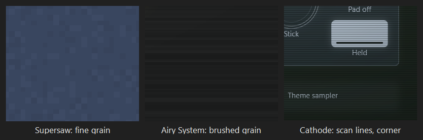
"speckle" is specks a few pixels across, some lighter and some darker than the deck, like Supersaw’s bead-blasted blue panel (34 percent of #8496B4). An unset grain color is the deck’s own color, lifted a little."brushed" is long streaks running across the page, like Airy System’s brushed metal (32 percent of #FFFFFF). grainStreak is how long each streak is, and only brushed grain uses it: Airy System uses 48, and 1 means the usual 12. Brushed grain is always lighter than the deck, the way light catches the ridges."fine" is a noise in every screen pixel, like stippled plastic or poster paper. Each percent moves a pixel about a tenth of a brightness level lighter or darker, so 50 is about five levels either way, and the page’s average stays where it was. Soft Sector uses 36, Hard Sector 24, and Groovy Dark 50. Fine grain stays sharp at every zoom. An unset grain color lightens toward white.rainPercent) is fine streaks falling nine degrees off the vertical, under the controls. rainColor is what they’re made of, and a cool white, #C6E4EE, when it isn’t set. rainSpeed is how fast they fall, in page pixels a second, up to 600. The rain holds still in the editor, in thumbnails, and whenever Windows animation effects are turned off. Off-world Colonies uses 35 percent, falling at 300.floorPercent) is a grid running away to the horizon, under the controls: lines that meet in the middle of the horizon, and rungs that get closer together as they get further away. It fades in out of the haze over the first third below the horizon. floorColor is what the lines are drawn in, and slot 1 when it isn’t set. floorHorizonPercent is where the horizon is, as a share of the way down the deck’s picture when one picture fills the page, so the grid meets the horizon painted in the picture, or of the page otherwise. floorSpeed rolls the floor toward you, in page pixels a second, up to 600. Like the rain, it holds still in the editor, in thumbnails, and whenever Windows animation effects are turned off. Night Drive uses 55 percent of its pink, with the horizon at 58 percent of the way down its sky, rolling at 14.scanLinePitch is the distance between lines. It’s measured in screen pixels rather than page pixels, so the lines stay the same distance apart and stay sharp at every zoom. scanLineStrength is how dark each line is. Cathode, Terminal Amber, and Terminal Green use a pitch of 3 at about 45 percent.vignettePercent) darkens the corners, the way a tube is brightest in the middle. It’s drawn over the controls. The tube themes use 60, Off-world Colonies uses 30 so its corners fall into the dark, and Visor uses 35 so its display is brightest in the middle. An unset vignetteColor is the deck’s floor color, taken further down.faceplateSheenPercent) is a soft diagonal light across the upper left: the room, reflected in the glass. It’s in every photograph of a real terminal, and it’s what makes glass look like glass instead of paint. Terminal Green uses 5 percent of #BEE1F0, which is also what an unset color means. It’s meant to be faint: at 5 percent, the top left of the page is only a little lighter than the top right, so you won’t see it in a close-up. Insert Coin uses 8 percent of #CDDCF0: the sheet of clear plastic over an arcade panel.From the bottom up, the order is: the deck’s picture, the grid floor, grain, rain, the controls, the vignette, the scan lines, and the reflection.
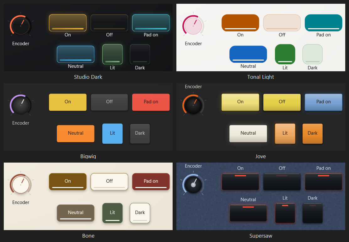
The plate is the body of a control. A theme makes it in one of three ways, and the app uses the first one that applies:
fillAtRest says how much, from 0 to 1. Tonal Light uses 0.14 and Tonal Dark 0.18, which is why every control on those themes is lightly colored even when nothing is happening.plateColor is set, the plate is that color, and plateEndColor turns it into a gradient from top to bottom. Bigwig’s plate is a raised gray, #474747 to #3C3C3C, because on Bigwig orange only ever means “this is the value.” Supersaw’s plate is shiny black molding, #1C1F25 to #0D0F13.glassColor, laid over the deck at glassTintPercent opacity. Studio Dark uses #17181B at 86. At 0 there’s no plate at all, which is what High contrast does.Glass should be a little lighter than the deck, not black. A black plate on a near-black deck reads as a hole cut in the page rather than an object sitting on it.
A plate can also carry light and shade:
plateSheenPercent washes light down the top of the plate, fading out before the middle, in plateSheenColor (white when it isn’t set). Studio Dark uses 6. A white sheen on a near-white plate is only haze, so the light themes use 0. On a warm plate a white sheen turns gray, so give a warm theme a warm sheen color.plateShadePercent darkens the bottom of the plate, in the shadow color. Together with a sheen it makes a plate look glossy, like Jove’s colored tabs (sheen 17, shade 16).plateHighlightPercent draws a one-pixel line of light just inside the top edge, which is what makes plastic look molded. Supersaw uses 24 on its molding. The same line is drawn on fader caps and on note pads.cornerRadius rounds the corners, in pixels, but never past half the control’s shorter side. Studio Dark uses 7, Bigwig 4, Jove 3, the tonal themes 14, and High contrast 0.Shade and the top-edge line aren’t drawn on round controls.
plateElevation is how dark the shadow under a plate is, from 0 to 100.shadowSpread is how far the shadow reaches: its blur, in pixels. The shadow also drops down by a third of that.shadowColor is what the shadow is made of. Black is right on a dark deck. On a light deck a black shadow comes out a dirty gray.thumbShadowPercent puts a shadow under a fader’s cap, so the cap stands off its slot.recessShadePercent shades the inside of anything cut into the surface: fader and meter slots, and the display wells described below. It’s strongest along the top edge.A shadow is always the exact shape of whatever casts it, and it needs a plate to cast from.
On a dark deck a shadow is barely visible, so Studio Dark leaves it at 55 with a spread of 3. Bone is where the shadow does the real work. A warm white plate on a bone deck measures 1.23 : 1, almost no difference at all, so the shadow is the only thing separating a control from the page. Bone uses elevation 45, a spread of 9, and a warm shadow, #5E5139. The theme editor warns you when a plate and its deck are this close, because at zero the layout disappears.
A picture tube has no thickness, so the tube themes use no shadow at all.
rim says where the outline’s color comes from: "controlHue" (each control’s own color), "neutralEdge" (one color for every control, from neutralRimColor), or "none".rimStrengthPercent is how strong a colored rim is at rest. 0 means no rim.switchRimStrengthPercent does the same for everything you press or read rather than turn or slide: buttons, toggles, pads, page tabs, lamps, meters, readouts, and the like. -1 means “the same as rimStrengthPercent.”rimThickness is how heavy the rim is, from 1 to 6 pixels: on plates, knob faces, and sections, and the lit rim on a switch. The outer edge stays on the control’s own corner at any weight.rimStyle is "outline", a full outline, or "corners": only the four corners of it at rest, in the rim’s color and strength. A control that’s on closes its corners into a full frame in its own color, so on a busy page the few that are on stand out, because only they are closed. A knob shows its corners only while it’s touched. Faders, meters, lamps, lines, pad grids, and round buttons never get corners, and sections get longer ones. Visor uses corners at 60 percent.Under a finger, the rim rises to nearly full strength. When a switch turns on, its rim lights in the control’s color, or on a theme that uses lamps, in a faint line of the lamp’s color.
A quarter strength keeps a busy page calm, and Studio Dark uses 28. On a light plate a faint hairline disappears, and the control’s color goes with it: six faders on six different slots all look the same. Bone runs its rim at 85 for that reason, and the app’s accessibility check asks for at least 50 on a light plate. The tube themes use 40 to 55.
Bigwig uses a neutral edge, #1A1A1A, so that color only ever means the value. Jove and Supersaw have no rim at all, because on real hardware the control is simply the thing you touch. Airy System lights its knob and fader rims at 85 but sets the switch rim to 0, so its buttons stay black until they’re on. Groovy and Groovy Dark run their rims at 100 and 3 pixels thick, which breaks the quarter-strength rule on purpose: a cream plate on Groovy’s goldenrod page is only 1.41 : 1, so the line is what makes each control.
A bevel is a two-tone edge that makes a flat gray shape look raised or pressed in, the way every button on a desktop of the nineties did. On a beveled theme the bevel is the whole language: raised is something to press, pressed is something that’s down, and sunken is a field that holds a value.
bevelPixels is how wide the bevel is, from 0 to 3 pixels. 0 is no bevels at all.bevelHighlightColor, bevelLightColor, bevelShadowColor, and bevelDarkColor are its four colors, from the outside edge in. When they aren’t set, they’re white, the plate lifted halfway to white, the plate darkened by a third, and black.Where the app puts each kind:
wellFillsControl; and a round lamp.On a beveled theme, windows are square. A round lamp on a beveled theme with a wellColor is a hole in that color, like a radio button, with a dot of the lamp’s color in the middle when it’s lit. Chicago uses 2 pixels in #FFFFFF, #DFDFDF, #808080, and #000000, with every window white.
glowStrength is how bright a control’s glow gets when you touch it, when MIDI arrives for it, or while a switch is on. A switch that stays on holds a little over half of it. The glow is a soft blur in the shape of the plate.bloomColor is the color of the glow. When it isn’t set, each control glows in its own color.restingGlowPercent is a floor under the glow, so a control spills a little light all the time. It’s a share of glowStrength, so it does nothing when the glow is 0. switchRestingGlowPercent sets a different floor for everything you press or read, and -1 means the same.persistenceMilliseconds is how long the glow takes to fade after a touch. 0 means the normal 220 milliseconds. A control that listens for MIDI has its own Light duration, 120 milliseconds unless the layout changes it, and that’s what MIDI arriving for it uses. The theme’s time applies there only when the control’s own time is 0.touchFillPercent washes the plate with the control’s color while a finger is on it. On a flat theme with no glow, it’s the only thing that shows a control is being held. Switches never take it, because a switch shows it’s held by being on, or on a theme with key travel, by going down.glowFallPixels moves a control’s glow down by this many pixels, so the light reaches further below a control than above it, the way it runs down a wet wall. Off-world Colonies uses 8. A name in neon takes it too.flarePercent makes a lit light throw a lens flare. A lit switch’s value strip gets a streak along it that runs past both ends and a short ray across it. An XY pad’s puck gets a long streak, a ring that fringes red at its edge, and a faint four-point star, all following the puck. flareColor is the flare’s warm heart, and the light’s own color when it isn’t set. Off-world Colonies uses 100 with #FFF1DC. A flare is only decoration: the light coming on is still what shows the state.The glow also drives the halos: the light around a fader’s fill, around an XY pad’s puck, around a knob’s arc on a theme that asks for it, and around a lit round lamp. A theme with no glow has no halos.
When Windows animation effects are turned off, the glow switches on and off instead of fading.
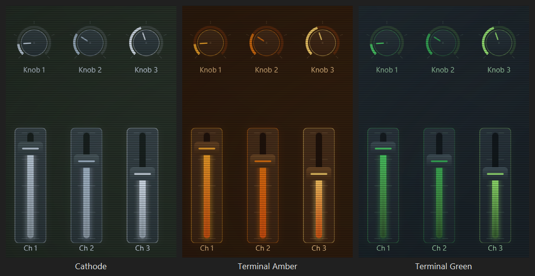
The tube themes are where these settings matter most. A box drawn on a picture tube is barely brighter than the glass around it, 1.11 : 1 to 1.22 : 1, so the light it spills all the time is what makes it an object. Cathode, Terminal Amber, and Terminal Green each keep a resting glow (13, 16, and 9 percent), and each glows in its phosphor’s color rather than in the control’s. Cathode’s black and white tube glows blue white, #CFE0F3. Terminal Amber glows #FF6010, redder than the amber itself, because that phosphor fades through red, and that’s what people recognize as an amber screen. Terminal Green glows yellower than its green, #86F260. Terminal Amber also holds its glow for 400 milliseconds, the way that phosphor does. On a theme with a resting glow, the theme editor reminds you that at zero the controls would dissolve into the deck.
Bone glows white (bloomColor #FFFFFF). Its plates are already near white, so the only room left to say “this one just did something” is to take them the rest of the way.
The value is the light that shows where a control is set.
valueColor draws every value on the page in one color: knob arcs, fader fills, pucks, the LFO’s wave, and the numbers. When it isn’t set, each value is its own control’s color. Jove draws every value in its orange, #E8601C, and Five-iSH in its white print, #F2EFE3.trackColor is the empty part of a fader or meter slot. A slot is cut into the plate, so it has to be darker than the plate.arcTrackColor is the empty part of a knob’s arc. The arc sits outside the plate on the bare deck, where on a dark theme there’s nothing left to be darker than, so it usually has to be a faint light instead. Jove and Supersaw use white at 10 percent, #1AFFFFFF. When it isn’t set, it’s the same as trackColor. Without a visible arc track, a knob shows where it’s set but never how far it can go.arcTrackHuePercent makes the empty part of the arc the control’s own color at this strength instead. Airy System uses 30, so a green knob sits in a dim green ring.arcGlow gives a knob’s arc the same halo a fader’s fill has. Airy System turns it on.arcThickness is how heavy a knob’s arc is, in pixels, and 0 means the usual 4. When it’s set, the gap between the arc and the face grows to half of it, the pointer becomes two thirds of it, and a fader’s slot is at least the arc plus 4 pixels, so everything reads as one weight. Groovy and Groovy Dark use 6.arcRoundEnds rounds both ends of a knob’s arc, the way a pen draws a line, and makes a fader’s cap a pill. A knob at zero shows no value arc at all, so a round end never leaves a dot. Groovy and Groovy Dark turn it on.valueCorePercent draws a lighter line down the middle of every lit value, this far toward white: a knob’s arc, a fader’s fill, and a switch’s value strip. An XY pad’s puck gets a white heart. It’s the white hot middle of a neon tube. Off-world Colonies uses 65.pipeFalloff is how bright the far end of a fader’s fill is, from 0 to 1, so the fill is brightest at the value and fades away behind it. 1 is a flat bar. Studio Dark uses 0.35.valueFadesToLight runs the far end of the fill into the glow color instead. It’s what makes an amber fader look like fire on Terminal Amber.valueStrip puts a thin line along the "bottom" or the "top" of buttons, toggles, pads, page tabs, lamps, and readouts, or "none" for no line. The line is dim where it’s empty and lit up to the control’s value, so a switch that’s on lights all of it.valueIndicator draws a knob’s arc as a "solidArc" or as a "segmentedLamps" ring. lampCount is how many lamps, and a knob smaller than minimumLampRingSize pixels falls back to the solid arc, because below that the lamps run together.meterSlots picks the slots for a meter’s three zones: the first 70 percent of its travel, the next 20, and the top 10. Choose three that are also a rising brightness, and the meter still reads for someone with no color vision. The tube themes use the widest three brightnesses they have.meterUnlitColor is the color of a meter’s lights while they’re out. When it isn’t set, each zone’s lights are their own color at about a sixth of its strength. Most dark themes use a faint white, like the comps; the tonal themes and Bone use their track color.For agents:
meterSlotscounts from 0, unlike the slot numbers the app shows. The default,[1, 2, 5], is slots 2, 3, and 6. If your sixth slot isn’t a warning color, setmeterSlotsso the top zone lands on your red.
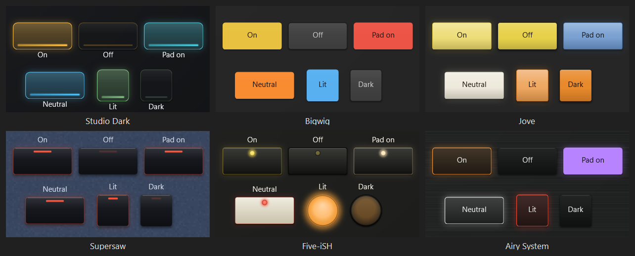
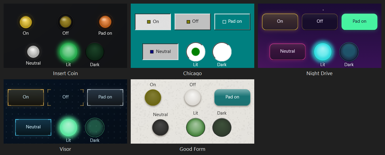
A switch is anything you press: a button, toggle, pad, page tab, or lamp. How a theme draws switches at rest and when they’re on is most of its personality.
At rest:
switchFillAtRest is a tonal fill for switches only, from 0 to 1, and -1 means the same as fillAtRest. Jove sets it to 1, so every tab is solid color at rest while its knobs stay black.padFillAtRest does the same for pads only. Airy System uses 0.34, so its pads are dim colored plastic while the buttons beside them are black.restTintOnPlate mixes that resting color into the plate instead of into the page. Groovy’s pads use it, so a pad at rest is a pale shade of the same cream as every other control rather than a mustard shade of the goldenrod page.When on:
fillWhenOnPercent is how much of the control’s color the plate takes when it’s on. The default is 34. At 100 the plate becomes the color from top to bottom, which is what Bigwig and Bone do. At 0 the plate doesn’t change at all, and the switch lights a lamp instead, which is what Supersaw and Five-iSH do. A rack of identical black switches with one lamp lit is easier to read across a room than a rack of colored blocks, because the eye only has to find the bright thing. padFillWhenOnPercent sets this for pads only.lampFillWhenOnPercent sets it for Lamp controls only. At 0, a lamp lights its own lamp even on a theme whose switches fill with their color, and with round lamps that’s a lens like an LED. -1 means the same as other switches. Insert Coin, Night Drive, Visor, and Good Form use 0.onLiftPercent moves a lit plate toward white (above 0) or toward black (below 0). Jove uses 36, so a lit tab goes paler, like colored plastic with a lamp behind it. Bone uses -16, so a lit button on its light page gets deeper and its white name still reads.onInkColor is the color of a switch’s name while the switch is on. It’s used only where it reads at 4.5 : 1 or better; otherwise the name takes the ink, or failing that whichever of a light or dark ink reads. Groovy prints a cream name, #FFF7E6, on every lit color, and the tube themes print a name the color of their dark glass, the way a terminal’s inverse video does.lampColor is the lamp’s color when fillWhenOnPercent is 0. When it isn’t set, a lamp is its control’s own color. A lit lamp puts a faint line of its light around the switch, and a named lamp color also colors the switch’s glow. Supersaw lights every switch with one red lamp, #FF523A.lampShape is "bar", a short bar across the top of the switch, or "dot", a round lens. An unlit lamp is still drawn, dimly, so you know where to look for it.lampPosition puts a round lamp at the "topCenter" of a switch or in its "topRight" corner, the way a keyboard’s LED sits clear of the name printed at the top left. Soft Sector and Hard Sector use the corner.lampHolderColor sets a round lamp into a holder: a dark ring round the lens, with the light catching its lower edge. Unlit, the lens is only a hint of its color. Soft Sector’s holder is #2B2723 and Hard Sector’s #0C0C0C.lampGlowPercent is how strongly a lit round lamp glows, apart from glowStrength. -1 means the same as glowStrength. It lets an LED light the key round it on a theme where nothing else glows: both Sector themes use 100 with a glow of 0.namesInsideSwitches puts a switch’s name in its middle, whatever labels says for everything else, the way a hardware panel prints names above its knobs but on its buttons. The name changes ink when the switch lights, so it can still be read on a bright fill.switchNames says where that name sits: "center", or "topLeft", one line at the top left the way a keyboard prints the legend on a key. A layout can also put one control’s name there with the Inside top left label placement.neutralCaps makes a switch or fader on the neutral slot wear the neutral color as its cap. It’s how a hardware panel marks one row of controls as belonging together without giving it a color. Five-iSH uses it for one row of cream caps. The theme needs a neutralColor for this to do anything.latchStyle says how a switch that stays on shows it: "lit", or "checkerboard", where a toggle or a page tab that’s on stays pressed in and fills with a fine checkerboard of the bevel highlight and the plate, with no color at all. A button that’s on is only pressed, and a pad still lights in its color. Chicago uses it.switchColorTag puts a small square of the control’s color before a name printed in the middle of a switch, so a gray button still says what it’s for. It needs namesInsideSwitches.currentStepStyle marks the step a step sequencer is playing: "lit", or "dottedFocus", lit with a dotted line around it, the way a focused control was marked. Chicago uses the dotted line.Keys:
switchShape is "plate", or "keycap" for a key: a skirt in the plate’s two colors with a dished top set into it, a thin dark line along the foot of the skirt, and a line of light along the top of the dish. It needs a plateColor. A lamp on its own stays a lamp.keycapTopColor and keycapTopEndColor are the dished top, from the back to the front. A dish is darker at the back than at the front. When they aren’t set, they’re worked out from the plate. A key held down gets a few levels darker.neutralCaps, a key is the other plastic: all four of its colors are the first key’s, scaled to the neutral color. Soft Sector’s second key is #A29C8F, and Hard Sector’s is near black.pressTravelPixels is how far a switch goes down under a finger, from 0 to 8 pixels. A toggle that’s on, and the page tab you’re on, stay half as far down. A pad or button lit only by MIDI doesn’t move, because nobody pressed it. While a key is down, its shadow shrinks. Both Sector themes use 2, because a glow alone was too faint to show a press on their keys.Round buttons:
switchShape "round" makes buttons, toggles, and pads the largest circle that fits the control, centered, and domed by the plate’s sheen and shade. plateHighlightPercent becomes a spot of light at the upper left. A lit button is its color, hotter in the middle by as much as the theme glows. A page tab and a lamp stay as they are.switchRingColor sets a round button into a ring of that color. The button is then 72 percent of the ring, and only the button moves under a finger. When it isn’t set, the button is the whole circle.padsFollowSwitchShape is on unless a theme turns it off. Off, pads stay rounded rectangles beside round buttons, which is what Good Form does.labels says, the way an arcade panel prints it beside the button.Insert Coin sets its round buttons into black rings. Each is its own colored plastic at rest (switchFillAtRest 0.62 over a near-black plate, with restTintOnPlate) and its color outright when it’s on.
The on state paints the plate. On a theme with no plate at all, like High contrast, a switch shows it’s on through its value strip.
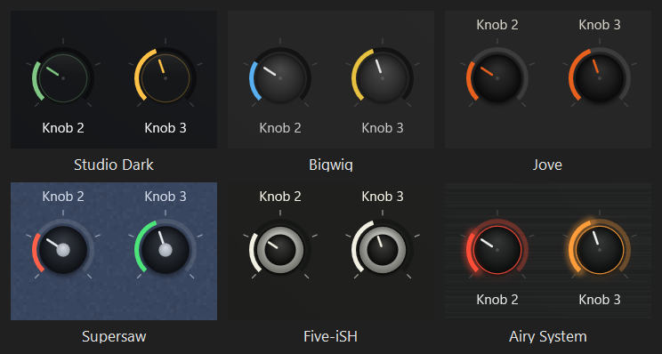
A knob’s plate is only its face. The value arc hangs just outside the face, 2 pixels clear, and runs three quarters of a turn, from about seven o’clock round to five o’clock.
knobFaceColor and knobFaceEndColor turn the face into a turned cap: brightest just above the middle, where the light catches it, and darker toward the edge. When they aren’t set, the face is the plate. A face needs a plate to sit on, so on a theme with no plate, set plateColor too.knobCapColor, knobCapEndColor, and knobCapSizePercent put a smaller cap in the middle of the face. The size is a share of the face. Without a cap there’s a small dot in the middle instead.pointerColor is the line that shows which way a knob points. When it isn’t set, the pointer is the control’s color, or the ink on a theme with a neutral rim. On a real panel every pointer is the same color whatever the knob does, and that’s what Jove (#E8601C), Supersaw (#E9ECF2), and Bigwig (#E6E6E6) do.pointerOnCap prints the pointer on the cap, from its edge toward the middle, the way Five-iSH’s white line is printed on its black cap. Without it, the pointer comes out from under the cap.knobCapFromHue makes each knob’s cap its own color, lit a little at the top and deeper at the edge. The pointer on it is pointerColor where that reads at 3 : 1 on the cap, and otherwise white or near black, whichever reads. On a theme with no knobFaceColor, the knob is only its cap: there’s no face around it, and the shadow is the cap’s. Insert Coin and Good Form use it.pointerShape is "line", or "chevron": a small chevron in the value color riding just outside the arc and pointing at the marks, instead of a line across the face. Visor uses it.knobArcOnFace makes the face reach out under the arc, so the arc is printed on the face, just inside its edge. Chicago’s knobs are a gray cap in a sunken white ring that holds the value this way.knobTickCount prints a ring of marks around every knob, outside its arc, in the ink. Supersaw prints 9 and Five-iSH 11.knobMajorTickEvery makes every so many of the theme’s marks longer, and prints them in the full ink, so the scale can be read at a glance. 0 is none. Visor prints 37 marks with a long one every 4.knobKnurlCount cuts ridges round the side of the face, from 0 to 120, alternating the face’s two colors, lit along the top and shaded along the bottom. It’s the grip on a molded knob. Both Sector themes use 36, with a flat cap in the middle.A knob keeps its own marks. A new knob shows five marks of its own. On a theme with knobTickCount, those five are printed in the ink, and the theme’s count is used on knobs whose own marks are turned off. Knobs smaller than 36 pixels have no room for marks.

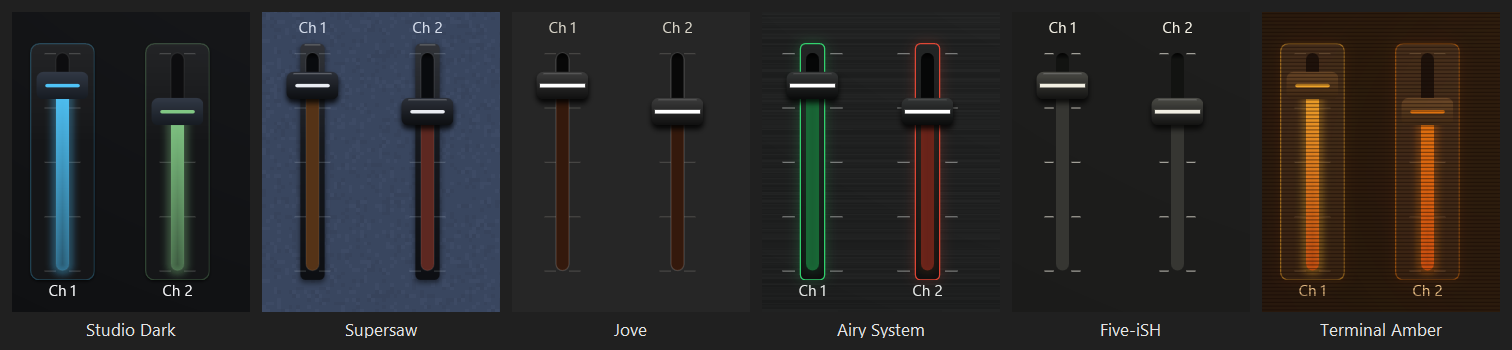
faderPlate says what a fader’s slot is cut into:
"full" is a plate the size of the whole control, which is what most themes use."strip" is a narrow strip of molding, 5 pixels wider than the slot on each side, with the cap wider than the strip. Supersaw."none" is no plate and no rim, just the slot cut into the panel. The glow comes from the slot. Jove and Five-iSH."frame" has the strip’s shape but is cut into the panel instead of standing on it: no shadow and no sheen, with the rim and the resting glow around the slot and the marks printed outside. Airy System.faderFillPercent is how strong the fill below the cap is. When the cap’s position is the whole value, as on Jove (20) and Five-iSH (16), the slot is only faintly lit. A faint fill also throws much less halo.faderScalePercent prints the marks beside the slot in the ink at this strength, reaching out toward the control’s edges like the scale beside a slider on hardware. At 0 they’re the faint marks meant for inside a plate.thumb is the cap: "none", "neutral" (a cap in thumbColor fading to thumbEndColor, with a line through it), or "hue" (the cap is the control’s color, with no line). The tonal themes and High contrast use colored caps.thumbShape is the cap’s shape: "bar"; "pointer", five sided and pointing at the printed scale, which is then printed only on that side (Chicago); or "chevrons", two chevrons pinching the slot at the value with a hairline between them and no cap body at all (Visor). With chevrons, the slot is a 3 pixel rail.faderMajorTickEvery makes every so many marks beside the slot longer, and prints them in the full ink when the scale is printed. Visor uses 5.capLineColor is the line across a neutral cap. When it isn’t set, the line is the control’s color, which is what tells six side-by-side faders apart. capLineWide makes it nearly the cap’s full width and 3 pixels thick, the way hardware paints it. Jove, Five-iSH, and Airy System draw it white on every fader.A cap is 80 percent of the fader’s width, a little over half that tall, and never more than about a third of the travel. A fader narrower than 34 pixels has no cap and shows its fill alone. A fader drawn wider than it is tall is a horizontal fader.
A meter is a row of lights: segments 4 pixels long and 2 apart, packed from its quiet end, the bottom of a tall meter or the left of a wide one. The first 70 percent of the segments are the signal zone, the next 20 the warning zone, and the rest the top. A lit segment is its zone’s color from meterSlots, and an unlit one is meterUnlitColor, so every light is there when it’s out, the way a real meter’s are.
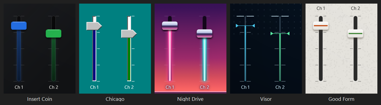
wellColor sinks the field of anything that shows you something into its plate: the XY pad’s field, the LFO’s wave, and the ribbon’s strip. When it isn’t set, there’s no well.recessShadePercent shades the inside of a well as well as a slot.recessLipColor draws a thin light line along the lower edge of anything cut into the surface: a fader slot, a well, a window, a lamp holder, and a section pressed into the case. It’s the light catching the edge of a cut. Soft Sector’s is white at 55 percent, and Hard Sector’s white at 10.wellFillsControl makes every display a dark window the size of the whole control, with no plate or rim round it: XY pads, LFOs, step sequencers, meters, readouts, beat clocks, and stopwatches. Inside a window a light keeps its own color, even on a theme whose valueColor prints every other value in one ink. Both Sector themes do this, so their LEDs glow in green, amber, and red behind smoked plastic while their knobs point in the ink.wellGlossPercent lays a hard-edged reflection across the upper left of every window, in white at this strength, the way a room shows in smoked plastic. Soft Sector uses 7 and Hard Sector 6.wellInkColor is the color of numbers printed inside a window, like a stopwatch’s time. When it isn’t set, they’re the window’s own light. Good Form prints light figures, #F1F0EC, in its black windows, because its six colors are too dark to read there as small numbers.This is the “sunk” part of raised, sunk, and flat. Bigwig’s wells are #161616, darker than every gray around them. Bone’s is #EDE6D8, with a warm shade along the top.
For agents: A well, a slot, or anything else that’s cut in must be darker than whatever it’s cut into. A well that’s lighter than its plate reads as another raised plate.
labels says where a control’s name goes: "above", "below", "inside" (along the bottom, inside the control), or "none". Hardware panels print names above their controls, which is why Jove, Supersaw, and Five-iSH use "above". A layout can still move any one control’s label.inkColor is the color of labels, tick marks, and printed scales. When it isn’t set, the app looks at what’s behind each label and picks a light or a dark ink that reads on it. A tube theme names its ink because its ink is its phosphor: a plain white label on amber glass looks like a fault.sectionInkColor is the ink for anything printed on a filled section. Anything on the deck keeps inkColor, and so does anything on an inner section, unless inkColor doesn’t read there at 4.5 : 1 and sectionInkColor does. Use it when no one ink reads on both. Five-iSH’s white print measures only 1.5 : 1 on its tan sections, so the sections are printed in black, #1D1D1A. Chicago prints white on its teal desktop and black in its gray windows, including the group boxes inside them.deckInkHaloColor puts a soft halo behind anything printed straight on the deck, so it reads over a bright part of a picture. The color’s alpha is how strong the halo is, and alpha 0 is none. Names printed on a control or a section don’t get one. Night Drive uses its darkest sky violet at 65 percent: white on its bare horizon measures 2.43 : 1, and 9.08 on the halo.neonLetters makes a section’s name and the words on a Text control glow like neon: the letters are their tube’s color most of the way to white, in a soft light of that color, with a longer glow falling below them. A layout’s own label color turns it off for that label. Off-world Colonies uses it.Which ink a label gets depends on where the words land, not where the control is. A name above a knob can sit on the deck while the knob sits on a section.
A name inside a switch uses the theme’s ink only when it reads there, at 4.5 : 1 or better. Otherwise the app picks a light or a dark ink for it, separately for the switch at rest and lit.
Labels are Segoe UI Variable Text at 12 pixels unless the layout sets something else, and the small value numbers are Cascadia Mono at 10 pixels, in the value color. A theme can’t change either one.
A Group control draws a frame around controls that belong together. It sends nothing, and taps go through it to whatever is underneath. The theme calls it a section.
A Group you add in the editor follows the theme, so the section settings below decide its fill, its outline color, and the inner-section color. Give it the Outline style in the inspector and it’s only a frame in the rim color, whatever the theme says. The section header settings apply either way.
panelFill is "plate" (the same plate a control gets), "color" (panelColor, fading to panelEndColor from top to bottom), or "none" (an outline only).panelOutlineColor is the frame’s line. When it isn’t set, it’s the rim.panelElevation is how hard a section sits above the deck. -1 means the same as plateElevation. A printed section, like Five-iSH’s, uses 0.sectionHeader says how a section shows its name:
"caption" puts the name at the top left, inside the frame."filledBar" fills a bar across the top in the section’s color, and prints the name in whichever of a dark or a light ink reads on it. Jove’s orange banners."notched" sets the name in a gap cut into the top line of the frame. Supersaw, Groovy, and Groovy Dark. The gap is cut out of the frame, so the page shows through it, grain and all."centered" centers the name across the top, inside the frame. Five-iSH and Airy System.sectionNameInHue prints the name in the section’s color instead of the ink. Bigwig, Supersaw, and Airy System.insetPanelColor and insetPanelEndColor give an inner section its own color. A filled section whose middle sits on another filled section is an inner section, and it’s printed flat, with no shadow, like a second layer of ink. Five-iSH’s green blocks inside its tan sections work this way.stripeColors frames every section in up to four bands of flat color instead of one outline, from the outside in, each stripeWidth pixels wide. The list ends at the first color left empty. The outer corner grows by the width of the stripes, so the innermost stripe turns the same curve as a control. A notched name sits across the middle of the band, clear of the corner. Groovy uses brown, burnt orange, and orange at 4 pixels; Groovy Dark red, orange, gold, and cream at 3. Make the outermost stripe the one that stands out against the page.panelRecessPercent presses a section into the surface like a molded tray, with a shadow along its top inside edge in the shadow color. A tray has no sheen and no shade of its own. Soft Sector uses 20 and Hard Sector 50.sectionTexture lays a picture over every section in black, through the picture’s own see-through parts, at sectionTexturePercent strength. It only ever darkens, so it’s for dirt and stains. Like a deck picture, it’s a plain file name in the Themes folder. Off-world Colonies lays its wall’s stains over every module at 55 percent.A section’s color is the value color when the theme sets one, and otherwise the color of the section’s own slot. That’s why every banner on Jove is orange, whatever slot its section uses.
A Line control is a printed rule, like the lines between groups of sections on a hardware panel.
ruleColor is its color. When it isn’t set, it’s the ink at a sixth of its strength.ruleFades fades the line out at both ends instead of stopping it square. Each line in a layout can also set its own color and ends.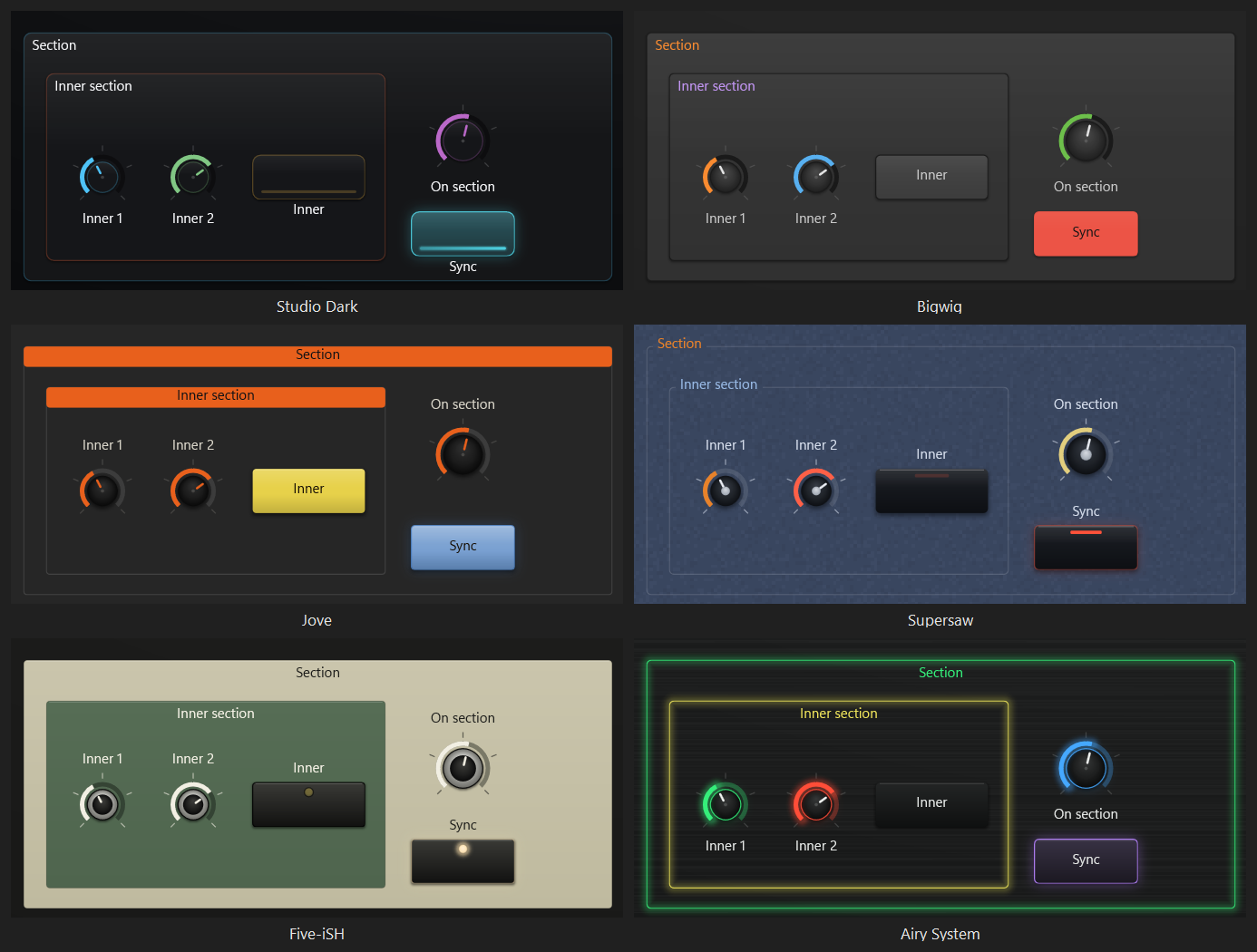
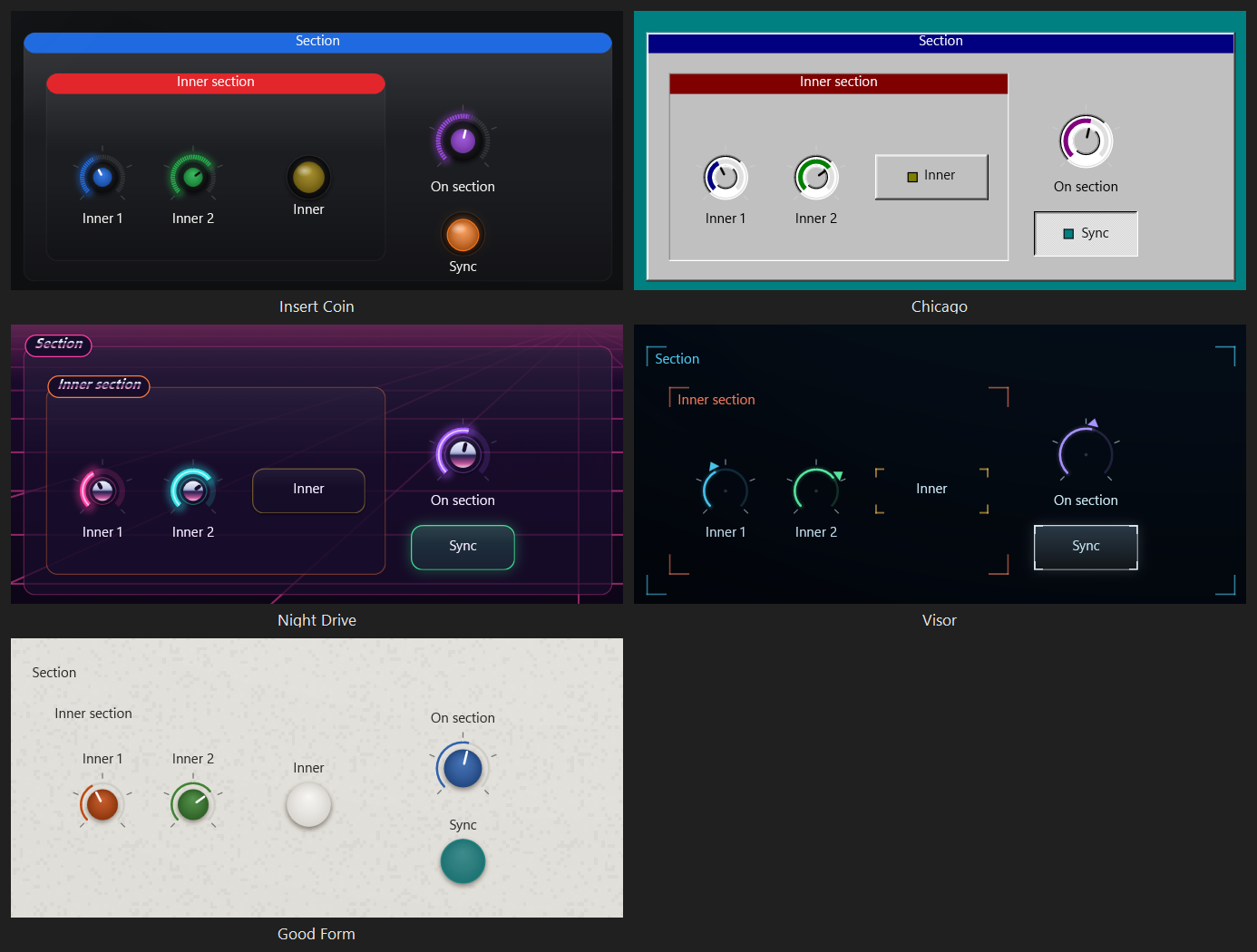
Chrome is polished metal reflecting a sky: light above a hard horizon line, dark just below it, and a glow in the ground.
chromeCaps draws every knob cap and fader cap in chrome. A knob needs a cap to be chrome, so set knobCapColor as well. A chrome fader cap has no painted line, because it reflects rather than being painted.chromeColors is up to four colors: the sky, the light and dark sides of the horizon, and the glow in the ground. When they aren’t set, they’re a cool sky, #EEF2FF, #8E97C6, and #2A2350, over a sunset glow, #C4539A.chromeLetters prints section names and the words on a Text control in the same chrome, in italic letters, bold for a section’s name. A name set into a notch in the frame sits on a dark badge edged in the section’s outline color, so the dark line through its letters never meets a dark sky.Night Drive uses all three.
keyWhiteColor and keyBlackColor are the natural keys and the sharps and flats. When they aren’t set, they’re a plain white, #E8EAEE, and a plain black, #16191F. The natural keys are outlined in the dark key color at half strength, so a light key still has an edge on a light page. A pressed key lights in the value color. Each keyboard in a layout can set its own key colors.A tube has no white and no black, so Cathode draws its keys in its phosphor and its glass: #CFDDEE and #1B231E.
The names here are the ones in the Windows MIDI Glass palette. Everything a control draws comes from the settings above; this section says which ones matter for each control, and why the control is drawn the way it is.
A layout can also give one control its own style, which the editor shows as five choices. Theme and Plate both follow the theme, and Theme is what almost every control uses. Outline drops the plate, Solid fills the plate with the control’s own color, and Bare drops both the plate and the rim, leaving only the value and the label. New Text arrives Bare. Apart from that, a style other than Theme is for the odd control that has to stand apart, like a panic button.
You turn a knob to a value, so its value is light running around it, and the knob itself can look like the hardware it stands in for.
knobFaceColor, knobCapColor, knobCapSizePercent, knobCapFromHue, knobKnurlCount, pointerColor, pointerOnCap, pointerShape, knobTickCount, knobMajorTickEvery, knobArcOnFace, arcTrackColor, arcTrackHuePercent, arcGlow, arcThickness, arcRoundEnds, valueCorePercent, valueColor, valueIndicator, chromeCaps, and bevelPixels.A fader shows its value by how far the light climbs its slot, and its cap is the thing you grab. So the slot is sunk and the cap stands up.
faderPlate, faderFillPercent, faderScalePercent, faderMajorTickEvery, thumb, thumbShape, thumbColor, thumbEndColor, capLineColor, capLineWide, thumbShadowPercent, recessShadePercent, recessLipColor, trackColor, pipeFalloff, valueFadesToLight, valueCorePercent, arcThickness, arcRoundEnds, neutralCaps, chromeCaps, and bevelPixels.meterSlots, unlit ones in meterUnlitColor, and a window round it on a theme with wellFillsControl.These are switches: on or off. The plate carries the state, and it’s the one place a theme is allowed to fill a whole area with color, which is why “on” reads across a room on a page of two hundred controls.
switchFillAtRest, fillWhenOnPercent, onLiftPercent, onInkColor, lampColor, lampShape, lampPosition, lampHolderColor, lampGlowPercent, namesInsideSwitches, switchNames, switchShape, switchRingColor, keycapTopColor, keycapTopEndColor, pressTravelPixels, latchStyle, switchColorTag, bevelPixels, rimStyle, switchRimStrengthPercent, switchRestingGlowPercent, valueStrip, flarePercent, and neutralCaps. For pads, also padFillAtRest, padFillWhenOnPercent, padsFollowSwitchShape, and restTintOnPlate.A lamp is a light that MIDI turns on, like an LED on a piece of hardware.
lampShape "dot"), that plate is round: a ring of its color at rest and a disc of it when it’s lit.fillWhenOnPercent 0), or that sets lampFillWhenOnPercent to 0, the lamp is a lamp: a bar at the top of its plate or, with round lamps, the whole control becomes a round lens in a dark bezel that throws a halo when it’s lit. A lamp holder color becomes the bezel. A round lens has no room inside it for a name, so a lamp’s name goes where the theme puts every other name.wellColor, a round lamp is a radio button: a hole in the well color, sunken, with a dot of its color in the middle when it’s lit.lampShape, lampColor, lampHolderColor, lampGlowPercent, lampFillWhenOnPercent, fillWhenOnPercent, glowStrength, bevelPixels, and wellColor.valueStrip. On a theme with wellFillsControl it’s a dark window the size of the control.neonLetters, its words glow in the color of its slot.These show their value inside a field rather than along a track.
wellFillsControl the field is a window the size of the control, and its grid, crosshair, and puck keep the control’s own color.thumb set to "none", only the dot shows.wellColor, recessShadePercent, valueColor, glowStrength, puck, the rim, and, for the joystick, thumbColor and thumbEndColor.puck can change the puck on an XY pad and a joystick: "disc" is the usual one, "ball" is a glossy ball in the control’s color that sits on a short shaft on a joystick, and "reticle" is a ring with four ticks and nothing in the middle, so the point itself stays clear. Insert Coin uses the ball and Visor the reticle.These show something that’s running rather than a position.
wellFillsControl, all three are windows the size of the control, and what lights up inside keeps the control’s own color.A platter you push with a finger. It has a face in the track color with a rim, a ring of grip marks, a spindle in the fader cap color, and a marker in the value color that turns as you push it. The marker is the only part that moves, which is what shows the platter has been pushed.
The keys fill the whole control, so its plate barely shows. It uses keyWhiteColor, keyBlackColor, and the value color for a pressed key.
A grid of pads that each play a note, colored by whether that note is in the chosen key. On these the colors are the information, because they’re how a player finds the key without looking for it, so they’re stronger at rest than anything else on the page.
These are covered in Sections, inner sections, and lines. Neither sends anything or takes any input.
When a control’s device isn’t connected, the control is dimmed and crossed with faint diagonal lines, and it sends nothing until the device comes back. A theme can’t change how that looks.
Studio Dark comes first in the gallery because it’s the default and the one that stays readable on the busiest page. The rest are in alphabetical order.
| Theme | The idea | Worth borrowing | What it costs |
|---|---|---|---|
| Studio Dark | Smoked glass plates on a near-black deck that’s lit from above. Faint rims, and only values and activity are bright. | Glass at 86 percent, rims at 28, a value that fades behind itself (0.35). | Nothing the app warns about. It’s the best choice for a dense page. |
| Airy System | Black brushed metal and green light, after Roland’s AIRA gear. What you turn or slide is lit all the time, buttons are black until they’re on, and pads are dim colored plastic. | Brushed grain (streak 48), rims at 85 with a resting glow of 30, switch rim and glow at 0, pads as their own family, knob rings in their own color, arc glow, lit frames around fader slots. | A light show on purpose. On a busy page a touch has less to stand out against. It’s made for a dark room. |
| Bigwig | A ladder of grays with one lead orange. Color only ever means the value, the state, or which section this is. | A neutral edge instead of colored rims, named plates, sections in their own gray with names in their color, names on switches, a full fill when on, turned knob faces, dark wells. | Red is for light, not words: it’s too dark to read as a name. |
| Blueprint | Six blues on a navy deck. | A one-color family on Studio Dark’s glass. | Its closest two slots, 2 and 4, are only about 11 apart in color, so pair color with position and names. |
| Bone | A warm light theme in two colors, bone and a warm brown. The shadow is what separates a control from the page. | A warm shadow (elevation 45, spread 9), rims at 85, a white glow, lit buttons that deepen (-16), sunk slots and wells, cap shadows. | In a dark room it’s a lamp pointed at the performer. Best at a desk or in a lit room. |
| Cathode | An old black and white TV: olive glass, a blue-white phosphor, soft edges, and no pure black or white anywhere. | Scan lines, a vignette, a named plate gradient, a resting glow, a glow color, an ink that is the phosphor, a fill that fades to the glow, and inverse video: a lit switch is the phosphor with a dark name. | Its six slots are six brightnesses of one phosphor, so nothing can be grouped by color. Controls are known by where they are and what they’re called. |
| Chicago | Windows 95, whose code name this was: a teal desktop, gray windows with title bars in their color, and two pixel bevels on everything. Raised is something to press, pressed is down, and sunken is a white field that holds a value. | Bevels, a checkered latch, color tags on buttons, a dotted line around the playing step, arcs printed on the knob face, pointer caps, white windows with black figures, white print on the desktop and black print in the windows. | Mostly gray, with the color in small places. It’s not made for a dark stage, and the teal is loud. With red-green color blindness, green and olive look alike. |
| Daylight | The light version of the original set: a near-white deck with dark, saturated colors. | A named light track, glass at 92, a softer glow (35), a white cap. | Like any light theme, it’s bright in a dark room. |
| Five-iSH | Black metal with the panel printed on it twice, after the Roland SH-7: tan sections named in black, green blocks named in white, silver knobs with black caps. | Inner sections, a section ink, centered names, pointers on caps, printed scales, round lamps, cream caps on the neutral slot, every value in the print white. | Color is only a lamp, so knobs and faders can’t be grouped by color. Put controls on the green or the black, not the tan. |
| Good Form | Rational industrial design, and the small instruments that took it up again: a warm light gray panel with a fine grain, light keys that stand on it, knobs that are only their colored caps, slim dark slots, and small black windows. | Round keys with no ring beside rounded pads, lit keys that get deeper (-12) with a white name, caps in their own color, a warm shadow, light figures in black windows, labels above, charcoal rules. | A light theme, so it’s bright on a dark stage. A key at rest is the color of the panel, and only its shadow sets it apart. With red-green color blindness, orange and mustard look alike. |
| Groovy | The seventies: a flat goldenrod page, earthy colors, cream controls, and heavy lines with no shading and no shadow. Sections are framed in brown, burnt orange, and orange stripes. | Stripes 4 pixels wide, rims at 100 and 3 pixels thick, knob arcs 6 pixels thick with round ends, a cream name on a lit switch, pads tinted on the plate. | A bright page, made for a lit room. The six colors are close in brightness, so they’re told apart by color alone. |
| Groovy Dark | Groovy on a brown page, with espresso controls cut into it, a paper grain, and four stripes of red, orange, gold, and cream. | Fine grain at 50, a plate darker than its page, a dark name on a lit switch. | Made for a dark room. A switch that’s on is a solid block of color, and with red-green color blindness red and avocado look alike. |
| Hard Sector | Soft Sector in charcoal plastic: gray keys, black keys on the neutral slot, and the same LEDs. | The same as Soft Sector, with a black shadow and a finer grain (24). | Red, amber, and green are the hardest three to tell apart with red-green color blindness. A key that’s on also stays down, so the state isn’t color alone. |
| High contrast | Hard edges, no glow, no rounding, and no plate. Touching a knob or a fader fills it hard. | What to turn off for someone who can’t resolve a blur. | Offered, never forced. If Windows switches to high contrast during a set, the running layout is left alone until it’s next opened. |
| Insert Coin | Arcade control panels, and the finger drumming controllers built from their buttons: a black panel under clear plastic, round domed buttons in black rings, knobs with colored caps inside rings of lights, and a joystick with a ball on top. | Round buttons in rings, a switch fill at rest of 0.62 over a near-black plate, a full fill when on, two pixels of travel, knob caps in their own color, a ball for a puck, filled section banners, LEDs for lamps, a faceplate reflection. | Every button shows its color all the time, which suits a page of pads more than a page of two hundred switches. Round buttons want square controls. With red-green color blindness, blue and purple look alike. |
| Jove | Matte black steel, orange pointers, and a row of solid colored tabs, after the Roland Jupiter-8. | Switch fill at rest of 1 with bare knobs, tabs that go paler when lit, filled section banners, labels above, no rims, fader slots cut straight into the panel, one value color. | The tabs are full color all the time. That’s lovely on a few dozen switches and a wall of color on a few hundred. |
| Night Drive | The synthwave sunset: a violet sky going to orange at the horizon, a striped sun, a pink grid floor rolling toward you, and dark glass, neon, and chrome on top. | A built-in deck picture that fills the page, a grid floor, a halo behind words on the deck, chrome caps and chrome names on dark badges, a white hot core, arc glow, lit pads with a dark name. | A picture is a lot to put behind a control surface, and the sun pulls your eye to the middle of the page. Made for a dark room. |
| Off-world Colonies | A city where it never stops raining, after the film Blade Runner: a wall of cast concrete blocks with the rain running down it, equipment of dark worn metal, and neon. | A repeating deck picture, rain, a picture of stains laid over every section in black, neon names, a white hot core in every lit value, glows that run down the wall, lens flares, corner fall-off. | A busy wall, made for a dark room. Keep names on the sections rather than on the bare wall. |
| Soft Sector | A home computer of the early eighties in putty plastic: keys with dished tops and the name at the top left, an LED in the corner of each key, ridged knobs, and every display a smoked window. | Keys, key travel, LEDs in holders that glow on a theme with no glow, ridged knobs, windows with a reflection, trays pressed into the case, lips under every cut, a fine grain (36). | A light theme, so it’s bright on a dark stage. Red, amber, and green are the hardest three to tell apart with red-green color blindness, though a key that’s on also stays down. |
| Supersaw | A matte blue panel with a fine grain, shiny black molding, and one small red lamp per switch, after the Roland JP-8000. | Fine grain, lamps instead of fills, knob caps and printed mark rings, strip faders, names set in a notch in the section frame. | A switch that’s on looks just like one that’s off apart from its lamp, so the state is one small light. |
| Terminal Amber | An amber terminal: warm maroon glass, a glow redder than the amber, and colors that run like heat from ember to white hot. | A heat ramp that’s also a rising brightness, a 400 millisecond glow, a fill that fades to the glow, inverse video. | A lamp in a dark room. The deepest ember is light rather than letters: give it a rim, a value, or a fill, never a label. |
| Terminal Green | A green terminal. The glass isn’t green: it’s a cool blue slate, with the room reflected across its upper left. | A faceplate reflection, a glow yellower than the green, inverse video. | The deepest green is too dark to carry a name on a lit control. |
| Tonal Dark | Flat, rounded, and friendly, with each control washed in its own color at rest, on a dark deck. | Fill at rest (0.18), a touch fill, colored caps, a lit switch that’s its color outright with a dark name, no glass and no glow. | A busy page is colorful even when nothing is happening, so activity has less room to stand out. |
| Tonal Light | The same idea on a near-white deck, with darker colors so a thin rim still reads. | Fill at rest (0.14), a light track, round corners (14), a lit switch that’s its color outright with a white name. | The same as Tonal Dark. |
| Visor | A head-up display: thin light on a dark field of dots. Every control is four corners, closed into a frame only when it’s on. Knobs are rings of fine marks with a chevron riding the value, faders are rails pinched by two chevrons, and the XY field has a reticle. | Corners instead of outlines, chevron pointers and caps, a reticle for a puck, long marks at an interval, a repeating picture of dots, corner fall-off. | Thin lines want a close screen or a big one. Nothing is filled until it’s on, which is quick once you know the page and slower for somebody new to it. Made for a dark room. |
This part is for anyone building a theme for someone else, and it’s written with AI agents in mind.
| If they want | Start from |
|---|---|
| A calm dark surface for a busy stage page | Studio Dark |
| Colored buttons that glow, on black | Insert Coin |
| Neon and chrome over a picture | Night Drive |
| A light theme for a bright room | Daylight, or Bone for something warm |
| A calm light instrument with colored knobs | Good Form |
| Flat, friendly, and colorful | Tonal Light or Tonal Dark |
| A DAW or plug-in look: grays and one accent | Bigwig |
| A retro screen | Cathode, Terminal Amber, or Terminal Green |
| A synthesizer panel with colored buttons | Jove |
| Black knobs, lamps, and a textured panel | Supersaw |
| A printed panel with sections | Five-iSH |
| Everything lit up, for a dark room | Airy System |
| Flat seventies color with heavy lines | Groovy, or Groovy Dark for a dark room |
| A home computer or a keyboard with LEDs in its keys | Soft Sector, or Hard Sector for dark plastic |
| A textured wall, rain, and neon | Off-world Colonies |
| A desktop of the nineties: gray, beveled, and calm | Chicago |
| Thin lines on a dark screen | Visor |
| The easiest possible reading | High contrast |
Borrow the settings the table above lists for that theme, then change the colors and the deck. The complete file at the end of this article has every key at Studio Dark’s values, so it’s a safe place to start typing.
Don’t judge colors by eye, and don’t trust a screenshot to judge them for you. Measure them.
sectionNameInHue, a filled bar, or namesInsideSwitches with a full fill.function Get-Luminance([string]$Hex) {
$digits = $Hex.TrimStart('#')
if ($digits.Length -eq 8) { $digits = $digits.Substring(2) } # alpha comes first; drop it
$linear = foreach ($at in 0, 2, 4) {
$v = [Convert]::ToInt32($digits.Substring($at, 2), 16) / 255.0
if ($v -le 0.03928) { $v / 12.92 } else { [Math]::Pow(($v + 0.055) / 1.055, 2.4) }
}
0.2126 * $linear[0] + 0.7152 * $linear[1] + 0.0722 * $linear[2]
}
function Get-ContrastRatio([string]$First, [string]$Second) {
$one = Get-Luminance $First
$two = Get-Luminance $Second
([Math]::Max($one, $two) + 0.05) / ([Math]::Min($one, $two) + 0.05)
}
Get-ContrastRatio '#FF6B84' '#1E2B33' # 5.31
A translucent plate lands somewhere between its own color and the deck’s. To measure against it, mix the two first: each channel is deck + (plate - deck) * tint / 100.
Most of a theme’s character comes from these choices. Pick one for each kind of control:
| The look | Settings |
|---|---|
| Calm at rest, color only on activity | Glass or a named plate, rimStrengthPercent near 28, restingGlowPercent 0, fillWhenOnPercent 34 |
| Colored blocks that light up when on | fillWhenOnPercent 100 and namesInsideSwitches true. Add onLiftPercent above 0 to make a lit switch paler, or below 0 to make it deeper so a light name still reads |
| Lamps instead of fills | fillWhenOnPercent 0, lampColor, lampShape, and valueStrip "none", because a strip and a lamp would be two lights saying one thing |
| Solid tabs at rest, bare knobs | switchFillAtRest 1, fillAtRest 0, a named plateColor for the knobs |
| Knobs and faders lit all the time, buttons dark | rimStrengthPercent high, restingGlowPercent above 0, switchRimStrengthPercent 0, switchRestingGlowPercent 0 |
| Pads as their own family | padFillAtRest and padFillWhenOnPercent, independent of the buttons |
| Keys that go down | switchShape "keycap", pressTravelPixels 2, fillWhenOnPercent 0, and round lamps in the corner (lampShape "dot", lampPosition "topRight") with lampHolderColor and lampGlowPercent |
| Heavy flat lines | rimThickness, rimStrengthPercent 100, arcThickness, stripeColors, and no glow, sheen, or shadow |
| Neon on a dark wall | valueCorePercent, neonLetters, glowFallPixels, and flarePercent |
| Arcade buttons | switchShape "round", switchRingColor, switchFillAtRest above 0 with restTintOnPlate and a dark plateColor, fillWhenOnPercent 100, and pressTravelPixels |
| Raised, pressed, and sunken gray | bevelPixels 2, the four bevel colors, latchStyle "checkerboard", switchColorTag, and wellFillsControl with a white wellColor |
| Nothing filled until it’s on | rimStyle "corners", a glassTintPercent near 0, and a low fillWhenOnPercent |
Save the file as UTF-8 without a byte order mark, in the customer’s Themes folder, named after the theme. In PowerShell 7:
$folder = Join-Path ([Environment]::GetFolderPath('MyDocuments')) 'MIDI Layouts\Themes'
New-Item -ItemType Directory -Path $folder -Force | Out-Null

$path = Join-Path $folder 'Harbor.miditheme'
[IO.File]::WriteAllText($path, $json, [Text.UTF8Encoding]::new($false))   # $false: no byte order mark

# Check it the way the app reads it. ReadAllText hides a byte order mark, so look at the bytes.
$bytes = [IO.File]::ReadAllBytes($path)
if ($bytes.Length -ge 3 -and $bytes[0] -eq 0xEF -and $bytes[1] -eq 0xBB -and $bytes[2] -eq 0xBF) { throw 'The file starts with a byte order mark.' }
$null = [System.Text.Json.JsonDocument]::Parse([IO.File]::ReadAllText($path))   # throws on a comment or a trailing comma
GetFolderPath('MyDocuments') finds the Documents folder even when it has been moved into OneDrive. Windows PowerShell 5.1’s Set-Content -Encoding UTF8 and .NET’s [Text.Encoding]::UTF8 both write a byte order mark, so don’t use them for a theme file.
Then tell the customer how to use it: open a layout in Windows MIDI Glass, go to the layout’s Appearance settings, and pick the theme in the gallery.
For agents: Don’t edit a layout file to add a
themeColorsblock while that layout is open in Windows MIDI Glass. The app saves its own copy of the layout and can write over your change. A theme file in the Themes folder is always the safer delivery.
You probably can’t see the result yourself, so ask the customer to check it, or to send you a screenshot at actual size. The best test page has one of every control, all six slots, a switch that’s on and one that’s off, a meter near the top of its travel, a section with an inner section inside it (both Groups set to the Plate style), and a line.
The layout’s Accessibility check page in the editor measures the slots against the deck, checks that a plate that’s close to its deck has a shadow or a glow to separate it, and checks the rim on a light plate. The Appearance page shows each slot’s contrast against the deck, and warns when one is too close.
For agents: Each of these loads without an error and gives the customer the wrong theme.
- The file has a byte order mark, so the theme never shows up.
- A color is written CSS style,
#RRGGBBAA. Windows MIDI Glass reads it as#AARRGGBB.- A fraction is written as a percentage:
"fillAtRest": 14instead of0.14. Out of range, so it’s ignored.- Any number out of range is ignored, not clamped.
"shadowSpread": 100is Studio Dark’s 3.- A number or a
trueis written in quotes.- A
deckblock has nokind, so the gradient is flat.- A deck or section picture is written as a path. Only a plain file name in the Themes folder is used.
- A repeating deck picture has no see-through parts, so the deck’s own colors never show.
- A stripe color is left empty in the middle of
stripeColors. The list ends there, so the stripes after it are ignored.- The theme is named after a built-in theme, or after Pigment Light, Pigment Dark, or Amber Console, so it’s hidden.
- Two theme files have the same
name, so one is hidden.- A setting is left out on purpose, forgetting that it then takes Studio Dark’s value rather than “nothing.”
plateEndColoris set withoutplateColor, orknobFaceColoron a theme with no plate. Neither does anything.restingGlowPercentis set withglowStrengthat 0. A resting glow is a share of the glow, so there’s none.lampColoris set whilefillWhenOnPercentis above 0. A switch’s lamp only lights when the fill is 0. The same goes forlampPosition,lampHolderColor, andlampGlowPercent. A Lamp control followslampFillWhenOnPercentinstead, when that’s set.switchShapeis"keycap"on a theme with noplateColor, so the switches stay plates.switchRingColororpadsFollowSwitchShapeis set whileswitchShapeisn’t"round". Neither does anything.chromeCapsis on, but the theme has no knob cap. SetknobCapColortoo, or turn onknobCapFromHue.panelColoris set whilepanelFillisn’t"color", orinsetPanelColoris set while sections aren’t filled.- The customer’s Groups have the Outline style, so none of the section settings show. Groups added in earlier versions of Windows MIDI Glass arrived that way. Ask them to set their Groups to Theme.
meterSlotscounted from 1 instead of 0.- The theme is expected to set fonts, sizes, positions, or one control’s color. A theme can’t do any of those.
- There’s no
provenanceblock, or it names you as the author, or it saysdigitalCreationfor a theme an AI made.
Keys are in the order Windows MIDI Glass writes them. If left out is the value the app uses when a file doesn’t have the key, which is Studio Dark’s. A color shown as #00000000 is “not set,” and the last column says what the app does instead. In the app is the matching row on the layout’s Appearance page. Where the app’s slider stops short of what a file can hold, the slider’s range is in parentheses. Keep to that range so the customer can still edit the theme in the app.
| Key | Values | If left out | In the app | What it does |
|---|---|---|---|---|
_comment |
text | Ignored. The app writes a line here saying what the file is. | ||
fileVersion |
1 | 1 | The file format version. Write 1. A file with a higher number still loads. | |
provenance |
object | none | About this theme… | Who made the theme, with what, and from what. See Who made a theme. |
name |
text | required | (the name you save under) | The theme’s name in the gallery. It can’t be a built-in theme’s name, or Pigment Light, Pigment Dark, or Amber Console. |
hueSlots |
six colors | #4FC3F7, #81C784, #FFC247, #FF7043, #BA68C8, #4DD0E1 |
Colors | Slots 1 to 6. A missing or unreadable entry keeps Studio Dark’s color for that slot. |
deck.kind |
solidColor, gradient, image |
gradient with no deck block; solidColor in a block without it |
Background | A flat deck, a deck lit from above, or a picture. |
deck.color |
color | #1D1E21 |
Color | The deck color, or the top of the gradient. |
deck.gradientEndColor |
color | #07080A; deck.color in a block without it |
Bottom color | The bottom and lower corners of a gradient. |
deck.image |
file name | empty | Image | A .png or .jpg file in the Themes folder, for a picture deck. Only a plain file name is accepted. |
deck.imageRepeats |
true, false |
false |
Tile image | The picture repeats at its own size over the deck’s colors instead of filling the page. |
cornerRadius |
0 to 128 pixels (0 to 32) | 7 | Corner radius | How round plates, sections, and note pads are. Never more than half a control’s shorter side. |
glassTintPercent |
0 to 100 | 86 | Glass tint | How solid a glass plate is. 0 is no plate at all. Only used when there’s no plateColor and no fill at rest. |
glowStrength |
0 to 100 | 60 | Glow | How bright a control glows when touched, when MIDI arrives, or while a switch is on. Also drives every halo. |
labels |
inside, below, none, above |
below |
Labels | Where control names go by default. |
fillAtRest |
0 to 1 (the app shows a percentage) | 0 | Fill at rest | A wash of each control’s own color over the deck, making the plate. Above 0 the theme is tonal. |
touchFillPercent |
0 to 100 | 22 | Touch fill | A wash of the control’s color while it’s touched. Not used on switches. |
trackColor |
color | #0D0D0F |
Slot track | The empty part of a fader or meter slot, a beat clock’s ring, and a turntable’s face. |
inkColor |
color | #00000000: measured light or dark ink |
Ink | Labels, marks, and printed scales. |
plateColor |
color | #00000000: glass or tonal plate |
Plate | A plate of this color instead of glass. |
rim |
controlHue, neutralEdge, none |
controlHue |
Rim color | Where the rim’s color comes from. |
neutralRimColor |
color | #5A5A5A |
Neutral rim | The rim on every control when rim is neutralEdge. Its alpha counts. |
valueStrip |
bottom, top, none |
bottom |
Value strip | A thin line along one edge of switches, lamps, and readouts. |
valueIndicator |
solidArc, segmentedLamps |
solidArc |
Knob indicator | A knob’s value as a solid arc or a ring of lamps. |
lampCount |
2 to 128 (2 to 64) | 24 | Lamps | How many lamps in a ring of lamps. |
minimumLampRingSize |
8 to 512 pixels (8 to 160) | 48 | Smallest ring | Below this size a knob uses the solid arc instead. |
plateSheenPercent |
0 to 100 | 6 | Sheen | Light down the top of a plate. |
plateElevation |
0 to 100 | 55 | Elevation | How dark the shadow under a plate is. |
shadowSpread |
0 to 64 pixels (0 to 32) | 3 | Shadow spread | How far the shadow reaches. It also drops by a third of this. |
shadowColor |
color | #000000 |
Shadow color | The color of every shadow and shade: under plates and caps, in slots, and at the bottom of plates. |
rimStrengthPercent |
0 to 100 | 28 | Rim strength | How strong a colored rim is at rest. 0 is no rim. |
pipeFalloff |
0 to 1 (the app shows a percentage) | 0.35 | Value fade | How bright the far end of a fader’s fill is. 1 is a flat bar. |
thumb |
none, neutral, hue |
neutral |
Fader cap | No cap, a neutral cap with a line, or a cap in the control’s color. |
thumbColor |
color | #313945 |
Cap top | The top of a neutral cap, and a joystick’s puck. |
thumbEndColor |
color | #161A21 |
Cap bottom | The bottom of a neutral cap. |
glassColor |
color | #17181B |
Glass color | What a glass plate is made of. Keep it a little lighter than the deck. |
bloomColor |
color | #00000000: each control’s own color |
Light color | The color every control glows in. |
restingGlowPercent |
0 to 100 | 0 | Resting glow | A floor under the glow, as a share of glowStrength. |
persistenceMilliseconds |
0 to 10000 (0 to 2000) | 0: 220 ms | Light duration | How long the glow takes to fade after a touch, and after MIDI on a control whose own hold time is 0. |
plateSheenColor |
color | #00000000: white |
Sheen color | What the sheen and the top-edge line are made of. |
plateEndColor |
color | #00000000: a flat plate |
Plate bottom | The bottom of a named plate. Needs plateColor. |
arcTrackColor |
color | #00000000: trackColor |
Knob arc track | The empty part of a knob’s arc. |
valueFadesToLight |
true, false |
false |
Fade to light color | The far end of a fader’s fill runs into the glow color. Needs a bloomColor. |
switchFillAtRest |
-1, or 0 to 1 (the app shows a percentage) |
-1: fillAtRest |
Switch fill at rest | The fill at rest for buttons, toggles, pads, page tabs, and lamps. |
fillWhenOnPercent |
0 to 100 | 34 | Fill when on | How much of its color a switch’s plate takes when on. 0 lights a lamp instead. |
pointerColor |
color | #00000000: the control’s color, or the ink with a neutral rim |
Knob pointer | Every knob’s pointer. |
capLineColor |
color | #00000000: the control’s color |
Cap line | The line across every neutral fader cap. |
neutralColor |
color | #00000000: none, and neutral controls use slot 1 |
Neutral color | The one “no color” color. |
sectionHeader |
caption, filledBar, notched, centered |
caption |
Section header | How a section shows its name. |
sectionNameInHue |
true, false |
false |
Colored section names | A section’s name in its color instead of the ink. |
panelFill |
plate, color, none |
plate |
Section fill | What fills a section. |
panelColor |
color | #00000000 |
Section color | A section’s color when panelFill is color. |
panelEndColor |
color | #00000000: a flat fill |
Section bottom | The bottom of a section’s color. |
panelOutlineColor |
color | #00000000: the rim |
Section outline | The line around every section. |
knobFaceColor |
color | #00000000: the plate |
Knob face | A turned knob face, brightest just above the middle. Needs a plate. |
knobFaceEndColor |
color | #00000000: knobFaceColor |
Knob face edge | The edge of the knob face. |
knobCapColor |
color | #00000000: no cap, a center dot |
Knob cap | A smaller cap in the middle of the face. |
knobCapEndColor |
color | #00000000: knobCapColor |
Knob cap edge | The edge of the cap. |
knobCapSizePercent |
5 to 100 | 28 | Knob cap size | The cap’s size, as a share of the face. |
knobTickCount |
0 to 64 | 0 | Knob marks | A printed ring of marks around knobs, in the ink. Knobs that show their own marks keep their own count. |
namesInsideSwitches |
true, false |
false |
Names inside switches | Switch names go in the middle of the switch. |
onLiftPercent |
-100 to 100 | 0 | Lift when on | A lit switch toward white (above 0) or black (below 0). |
lampColor |
color | #00000000: the control’s color |
Lamp color | The lamp a switch lights when fillWhenOnPercent is 0. |
plateShadePercent |
0 to 100 | 0 | Shade | A shade up from the bottom of a plate, in the shadow color. |
plateHighlightPercent |
0 to 100 | 0 | Top highlight | A one-pixel light line inside the top edge of plates, caps, and pads. |
faderPlate |
full, strip, none, frame |
full |
Fader plate | What a fader’s slot is cut into. |
faderFillPercent |
0 to 100 | 100 | Fader fill | How strong a fader’s fill is. |
valueColor |
color | #00000000: each control’s own color |
Value color | Every value on the page in one color. |
recessShadePercent |
0 to 100 | 0 | Recess shadow | A shade inside slots and wells, in the shadow color. |
wellColor |
color | #00000000: no well |
Display well | A sunk field for XY pads, LFOs, and ribbons. |
thumbShadowPercent |
0 to 100 | 0 | Cap shadow | A shadow under fader caps. |
capLineWide |
true, false |
false |
Wide cap line | A cap line nearly the cap’s width and 3 pixels thick. |
keyWhiteColor |
color | #00000000: #E8EAEE |
Natural keys | A keyboard’s natural keys. |
keyBlackColor |
color | #00000000: #16191F |
Sharp keys | A keyboard’s sharps and flats. |
insetPanelColor |
color | #00000000: like any section |
Inner section | The color of a section inside another section, printed flat. |
insetPanelEndColor |
color | #00000000: insetPanelColor |
Inner section bottom | The bottom of an inner section. |
panelElevation |
-1, or 0 to 100 |
-1: plateElevation |
Section elevation | How dark the shadow under a section is. |
sectionInkColor |
color | #00000000: inkColor |
Section ink | The ink for anything printed on a filled section. |
pointerOnCap |
true, false |
false |
Pointer on cap | The pointer is printed on the knob cap. Needs a cap. |
arcGlow |
true, false |
false |
Knob value glow | A halo around a knob’s value arc. |
arcTrackHuePercent |
0 to 100 | 0: arcTrackColor |
Colored knob ring | The empty part of a knob’s arc in the knob’s own color at this strength. |
lampShape |
bar, dot |
bar |
Lamp shape | A bar lamp or a round lens. With dot, a lamp control is round. |
switchRimStrengthPercent |
-1, or 0 to 100 |
-1: rimStrengthPercent |
Switch rim strength | The rim at rest on everything you press or read. |
switchRestingGlowPercent |
-1, or 0 to 100 |
-1: restingGlowPercent |
Switch resting glow | The resting glow on everything you press or read. |
padFillAtRest |
-1, or 0 to 1 (the app shows a percentage) |
-1: like other switches |
Pad fill at rest | The fill at rest for pads only. |
padFillWhenOnPercent |
-1, or 0 to 100 |
-1: like other switches |
Pad fill when on | The fill when on for pads only. |
lampFillWhenOnPercent |
-1, or 0 to 100 |
-1: like other switches |
Lamp fill when on | The fill when on for Lamp controls only. 0 lights the lamp’s own lamp instead, a round lens with lampShape dot. |
neutralCaps |
true, false |
false |
Neutral caps | Faders and switches on the neutral slot wear the neutral as their cap. Needs neutralColor. |
faderScalePercent |
0 to 100 | 0 | Fader scale | Fader marks printed in the ink at this strength. |
ruleColor |
color | #00000000: the ink at a sixth |
Line color | The color of Line controls. |
ruleFades |
true, false |
true |
Faded line ends | Lines fade out at both ends instead of stopping square. |
stripeColors |
up to four colors | empty: a plain outline | Stripe 1 to Stripe 4 | Bands of flat color that frame every section, outside in, and split a line with no color of its own, top down. The list ends at the first empty color. |
stripeWidth |
1 to 16 pixels | 4 | Stripe width | How wide each stripe is. |
rimThickness |
1 to 6 pixels | 1 | Rim weight | How heavy the rim is on plates, knob faces, and sections. |
arcThickness |
0 to 12 pixels | 0: 4 pixels | Knob ring weight | How heavy a knob’s arc is. Set, it also grows the pointer and a fader’s slot. |
arcRoundEnds |
true, false |
false |
Round ends | Round ends on a knob’s arc, and a fader cap shaped like a pill. |
switchShape |
plate, keycap, round |
plate |
Switch shape | A switch as a plate, a key with a dished top, or a round button. A key needs plateColor. |
keycapTopColor |
color | #00000000: from the plate |
Key top, back | The back of a key’s dished top. |
keycapTopEndColor |
color | #00000000: from the plate |
Key top, front | The front of a key’s dished top. |
switchNames |
center, topLeft |
center |
Switch name placement | Where a name inside a switch goes. |
pressTravelPixels |
0 to 8 | 0 | Key travel | How far a switch goes down under a finger. Half as far while it’s latched on. |
lampPosition |
topCenter, topRight |
topCenter |
Round lamp placement | A round lamp at the top middle of a switch or in its corner. |
lampHolderColor |
color | #00000000: a thin dark ring |
Lamp holder | The holder a round lamp is set into. |
lampGlowPercent |
-1, or 0 to 100 |
-1: glowStrength |
Lamp glow | How strongly a lit round lamp glows. |
knobKnurlCount |
0 to 120 | 0 | Knob ridges | Ridges round the side of a knob’s face, in its two colors. |
panelRecessPercent |
0 to 100 | 0 | Section recess | A section as a tray, shaded along its top inside edge. |
recessLipColor |
color | #00000000: none |
Cutout lip | A thin light line under anything cut into the surface. |
wellFillsControl |
true, false |
false |
Window displays | Every display is a dark window the size of the control, and lights inside keep their own color. |
wellGlossPercent |
0 to 100 | 0 | Window reflection | A hard-edged reflection across the upper left of every window. |
neonLetters |
true, false |
false |
Neon text | Section names and Text glow in their own color. |
valueCorePercent |
0 to 100 | 0 | Hot core | A lighter line down the middle of every lit value, this far toward white. |
glowFallPixels |
0 to 32 | 0 | Downward glow | How much further a glow reaches below a control than above it. |
flarePercent |
0 to 100 | 0 | Lens flare | A streak and a star thrown by a lit light. |
flareColor |
color | #00000000: the light’s own color |
Flare color | The heart of a flare. |
sectionTexture |
file name | empty | Section texture | A picture in the Themes folder, laid over every section in black. |
sectionTexturePercent |
0 to 100 | 0 | Section texture strength | How strongly the section picture shows. |
meterUnlitColor |
color | #00000000: each zone’s color, turned down |
Unlit segment | A meter’s lights while they’re out. |
onInkColor |
color | #00000000: the ink |
Name color when on | A switch’s name while it’s on, where it reads. |
restTintOnPlate |
true, false |
false |
Resting tint on plate | A resting tint mixed into the plate instead of into the page. |
switchRingColor |
color | #00000000: no ring |
Round button ring | The ring a round button is set into. |
padsFollowSwitchShape |
true, false |
true |
Pads match switch shape | Pads are round too, on a theme with round buttons. |
knobCapFromHue |
true, false |
false |
Colored knob cap | Each knob’s cap is its own color, with a pointer that reads on it. With no knobFaceColor, the cap is the whole knob. |
puck |
disc, ball, reticle |
disc |
XY and joystick puck | The puck on XY pads and joysticks. |
thumbShape |
bar, pointer, chevrons |
bar |
Fader cap shape | A bar, a cap pointing at the scale, or two chevrons on a rail. |
pointerShape |
line, chevron |
line |
Pointer shape | A line across the knob, or a chevron riding its arc. |
knobMajorTickEvery |
0 to 32 | 0 | Knob major mark interval | Every so many of the theme’s knob marks, one is longer. |
faderMajorTickEvery |
0 to 32 | 0 | Fader major mark interval | Every so many fader marks, one is longer. |
knobArcOnFace |
true, false |
false |
Arc on face | The face reaches out under the arc, so the arc is printed on it. |
rimStyle |
outline, corners |
outline |
Rim style | A full outline, or only its four corners until the control is on. |
bevelPixels |
0 to 3 pixels | 0 | Bevel width | How wide the bevels are. 0 is none. |
bevelHighlightColor |
color | #00000000: white |
Bevel highlight | The bevel’s outer light edge. |
bevelLightColor |
color | #00000000: the plate, lifted |
Bevel light | The bevel’s inner light edge. |
bevelShadowColor |
color | #00000000: the plate, darkened |
Bevel shadow | The bevel’s inner dark edge. |
bevelDarkColor |
color | #00000000: black |
Bevel dark | The bevel’s outer dark edge. |
latchStyle |
lit, checkerboard |
lit |
Latched switch | A toggle or page tab that’s on lights up, or stays pressed and checkered. |
currentStepStyle |
lit, dottedFocus |
lit |
Current step | The playing step is lit, or lit with a dotted line around it. |
switchColorTag |
true, false |
false |
Switch color tag | A small square of the control’s color before a name in the middle of a switch. |
deckInkHaloColor |
color | #00000000: none |
Text background halo | A halo behind print on the bare deck. Its alpha is how strong it is. |
wellInkColor |
color | #00000000: the window’s own light |
Window text | Numbers printed inside a window. |
chromeCaps |
true, false |
false |
Chrome knob and fader caps | Knob caps and fader caps in chrome. |
chromeColors |
up to four colors | empty: #EEF2FF, #8E97C6, #2A2350, #C4539A |
Chrome sky to Chrome glow | The sky, the light and dark sides of the horizon, and the glow in the ground. An empty color keeps its default. |
chromeLetters |
true, false |
false |
Chrome section names | Section names and Text in chrome. |
meterSlots |
three slots, 0 to 5 | [1, 2, 5] |
Signal, Warning, Too loud | The slots for a meter’s three zones, counted from 0. |
deckOverlay.scanLinePitch |
0 to 64 screen pixels (0 to 12) | 0 | Scan lines | Distance between scan lines. 0 is off. |
deckOverlay.scanLineStrength |
0 to 100 | 0 | Scan strength | How dark each scan line is. |
deckOverlay.scanLineColor |
color | #000000 |
Scan color | What scan lines are made of. |
deckOverlay.vignettePercent |
0 to 100 | 0 | Vignette | How much the corners darken. |
deckOverlay.vignetteColor |
color | #00000000: the deck floor, darker |
Vignette color | What the corners darken to. |
deckOverlay.faceplateSheenPercent |
0 to 100 | 0 | Faceplate | A reflection across the upper left of the page. |
deckOverlay.faceplateSheenColor |
color | #00000000: #BEE1F0 |
Faceplate color | What the reflection is made of. |
deckOverlay.grainPercent |
0 to 100 | 0 | Grain | How strong the panel’s texture is. |
deckOverlay.grainColor |
color | #00000000: the deck color, lifted |
Grain color | What the grain is made of. |
deckOverlay.grainStreak |
1 to 64 | 1 | Grain length | How long a brushed streak is. 1 is the usual 12. Only brushed grain uses it. |
deckOverlay.grainStyle |
speckle, brushed, fine |
speckle |
Grain style | Specks, brushed streaks, or a fine noise in every pixel. |
deckOverlay.rainPercent |
0 to 100 | 0 | Rain | How strong the rain under the controls is. |
deckOverlay.rainColor |
color | #00000000: #C6E4EE |
Rain color | What the rain is made of. |
deckOverlay.rainSpeed |
0 to 600 page pixels a second | 0 | Rain speed | How fast the rain falls. 0 holds it still. |
deckOverlay.floorPercent |
0 to 100 | 0 | Grid floor | How strong the grid floor’s lines are. 0 is no floor. |
deckOverlay.floorColor |
color | #00000000: slot 1 |
Grid floor color | What the grid floor is drawn in. |
deckOverlay.floorHorizonPercent |
0 to 100 | 58 | Horizon height | Where the horizon is, as a share of the way down the deck’s picture or the page. |
deckOverlay.floorSpeed |
0 to 600 page pixels a second | 0 | Grid floor speed | How fast the floor rolls toward you. 0 holds it still. |
This is Studio Dark written out in full, under a new name so it can sit in the Themes folder. Every key is here, so copy it, rename it, and change what you need.
{
  "_comment": "Windows MIDI Glass theme. Written by the Windows MIDI Glass app. The MIDI service does not read this file.",
  "fileVersion": 1,
  "name": "My Studio Dark",
  "hueSlots": [
    "#4FC3F7",
    "#81C784",
    "#FFC247",
    "#FF7043",
    "#BA68C8",
    "#4DD0E1"
  ],
  "deck": {
    "kind": "gradient",
    "color": "#1D1E21",
    "gradientEndColor": "#07080A",
    "image": "",
    "imageRepeats": false
  },
  "cornerRadius": 7,
  "glassTintPercent": 86,
  "glowStrength": 60,
  "labels": "below",
  "fillAtRest": 0,
  "touchFillPercent": 22,
  "trackColor": "#0D0D0F",
  "inkColor": "#00000000",
  "plateColor": "#00000000",
  "rim": "controlHue",
  "neutralRimColor": "#5A5A5A",
  "valueStrip": "bottom",
  "valueIndicator": "solidArc",
  "lampCount": 24,
  "minimumLampRingSize": 48,
  "plateSheenPercent": 6,
  "plateElevation": 55,
  "shadowSpread": 3,
  "shadowColor": "#000000",
  "rimStrengthPercent": 28,
  "pipeFalloff": 0.35,
  "thumb": "neutral",
  "thumbColor": "#313945",
  "thumbEndColor": "#161A21",
  "glassColor": "#17181B",
  "bloomColor": "#00000000",
  "restingGlowPercent": 0,
  "persistenceMilliseconds": 0,
  "plateSheenColor": "#00000000",
  "plateEndColor": "#00000000",
  "arcTrackColor": "#00000000",
  "valueFadesToLight": false,
  "switchFillAtRest": -1,
  "fillWhenOnPercent": 34,
  "pointerColor": "#00000000",
  "capLineColor": "#00000000",
  "neutralColor": "#00000000",
  "sectionHeader": "caption",
  "sectionNameInHue": false,
  "panelFill": "plate",
  "panelColor": "#00000000",
  "panelEndColor": "#00000000",
  "panelOutlineColor": "#00000000",
  "knobFaceColor": "#00000000",
  "knobFaceEndColor": "#00000000",
  "knobCapColor": "#00000000",
  "knobCapEndColor": "#00000000",
  "knobCapSizePercent": 28,
  "knobTickCount": 0,
  "namesInsideSwitches": false,
  "onLiftPercent": 0,
  "lampColor": "#00000000",
  "plateShadePercent": 0,
  "plateHighlightPercent": 0,
  "faderPlate": "full",
  "faderFillPercent": 100,
  "valueColor": "#00000000",
  "recessShadePercent": 0,
  "wellColor": "#00000000",
  "thumbShadowPercent": 0,
  "capLineWide": false,
  "keyWhiteColor": "#00000000",
  "keyBlackColor": "#00000000",
  "insetPanelColor": "#00000000",
  "insetPanelEndColor": "#00000000",
  "panelElevation": -1,
  "sectionInkColor": "#00000000",
  "pointerOnCap": false,
  "arcGlow": false,
  "arcTrackHuePercent": 0,
  "lampShape": "bar",
  "switchRimStrengthPercent": -1,
  "switchRestingGlowPercent": -1,
  "padFillAtRest": -1,
  "padFillWhenOnPercent": -1,
  "lampFillWhenOnPercent": -1,
  "neutralCaps": false,
  "faderScalePercent": 0,
  "ruleColor": "#00000000",
  "ruleFades": true,
  "stripeColors": [
  ],
  "stripeWidth": 4,
  "rimThickness": 1,
  "arcThickness": 0,
  "arcRoundEnds": false,
  "switchShape": "plate",
  "keycapTopColor": "#00000000",
  "keycapTopEndColor": "#00000000",
  "switchNames": "center",
  "pressTravelPixels": 0,
  "lampPosition": "topCenter",
  "lampHolderColor": "#00000000",
  "lampGlowPercent": -1,
  "knobKnurlCount": 0,
  "panelRecessPercent": 0,
  "recessLipColor": "#00000000",
  "wellFillsControl": false,
  "wellGlossPercent": 0,
  "neonLetters": false,
  "valueCorePercent": 0,
  "glowFallPixels": 0,
  "flarePercent": 0,
  "flareColor": "#00000000",
  "sectionTexture": "",
  "sectionTexturePercent": 0,
  "meterUnlitColor": "#12FFFFFF",
  "onInkColor": "#00000000",
  "restTintOnPlate": false,
  "switchRingColor": "#00000000",
  "padsFollowSwitchShape": true,
  "knobCapFromHue": false,
  "puck": "disc",
  "thumbShape": "bar",
  "pointerShape": "line",
  "knobMajorTickEvery": 0,
  "faderMajorTickEvery": 0,
  "knobArcOnFace": false,
  "rimStyle": "outline",
  "bevelPixels": 0,
  "bevelHighlightColor": "#00000000",
  "bevelLightColor": "#00000000",
  "bevelShadowColor": "#00000000",
  "bevelDarkColor": "#00000000",
  "latchStyle": "lit",
  "currentStepStyle": "lit",
  "switchColorTag": false,
  "deckInkHaloColor": "#00000000",
  "wellInkColor": "#00000000",
  "chromeCaps": false,
  "chromeColors": [
    "#00000000",
    "#00000000",
    "#00000000",
    "#00000000"
  ],
  "chromeLetters": false,
  "meterSlots": [
    1,
    2,
    5
  ],
  "deckOverlay": {
    "scanLinePitch": 0,
    "scanLineStrength": 0,
    "scanLineColor": "#000000",
    "vignettePercent": 0,
    "vignetteColor": "#00000000",
    "faceplateSheenPercent": 0,
    "faceplateSheenColor": "#00000000",
    "grainPercent": 0,
    "grainColor": "#00000000",
    "grainStreak": 1,
    "grainStyle": "speckle",
    "rainPercent": 0,
    "rainColor": "#00000000",
    "rainSpeed": 0,
    "floorPercent": 0,
    "floorColor": "#00000000",
    "floorHorizonPercent": 58,
    "floorSpeed": 0
  }
}
Windows MIDI Services is an open source project with all source available on GitHub. We have a great community on Discord as well. Between GitHub and Discord, you should find the information you are looking for.
