Multivariate Anomaly Detection with Isolation Forest
This article shows how you can use SynapseML on Apache Spark for multivariate anomaly detection. Multivariate anomaly detection allows for the detection of anomalies among many variables or time series, taking into account all the inter-correlations and dependencies between the different variables. In this scenario, we use SynapseML to train an Isolation Forest model for multivariate anomaly detection, and we then use to the trained model to infer multivariate anomalies within a dataset containing synthetic measurements from three IoT sensors.
To learn more about the Isolation Forest model please refer to the original paper by Liu et al..
Prerequisites
- If running on Synapse, you'll need to create an AML workspace and set up linked Service and add the following installation cell.
- If running on Fabric, you need to add the following installation cell and attach the notebook to a lakehouse. On the left side of your notebook, select Add to add an existing lakehouse or create a new one.
# %%configure -f
# {
#   "name": "synapseml",
#   "conf": {
#       "spark.jars.packages": "com.microsoft.azure:synapseml_2.12:<THE_SYNAPSEML_VERSION_YOU_WANT>",
#       "spark.jars.repositories": "https://mmlspark.azureedge.net/maven",
#       "spark.jars.excludes": "org.scala-lang:scala-reflect,org.apache.spark:spark-tags_2.12,org.scalactic:scalactic_2.12,org.scalatest:scalatest_2.12,com.fasterxml.jackson.core:jackson-databind",
#       "spark.yarn.user.classpath.first": "true",
#       "spark.sql.parquet.enableVectorizedReader": "false"
#   }
# }
%pip install sqlparse raiwidgets interpret-community mlflow==2.6.0 numpy==1.22.4
Library imports
import uuid
import mlflow

from pyspark.sql import functions as F
from pyspark.ml.feature import VectorAssembler
from pyspark.sql.types import *
from pyspark.ml import Pipeline

from synapse.ml.isolationforest import *
from synapse.ml.explainers import *
from synapse.ml.core.platform import *
from synapse.ml.isolationforest import *
# %matplotlib inline
Input data
# Table inputs
timestampColumn = "timestamp"  # str: the name of the timestamp column in the table
inputCols = [
    "sensor_1",
    "sensor_2",
    "sensor_3",
]  # list(str): the names of the input variables

# Training Start time, and number of days to use for training:
trainingStartTime = (
    "2022-02-24T06:00:00Z"  # datetime: datetime for when to start the training
)
trainingEndTime = (
    "2022-03-08T23:55:00Z"  # datetime: datetime for when to end the training
)
inferenceStartTime = (
    "2022-03-09T09:30:00Z"  # datetime: datetime for when to start the training
)
inferenceEndTime = (
    "2022-03-20T23:55:00Z"  # datetime: datetime for when to end the training
)

# Isolation Forest parameters
contamination = 0.021
num_estimators = 100
max_samples = 256
max_features = 1.0

# MLFlow experiment
artifact_path = "isolationforest"
model_name = f"isolation-forest-model"

platform = current_platform()
experiment_name = {
    "databricks": f"/Shared/isolation_forest_experiment-{str(uuid.uuid1())}/",
    "synapse": f"isolation_forest_experiment-{str(uuid.uuid1())}",
    "synapse_internal": f"isolation_forest_experiment-{str(uuid.uuid1())}",  # Fabric
}.get(platform, f"isolation_forest_experiment")
Read data
df = (
    spark.read.format("csv")
    .option("header", "true")
    .load(
        "wasbs://publicwasb@mmlspark.blob.core.windows.net/generated_sample_mvad_data.csv"
    )
)
cast columns to appropriate data types
df = (
    df.orderBy(timestampColumn)
    .withColumn("timestamp", F.date_format(timestampColumn, "yyyy-MM-dd'T'HH:mm:ss'Z'"))
    .withColumn("sensor_1", F.col("sensor_1").cast(DoubleType()))
    .withColumn("sensor_2", F.col("sensor_2").cast(DoubleType()))
    .withColumn("sensor_3", F.col("sensor_3").cast(DoubleType()))
    .drop("_c5")
)

display(df)
Training data preparation
# filter to data with timestamps within the training window
df_train = df.filter(
    (F.col(timestampColumn) >= trainingStartTime)
    & (F.col(timestampColumn) <= trainingEndTime)
)
display(df_train.limit(5))
Test data preparation
# filter to data with timestamps within the inference window
df_test = df.filter(
    (F.col(timestampColumn) >= inferenceStartTime)
    & (F.col(timestampColumn) <= inferenceEndTime)
)
display(df_test.limit(5))
Train Isolation Forest model
isolationForest = (
    IsolationForest()
    .setNumEstimators(num_estimators)
    .setBootstrap(False)
    .setMaxSamples(max_samples)
    .setMaxFeatures(max_features)
    .setFeaturesCol("features")
    .setPredictionCol("predictedLabel")
    .setScoreCol("outlierScore")
    .setContamination(contamination)
    .setContaminationError(0.01 * contamination)
    .setRandomSeed(1)
)
Next, we create an ML pipeline to train the Isolation Forest model. We also demonstrate how to create an MLFlow experiment and register the trained model.
Note that MLFlow model registration is strictly only required if accessing the trained model at a later time. For training the model, and performing inferencing in the same notebook, the model object model is sufficient.
if running_on_synapse():
    from synapse.ml.core.platform import find_secret

    tracking_url = find_secret(
        secret_name="aml-mlflow-tracking-url", keyvault="mmlspark-build-keys"
    )  # check link in prerequisites for more information on mlflow tracking url
    mlflow.set_tracking_uri(tracking_url)
mlflow.set_experiment(experiment_name)
with mlflow.start_run() as run:
    va = VectorAssembler(inputCols=inputCols, outputCol="features")
    pipeline = Pipeline(stages=[va, isolationForest])
    model = pipeline.fit(df_train)
    mlflow.spark.log_model(
        model, artifact_path=artifact_path, registered_model_name=model_name
    )
Perform inferencing
Load the trained Isolation Forest Model
# if running_on_databricks():
#     model_version = <your_model_version>
#     model_uri = f"models:/{model_name}/{model_version}"
# elif running_on_synapse_internal():
#     model_uri = "runs:/{run_id}/{artifact_path}".format(
#         run_id=run.info.run_id, artifact_path=artifact_path
#     )
# model = mlflow.spark.load_model(model_uri)
Perform inferencing
df_test_pred = model.transform(df_test)
display(df_test_pred.limit(5))
ML interpretability
In this section, we use ML interpretability tools to help unpack the contribution of each sensor to the detected anomalies at any point in time.
# Here, we create a TabularSHAP explainer, set the input columns to all the features the model takes, specify the model and the target output column
# we are trying to explain. In this case, we are trying to explain the "outlierScore" output.
shap = TabularSHAP(
    inputCols=inputCols,
    outputCol="shapValues",
    model=model,
    targetCol="outlierScore",
    backgroundData=F.broadcast(df_test.sample(0.02)),
)
Display the dataframe with shapValues column
shap_df = shap.transform(df_test_pred)
# Define UDF
vec2array = F.udf(lambda vec: vec.toArray().tolist(), ArrayType(FloatType()))
# Here, we extract the SHAP values, the original features and the outlier score column. Then we convert it to a Pandas DataFrame for visualization.
# For each observation, the first element in the SHAP values vector is the base value (the mean output of the background dataset),
# and each of the following elements represents the SHAP values for each feature
shaps = (
    shap_df.withColumn("shapValues", vec2array(F.col("shapValues").getItem(0)))
    .select(
        ["shapValues", "outlierScore"] + inputCols + [timestampColumn, "predictedLabel"]
    )
    .withColumn("sensor_1_localimp", F.col("shapValues")[1])
    .withColumn("sensor_2_localimp", F.col("shapValues")[2])
    .withColumn("sensor_3_localimp", F.col("shapValues")[3])
)
shaps_local = shaps.toPandas()
shaps_local
Retrieve local feature importances
local_importance_values = shaps_local[["shapValues"]]
eval_data = shaps_local[inputCols]
# Removing the first element in the list of local importance values (this is the base value or mean output of the background dataset)
list_local_importance_values = local_importance_values.values.tolist()
converted_importance_values = []
bias = []
for classarray in list_local_importance_values:
    for rowarray in classarray:
        converted_list = rowarray.tolist()
        bias.append(converted_list[0])
        # remove the bias from local importance values
        del converted_list[0]
        converted_importance_values.append(converted_list)
from interpret_community.adapter import ExplanationAdapter

adapter = ExplanationAdapter(inputCols, classification=False)
global_explanation = adapter.create_global(
    converted_importance_values, eval_data, expected_values=bias
)
# view the global importance values
global_explanation.global_importance_values
# view the local importance values
global_explanation.local_importance_values
# Defining a wrapper class with predict method for creating the Explanation Dashboard


class wrapper(object):
    def __init__(self, model):
        self.model = model

    def predict(self, data):
        sparkdata = spark.createDataFrame(data)
        return (
            model.transform(sparkdata)
            .select("outlierScore")
            .toPandas()
            .values.flatten()
            .tolist()
        )
Visualize results
Visualize anomaly results and feature contribution scores (derived from local feature importance)
import matplotlib.pyplot as plt


def visualize(rdf):
    anoms = list(rdf["predictedLabel"] == 1)

    fig = plt.figure(figsize=(26, 12))

    ax = fig.add_subplot(611)
    ax.title.set_text(f"Multivariate Anomaly Detection Results")
    ax.plot(
        rdf[timestampColumn],
        rdf["sensor_1"],
        color="tab:orange",
        line,
        linewidth=2,
        label="sensor_1",
    )
    ax.grid(axis="y")
    _, _, ymin, ymax = plt.axis()
    ax.vlines(
        rdf[timestampColumn][anoms],
        ymin=ymin,
        ymax=ymax,
        color="tab:red",
        alpha=0.2,
        linewidth=6,
    )
    ax.tick_params(axis="x", which="both", bottom=False, labelbottom=False)
    ax.set_ylabel("sensor1_value")
    ax.legend()

    ax = fig.add_subplot(612, sharex=ax)
    ax.plot(
        rdf[timestampColumn],
        rdf["sensor_2"],
        color="tab:green",
        line,
        linewidth=2,
        label="sensor_2",
    )
    ax.grid(axis="y")
    _, _, ymin, ymax = plt.axis()
    ax.vlines(
        rdf[timestampColumn][anoms],
        ymin=ymin,
        ymax=ymax,
        color="tab:red",
        alpha=0.2,
        linewidth=6,
    )
    ax.tick_params(axis="x", which="both", bottom=False, labelbottom=False)
    ax.set_ylabel("sensor2_value")
    ax.legend()

    ax = fig.add_subplot(613, sharex=ax)
    ax.plot(
        rdf[timestampColumn],
        rdf["sensor_3"],
        color="tab:purple",
        line,
        linewidth=2,
        label="sensor_3",
    )
    ax.grid(axis="y")
    _, _, ymin, ymax = plt.axis()
    ax.vlines(
        rdf[timestampColumn][anoms],
        ymin=ymin,
        ymax=ymax,
        color="tab:red",
        alpha=0.2,
        linewidth=6,
    )
    ax.tick_params(axis="x", which="both", bottom=False, labelbottom=False)
    ax.set_ylabel("sensor3_value")
    ax.legend()

    ax = fig.add_subplot(614, sharex=ax)
    ax.tick_params(axis="x", which="both", bottom=False, labelbottom=False)
    ax.plot(
        rdf[timestampColumn],
        rdf["outlierScore"],
        color="black",
        line,
        linewidth=2,
        label="Outlier score",
    )
    ax.set_ylabel("outlier score")
    ax.grid(axis="y")
    ax.legend()

    ax = fig.add_subplot(615, sharex=ax)
    ax.tick_params(axis="x", which="both", bottom=False, labelbottom=False)
    ax.bar(
        rdf[timestampColumn],
        rdf["sensor_1_localimp"].abs(),
        width=2,
        color="tab:orange",
        label="sensor_1",
    )
    ax.bar(
        rdf[timestampColumn],
        rdf["sensor_2_localimp"].abs(),
        width=2,
        color="tab:green",
        label="sensor_2",
        bottom=rdf["sensor_1_localimp"].abs(),
    )
    ax.bar(
        rdf[timestampColumn],
        rdf["sensor_3_localimp"].abs(),
        width=2,
        color="tab:purple",
        label="sensor_3",
        bottom=rdf["sensor_1_localimp"].abs() + rdf["sensor_2_localimp"].abs(),
    )
    ax.set_ylabel("Contribution scores")
    ax.grid(axis="y")
    ax.legend()

    plt.show()
visualize(shaps_local)
When you run the cell above, you will see the following plots:
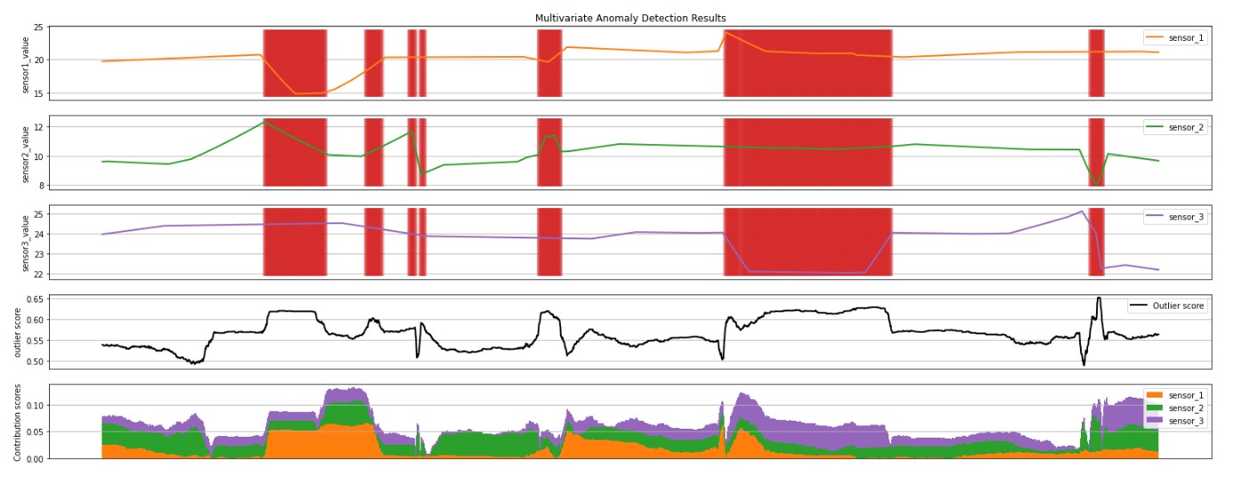
- The first 3 plots above show the sensor time series data in the inference window, in orange, green, purple and blue. The red vertical lines show the detected anomalies (
prediction= 1). - The fourth plot shows the outlierScore of all the points, with the
minOutlierScorethreshold shown by the dotted red horizontal line. - The last plot shows the contribution scores of each sensor to the
outlierScorefor that point.
Plot aggregate feature importance
plt.figure(figsize=(10, 7))
plt.bar(inputCols, global_explanation.global_importance_values)
plt.ylabel("global importance values")
When you run the cell above, you will see the following global feature importance plot:

Visualize the explanation in the ExplanationDashboard from https://github.com/microsoft/responsible-ai-widgets.
# View the model explanation in the ExplanationDashboard
from raiwidgets import ExplanationDashboard

ExplanationDashboard(global_explanation, wrapper(model), dataset=eval_data)