Interpretability - Explanation Dashboard
In this example, similar to the "Interpretability - Tabular SHAP explainer" notebook, we use Kernel SHAP to explain a tabular classification model built from the Adults Census dataset and then visualize the explanation in the ExplanationDashboard from https://github.com/microsoft/responsible-ai-widgets.
First we import the packages and define some UDFs we will need later.
%pip install raiwidgets itsdangerous==2.0.1 interpret-community
from IPython.terminal.interactiveshell import TerminalInteractiveShell
from synapse.ml.explainers import *
from pyspark.ml import Pipeline
from pyspark.ml.classification import LogisticRegression
from pyspark.ml.feature import StringIndexer, OneHotEncoder, VectorAssembler
from pyspark.ml.functions import vector_to_array
from pyspark.sql.types import *
from pyspark.sql.functions import *
import pandas as pd

vec_access = udf(lambda v, i: float(v[i]), FloatType())
Now let's read the data and train a simple binary classification model.
df = spark.read.parquet(
    "wasbs://publicwasb@mmlspark.blob.core.windows.net/AdultCensusIncome.parquet"
).cache()

labelIndexer = StringIndexer(
    inputCol="income", outputCol="label", stringOrderType="alphabetAsc"
).fit(df)
print("Label index assigment: " + str(set(zip(labelIndexer.labels, [0, 1]))))

training = labelIndexer.transform(df)
display(training)
categorical_features = [
    "workclass",
    "education",
    "marital-status",
    "occupation",
    "relationship",
    "race",
    "sex",
    "native-country",
]
categorical_features_idx = [col + "_idx" for col in categorical_features]
categorical_features_enc = [col + "_enc" for col in categorical_features]
numeric_features = [
    "age",
    "education-num",
    "capital-gain",
    "capital-loss",
    "hours-per-week",
]

strIndexer = StringIndexer(
    inputCols=categorical_features, outputCols=categorical_features_idx
)
onehotEnc = OneHotEncoder(
    inputCols=categorical_features_idx, outputCols=categorical_features_enc
)
vectAssem = VectorAssembler(
    inputCols=categorical_features_enc + numeric_features, outputCol="features"
)
lr = LogisticRegression(featuresCol="features", labelCol="label", weightCol="fnlwgt")
pipeline = Pipeline(stages=[strIndexer, onehotEnc, vectAssem, lr])
model = pipeline.fit(training)
After the model is trained, we randomly select some observations to be explained.
explain_instances = (
    model.transform(training).orderBy(rand()).limit(5).repartition(200).cache()
)
display(explain_instances)
We create a TabularSHAP explainer, set the input columns to all the features the model takes, specify the model and the target output column we are trying to explain. In this case, we are trying to explain the "probability" output which is a vector of length 2, and we are only looking at class 1 probability. Specify targetClasses to [0, 1] if you want to explain class 0 and 1 probability at the same time. Finally we sample 100 rows from the training data for background data, which is used for integrating out features in Kernel SHAP.
shap = TabularSHAP(
    inputCols=categorical_features + numeric_features,
    outputCol="shapValues",
    numSamples=5000,
    model=model,
    targetCol="probability",
    targetClasses=[1],
    backgroundData=broadcast(training.orderBy(rand()).limit(100).cache()),
)

shap_df = shap.transform(explain_instances)
Once we have the resulting dataframe, we extract the class 1 probability of the model output, the SHAP values for the target class, the original features and the true label. Then we convert it to a pandas dataframe for visualization. For each observation, the first element in the SHAP values vector is the base value (the mean output of the background dataset), and each of the following element is the SHAP values for each feature.
shaps = (
    shap_df.withColumn("probability", vec_access(col("probability"), lit(1)))
    .withColumn("shapValues", vector_to_array(col("shapValues").getItem(0)))
    .select(
        ["shapValues", "probability", "label"] + categorical_features + numeric_features
    )
)

shaps_local = shaps.toPandas()
shaps_local.sort_values("probability", ascending=False, inplace=True, ignore_index=True)
pd.set_option("display.max_colwidth", None)
shaps_local
We can visualize the explanation in the interpret-community format in the ExplanationDashboard from https://github.com/microsoft/responsible-ai-widgets/
import numpy as np

features = categorical_features + numeric_features
features_with_base = ["Base"] + features

rows = shaps_local.shape[0]

local_importance_values = shaps_local[["shapValues"]]
eval_data = shaps_local[features]
true_y = np.array(shaps_local[["label"]])
list_local_importance_values = local_importance_values.values.tolist()
converted_importance_values = []
bias = []
for classarray in list_local_importance_values:
    for rowarray in classarray:
        converted_list = rowarray.tolist()
        bias.append(converted_list[0])
        # remove the bias from local importance values
        del converted_list[0]
        converted_importance_values.append(converted_list)
When running Synapse Analytics, please follow instructions here Package management - Azure Synapse Analytics | Microsoft Docs to install "raiwidgets" and "interpret-community" packages.
from interpret_community.adapter import ExplanationAdapter

adapter = ExplanationAdapter(features, classification=True)
global_explanation = adapter.create_global(
    converted_importance_values, eval_data, expected_values=bias
)
# view the global importance values
global_explanation.global_importance_values
# view the local importance values
global_explanation.local_importance_values
class wrapper(object):
    def __init__(self, model):
        self.model = model

    def predict(self, data):
        sparkdata = spark.createDataFrame(data)
        return (
            model.transform(sparkdata)
            .select("prediction")
            .toPandas()
            .values.flatten()
            .tolist()
        )

    def predict_proba(self, data):
        sparkdata = spark.createDataFrame(data)
        prediction = (
            model.transform(sparkdata)
            .select("probability")
            .toPandas()
            .values.flatten()
            .tolist()
        )
        proba_list = [vector.values.tolist() for vector in prediction]
        return proba_list
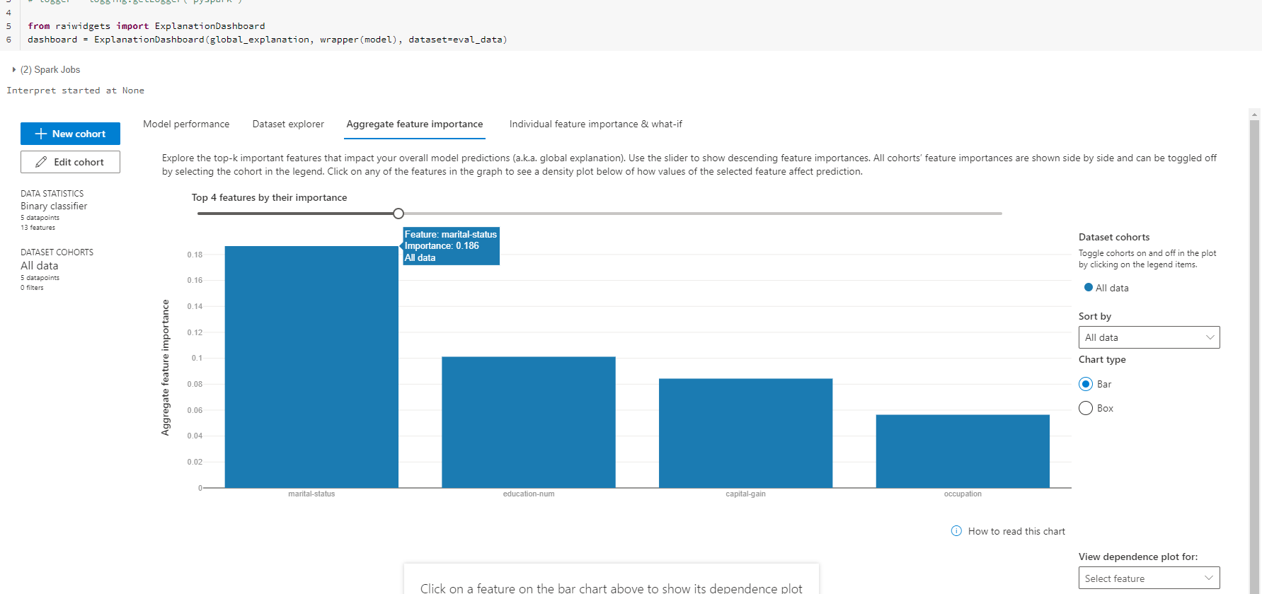
# view the explanation in the ExplanationDashboard
from raiwidgets import ExplanationDashboard

ExplanationDashboard(
    global_explanation, wrapper(model), dataset=eval_data, true_y=true_y
)
Your results will look like: