Partial Dependence (PDP) and Individual Conditional Expectation (ICE) plots
Partial Dependence Plot (PDP) and Individual Condition Expectation (ICE) are interpretation methods which describe the average behavior of a classification or regression model. They are particularly useful when the model developer wants to understand generally how the model depends on individual feature values, overall model behavior and do debugging.
To practice responsible AI, it is crucial to understand which features drive your model's predictions. This knowledge can facilitate the creation of Transparency Notes, facilitate auditing and compliance, help satisfy regulatory requirements, and improve both transparency and accountability.
The goal of this notebook is to show how these methods work for a pretrained model.
In this example, we train a classification model with the Adult Census Income dataset. Then we treat the model as an opaque-box model and calculate the PDP and ICE plots for some selected categorical and numeric features.
This dataset can be used to predict whether annual income exceeds $50,000/year or not based on demographic data from the 1994 U.S. Census. The dataset we're reading contains 32,561 rows and 14 columns/features.
We will train a classification model to predict >= 50K or < 50K based on our features.
Python dependencies:
matplotlib==3.2.2
from pyspark.ml import Pipeline
from pyspark.ml.classification import GBTClassifier
from pyspark.ml.feature import VectorAssembler, StringIndexer, OneHotEncoder
import pyspark.sql.functions as F
from pyspark.ml.evaluation import BinaryClassificationEvaluator
from synapse.ml.explainers import ICETransformer
import matplotlib.pyplot as plt
from synapse.ml.core.platform import *
Read and prepare the dataset
df = spark.read.parquet(
    "wasbs://publicwasb@mmlspark.blob.core.windows.net/AdultCensusIncome.parquet"
)
display(df)
Fit the model and view the predictions
categorical_features = [
    "race",
    "workclass",
    "marital-status",
    "education",
    "occupation",
    "relationship",
    "native-country",
    "sex",
]
numeric_features = [
    "age",
    "education-num",
    "capital-gain",
    "capital-loss",
    "hours-per-week",
]
string_indexer_outputs = [feature + "_idx" for feature in categorical_features]
one_hot_encoder_outputs = [feature + "_enc" for feature in categorical_features]

pipeline = Pipeline(
    stages=[
        StringIndexer()
        .setInputCol("income")
        .setOutputCol("label")
        .setStringOrderType("alphabetAsc"),
        StringIndexer()
        .setInputCols(categorical_features)
        .setOutputCols(string_indexer_outputs),
        OneHotEncoder()
        .setInputCols(string_indexer_outputs)
        .setOutputCols(one_hot_encoder_outputs),
        VectorAssembler(
            inputCols=one_hot_encoder_outputs + numeric_features, outputCol="features"
        ),
        GBTClassifier(weightCol="fnlwgt", maxDepth=7, maxIter=100),
    ]
)

model = pipeline.fit(df)
Check that model makes sense and has reasonable output. For this, we will check the model performance by calculating the ROC-AUC score.
data = model.transform(df)
display(data.select("income", "probability", "prediction"))
eval_auc = BinaryClassificationEvaluator(
    labelCol="label", rawPredictionCol="prediction"
)
eval_auc.evaluate(data)
Partial Dependence Plots
Partial dependence plots (PDP) show the dependence between the target response and a set of input features of interest, marginalizing over the values of all other input features. It can show whether the relationship between the target response and the input feature is linear, smooth, monotonic, or more complex. This is relevant when you want to have an overall understanding of model behavior. E.g. Identifying specific age group has a favorable predictions vs other age groups.
If you want to learn more please check out the scikit-learn page on partial dependence plots.
Set up the transformer for PDP
To plot PDP we need to set up the instance of ICETransformer first and set the kind parameter to average and then call the transform function.
For the setup we need to pass the pretrained model, specify the target column ("probability" in our case), and pass categorical and numeric feature names.
Categorical and numeric features can be passed as a list of names. But we can specify parameters for the features by passing a list of dicts where each dict represents one feature.
For the numeric features a dictionary can look like this:
{"name": "capital-gain", "numSplits": 20, "rangeMin": 0.0, "rangeMax": 10000.0, "outputColName": "capital-gain_dependance"}
Where the required key-value pair is name - the name of the numeric feature. Next key-values pairs are optional: numSplits - the number of splits for the value range for the numeric feature, rangeMin - specifies the min value of the range for the numeric feature, rangeMax - specifies the max value of the range for the numeric feature, outputColName - the name for output column with explanations for the feature.
For the categorical features a dictionary can look like this:
{"name": "marital-status", "numTopValues": 10, "outputColName": "marital-status_dependance"}
Where the required key-value pair is name - the name of the numeric feature. Next key-values pairs are optional: numTopValues - the max number of top-occurring values to be included in the categorical feature, outputColName - the name for output column with explanations for the feature.
pdp = ICETransformer(
    model=model,
    targetCol="probability",
    kind="average",
    targetClasses=[1],
    categoricalFeatures=categorical_features,
    numericFeatures=numeric_features,
)
PDP transformer returns a dataframe of 1 row * {number features to explain} columns. Each column contains a map between the feature's values and the model's average dependence for that feature value.
output_pdp = pdp.transform(df)
display(output_pdp)
Visualization
# Helper functions for visualization


def get_pandas_df_from_column(df, col_name):
    keys_df = df.select(F.explode(F.map_keys(F.col(col_name)))).distinct()
    keys = list(map(lambda row: row[0], keys_df.collect()))
    key_cols = list(map(lambda f: F.col(col_name).getItem(f).alias(str(f)), keys))
    final_cols = key_cols
    pandas_df = df.select(final_cols).toPandas()
    return pandas_df


def plot_dependence_for_categorical(df, col, col_int=True, figsize=(20, 5)):
    dict_values = {}
    col_names = list(df.columns)

    for col_name in col_names:
        dict_values[col_name] = df[col_name][0].toArray()[0]
        marklist = sorted(
            dict_values.items(), key=lambda x: int(x[0]) if col_int else x[0]
        )
        sortdict = dict(marklist)

    fig = plt.figure(figsize=figsize)
    plt.bar(sortdict.keys(), sortdict.values())

    plt.xlabel(col, size=13)
    plt.ylabel("Dependence")
    plt.show()


def plot_dependence_for_numeric(df, col, col_int=True, figsize=(20, 5)):
    dict_values = {}
    col_names = list(df.columns)

    for col_name in col_names:
        dict_values[col_name] = df[col_name][0].toArray()[0]
        marklist = sorted(
            dict_values.items(), key=lambda x: int(x[0]) if col_int else x[0]
        )
        sortdict = dict(marklist)

    fig = plt.figure(figsize=figsize)

    plt.plot(list(sortdict.keys()), list(sortdict.values()))

    plt.xlabel(col, size=13)
    plt.ylabel("Dependence")
    plt.ylim(0.0)
    plt.show()
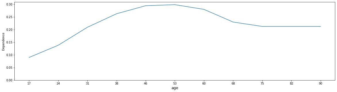
Example 1: "age"
We can observe non-linear dependency. The model predicts that income rapidly grows from 24-46 y.o. age, after 46 y.o. model predictions slightly drops and from 68 y.o. remains stable.
df_education_num = get_pandas_df_from_column(output_pdp, "age_dependence")
plot_dependence_for_numeric(df_education_num, "age")
Your results will look like:
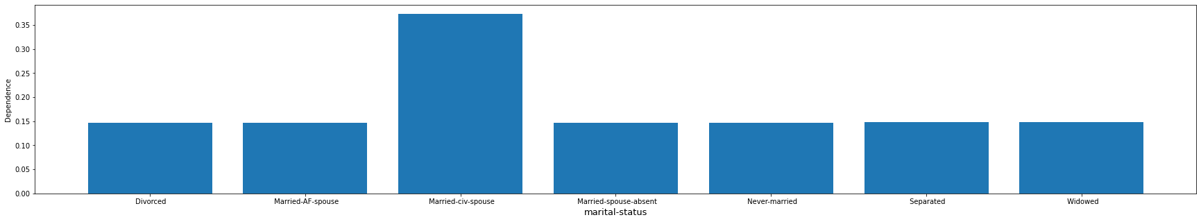
Example 2: "marital-status"
The model seems to treat "married-cv-spouse" as one category and tend to give a higher average prediction, and all others as a second category with the lower average prediction.
df_occupation = get_pandas_df_from_column(output_pdp, "marital-status_dependence")
plot_dependence_for_categorical(df_occupation, "marital-status", False, figsize=(30, 5))
Your results will look like:
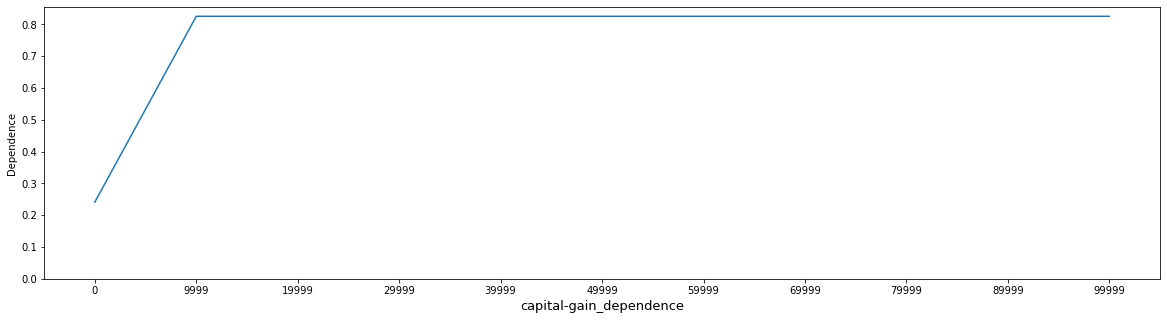
Example 3: "capital-gain"
In the first graph, we run PDP with default parameters. We can see that this representation is not super useful because it is not granular enough. By default the range of numeric features are calculated dynamically from the data.
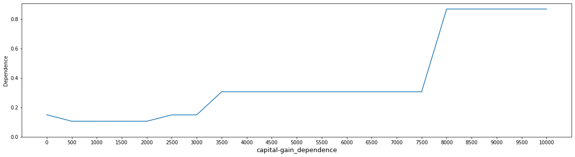
In the second graph, we set rangeMin = 0 and rangeMax = 10000 to visualize more granular interpretations for the feature of interest. Now we can see more clearly how the model made decisions in a smaller region.
df_education_num = get_pandas_df_from_column(output_pdp, "capital-gain_dependence")
plot_dependence_for_numeric(df_education_num, "capital-gain_dependence")
Your results will look like:
pdp_cap_gain = ICETransformer(
    model=model,
    targetCol="probability",
    kind="average",
    targetClasses=[1],
    numericFeatures=[
        {"name": "capital-gain", "numSplits": 20, "rangeMin": 0.0, "rangeMax": 10000.0}
    ],
    numSamples=50,
)
output_pdp_cap_gain = pdp_cap_gain.transform(df)
df_education_num_gain = get_pandas_df_from_column(
    output_pdp_cap_gain, "capital-gain_dependence"
)
plot_dependence_for_numeric(df_education_num_gain, "capital-gain_dependence")
Your results will look like:
Conclusions
PDP can be used to show how features influence model predictions on average and help modeler catch unexpected behavior from the model.
Individual Conditional Expectation
ICE plots display one line per instance that shows how the instance’s prediction changes when a feature values change. Each line represents the predictions for one instance if we vary the feature of interest. This is relevant when you want to observe model prediction for instances individually in more details.
If you want to learn more please check out the scikit-learn page on ICE plots.
Set up the transformer for ICE
To plot ICE we need to set up the instance of ICETransformer first and set the kind parameter to individual and then call the transform function. For the setup we need to pass the pretrained model, specify the target column ("probability" in our case), and pass categorical and numeric feature names. For better visualization we set the number of samples to 50.
ice = ICETransformer(
    model=model,
    targetCol="probability",
    targetClasses=[1],
    categoricalFeatures=categorical_features,
    numericFeatures=numeric_features,
    numSamples=50,
)

output = ice.transform(df)
Visualization
# Helper functions for visualization
from math import pi

from collections import defaultdict


def plot_ice_numeric(df, col, col_int=True, figsize=(20, 10)):
    dict_values = defaultdict(list)
    col_names = list(df.columns)
    num_instances = df.shape[0]

    instances_y = {}
    i = 0

    for col_name in col_names:
        for i in range(num_instances):
            dict_values[i].append(df[col_name][i].toArray()[0])

    fig = plt.figure(figsize=figsize)
    for i in range(num_instances):
        plt.plot(col_names, dict_values[i], "k")

    plt.xlabel(col, size=13)
    plt.ylabel("Dependence")
    plt.ylim(0.0)


def plot_ice_categorical(df, col, col_int=True, figsize=(20, 10)):
    dict_values = defaultdict(list)
    col_names = list(df.columns)
    num_instances = df.shape[0]

    angles = [n / float(df.shape[1]) * 2 * pi for n in range(df.shape[1])]
    angles += angles[:1]

    instances_y = {}
    i = 0

    for col_name in col_names:
        for i in range(num_instances):
            dict_values[i].append(df[col_name][i].toArray()[0])

    fig = plt.figure(figsize=figsize)
    ax = plt.subplot(111, polar=True)
    plt.xticks(angles[:-1], col_names)

    for i in range(num_instances):
        values = dict_values[i]
        values += values[:1]
        ax.plot(angles, values, "k")
        ax.fill(angles, values, "teal", alpha=0.1)

    plt.xlabel(col, size=13)
    plt.show()


def overlay_ice_with_pdp(df_ice, df_pdp, col, col_int=True, figsize=(20, 5)):
    dict_values = defaultdict(list)
    col_names_ice = list(df_ice.columns)
    num_instances = df_ice.shape[0]

    instances_y = {}
    i = 0

    for col_name in col_names_ice:
        for i in range(num_instances):
            dict_values[i].append(df_ice[col_name][i].toArray()[0])

    fig = plt.figure(figsize=figsize)
    for i in range(num_instances):
        plt.plot(col_names_ice, dict_values[i], "k")

    dict_values_pdp = {}
    col_names = list(df_pdp.columns)

    for col_name in col_names:
        dict_values_pdp[col_name] = df_pdp[col_name][0].toArray()[0]
        marklist = sorted(
            dict_values_pdp.items(), key=lambda x: int(x[0]) if col_int else x[0]
        )
        sortdict = dict(marklist)

    plt.plot(col_names_ice, list(sortdict.values()), "r", linewidth=5)

    plt.xlabel(col, size=13)
    plt.ylabel("Dependence")
    plt.ylim(0.0)
    plt.show()
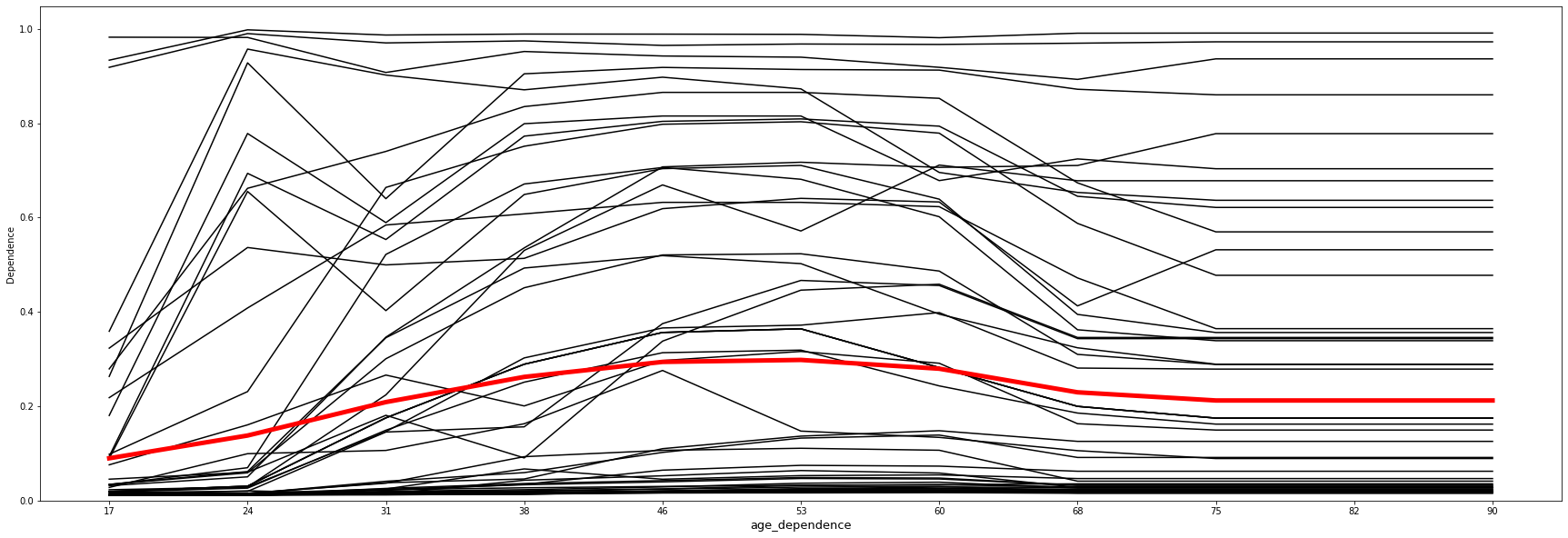
Example 1: Numeric feature: "age"
We can overlay the PDP on top of ICE plots. In the graph, the red line shows the PDP plot for the "age" feature, and the black lines show ICE plots for 50 randomly selected observations.
The visualization shows that all curves in the ICE plot follow a similar course. This means that the PDP (red line) is already a good summary of the relationships between the displayed feature "age" and the model's average predictions of "income".
age_df_ice = get_pandas_df_from_column(output, "age_dependence")
age_df_pdp = get_pandas_df_from_column(output_pdp, "age_dependence")

overlay_ice_with_pdp(age_df_ice, age_df_pdp, col="age_dependence", figsize=(30, 10))
Your results will look like:
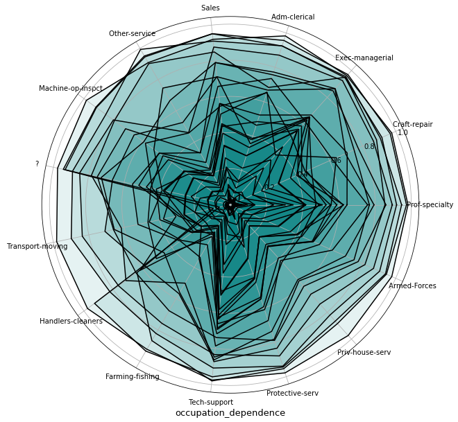
Example 2: Categorical feature: "occupation"
For visualization of categorical features, we are using a star plot.
- The X-axis here is a circle which is split into equal parts, each representing a feature value.
- The Y-coordinate shows the dependence values. Each line represents a sample observation.
Here we can see that "Farming-fishing" drives the least predictions - because values accumulated near the lowest probabilities, but, for example, "Exec-managerial" seems to have one of the highest impacts for model predictions.
occupation_dep = get_pandas_df_from_column(output, "occupation_dependence")

plot_ice_categorical(occupation_dep, "occupation_dependence", figsize=(30, 10))
Your results will look like:
Conclusions
ICE plots show model behavior on individual observations. Each line represents the prediction from the model if we vary the feature of interest.
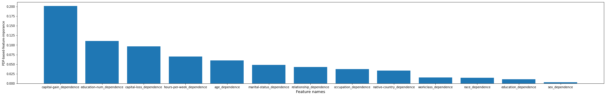
PDP-based Feature Importance
Using PDP we can calculate a simple partial dependence-based feature importance measure. We note that a flat PDP indicates that varying the feature does not affect the prediction. The more the PDP varies, the more "important" the feature is.
If you want to learn more please check out Christoph M's Interpretable ML Book.
Set up the transformer for PDP-based Feature Importance
To plot PDP-based feature importance, we first need to set up the instance of ICETransformer by setting the kind parameter to feature. We can then call the transform function.
transform returns a two-column table where the first columns are feature importance values and the second are corresponding features names. The rows are sorted in descending order by feature importance values.
pdp_based_imp = ICETransformer(
    model=model,
    targetCol="probability",
    kind="feature",
    targetClasses=[1],
    categoricalFeatures=categorical_features,
    numericFeatures=numeric_features,
)

output_pdp_based_imp = pdp_based_imp.transform(df)
display(output_pdp_based_imp)
Visualization
# Helper functions for visualization


def plot_pdp_based_imp(df, figsize=(35, 5)):
    values_list = list(df.select("pdpBasedDependence").toPandas()["pdpBasedDependence"])
    names = list(df.select("featureNames").toPandas()["featureNames"])
    dependence_values = []
    for vec in values_list:
        dependence_values.append(vec.toArray()[0])

    fig = plt.figure(figsize=figsize)
    plt.bar(names, dependence_values)

    plt.xlabel("Feature names", size=13)
    plt.ylabel("PDP-based-feature-imporance")
    plt.show()
This shows that the features capital-gain and education-num were the most important for the model, and sex and education were the least important.
plot_pdp_based_imp(output_pdp_based_imp)
Your results will look like:
Overall conclusions
Interpretation methods are very important responsible AI tools.
Partial dependence plots (PDP) and Individual Conditional Expectation (ICE) plots can be used to visualize and analyze interaction between the target response and a set of input features of interest.
PDPs show the dependence of the average prediction when varying each feature. In contrast, ICE shows the dependence for individual samples. The approaches can help give rough estimates of a function's deviation from a baseline. This is important not only to help debug and understand how a model behaves but is a useful step in building responsible AI systems. These methodologies can improve transparency and provide model consumers with an extra level of accountability by model creators.
Using examples above we showed how to calculate and visualize such plots at a scalable manner to understand how a classification or regression model makes predictions, which features heavily impact the model, and how model prediction changes when feature value changes.