Data Balance Analysis using the Adult Census Income dataset
In this example, we will conduct Data Balance Analysis (which consists on running three groups of measures) on the Adult Census Income dataset to determine how well features and feature values are represented in the dataset.
This dataset can be used to predict whether annual income exceeds $50,000/year or not based on demographic data from the 1994 U.S. Census. The dataset we're reading contains 32,561 rows and 14 columns/features.
Data Balance Analysis consists of a combination of three groups of measures: Feature Balance Measures, Distribution Balance Measures, and Aggregate Balance Measures. In summary, Data Balance Analysis, when used as a step for building ML models, has the following benefits:
- It reduces costs of ML building through the early identification of data representation gaps that prompt data scientists to seek mitigation steps (such as collecting more data, following a specific sampling mechanism, creating synthetic data, and so on) before proceeding to train their models.
- It enables easy end-to-end debugging of ML systems in combination with the RAI Toolbox by providing a clear view of model-related issues versus data-related issues.
Note: If you are running this notebook in a Spark environment such as Azure Synapse or Databricks, then you can easily visualize the imbalance measures using the built-in plotting features.
Python dependencies:
matplotlib==3.2.2
numpy==1.19.2
import matplotlib.pyplot as plt
import numpy as np
import pyspark.sql.functions as F
from synapse.ml.core.platform import *
df = spark.read.parquet(
    "wasbs://publicwasb@mmlspark.blob.core.windows.net/AdultCensusIncome.parquet"
)
display(df)
# Convert the "income" column from {<=50K, >50K} to {0, 1} to represent our binary classification label column
label_col = "income"
df = df.withColumn(
    label_col, F.when(F.col(label_col).contains("<=50K"), F.lit(0)).otherwise(F.lit(1))
)
Perform preliminary analysis on columns of interest
display(df.groupBy("race").count())
display(df.groupBy("sex").count())
# Choose columns/features to do data balance analysis on
cols_of_interest = ["race", "sex"]
display(df.select(cols_of_interest + [label_col]))
Calculate Feature Balance Measures
Feature Balance Measures allow us to see whether each combination of sensitive feature is receiving the positive outcome (true prediction) at equal rates.
In this context, we define a feature balance measure, also referred to as the parity, for label y as the absolute difference between the association metrics of two different sensitive classes , with respect to the association metric . That is:
Using the dataset, we can see if the various sexes and races are receiving >50k income at equal or unequal rates.
Note: Many of these metrics were influenced by this paper Measuring Model Biases in the Absence of Ground Truth.
from synapse.ml.exploratory import FeatureBalanceMeasure

feature_balance_measures = (
    FeatureBalanceMeasure()
    .setSensitiveCols(cols_of_interest)
    .setLabelCol(label_col)
    .setVerbose(True)
    .transform(df)
)

# Sort by Statistical Parity descending for all features
display(feature_balance_measures.sort(F.abs("FeatureBalanceMeasure.dp").desc()))
# Drill down to feature == "sex"
display(
    feature_balance_measures.filter(F.col("FeatureName") == "sex").sort(
        F.abs("FeatureBalanceMeasure.dp").desc()
    )
)
# Drill down to feature == "race"
display(
    feature_balance_measures.filter(F.col("FeatureName") == "race").sort(
        F.abs("FeatureBalanceMeasure.dp").desc()
    )
)
Visualize Feature Balance Measures
races = [row["race"] for row in df.groupBy("race").count().select("race").collect()]
dp_rows = (
    feature_balance_measures.filter(F.col("FeatureName") == "race")
    .select("ClassA", "ClassB", "FeatureBalanceMeasure.dp")
    .collect()
)
race_dp_values = [(row["ClassA"], row["ClassB"], row["dp"]) for row in dp_rows]

race_dp_array = np.zeros((len(races), len(races)))
for class_a, class_b, dp_value in race_dp_values:
    i, j = races.index(class_a), races.index(class_b)
    dp_value = round(dp_value, 2)
    race_dp_array[i, j] = dp_value
    race_dp_array[j, i] = -1 * dp_value

colormap = "RdBu"
dp_min, dp_max = -1.0, 1.0

fig, ax = plt.subplots()
im = ax.imshow(race_dp_array, vmin=dp_min, vmax=dp_max, cmap=colormap)

cbar = ax.figure.colorbar(im, ax=ax)
cbar.ax.set_ylabel("Statistical Parity", rotation=-90, va="bottom")

ax.set_xticks(np.arange(len(races)))
ax.set_yticks(np.arange(len(races)))
ax.set_xticklabels(races)
ax.set_yticklabels(races)

plt.setp(ax.get_xticklabels(), rotation=45, ha="right", rotation_mode="anchor")

for i in range(len(races)):
    for j in range(len(races)):
        text = ax.text(j, i, race_dp_array[i, j], ha="center", va="center", color="k")

ax.set_title("Statistical Parity of Races in Adult Dataset")
fig.tight_layout()
plt.show()
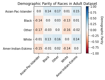
Interpret Feature Balance Measures
Statistical Parity:
- When it is positive, it means that ClassA sees the positive outcome more than ClassB.
- When it is negative, it means that ClassB sees the positive outcome more than ClassA.
From the results, we can tell the following:
For Sex:
- SP(Male, Female) = 0.1963 shows "Male" observations are associated with ">50k" income label more often than "Female" observations.
For Race:
- SP(Other, Asian-Pac-Islander) = -0.1734 shows "Other" observations are associated with ">50k" income label less than "Asian-Pac-Islander" observations.
- SP(White, Other) = 0.1636 shows "White" observations are associated with ">50k" income label more often than "Other" observations.
- SP(Asian-Pac-Islander, Amer-Indian-Eskimo) = 0.1494 shows "Asian-Pac-Islander" observations are associated with ">50k" income label more often than "Amer-Indian-Eskimo" observations.
Again, you can take mitigation steps to upsample/downsample your data to be less biased towards certain features and feature values.
Built-in mitigation steps are coming soon.
Calculate Distribution Balance Measures
Distribution Balance Measures allow us to compare our data with a reference distribution (i.e. uniform distribution). They are calculated per sensitive column and don't use the label column. |
from synapse.ml.exploratory import DistributionBalanceMeasure

distribution_balance_measures = (
    DistributionBalanceMeasure().setSensitiveCols(cols_of_interest).transform(df)
)

# Sort by JS Distance descending
display(
    distribution_balance_measures.sort(
        F.abs("DistributionBalanceMeasure.js_dist").desc()
    )
)
Visualize Distribution Balance Measures
distribution_rows = distribution_balance_measures.collect()
race_row = [row for row in distribution_rows if row["FeatureName"] == "race"][0][
    "DistributionBalanceMeasure"
]
sex_row = [row for row in distribution_rows if row["FeatureName"] == "sex"][0][
    "DistributionBalanceMeasure"
]

measures_of_interest = [
    "kl_divergence",
    "js_dist",
    "inf_norm_dist",
    "total_variation_dist",
    "wasserstein_dist",
]
race_measures = [round(race_row[measure], 4) for measure in measures_of_interest]
sex_measures = [round(sex_row[measure], 4) for measure in measures_of_interest]

x = np.arange(len(measures_of_interest))
width = 0.35

fig, ax = plt.subplots()
rects1 = ax.bar(x - width / 2, race_measures, width, label="Race")
rects2 = ax.bar(x + width / 2, sex_measures, width, label="Sex")

ax.set_xlabel("Measure")
ax.set_ylabel("Value")
ax.set_title("Distribution Balance Measures of Sex and Race in Adult Dataset")
ax.set_xticks(x)
ax.set_xticklabels(measures_of_interest)
ax.legend()

plt.setp(ax.get_xticklabels(), rotation=20, ha="right", rotation_mode="default")


def autolabel(rects):
    for rect in rects:
        height = rect.get_height()
        ax.annotate(
            "{}".format(height),
            xy=(rect.get_x() + rect.get_width() / 2, height),
            xytext=(0, 1),  # 1 point vertical offset
            textcoords="offset points",
            ha="center",
            va="bottom",
        )


autolabel(rects1)
autolabel(rects2)

fig.tight_layout()

plt.show()
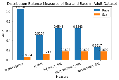
Interpret Distribution Balance Measures
Race has a JS Distance of 0.5104 while Sex has a JS Distance of 0.1217.
Knowing that JS Distance is between [0, 1] where 0 means perfectly balanced distribution, we can tell that:
- There is a larger disparity between various races than various sexes in our dataset.
- Race is nowhere close to a perfectly balanced distribution (i.e. some races are seen ALOT more than others in our dataset).
- Sex is fairly close to a perfectly balanced distribution.
Calculate Aggregate Balance Measures
Aggregate Balance Measures allow us to obtain a higher notion of inequality. They are calculated on the global set of sensitive columns and don't use the label column.
These measures look at distribution of records across all combinations of sensitive columns. For example, if Sex and Race are sensitive columns, it shall try to quantify imbalance across all combinations - (Male, Black), (Female, White), (Male, Asian-Pac-Islander), etc.
from synapse.ml.exploratory import AggregateBalanceMeasure

aggregate_balance_measures = (
    AggregateBalanceMeasure().setSensitiveCols(cols_of_interest).transform(df)
)

display(aggregate_balance_measures)
Interpret Aggregate Balance Measures
An Atkinson Index of 0.7779 lets us know that 77.79% of data points need to be foregone to have a more equal share among our features.
It lets us know that our dataset is leaning towards maximum inequality, and we should take actionable steps to:
- Upsample data points where the feature value is barely observed.
- Downsample data points where the feature value is observed much more than others.
Summary
Throughout the course of this sample notebook, we have:
- Chosen "Race" and "Sex" as columns of interest in the Adult Census Income dataset.
- Done preliminary analysis on our dataset.
- Ran the 3 groups of measures that compose our Data Balance Analysis:
- Feature Balance Measures
- Calculated Feature Balance Measures to see that the highest Statistical Parity is in "Sex": Males see >50k income much more than Females.
- Visualized Statistical Parity of Races to see that Asian-Pac-Islander sees >50k income much more than Other, in addition to other race combinations.
- Distribution Balance Measures
- Calculated Distribution Balance Measures to see that "Sex" is much closer to a perfectly balanced distribution than "Race".
- Visualized various distribution balance measures to compare their values for "Race" and "Sex".
- Aggregate Balance Measures
- Calculated Aggregate Balance Measures to see that we need to forego 77.79% of data points to have a perfectly balanced dataset. We identified that our dataset is leaning towards maximum inequality, and we should take actionable steps to:
- Upsample data points where the feature value is barely observed.
- Downsample data points where the feature value is observed much more than others.
In conclusion:
- These measures provide an indicator of disparity on the data, allowing for users to explore potential mitigations before proceeding to train.
- Users can use these measures to set thresholds on their level of "tolerance" for data representation.
- Production pipelines can use these measures as baseline for models that require frequent retraining on new data.
- These measures can also be saved as key metadata for the model/service built and added as part of model cards or transparency notes helping drive overall accountability for the ML service built and its performance across different demographics or sensitive attributes.