Interpretability - Tabular SHAP explainer
In this example, we use Kernel SHAP to explain a tabular classification model built from the Adults Census dataset.
First we import the packages and define some UDFs we need later.
from synapse.ml.explainers import *
from pyspark.ml import Pipeline
from pyspark.ml.classification import LogisticRegression
from pyspark.ml.feature import StringIndexer, OneHotEncoder, VectorAssembler
from pyspark.ml.functions import vector_to_array
from pyspark.sql.types import *
from pyspark.sql.functions import *
import pandas as pd
from synapse.ml.core.platform import *

vec_access = udf(lambda v, i: float(v[i]), FloatType())
Now let's read the data and train a binary classification model.
df = spark.read.parquet(
    "wasbs://publicwasb@mmlspark.blob.core.windows.net/AdultCensusIncome.parquet"
)

labelIndexer = StringIndexer(
    inputCol="income", outputCol="label", stringOrderType="alphabetAsc"
).fit(df)
print("Label index assigment: " + str(set(zip(labelIndexer.labels, [0, 1]))))

training = labelIndexer.transform(df).cache()
display(training)
categorical_features = [
    "workclass",
    "education",
    "marital-status",
    "occupation",
    "relationship",
    "race",
    "sex",
    "native-country",
]
categorical_features_idx = [col + "_idx" for col in categorical_features]
categorical_features_enc = [col + "_enc" for col in categorical_features]
numeric_features = [
    "age",
    "education-num",
    "capital-gain",
    "capital-loss",
    "hours-per-week",
]

strIndexer = StringIndexer(
    inputCols=categorical_features, outputCols=categorical_features_idx
)
onehotEnc = OneHotEncoder(
    inputCols=categorical_features_idx, outputCols=categorical_features_enc
)
vectAssem = VectorAssembler(
    inputCols=categorical_features_enc + numeric_features, outputCol="features"
)
lr = LogisticRegression(featuresCol="features", labelCol="label", weightCol="fnlwgt")
pipeline = Pipeline(stages=[strIndexer, onehotEnc, vectAssem, lr])
model = pipeline.fit(training)
After the model is trained, we randomly select some observations to be explained.
explain_instances = (
    model.transform(training).orderBy(rand()).limit(5).repartition(200).cache()
)
display(explain_instances)
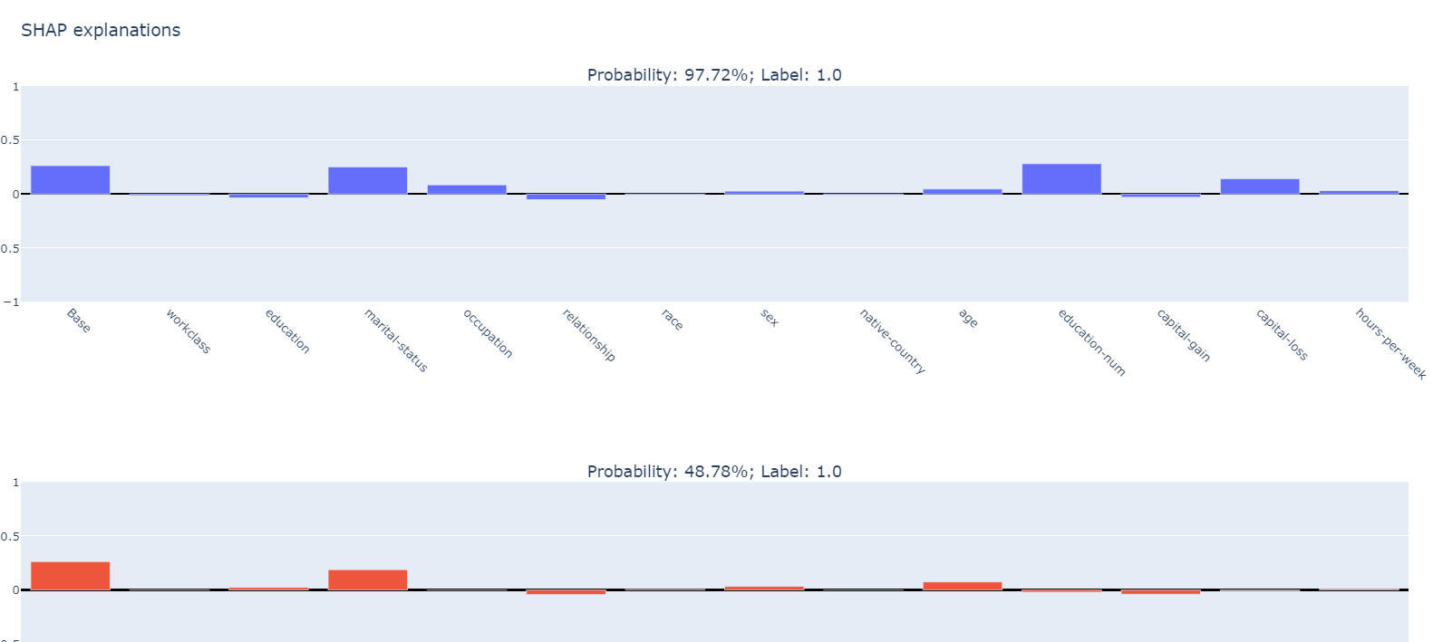
We create a TabularSHAP explainer, set the input columns to all the features the model takes, specify the model and the target output column we're trying to explain. In this case, we're trying to explain the "probability" output, which is a vector of length 2, and we're only looking at class 1 probability. Specify targetClasses to [0, 1] if you want to explain class 0 and 1 probability at the same time. Finally we sample 100 rows from the training data for background data, which is used for integrating out features in Kernel SHAP.
shap = TabularSHAP(
    inputCols=categorical_features + numeric_features,
    outputCol="shapValues",
    numSamples=5000,
    model=model,
    targetCol="probability",
    targetClasses=[1],
    backgroundData=broadcast(training.orderBy(rand()).limit(100).cache()),
)

shap_df = shap.transform(explain_instances)
Once we have the resulting dataframe, we extract the class 1 probability of the model output, the SHAP values for the target class, the original features and the true label. Then we convert it to a pandas dataframe for visualization. For each observation, the first element in the SHAP values vector is the base value (the mean output of the background dataset), and each of the following element is the SHAP values for each feature.
shaps = (
    shap_df.withColumn("probability", vec_access(col("probability"), lit(1)))
    .withColumn("shapValues", vector_to_array(col("shapValues").getItem(0)))
    .select(
        ["shapValues", "probability", "label"] + categorical_features + numeric_features
    )
)

shaps_local = shaps.toPandas()
shaps_local.sort_values("probability", ascending=False, inplace=True, ignore_index=True)
pd.set_option("display.max_colwidth", None)
shaps_local
We use plotly subplot to visualize the SHAP values.
from plotly.subplots import make_subplots
import plotly.graph_objects as go
import pandas as pd

features = categorical_features + numeric_features
features_with_base = ["Base"] + features

rows = shaps_local.shape[0]

fig = make_subplots(
    rows=rows,
    cols=1,
    subplot_titles="Probability: "
    + shaps_local["probability"].apply("{:.2%}".format)
    + "; Label: "
    + shaps_local["label"].astype(str),
)

for index, row in shaps_local.iterrows():
    feature_values = [0] + [row[feature] for feature in features]
    shap_values = row["shapValues"]
    list_of_tuples = list(zip(features_with_base, feature_values, shap_values))
    shap_pdf = pd.DataFrame(list_of_tuples, columns=["name", "value", "shap"])
    fig.add_trace(
        go.Bar(
            x=shap_pdf["name"],
            y=shap_pdf["shap"],
            hovertext="value: " + shap_pdf["value"].astype(str),
        ),
        row=index + 1,
        col=1,
    )

fig.update_yaxes(range=[-1, 1], fixedrange=True, zerolinecolor="black")
fig.update_xaxes(type="category", tickangle=45, fixedrange=True)
fig.update_layout(height=400 * rows, title_text="SHAP explanations")

if not running_on_synapse():
    fig.show()
Your results should look like: