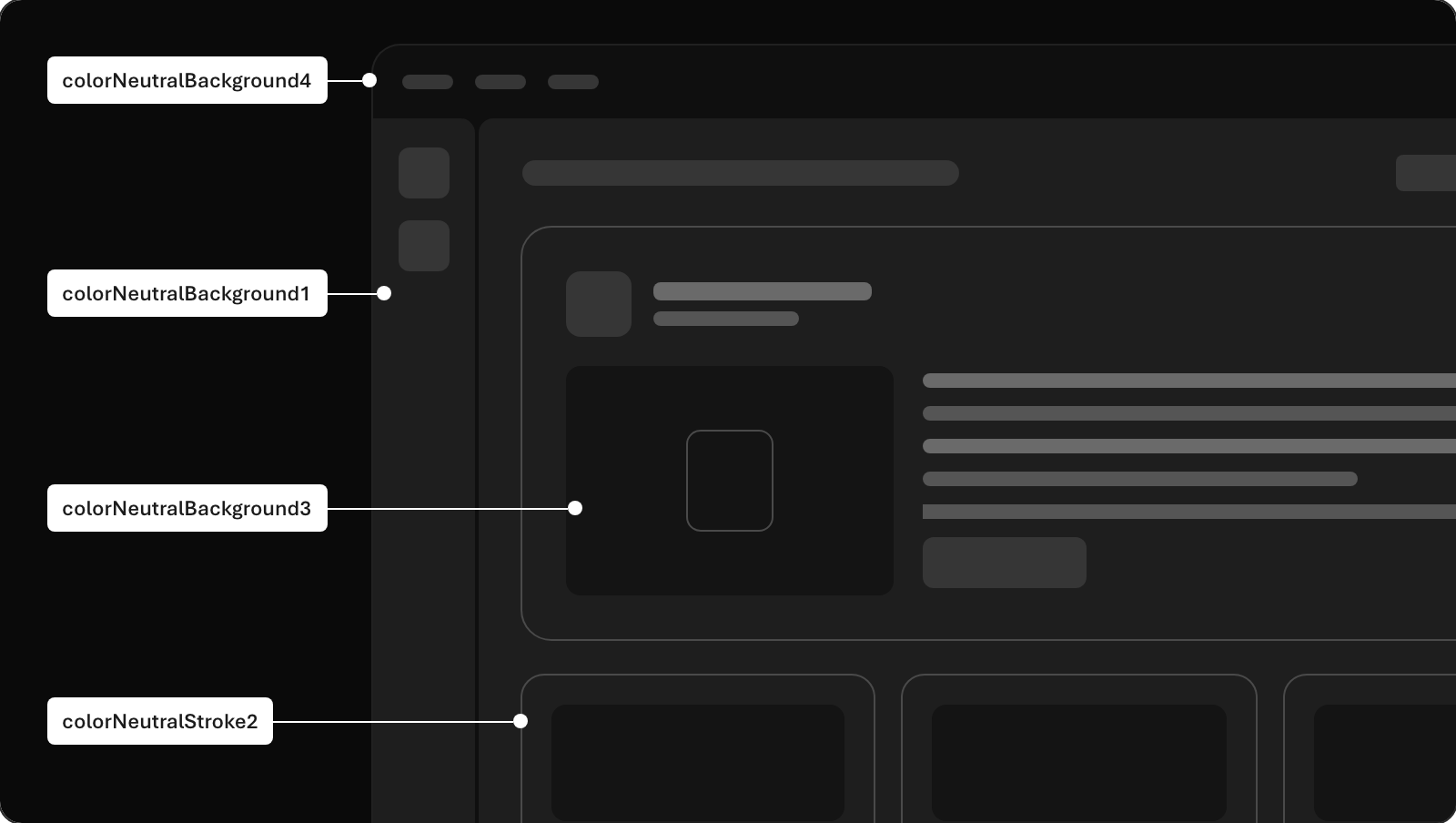
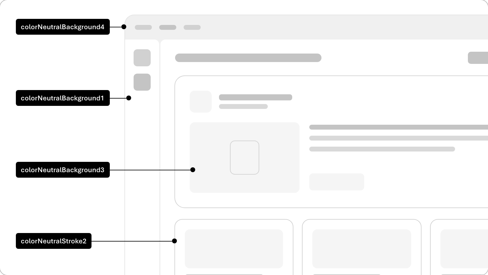
We use subtle variations in background color to simulate depth and layering in digital interfaces, mimicking how light interacts with physical surfaces. Lighter shades appear closer to the viewer, while slightly darker tones recede into the background, creating a sense of spatial hierarchy. This technique helps guide user focus and enhances visual clarity without relying on harsh shadows or complex textures.
To maintain clarity and usability, aim to limit visual hierarchy to no more than three layers on a screen.
Text, strokes, and fills that are darker than the background they rest on are perceived as being part of the page itself rather than floating above it, creating a visual sense of embedded content rather than layered depth.
Dark theme
Light theme
See semantic surface colors for the current token values.