Using PlatformColor and Responding to Themes
Overview
Windows supports two unique native styling/theming behaviors: one being the dark and light theme changes and the other being adaptive brushes and system colors. This article will show you how to set up your app to listen to theme changes and use the Windows brushes when and where you want.
Setting up and handling theme changed events
In this example, we'll look at three things:
- How to set up your React Native app to be style and event sensitive to the system themes
- How to switch styles when a theme change has occurred
- Handling a theme changed event
Using hooks to be sensitive to theme changes
First import the useColorScheme hook into your React Native app.
import { useColorScheme } from 'react-native'
 const MyAppComponent = () => {
        const colorScheme = useColorScheme();
        return (
          <Button title='click me' color={colorScheme === 'dark' ? 'grey' : 'orange'}/>
        );
      };
Note:
useColorScheme()will always return 'light' when remote debugging.
Setting up your app to be sensitive to theme changes without hooks
First import the Appearance API into your React Native app.
import { Appearance } from 'react-native'
Create a local variable to use in a style conditional or to reference elsewhere, and then supply mounting functions to ensure that you are listening to the theme change events correctly.
class MyAppClass extends Component {
  state = {
    currentTheme: Appearance.getColorScheme()
  };

  componentDidMount() {
    Appearance.addChangeListener(this.onAppThemeChanged);
  };

  componentWillUnmount() {
    Appearance.addChangeListener(this.onAppThemeChanged);
  };

  onAppThemeChanged = (theme) => {
    const currentTheme = theme;
    this.setState({currentTheme});
  };

  render() {
    <Button title='click me' color={this.state.currentTheme === 'dark' ? 'grey' : 'orange'}/>
  }
}
Note:
getColorScheme()will always return 'light' when remote debugging.
Using Windows-defined theme brushes
The following examples cover how to access and use the Windows system theme brushes and apply them in your styles. For more information on Windows XAML theme resources see: https://docs.microsoft.com/en-us/windows/uwp/design/controls-and-patterns/xaml-theme-resources
Any brush/color value within your apps native ResourceDictionary, either from the system, or custom native resources, are available using PlatformColor.
Using theme brushes in a style
const styles = StyleSheet.create({
  title: {
    fontSize: 19,
    fontWeight: 'bold',
    color: PlatformColor('SystemControlPageTextBaseHighBrush')
  },
});
Applying a system accent color variant
In Windows, there are algorithmically generated accent colors - dubbed Light or Dark 1, 2, and 3. This example covers what it would look like to apply that using the windowsbrush object.
const styles = StyleSheet.create({
  title: {
    fontSize: 19,
    fontWeight: 'bold',
    color: PlatformColor('SystemAccentColorLight3')
  },
});
Note: That the system accent colors are Color objects at the native layer, whereas the other examples showed the use of theme brushes are SolidColorBrush objects. This means that the SolidColorBrushes will adapt automatically based on the Theme (Light, Dark or High Contrast), while the Colors will remain static.
Using PlatformColor to access Reveal and Acrylic
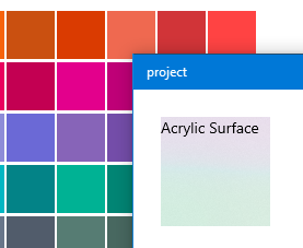
Two awesome features about the native XAML platform are Reveal and Acrylic. These two Fluent Design visuals are only found in Windows 10 apps, but can easily be accessed through the same PlatformColor API we provide on the JavaScript layer for other brushes.
Using System Acrylic
The PlatformColor API gives you access to all of the system acrylic brushes which can be accessed by resource name. Simply provide the resource brush name string in the component's style and it will be applied accordingly.

const styles = StyleSheet.create({
  viewcomponent: {
    backgroundColor: PlatformColor('SystemControlAcrylicWindowBrush')
  },
});
Applying Reveal Highlight
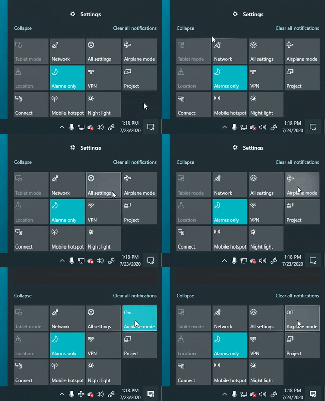
Reveal can be applied to surfaces exactly the same way that Acrylic and other system brushes are.

const styles = StyleSheet.create({
  viewcomponent: {
    backgroundColor: PlatformColor('SystemControlBackgroundAccentRevealBorderBrush')
  },
});
