Demo Notebook for the vivainsights Python package
Welcome to the comprehensive demo of the vivainsights Python package! This notebook showcases the full analytical capabilities available for Microsoft Viva Insights data analysis.
vivainsights is a powerful Python library designed to help you:
📊 Visualize collaboration patterns and organizational metrics
🔍 Analyze employee engagement and wellbeing indicators
📈 Identify trends, outliers, and areas for improvement
🌐 Explore collaboration networks and organizational dynamics
⚡ Generate actionable insights for leaders and HR teams
This demo covers the major function categories with real examples using sample Person Query data.
For more information about the package:
📚 Documentation - Complete API reference and guides
💻 GitHub Repository - Source code and issue tracking
🎯 Use Cases - Real-world applications and examples
Getting Started: Loading Data and Libraries
The vivainsights package comes with built-in sample datasets that mirror the structure of real Viva Insights exports. The load_pq_data() function loads a representative Person Query dataset containing:
Individual metrics: Collaboration hours, email activity, meeting patterns
Organizational attributes: Function, level, organization, manager status
Time series data: Weekly observations for trend analysis
Network data: Collaboration patterns across the organization
Let’s start by loading the library and exploring the sample data:
[4]:
import vivainsights as vi

# load in-built datasets
pq_data = vi.load_pq_data() # load and assign in-built person query
[5]:
import warnings
warnings.filterwarnings('ignore')
[6]:
pq_data.head()
[6]:
| PersonId | MetricDate | Collaboration_hours | Copilot_actions_taken_in_Teams | Meeting_and_call_hours | Internal_network_size | Email_hours | Channel_message_posts | Conflicting_meeting_hours | Large_and_long_meeting_hours | ... | Summarise_chat_actions_taken_using_Copilot_in_Teams | Summarise_email_thread_actions_taken_using_Copilot_in_Outlook | Summarise_meeting_actions_taken_using_Copilot_in_Teams | Summarise_presentation_actions_taken_using_Copilot_in_PowerPoint | Summarise_Word_document_actions_taken_using_Copilot_in_Word | FunctionType | SupervisorIndicator | Level | Organization | LevelDesignation | |
|---|---|---|---|---|---|---|---|---|---|---|---|---|---|---|---|---|---|---|---|---|---|
| 0 | bf361ad4-fc29-432f-95f3-837e689f4ac4 | 2024-03-31 | 17.452987 | 4 | 11.767599 | 92 | 7.523189 | 0.753451 | 2.079210 | 0.635489 | ... | 2 | 0 | 0 | 0 | 0 | Specialist | Manager | Level3 | IT | Senior IC |
| 1 | 0500f22c-2910-4154-b6e2-66864898d848 | 2024-03-31 | 32.860820 | 6 | 26.743370 | 193 | 11.578396 | 0.000000 | 8.106997 | 1.402567 | ... | 2 | 0 | 4 | 1 | 0 | Specialist | Manager | Level2 | Legal | Senior Manager |
| 2 | bb495ec9-8577-468a-8b48-e32677442f51 | 2024-03-31 | 21.502359 | 8 | 13.982031 | 113 | 9.073214 | 0.894786 | 3.001401 | 0.000192 | ... | 1 | 1 | 0 | 0 | 0 | Manager | Manager | Level4 | Legal | Junior IC |
| 3 | f6d58aaf-a2b2-42ab-868f-d7ac2e99788d | 2024-03-31 | 25.416502 | 4 | 16.895513 | 131 | 10.281204 | 0.528731 | 1.846423 | 1.441596 | ... | 0 | 0 | 0 | 0 | 0 | Manager | Manager | Level1 | HR | Executive |
| 4 | c81cb49a-aa27-4cfc-8211-4087b733a3c6 | 2024-03-31 | 11.433377 | 4 | 6.957468 | 75 | 5.510535 | 2.288934 | 0.474048 | 0.269996 | ... | 0 | 0 | 1 | 0 | 0 | Technician | Manager | Level1 | Finance | Executive |
5 rows × 73 columns
extract_hr() returns all the HR or organizational attributes it identifies within the target DataFrame:
[7]:
vi.extract_hr(pq_data)
MetricDate,
 FunctionType,
 SupervisorIndicator,
 Level,
 Organization,
 LevelDesignation,
Core Visualization Functions
The vivainsights package provides a comprehensive suite of visualization functions, each designed for specific analytical needs. All visualization functions follow a consistent pattern:
Key Parameters:
data- Your Viva Insights dataset (Person Query, Meeting Query, etc.)metric- The collaboration metric to analyze (e.g., ‘Collaboration_hours’, ‘Emails_sent’)hrvar- Organizational grouping variable (e.g., ‘Organization’, ‘LevelDesignation’)mingroup- Minimum group size to display (privacy protection)return_type- Output format:'plot'(visualization) or'table'(summary data)
Bar Charts: Comparing Groups
The create_bar() function creates person-averaged bar charts - it first calculates individual averages, then group averages. This prevents larger groups from dominating the analysis and ensures fair comparison across organizational segments.
[8]:
plot_bar = vi.create_bar(data=pq_data, metric='Emails_sent', hrvar='Organization', mingroup=5)
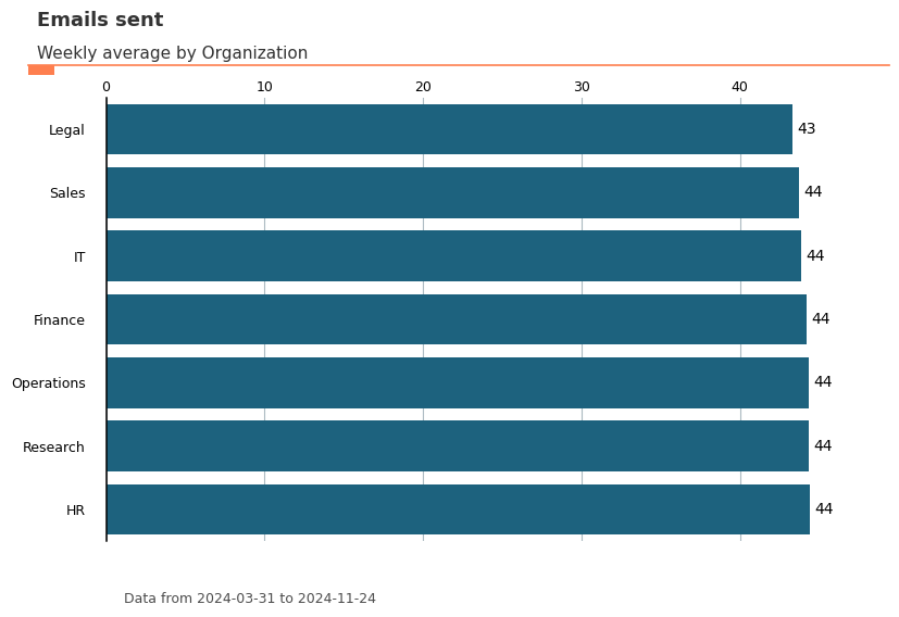
You can also ask the function to return a summary table by specifying the parameter return_type. This summary table can be copied to a clipboard with export().
[9]:
tb = vi.create_bar(data=pq_data, metric='Emails_sent', hrvar='Organization', mingroup=5, return_type='table')
print(tb)
  Organization     metric   n
1           HR  44.423377  33
5     Research  44.364859  52
4   Operations  44.345455  22
0      Finance  44.213445  68
2           IT  43.871867  68
6        Sales  43.723077  13
3        Legal  43.328571  44
[10]:
vi.export(tb)
Data frame copied to clipboard.
You may paste the contents directly to Excel.
[10]:
()
Here are some other visual outputs, and their accompanying summary table outputs:
[138]:
plot_line = vi.create_line(data=pq_data, metric='Emails_sent', hrvar='Level', mingroup=5, return_type='plot')
[139]:
vi.create_line(data=pq_data, metric='Emails_sent', hrvar='Organization', mingroup=5, return_type='table').head()
[139]:
| MetricDate | Organization | metric | n | |
|---|---|---|---|---|
| 0 | 2024-03-31 | Finance | 42.529412 | 68 |
| 1 | 2024-03-31 | HR | 41.090909 | 33 |
| 2 | 2024-03-31 | IT | 43.632353 | 68 |
| 3 | 2024-03-31 | Legal | 43.931818 | 44 |
| 4 | 2024-03-31 | Operations | 44.545455 | 22 |
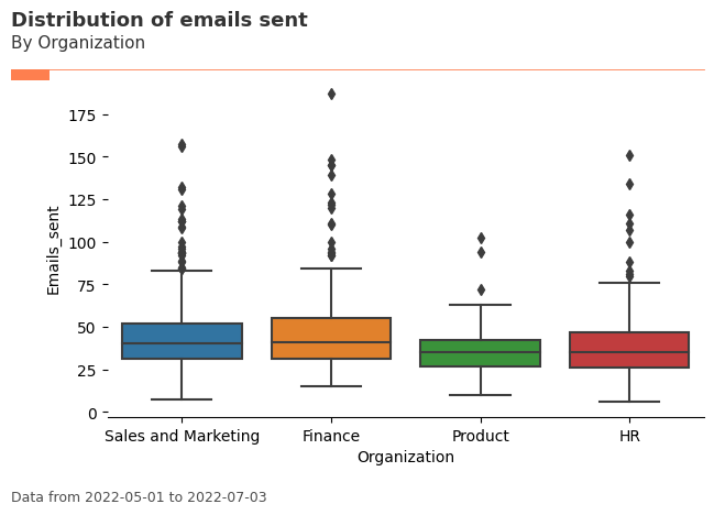
Distribution & Inequality Analysis
Understanding how metrics are distributed across your organization is crucial for identifying patterns, outliers, and inequality. The vivainsights package provides powerful functions for distribution analysis that go beyond simple averages.
Distribution Functions:
create_boxplot()- Visualizes metric distributions and identifies outliers across groupscreate_lorenz()- Analyzes inequality using Lorenz curves and Gini coefficients
These functions are particularly valuable when analyzing engagement metrics. For example, while the average “Collaboration hours” might appear healthy across your organization, the distribution could reveal that a small group of employees are experiencing unsustainable collaboration loads, while others might be under-collaborating.
[140]:
plot_box = vi.create_boxplot(data=pq_data, metric='Emails_sent', hrvar='Organization', mingroup=5, return_type='plot')
[141]:
vi.create_boxplot(data=pq_data, metric='Emails_sent', hrvar='Organization', mingroup=5, return_type='table')
[141]:
| index | group | mean | median | sd | min | max | n | |
|---|---|---|---|---|---|---|---|---|
| 0 | 0 | Finance | 44.213445 | 43.900000 | 2.446053 | 39.342857 | 50.000000 | 68 |
| 1 | 1 | HR | 44.423377 | 44.485714 | 2.140707 | 40.314286 | 49.428571 | 33 |
| 2 | 2 | IT | 43.871867 | 43.885714 | 2.565453 | 37.742857 | 48.542857 | 68 |
| 3 | 3 | Legal | 43.328571 | 43.585714 | 2.434427 | 38.314286 | 49.828571 | 44 |
| 4 | 4 | Operations | 44.345455 | 45.442857 | 3.152513 | 39.000000 | 50.085714 | 22 |
| 5 | 5 | Research | 44.364859 | 44.228571 | 2.276114 | 39.657143 | 48.971429 | 52 |
| 6 | 6 | Sales | 43.723077 | 43.971429 | 2.132463 | 40.000000 | 46.885714 | 13 |
Lorenz Curve: Analyzing Inequality
The create_lorenz() function helps you understand inequality within your data by plotting Lorenz curves and calculating Gini coefficients. This is particularly useful for identifying whether certain metrics are concentrated among a small subset of employees.
A Gini coefficient close to 0 indicates equality (everyone has similar values), while a value close to 1 indicates high inequality (few people have most of the value).
[12]:
# Lorenz curve for collaboration hours - shows inequality across the population
lorenz_plot = vi.create_lorenz(data=pq_data, metric='Collaboration_hours', return_type='plot')
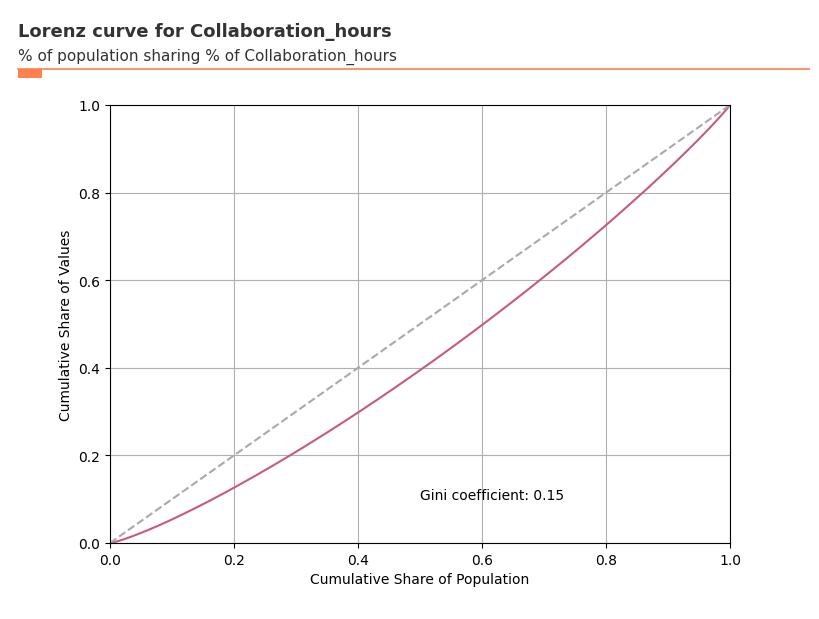
[143]:
# Get the Gini coefficient to quantify inequality
gini_coef = vi.create_lorenz(data=pq_data, metric='Collaboration_hours', return_type='gini')
print(f"Gini coefficient for Collaboration Hours: {gini_coef:.3f}")
print(f"Interpretation: {'High inequality' if gini_coef > 0.5 else 'Moderate inequality' if gini_coef > 0.3 else 'Low inequality'}")
Gini coefficient for Collaboration Hours: 0.149
Interpretation: Low inequality
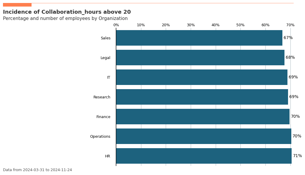
Incidence Analysis: Understanding Thresholds
The create_inc() function helps you understand what percentage of your population exceeds certain thresholds for key metrics. This is crucial for identifying employees who might be at risk of burnout or disengagement.
For example, you might want to know what percentage of employees in each organization have collaboration hours above a healthy threshold.
[144]:
# Incidence analysis: What % of people have >20 collaboration hours per week?
inc_plot = vi.create_inc(
    data=pq_data,
    metric='Collaboration_hours',
    hrvar='Organization',
    threshold=20,  # Threshold of 20 hours per week
    position='above',  # Looking at people above this threshold
    mingroup=5,
    return_type='plot'
)
[145]:
# Get the exact percentages as a table
inc_table = vi.create_inc(
    data=pq_data,
    metric='Collaboration_hours',
    hrvar='Organization',
    threshold=20,
    position='above',
    mingroup=5,
    return_type='table'
)
print("Percentage of employees with >20 collaboration hours per week:")
print(inc_table)
Percentage of employees with >20 collaboration hours per week:
  Organization    metric   n
1           HR  0.705628  33
4   Operations  0.703896  22
0      Finance  0.697059  68
5     Research  0.690659  52
2           IT  0.688235  68
3        Legal  0.676623  44
6        Sales  0.668132  13
Exploratory Data Analysis
Multi-dimensional Ranking: Finding Top Contributors and Risk Groups
The create_rank() function is one of the most powerful tools for rapid organizational exploration. It allows you to:
Compare multiple organizational dimensions simultaneously
Identify top and bottom performers across any metric
Discover hidden patterns in your organizational structure
Prioritize attention by ranking all groups by importance
This function is particularly valuable for leadership teams who need to quickly understand where to focus their attention across complex organizational hierarchies.
[146]:
vi.create_rank(
    data=pq_data,
    metric='Collaboration_hours',
    hrvar = ['Organization', 'FunctionType', 'LevelDesignation', 'SupervisorIndicator'],
    mingroup=5,
    return_type = 'table'
)
[146]:
| hrvar | attributes | metric | n | |
|---|---|---|---|---|
| 4 | FunctionType | Technician | 23.426417 | 292 |
| 0 | LevelDesignation | Executive | 23.285180 | 37 |
| 0 | FunctionType | Advisor | 23.252294 | 299 |
| 1 | Organization | HR | 23.249373 | 33 |
| 4 | Organization | Operations | 23.225234 | 22 |
| 5 | Organization | Research | 23.187623 | 52 |
| 0 | Organization | Finance | 23.100312 | 68 |
| 3 | FunctionType | Specialist | 23.092292 | 300 |
| 2 | LevelDesignation | Senior IC | 23.092287 | 87 |
| 0 | SupervisorIndicator | IC | 23.065672 | 34 |
| 1 | SupervisorIndicator | Manager | 23.052194 | 266 |
| 3 | LevelDesignation | Senior Manager | 23.037783 | 40 |
| 2 | FunctionType | Manager | 22.991247 | 300 |
| 6 | Organization | Sales | 22.984326 | 13 |
| 2 | Organization | IT | 22.980218 | 68 |
| 1 | LevelDesignation | Junior IC | 22.970769 | 136 |
| 1 | FunctionType | Consultant | 22.874061 | 298 |
| 3 | Organization | Legal | 22.725075 | 44 |
This can be visualized as well:
[147]:
plot_rank = vi.create_rank(
    data=pq_data,
    metric='Collaboration_hours',
    hrvar = ['Organization', 'FunctionType', 'LevelDesignation', 'SupervisorIndicator'],
    mingroup=5,
    return_type = 'plot'
)
Validating / exploring the data
Since HR variables or organizational attributes are a key part of the analysis process, it is also possible to perform some exploration or validation before we begin the analysis.
[148]:
plot_hrcount = vi.hrvar_count(data=pq_data, hrvar='Organization', return_type='plot')
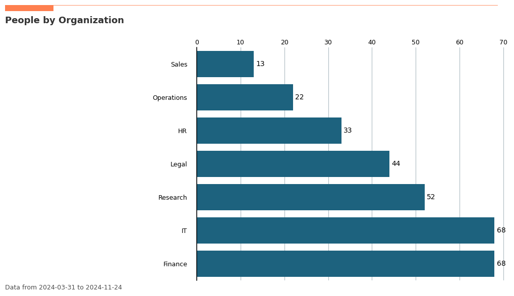
[149]:
vi.hrvar_count(data=pq_data, hrvar='Organization', return_type='table')
[149]:
| Organization | n | |
|---|---|---|
| 0 | Finance | 68 |
| 2 | IT | 68 |
| 5 | Research | 52 |
| 3 | Legal | 44 |
| 1 | HR | 33 |
| 4 | Operations | 22 |
| 6 | Sales | 13 |
Additional Examples
Below are additional examples using the demo dataset pq_data for some of the newer functions in vivainsights.
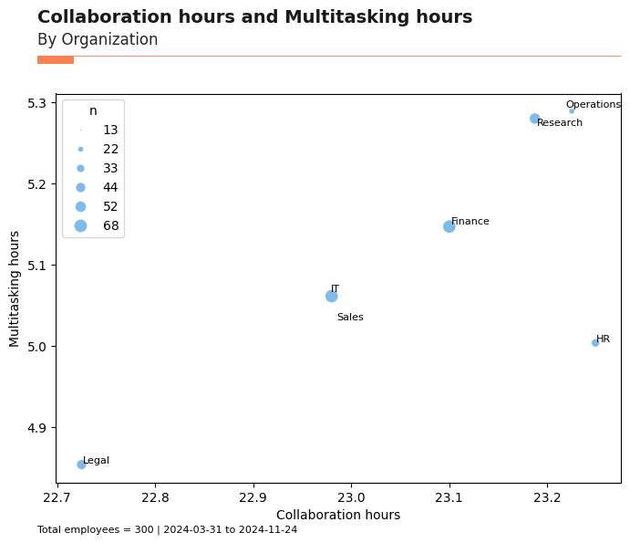
Bubble Plot: create_bubble()
The create_bubble() function visualizes the relationship between two metrics, with bubble size representing group size. This is useful for comparing two metrics across organizational groups.
[150]:
# Bubble plot: Collaboration_hours vs. Multitasking_hours by Organization
bubble_plot = vi.create_bubble(
    data=pq_data,
    metric_x="Collaboration_hours",
    metric_y="Multitasking_hours",
    hrvar="Organization",
    mingroup=5,
    return_type="plot"
)
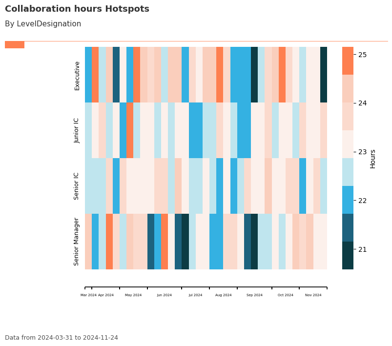
Trend Plot: create_trend()
The create_trend() function provides a week-by-week heatmap view of a selected metric, grouped by an HR attribute. This helps identify trends and hotspots over time.
[151]:
# Trend plot: Collaboration_hours by LevelDesignation
trend_plot = vi.create_trend(
    data=pq_data,
    metric="Collaboration_hours",
    hrvar="LevelDesignation",
    mingroup=5,
    return_type="plot"
)
Key Metrics Scan: keymetrics_scan()
The keymetrics_scan() function summarizes multiple key metrics across a grouping variable, returning either a heatmap or a summary table. This is useful for a high-level scan of organizational health.
[152]:
# Key metrics scan: heatmap by Organization
keymetrics_plot = vi.keymetrics_scan(
    data=pq_data,
    hrvar="Organization",
    mingroup=5,
    return_type="plot"
)
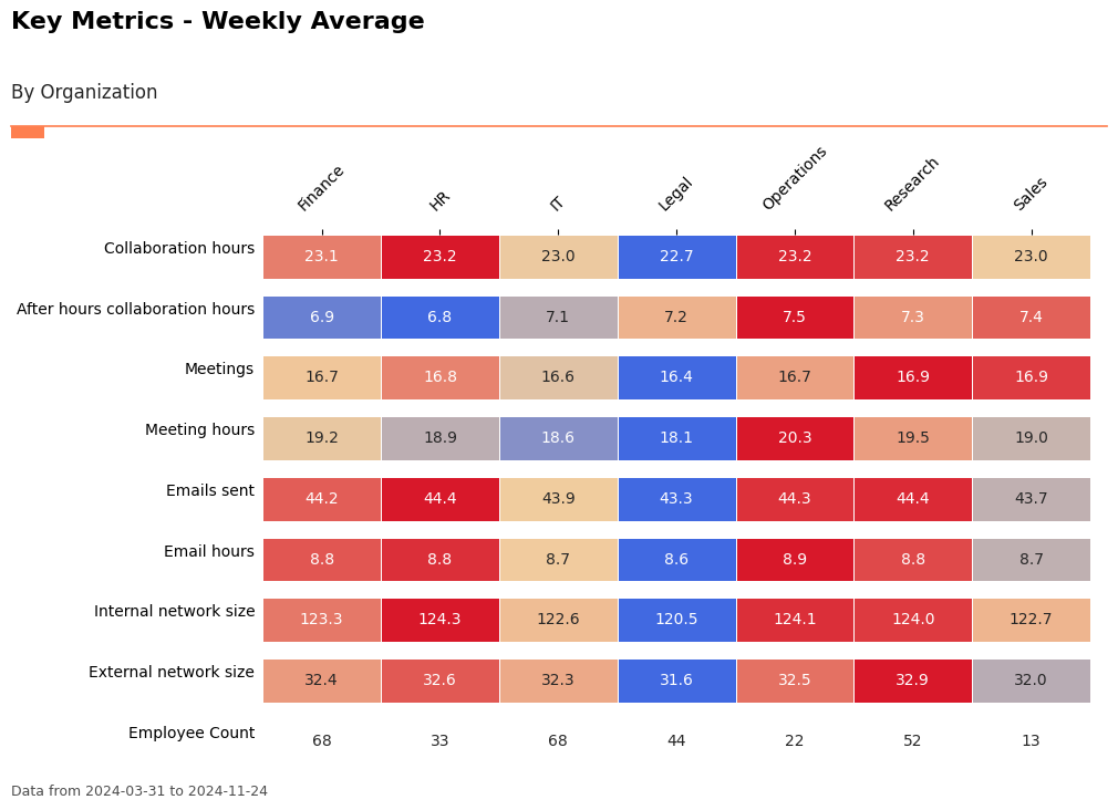
[153]:
# Key metrics scan: summary table by Organization
keymetrics_table = vi.keymetrics_scan(
    data=pq_data,
    hrvar="Organization",
    mingroup=5,
    return_type="table"
)
keymetrics_table.head()
[153]:
| Organization | Collaboration_hours | After_hours_collaboration_hours | Meetings | Meeting_hours | Emails_sent | Email_hours | Internal_network_size | External_network_size | Employee_Count | |
|---|---|---|---|---|---|---|---|---|---|---|
| 0 | Finance | 23.100312 | 6.917373 | 16.652941 | 19.172045 | 44.213445 | 8.818406 | 123.316807 | 32.385294 | 68 |
| 1 | HR | 23.249373 | 6.834921 | 16.757576 | 18.894323 | 44.423377 | 8.843827 | 124.337662 | 32.619913 | 33 |
| 2 | IT | 22.980218 | 7.079035 | 16.614569 | 18.561649 | 43.871867 | 8.743025 | 122.583193 | 32.331092 | 68 |
| 3 | Legal | 22.725075 | 7.239442 | 16.357143 | 18.121719 | 43.328571 | 8.627604 | 120.527922 | 31.561688 | 44 |
| 4 | Operations | 23.225234 | 7.540438 | 16.711688 | 20.339809 | 44.345455 | 8.858412 | 124.092208 | 32.531169 | 22 |
Network Analysis & Flow Visualization
vivainsights includes powerful functions for analyzing collaboration networks and visualizing flows between organizational groups.
Sankey Diagrams: Visualizing Organizational Flows
The create_sankey() function creates flow diagrams that show how people are distributed across different organizational attributes. This is particularly useful for understanding organizational structure and identifying potential silos.
[154]:
# First, create a summary table for the Sankey diagram
# Sankey diagrams need aggregated data showing flows between two variables
sankey_data = pq_data.groupby(['Organization', 'LevelDesignation'])['PersonId'].nunique().reset_index(name='n')

# Create Sankey diagram showing flow from Organization to Level
sankey_plot = vi.create_sankey(
    data=sankey_data,
    var1='Organization',  # Left side of diagram
    var2='LevelDesignation',  # Right side of diagram
    count='n'  # The flow volume
)
Data type cannot be displayed: application/vnd.plotly.v1+json
Advanced Analytics
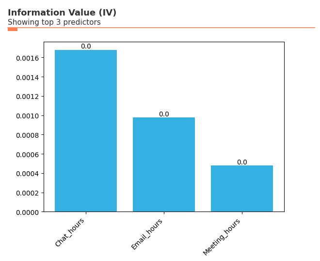
Information Value Analysis: Predictive Insights
The create_IV() function helps you understand which organizational attributes are most predictive of key outcomes. This is particularly useful for identifying factors that drive engagement, performance, or retention.
Information Value (IV) measures the predictive strength of variables:
IV < 0.02: Not useful for prediction
0.02 ≤ IV < 0.1: Weak predictive power
0.1 ≤ IV < 0.3: Medium predictive power
0.3 ≤ IV < 0.5: Strong predictive power
IV ≥ 0.5: Very strong (potentially suspicious)
[13]:
# Information Value analysis: Which factors predict high collaboration?
# First, create a binary outcome variable for high collaboration (>median)
pq_data_iv = vi.load_pq_data()
copilot_median = pq_data_iv['Copilot_actions_taken_in_Teams'].median()
pq_data_iv['High_Copilot'] = (pq_data_iv['Copilot_actions_taken_in_Teams'] > copilot_median).astype(int)

# Define predictor variables
predictors = ['Email_hours', 'Meeting_hours', 'Chat_hours']

# Run Information Value analysis
vi.create_IV(
    data=pq_data_iv,
    predictors=predictors,
    outcome='High_Copilot',
    return_type='plot'
)
Putting It All Together: Analysis Best Practices
The vivainsights package provides a comprehensive toolkit for organizational analytics. Here are some best practices for effective analysis:
1. Start with Exploration
Use
create_rank()andkeymetrics_scan()to get a high-level overviewApply
hrvar_count()to understand your population segmentsCheck data quality with
identify_outlier()and related functions
2. Dive Deep with Distribution Analysis
Use
create_boxplot()to identify outliers and understand spreadApply
create_lorenz()to assess inequality and concentrationLeverage
create_inc()to understand threshold exceedances
3. Understand Relationships
Use
create_bubble()to explore relationships between two metricsApply
create_trend()to identify patterns over timeVisualize organizational flows with
create_sankey()
4. Advanced Insights
Use
create_IV()for predictive analytics and identifying key driversApply network analysis functions for collaboration insights