Adding style using CSS
As we explored in the beginning of the workshop, HTML is used to structure the content of a page. CSS, or Cascading Stylesheets, is used to provide style. CSS is used to set colors and fonts, where on a page information should be displayed, and other decorative items. By keeping HTML and CSS focused on these concerns (sometimes called separation of concerns), you create pages which are easier to modify and maintain, and become more accessible to all users.
Introducing selectors
CSS uses selectors to indicate what to modify. These selectors can be the name of a tag such as h1, an attribute such as class or id - useful for modifying a group of elements or a specific one, respectively - or get really fancy and look at the entire structure of a page to determine what to modify. We’re first going to focus on using tag names as selectors.
When using a tag name for a selector, you use just the name of the tag. Keep in mind, when you indicate the name of a tag, the style applies to all tags.
Note: The word “cascading” for Cascading Stylesheets applies when multiple styles are used for the same element.
Adding style to a page
Let’s start by creating a CSS file to hold our code, so you can add style to the page. Then, you’ll set a couple of properties for the body tag to change the font and size.
- Hover over the name of your repository, resume, in the Explorer pane on the left-hand side of your screen, then select the File with + icon. Name the file style.css.
-
Inside style.css, add the following CSS to choose the font and size
 body {
     font-family: 'Segoe UI', Tahoma, Geneva, Verdana, sans-serif;
     font-size: 12px;
     max-width: 960px;
     margin: auto;
 }
Notice font-family, which is used to select the font. There are five fonts listed. Because users may not have a particular font installed, CSS offers the ability to fallback to the next font. In this case you’re telling the browser to try Segoe UI first, then Tahoma if that’s not installed, and so on.
There are also a few more rules that apply to everything in the body tag, which is the whole page:
font-size- sets the size of the font to 12 pixelsmax-width- sets a maximum width for your resume so that it doesn’t look strange on huge screens. 960 pixels is a common width for many websites.margin- sets the margin to auto. When combined with themax-widthproperty, this centers the content on the screen horizontally.
Sizing
CSS offers different ways to indicate sizes. In the example above, you used 12px. px stands for pixels, and is an absolute sizing - it will always be 12 pixels regardless of the screen used. The problem with using absolute sizing is modifications to the size require updates to multiple styles. By using relative sizing, you use a single base; updates to the base then update the rest of the page.
For our example we’ll use em. em indicates the size of the font at the root element - body in our example. em is a 1 based value, where 1em is the size of the root element, 1.5em is one and a half times the size, and .25em is one quarter the size.
Let’s set the size for our three different header elements.
-
At the bottom of style.css, add the following…
h1 { font-size: 3em; letter-spacing: .6em; padding-top: 1em; padding-bottom: 1em; } h2 { font-size: 1.5em; padding-bottom: 1em; } h3 { font-size: 1em; padding-bottom: 1em; } -
The page updates with the new sizes.
Notice that we can not only set the text size, but we can change the spacing in between letters with the letter-spacing property. We can add padding to an element with the padding property. All of these properties support the em relative sizing.
Creating a grid
CSS grids are a relatively new feature. Like the name implies, a grid allows you to place elements on a page much in the same way you might lay things out in a table. You can use grids to create columns and rows for your data.
Note: For accessibility purposes, you should avoid using a table to layout a page unless you are displaying tabular data.
Let’s review the structure of your page:
```html
<main>
    <article>
        Contact info
    </article>
    <article>
        About you & experience
    </article>
</main>
```
We want to create two columns, one for the first article with your contact info, skills, and education, and the second article with your work experience. Notice how both article elements are contained inside of a single main element. We will use the main element as the container for our grid. We will configure main to host the grid, and configure two column templates - one for each article.
```css
    main {
        display: grid;
        grid-template-columns: 40% 60%;
        margin-top: 3em;
    }
```
This will split the main element into two columns. The first top-level element under main which is an article will be the first column and will take up 40% of the available space. The second top-level element under main (also an article) will take up the remaining 60%.
Controlling spacing with the box model
CSS uses what’s known as the box model. The box model controls how information is displayed inside an element, and how close to one another elements are placed. There are 3 key properties - margin, border, and padding. The diagram below indicates how these control content placement.
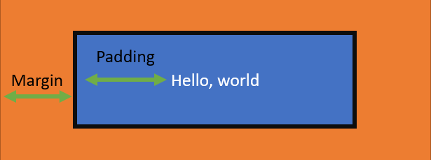
In this diagram the content is the text Hello, world. padding is the space between the text and the black border. And margin is the space between the border and the next element.
Add the remaining style rules to add some padding around the elements on your page:
```css
header {
    text-align: center;
    margin: auto 2em;
}

section {
    margin: auto 1em 4em 2em;
}

i {
    margin-right: .5em;
}

p {
    margin: .2em auto
}

hr {
    border: none;
    background-color: lightgray;
    height: 1px;
}

h1, h2, h3 {
    font-weight: 100;
    margin-bottom: 0;
}
```
- We’re centering the text in the
headerelement and adding a 2em margin to the left and the right so that the lines from thehrdon’t go all the way to the edge, but have a little padding. - The
sectionelement is given some margin so that each section (ABOUT, CONTACT, SKILLS) has spacing around it. Thepelement is also given some margin. - The
ielement is given some spacing on the right. These are the icons that we will be adding next. - The
hrelement is turned into a thinner gray line by removing its border and providing a background color and height. - We reduce the
font-weightor “thickness” of the font of our header tags so that they aren’t so blocky.
Note: Notice how we were able to modify multiple elements by listing them with commas:
h1, h2, h3. Also,margin-topandmargin-bottomsets the margin for the top and bottom respectively. You could also usemargin-leftandmargin-rightto set those values, or provide them all by just usingmargin.
Selecting an element by ID
Sometimes, you want to style a specific element on a page. For instance, we want to add a thin gray line between our two columns. We can do that by adding a right border to the left column, but both columns are article elements. How do we correctly pick the left one?
Notice that each of the article elements has an id property - “mainLeft” and “mainRight”. We can select these elements by their ID in the CSS and style them. So, to add a border to just the left column, add this final rule to your stylesheet:
```css
#mainLeft {
    border-right: 1px solid lightgray;
}
```
Your resume should look much better now. However, you’re still missing some icons in the CONTACT section. For that, we’ll need to add an icon font.
Add an icon font
An icon font is a font that contains symbols and glyphs instead of letters and numbers. In other words, it’s a font that contains icons! There are many open source/free icon fonts you can use, and one of the most popuplar is called “Font Awesome”. That’s the one we’ll add to our page.
-
In the index.html file, add the following line to the
headelement…<link rel="stylesheet" href="https://cdnjs.cloudflare.com/ajax/libs/font-awesome/5.15.4/css/all.min.css"> -
This will load the Font Awesome icon font. You should now see some nifty icons next to your CONTACT data.
Summary and next steps
You have successfully added style to your resume using CSS. You learned how to use selectors, sizing, grids, spacing, and icon fonts to make your resume stand out!
To complete your resume, you’ll learn how to host it on a website.