Pages, Components and Templates
The FMC Framework relies on three main concepts to arrange different pages and units of information laid out on those pages.
Page
A page is a singular view which can be displayed on a CDU screen. All cases studied in the development on this framework can only render one page at a time, with most unusual examples optionally rendering overlays on a single page.
In the FMC Framework, a page is represented by a single JavaScript class extending an implementation-specific class (which itself extends AbstractFmcPage).
This class takes care of:
- rendering content;
- (optionally) handling events such as button presses;
- managing any components present on the page;
- managing the lifecycle of any
Subscriptionsthe page relies on; - connecting to any external components which provide data for the page.
For one given page in a single FMC Screen, only one instance of the page class associated with it exists at any given time. It is possible to tweak when those instances are created - see the Page Lifecycle documentation.
Component
A component is an object which handles both rendering and processing of relevant events, in the context of a distinct piece of a page UI, according to a particular set of developer-defined logic. They allow moving the rendering and event handling logic from the page-level to a more individual level.
Using components has two main advantages:
- it allows isolating different parts of a page's contents from each-other, both in rendering and handling of user interaction;
- it provides a powerful framework for encapsulating and re-using behavior across multiple parts of the FMC Screen.
Additionally, some component classes provided in the SDK provide built-in data binding facilities that allow both binding the data the component is rendering, and potentially transforming user input into new values for bound data. The two-way aspect of this data binding system is very highly customisable, allows for very easy ejection from default behavior and has been successfully used to build extremely demanding CDU UIs in Microsoft Flight Simulator.
When rendering highly dynamic UIs with challenging layout requirements, the usage of components can be more difficult. As there is currently no way to destroy components (other than via the page being collected by GC), creating them at any other time than when the page is instantiated creates a memory leak.
It is therefore recommended to manually render templates (see the section below) when the complexity of a UI exceeds what components are designed for. However, it is still possible to develop most commonly present CDU UIs using components.
Types of components natively supported by the FMC Framework
- Display fields - these components allow rendering a value, with no user inputs handled by default.
- Editable fields - these components allow both rendering a value and changing its state using user inputs.
- Text input fields - these components extend editable fields and provide parsing of text typed in by the user.
Template
A template is the output of the render() method of an FMC page class. The template output dictates the layout of characters on a page, all fitted to lay on the CDU screen grid.
Template processing in the FMC Framework includes utilities and shortcuts that make creating page UIs easier.
Here is an example of a real page, and how a template would be written for it.
[
  // The root array of the template contains all the grid rows in the page.
  ["MENU"], // Each row can contain varying columns. See the section below.
  [""],
  ["<PAGE A", "PAGE B>"],
  [""],
  ["<PAGE C", "PAGE D>"],
  [""], // v-- Each column can be one of three types of values. See the section below.
  ["<PAGE E", this.Component],
];
Template rows
A template row is a row that will eventually be placed on the character grid. It can contain a varying number of columns, depending on the type of layout you choose to use:
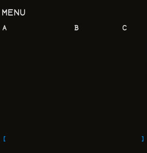
Positioned columns
Positioned columns specify their content, column index (along the grid row) and alignment:
/** A positionable FMC column. */
export type PositionedFmcColumn = [
  /** The content, either a string or an FmcComponent. */
  content: string | FmcComponent,
  /** The (zero-indexed) index on which the first character is placed (or the last, if right-aligned). */
  columnIndex: number,
  /** If 'left', the text will continue to the right of the `columnIndex`.
   * If 'right', the text will continue to the left of the `columnIndex`. */
  alignment?: "left" | "right"
];
[
  ["MENU"],
  // ...
  [
    ["A", 0, "right"],
    ["B", 12, "left"],
    ["C", 20, "right"],
  ],
  // ...
];

Left/Right/Center fixed columns
If plain columns without positioning are specified, you can list up to 3 values. Those are then automatically aligned, in order, to the left, right and center of the row.
[
  ["MENU"],
  // ...
  ["A", "B", "C"],
  // ...
];
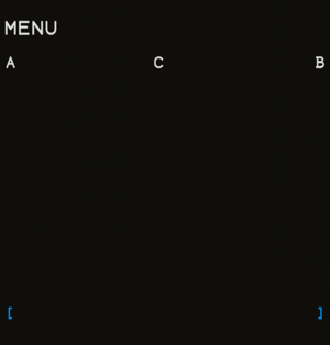
It is not recommended to use the center alignment (third column) when not specifying positions. It is imprecise in nature and is only present for legacy reasons.
A mix of both
You can mix the two layouts, but you must specify every positioned column last.
[
  ["MENU"],
  // ...
  ["A", ["B", 12, "left"], ["C", 20, "right"]], // Valid
  [["A", 0, "right"], "B", ["C", 20, "right"]], // Invalid
  // ...
];
Template columns
Template columns (individual elements in each row array) can be one of three values:
- a raw string value, which renders the literal contents of the string (with style tags taken into account);
- an instance of a component;
- a positioned column (see Positioned columns) containing both a column index and one of the two values above.
Template sub pages
A page can also contain sub pages. Where you wish to define a subpage, you can do this by creating another sub-array within the FmcTemplate. This would look similar to the below template:
[
  // Page 1
  [
    ["PAGE 1"],
    ["A", "B", "C"]
  ],
  // Page 2
  [
    ["PAGE 2"],
    ["D", "E", "F"]
  ],
];
Subpages should only be used for pages which are accessed through scrolling. When the screen receives a scrolling event, it will automatically move to the next/last subpage.