Native UI Layout
SUMMARY
For the HTML in your app, you use the same HTML/CSS layout mechanisms as you’ve always used. However, this topic discusses how you apply layout to native controls. The two main concepts are layout panels and layout properties. Layout PanelsThere are currently three cross-platform panels available:
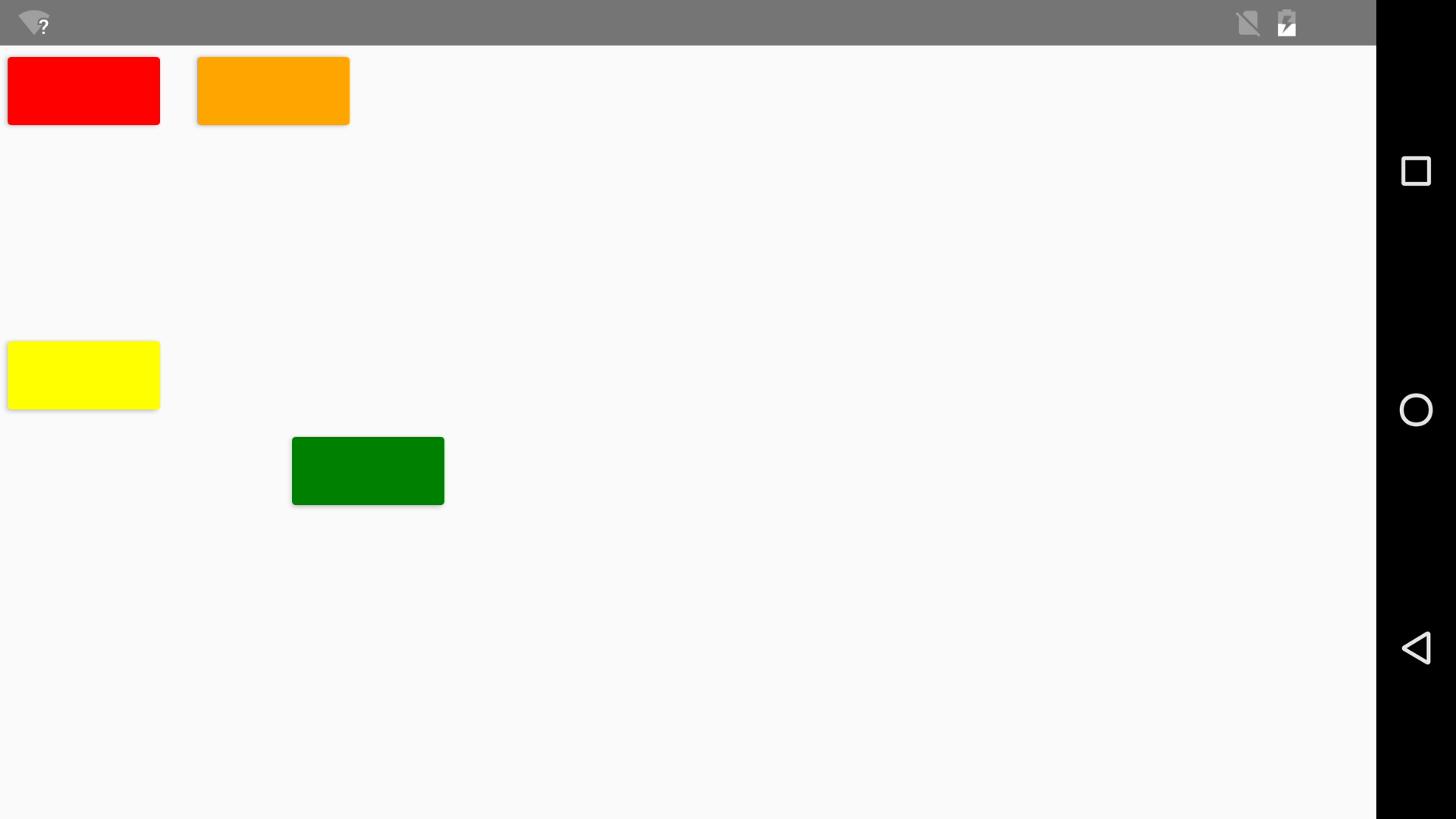
CanvasIn a Canvas, you position children with explicit Left and/or Top coordinates. Each child renders at its natural size by default. In XAML, you set these coordinates as “attached properties,” e.g.:
<Canvas>
    <!-- The default position is 0,0: -->
    <Button                                    Background="Red"    />
    <Button Canvas.Left="100"                  Background="Orange" />
    <Button                   Canvas.Top="150" Background="Yellow" />
    <Button Canvas.Left="150" Canvas.Top="200" Background="Green"  />
</Canvas>
In JavaScript, you set the coordinates via static methods on Canvas to get the same results:
var canvas = new ace.Canvas();

var b1 = new ace.Button();
b1.setBackground("Red");
canvas.getChildren().add(b1);

var b2 = new ace.Button();
b2.setBackground("Orange");
ace.Canvas.setLeft(b2, 100);
canvas.getChildren().add(b2);

var b3 = new ace.Button();
b3.setBackground("Yellow");
ace.Canvas.setTop(b3, 150);
canvas.getChildren().add(b3);

var b4 = new ace.Button();
b4.setBackground("Green");
ace.Canvas.setLeft(b4, 150);
ace.Canvas.setTop(b4, 200);
canvas.getChildren().add(b4);

// Navigate to this Canvas
ace.navigate(canvas);
Here is the result of using either approach, shown on iOS:
And here it is on Android:
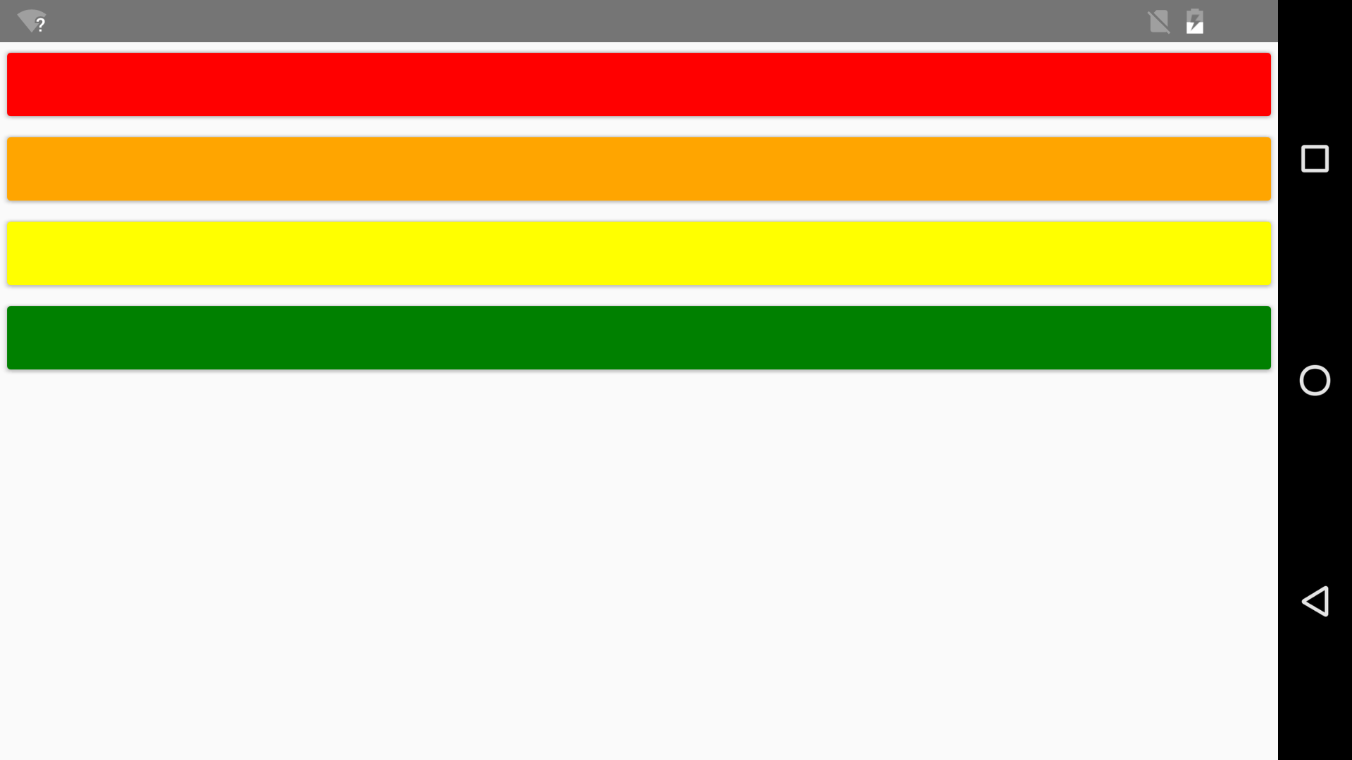
The different default Button size on each platform makes the results look a bit different from each other, but you could always explicitly set each Button’s Width and Height properties if the exact sizes matter. StackPanelStackPanel doesn’t provide any attached properties for controlling the layout of its children. You just add children, and they get stacked (vertically by default). You can set StackPanel’s Orientation property to either “vertical” or “horizontal”. By default, children are given their natural size in the direction of stacking, and they are stretched to fill the perpendicular direction. You can change this with the HorizontalAlignment/VerticalAlignment properties discussed later in this topic. Here’s a simple vertical StackPanel defined in XAML:
<StackPanel>
    <Button Background="Red"    />
    <Button Background="Orange" />
    <Button Background="Yellow" />
    <Button Background="Green"  />
</StackPanel>
And here it is defined in JavaScript:
var stackPanel = new ace.StackPanel();

var b1 = new ace.Button();
b1.setBackground("Red");
stackPanel.getChildren().add(b1);

var b2 = new ace.Button();
b2.setBackground("Orange");
stackPanel.getChildren().add(b2);

var b3 = new ace.Button();
b3.setBackground("Yellow");
stackPanel.getChildren().add(b3);

var b4 = new ace.Button();
b4.setBackground("Green");
stackPanel.getChildren().add(b4);

// Navigate to this StackPanel
ace.navigate(stackPanel);
Vertical StackPanel (Android)
Vertical StackPanel (iOS)
(Unlike on iOS, Android buttons render with a small amount of built-in margin, rounded corners, and a shadow.) To make it stack horizontally, add the following property in XAML:
<StackPanel Orientation="Horizontal">
    <Button Background="Red"    />
    <Button Background="Orange" />
    <Button Background="Yellow" />
    <Button Background="Green"  />
</StackPanel>
or in JavaScript:
var stackPanel = new ace.StackPanel();
stackPanel.setOrientation("Horizontal");
...
Horizontal StackPanel (Android)
Horizontal StackPanel (iOS)
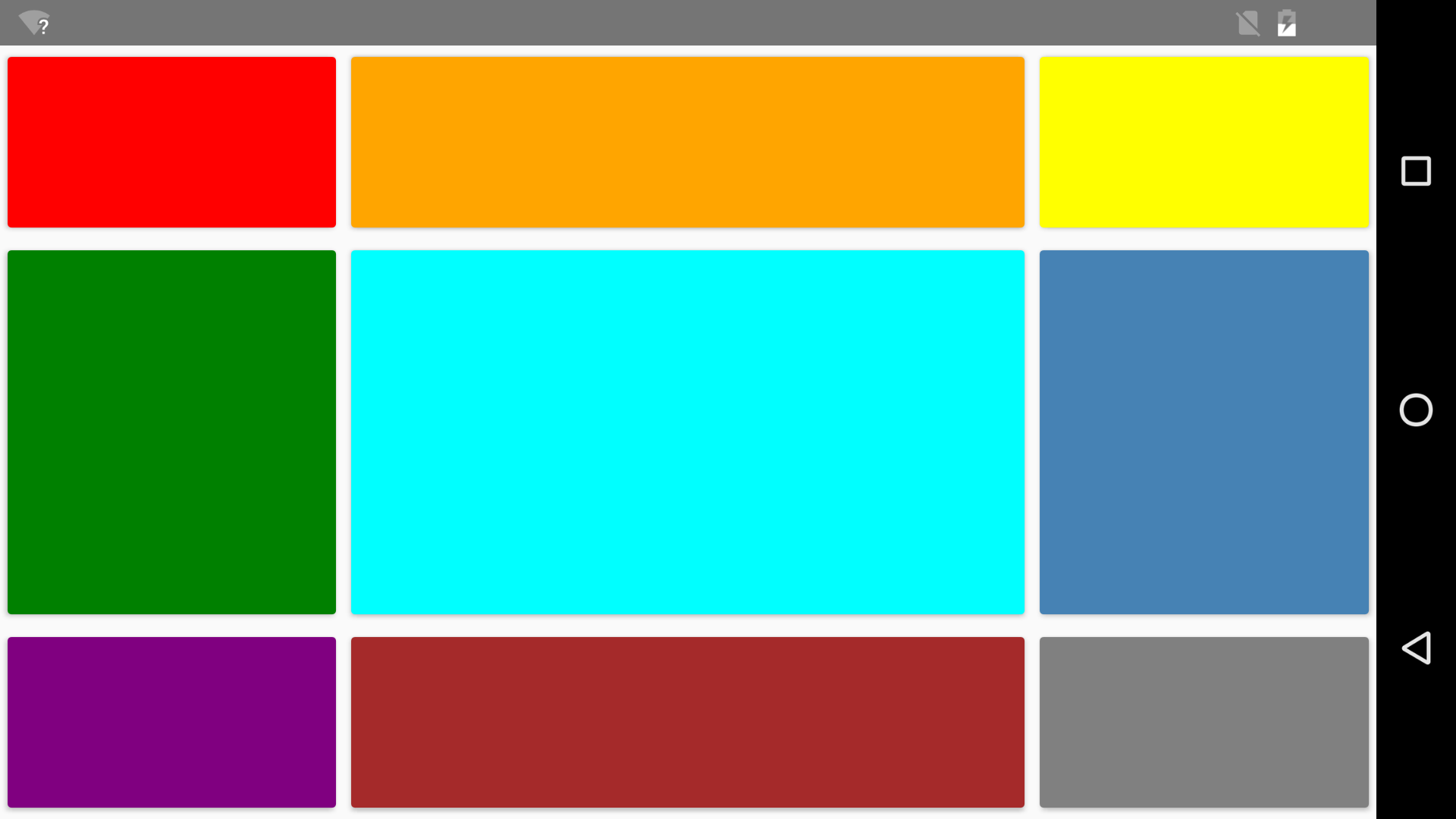
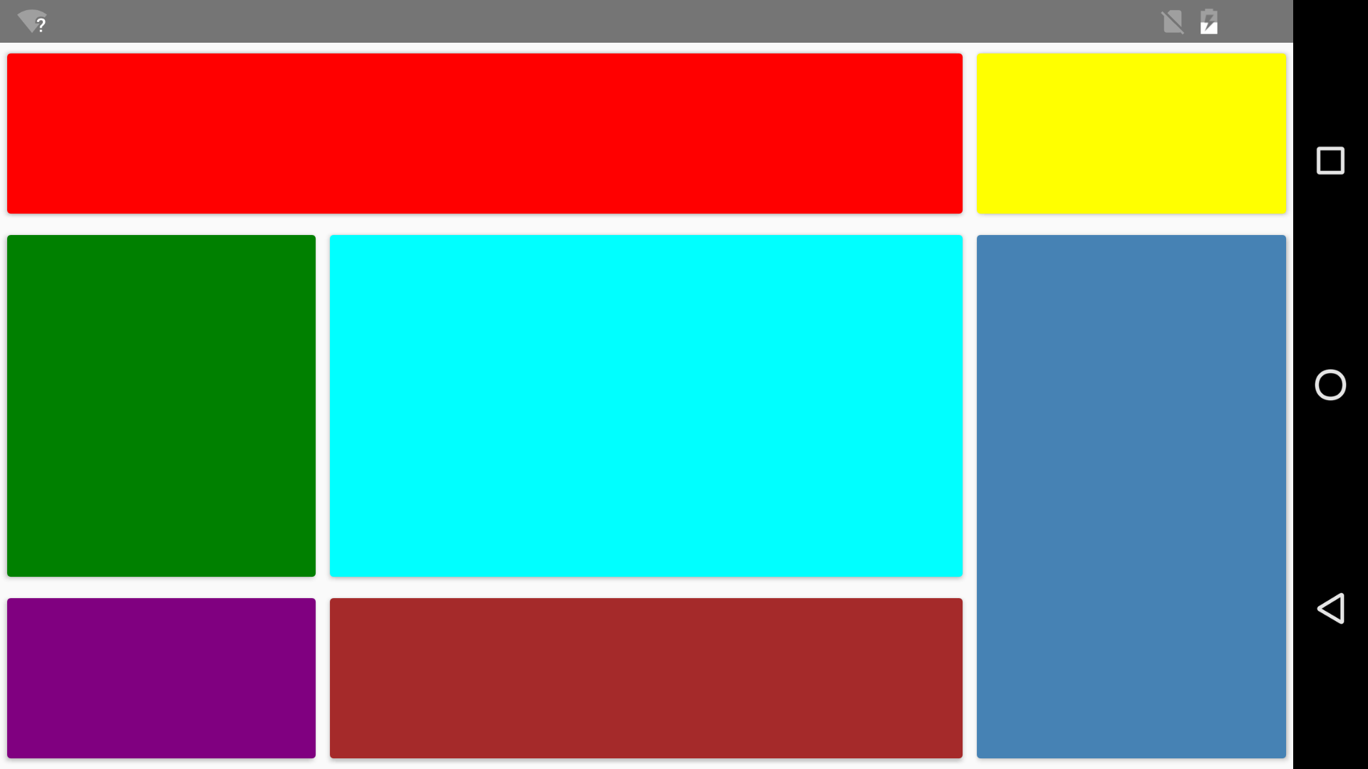
GridGrid enables you to define rows and columns, then place each child in specific rows/columns. There are many options for configuring how rows and columns are sized. They can be auto-sized, given explicit sizes, or given proportional sizes. For now, you can find more documentation about this toward the bottom of this page. Here’s an example that uses a Grid in XAML:
<Grid>
    <!-- Define a 3x3 grid with a center cell twice the size -->
    <Grid.RowDefinitions>
        <RowDefinition />
        <RowDefinition Height="2*" />
        <RowDefinition />
    </Grid.RowDefinitions>
    <Grid.ColumnDefinitions>
        <ColumnDefinition />
        <ColumnDefinition Width="2*" />
        <ColumnDefinition />
    </Grid.ColumnDefinitions>

    <!-- Row 0 -->
    <Button                                     Background="Red"       />
    <Button                     Grid.Column="1" Background="Orange"    />
    <Button                     Grid.Column="2" Background="Yellow"    />
    <!-- Row 1 -->
    <Button        Grid.Row="1"                 Background="Green"     />
    <Button        Grid.Row="1" Grid.Column="1" Background="Aqua"      />
    <Button        Grid.Row="1" Grid.Column="2" Background="SteelBlue" />
    <!-- Row 2 -->
    <Button        Grid.Row="2"                 Background="Purple"    />
    <Button        Grid.Row="2" Grid.Column="1" Background="Brown"     />
    <Button        Grid.Row="2" Grid.Column="2" Background="Gray"      />
</Grid>
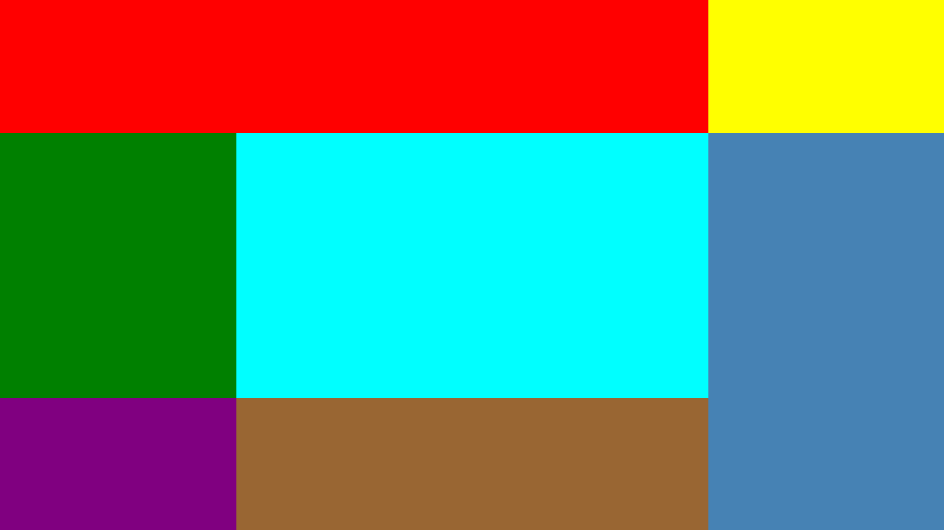
If you navigate to this markup file, you get the following result, which stretches to fill the screen regardless of size/orientation: Simple Grid (Android)
Simple Grid (iOS)
Here’s the same example purely in JavaScript, which produces the identical result with no markup involved:
var grid = new ace.Grid();

grid.getRowDefinitions().add(new ace.RowDefinition());
grid.getRowDefinitions().add(new ace.RowDefinition("2*"));
grid.getRowDefinitions().add(new ace.RowDefinition());

grid.getColumnDefinitions().add(new ace.ColumnDefinition());
grid.getColumnDefinitions().add(new ace.ColumnDefinition("2*"));
grid.getColumnDefinitions().add(new ace.ColumnDefinition());

var b1 = new ace.Button();
b1.setBackground("Red");
grid.getChildren().add(b1);

var b2 = new ace.Button();
ace.Grid.setColumn(b2, 1);
b2.setBackground("Orange");
grid.getChildren().add(b2);

var b3 = new ace.Button();
ace.Grid.setColumn(b3, 2);
b3.setBackground("Yellow");
grid.getChildren().add(b3);

var b4 = new ace.Button();
ace.Grid.setRow(b4, 1);
b4.setBackground("Green");
grid.getChildren().add(b4);

var b5 = new ace.Button();
ace.Grid.setRow(b5, 1);
ace.Grid.setColumn(b5, 1);
b5.setBackground("Aqua");
grid.getChildren().add(b5);

var b6 = new ace.Button();
ace.Grid.setRow(b6, 1);
ace.Grid.setColumn(b6, 2);
b6.setBackground("SteelBlue");
grid.getChildren().add(b6);

var b7 = new ace.Button();
ace.Grid.setRow(b7, 2);
b7.setBackground("Purple");
grid.getChildren().add(b7);

var b8 = new ace.Button();
ace.Grid.setRow(b8, 2);
ace.Grid.setColumn(b8, 1);
b8.setBackground("Brown");
grid.getChildren().add(b8);

var b9 = new ace.Button();
ace.Grid.setRow(b9, 2);
ace.Grid.setColumn(b9, 2);
b9.setBackground("Gray");
grid.getChildren().add(b9);

// Navigate to the Grid
ace.navigate(grid);
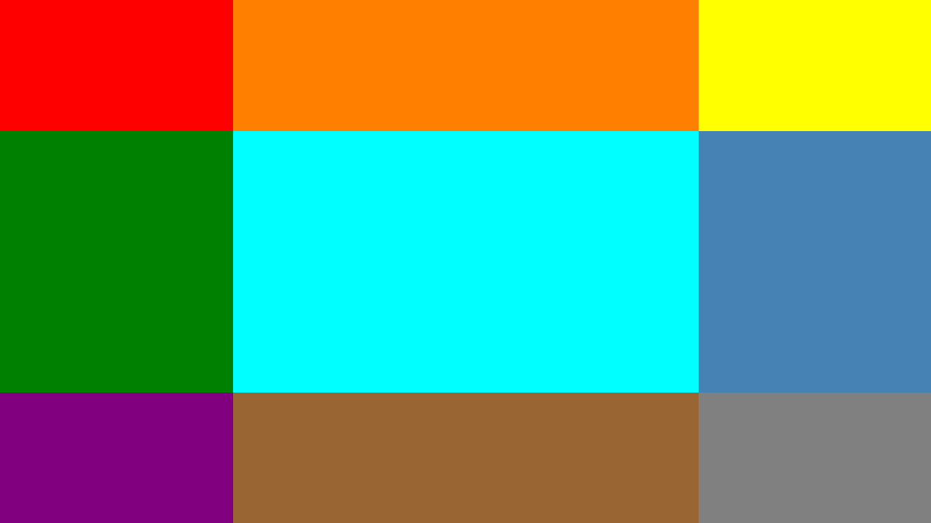
Children can span multiple rows/columns with the Grid.RowSpan and Grid.ColumnSpan properties, whose default value is 1. The following Grid produces the result below:
<Grid>
    <!-- Define a 3x3 grid with a center cell twice the size -->
    <Grid.RowDefinitions>
        <RowDefinition />
        <RowDefinition Height="2*" />
        <RowDefinition />
    </Grid.RowDefinitions>
    <Grid.ColumnDefinitions>
        <ColumnDefinition />
        <ColumnDefinition Width="2*" />
        <ColumnDefinition />
    </Grid.ColumnDefinitions>

    <!-- Row 0 -->
    <Button        Grid.ColumnSpan="2"                              Background="Red"       />
    <Button                                         Grid.Column="2" Background="Yellow"    />
    <!-- Row 1 -->
    <Button                            Grid.Row="1"                 Background="Green"     />
    <Button                            Grid.Row="1" Grid.Column="1" Background="Aqua"      />
    <Button        Grid.RowSpan="2"    Grid.Row="1" Grid.Column="2" Background="SteelBlue" />
    <!-- Row 2 -->
    <Button                            Grid.Row="2"                 Background="Purple"    />
    <Button                            Grid.Row="2" Grid.Column="1" Background="Brown"     />
</Grid>
Grid with RowSpan, ColumnSpan (Android)
Grid with RowSpan, ColumnSpan (iOS)
In JavaScript, you can set these properties as follows: ... ace.Grid.setColumnSpan(b1, 2); ... ace.Grid.setRowSpan(b6, 2); ... Layout PropertiesBesides panel-specific properties that can be attached to any UI object (like Canvas.Top or Grid.Row), all UI objects can be marked with properties that affect layout, such as Margin. Here’s a description of each one: MarginCan be set to a “thickness” value, which is one, two, or four comma-delimited numbers. For example:
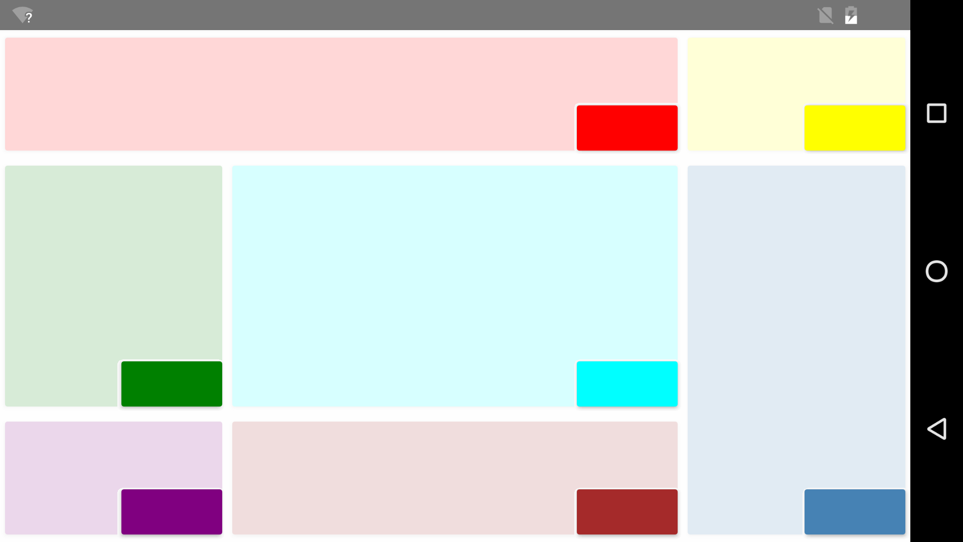
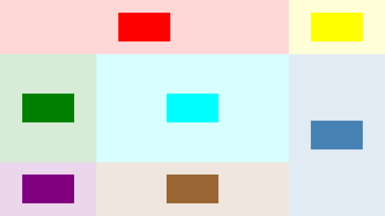
PaddingPadding is an “inner margin” that is only supported on specific controls, such as Button. The Grid and StackPanel layout panels also support padding. Padding can be set to a “thickness” value, just like with Margin. Width and HeightAll UI elements can be given explicit widths and heights, which override their natural size. HorizontalAlignment and VerticalAlignmentIf a layout panel gives a child element more space than it needs, you can use these properties to customize how the child element fills that space. HorizontalAlignment can be set to Left, Right, Center, or Stretch VerticalAlignment can be set to Top, Bottom, Center, or Stretch In a Grid, each element is stretched both horizontally and vertically by default in order to fill the “cell” given to it. The image below demonstrates what happens if each Button in the earlier Grid example (the one leveraging RowSpan and ColumnSpan) is marked with either the following in XAML: <Button ... HorizontalAlignment="Right" VerticalAlignment="Bottom" /> or the following in JavaScript:
...
b1.setHorizontalAlignment("Right");
b1.setVerticalAlignment("Bottom");
...
Examples are also given with values of “Left” and “Top” as well as “Center” and “Center”. The original Button layout is shown faded in the background just to make the cell sizes more obvious. In reality, the smaller buttons, now given their natural non-stretched size, are on top of a plain white background. HorizontalAlignment=Right, VerticalAlignment=Bottom (Android)
HorizontalAlignment=Left, VerticalAlignment=Top (Android)
HorizontalAlignment=Center, VerticalAlignment=Center (iOS)
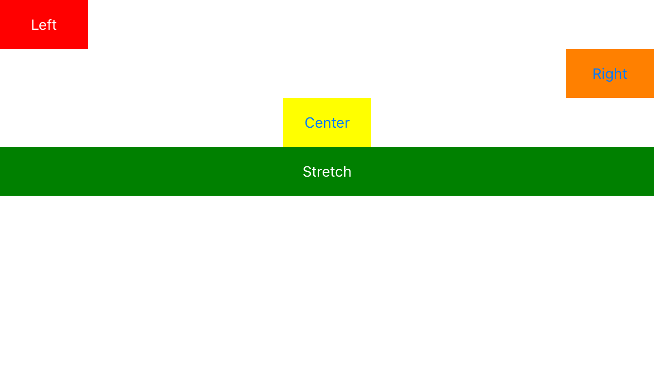
In a StackPanel, alignment only has an impact in the direction that is perpendicular to stacking, because children are given the exact amount of space they need in the direction of stacking. No more, no less. Here’s an example that uses different values of HorizontalAlignment in a vertical StackPanel:
<StackPanel>
    <Button HorizontalAlignment="Left"    Foreground="White" Background="Red" />
    <Button HorizontalAlignment="Right"   Background="Orange" />
    <Button HorizontalAlignment="Center"  Background="Yellow" />
    <Button HorizontalAlignment="Stretch" Foreground="White" Background="Green" />
</StackPanel>
HorizontalAlignment in a Vertical StackPanel (iOS)
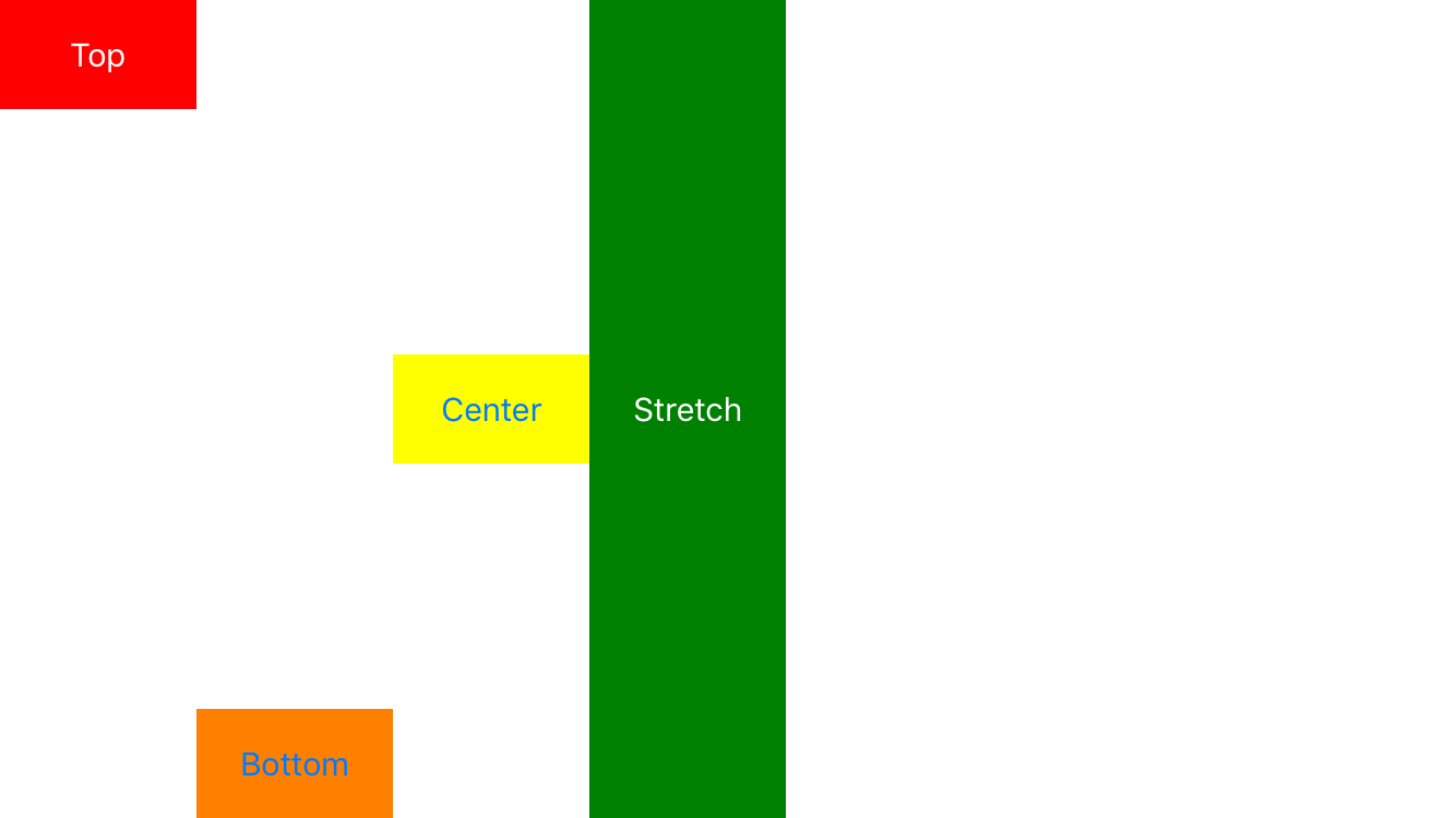
And here’s an example that uses different values of VerticalAlignment in a horizontal StackPanel:
<StackPanel Orientation="Horizontal">
    <Button VerticalAlignment="Top"     Foreground="White" Background="Red" />
    <Button VerticalAlignment="Bottom"  Background="Orange" />
    <Button VerticalAlignment="Center"  Background="Yellow" />
    <Button VerticalAlignment="Stretch" Foreground="White" Background="Green" />
</StackPanel>
VerticalAlignment in a Horizontal StackPanel (iOS)
HorizontalContentAlignment and VerticalContentAlignmentThese two properties can be set on some controls, such as TextBlock and Button, to control the alignment of its inner content. They accept the same values as HorizontalAlignment and VerticalAlignment. |