G3X Touch panel.xml Engine Gauges
Introduction
The G3X Touch allows you to define and configure the display of various types of gauges that display engine-related information via panel.xml. The goal is to allow airplane developers to build airplane-specific EIS and MFD engine page content without needing to directly write Typescript or HTML code.
The rest of this page describes the tags used to define and lay out engine gauges. For information on where to use these tags in panel.xml and for more general information on how configure the EIS and MFD engine page via panel.xml, please refer to the G3X Touch Engine Display page.
Layout Elements
The layout of gauges can be controlled using the <Row> and <Column> tags.
Rows
The <Row> tag defines a row. A row by default takes up 100% of its parent container's width. The height of a row and its margins can be configured using the <Style> tag. A row can only contain columns as direct children. Any direct children of a row that are not <Column> tags will be ignored.
The following is an example of how to define a row:
<Row>
  <!-- Set height to 100px and top margin to 10px. -->
  <Style>
    <Height>100px</Height>
    <Margins>
      <Top>10px</Top>
    </Margins>
  </Style>

  <!-- The row has three columns -->
  <Column></Column>
  <Column></Column>
  <Column></Column>
</Row>
Columns within a row that do not have explicit widths defined (via the <Style> tag) share any remaining width in the row equally amongst themselves according to the flex-grow mechanic.
Columns
The <Column> tag defines a column. A column by default takes up 100% of its parent container's height. Items in a column are stacked vertically and arranged according to flex-box rules. The width of a row, its margins, and its justify-content style property can be configured using the <Style> tag. Columns can contain rows and gauges as direct children.
The following is an example of how to define a row:
<Column>
  <!-- Set width to 100px, right margin to 10px, and justify-content to space-around. -->
  <Style>
    <Width>100px</Width>
    <Margins>
      <Right>10px</Right>
    </Margins>
    <JustifyContent>space-around</JustifyContent>
  </Style>

  <!-- Content -->
</Column>
Gauges
The G3X Touch offers a suite of common gauges that can be configured in panel.xml. These gauges are rendered to look and function like gauges that can be displayed on the real G3X Touch.
Not all gauges that appear in the real unit may be supported by the G3X Touch package. If your airplane requires a gauge that cannot be configured in panel.xml, then you may wish to consider using plugins to render the EIS and/or engine page.
Every gauge is defined using the <Gauge> tag. The <Type> child tag defines the gauge's type:
<!-- Defines a circular gauge -->
<Gauge>
  <Type>Circular</Type>
</Gauge>
Common Gauge Options
All gauges share the following common options. Option tags should be placed directly underneath the tag of the corresponding gauge:
<Gauge>
  <Title>RPM</Title>
  <Value>
    <Simvar name="GENERAL ENG RPM:1" unit="rpm"/>
  </Value>
  <Minimum>100</Minimum>
  <Maximum>3000</Maximum>
</Gauge>
| Tag | Description |
|---|---|
<Style> | Styling options to apply to the gauge. |
<Title> | The title of the gauge. The title will typically be displayed somewhere on the gauge. The exact position and formatting of the title depends on the gauge type. |
<Unit> | The text to display as the gauge's measurement unit. The unit text, if defined, will be appended to the end of the gauge's title. |
<ID> | The identifier to write to the data-checklist attribute of the gauge's root element. This allows the gauge to be selected and highlighted using the sim's checklist highlighting system. |
<Value> | The gauge's primary numerical value, as a logic element. |
<Value2> | The gauge's secondary value, as a logic element. May not be used by all gauge types. |
<Value3> | The gauge's tertiary value, as a logic element. May not be used by all gauge types. |
<Value4> | The gauge's quaternary value, as a logic element. May not be used by all gauge types. |
<Minimum> | The minimum value represented on the gauge's primary scale, as a logic element. |
<Maximum> | The maximum value represented on the gauge's primary scale, as a logic element. |
<Minimum2> | The minimum value represented on the gauge's secondary scale, as a logic element. May not be used by all gauge types. |
<Maximum2> | The maximum value represented on the gauge's secondary scale, as a logic element. May not be used by all gauge types. |
<SmoothFactor> | If defined and greater than zero, then all of the gauge's values will be subjected a smoothing filter before they are displayed. At each time step, the filter drives the smoothed value toward the observed value at a constant velocity. The velocity is equal to the value of this tag, in units of inverse milliseconds. |
<RedBlink> | Whether the gauge should flash a warning alert, as a boolean logic element. |
<ColorZone> | Defines a scale range for the gauge's primary scale. |
<ColorLine> | Defines a scale tick mark for the gauge's primary scale. |
<ColorZone2> | Defines a scale range for the gauge's secondary scale. May not be used by all gauge types. |
<ColorLine2> | Defines a scale tick mark for the gauge's secondary scale. May not be used by all gauge types. |
Common Styling Options
All gauges share the following common styling options. These styling options are defined using the <Style> tag. The <Style> tag should be placed directly underneath the tag of the corresponding gauge, and styling option tags should be placed underneath the <Style> tag:
<Gauge>
  <Style>
    <Height>100px</Height>
    <Margins>
      <Top>10px</Top>
    </Margins>
    <TextIncrement>0.1</TextIncrement>
  </Style>
</Gauge>
| Tag | Description |
|---|---|
<Height> | Sets the height of the gauge. Accepts any valid HTML height style property string (e.g. 50px, 50%, calc(100% - 10px), etc.). |
<Margins> | Sets the margins of the gauge. Use the <Top>, <Bottom>, <Left>, and <Right> child tags to define individual margins. The child tags accept any valid HTML margin style property string (e.g. 5px, auto, etc.). |
<SizePercent> | Sets a uniform scaling factor for the gauge, in percent. |
<TextIncrement> | Sets the increment at which any text readout displays the gauge's value. For example, an increment of 0.5 will cause readouts to display values in multiples of 0.5, even if the underlying value is more precise. Defaults to 1. |
<ValuePrecision> | Sets the decimal precision at which any text readout displays the gauge's value, in decimal places. For example, a precision of 1 will cause readouts to display values to 1 decimal place. If not defined, then it will default to the least number of decimal places required to accurately display the value of <TextIncrement>. |
<DisplayPlus> | Sets whether to force any text readouts to display a plus sign (+) for positive values. Defaults to false. |
Individual gauge types may support additional styling options that are specific to those types of gauges. For information on these styling options, please refer to the documentation on the different gauge types found below.
Scale Ranges
Gauges can display different colored ranges on their scales. These ranges are defined using the <ColorZone> and <ColorZone2> tags for the primary and secondary scales, respectively. Each tag defines a single range. Each of these tags has the following child tags:
| Tag | Description |
|---|---|
<Color> | The color of the range. Must be one of the following: white, green, cyan, black, yellow, red. If the color is equal to yellow or red, then when the scale's value is within the range any text readout for that value will be displayed in reverse video of the same color as the range. |
<Begin> | The beginning (minimum value) of the range, as a logic element. |
<End> | The end (maximum value) of the range, as a logic element. |
Here is an example of how to define scale ranges:
<Gauge>
  <ColorZone>
    <Color>green</Color>
    <Begin>20</Begin>
    <End>100</End>
  </ColorZone>
  <ColorZone>
    <Color>yellow</Color>
    <Begin>100</Begin>
    <End>110</End>
  </ColorZone>
  <ColorZone>
    <Color>red</Color>
    <Begin>110</Begin>
    <End>150</End>
  </ColorZone>
</Gauge>
Scale Ticks
Gauges can display different colored tick marks on their scales. These ticks are defined using the <ColorLine> and <ColorLine2> tags for the primary and secondary scales, respectively. Each tag defines a single tick mark. Each of these tags has the following child tags:
| Tag | Description |
|---|---|
<Color> | The color of the range. Must be one of the following: white, green, cyan, yellow, red. |
<Position> | The value at which the tick mark is positioned, as a logic element. |
Here is an example of how to define scale tick marks:
<Gauge>
  <ColorLine>
    <Color>white</Color>
    <Position>50</Position>
  </ColorLine>
  <ColorLine>
    <Color>red</Color>
    <Position>100</Position>
  </ColorLine>
</Gauge>
Circular Gauges
Circular gauges display values on a circular scale (arc) using a rotating needle pointer.
Types
Circular: A gauge with a single circular scale.TwinCircular: A gauge with two mirrored circular scales. The primary scale is on the left and the secondary scale is on the left.
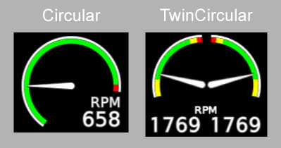
Gauge Options
The TwinCircular gauge uses the <Value2> tag to define its secondary value, but uses the <Minimum>, <Maximum>, <ColorZone>, and <ColorLine> tags to define options for both scales.
Styling Options
Circular gauges use the following additional styling options:
| Tag | Description |
|---|---|
<BeginAngle> | Sets the angle at which the minimum value of the gauge's scale is placed. The angle is measured in degrees, with zero pointing directly left and positive angles sweeping clockwise. For TwinCircular gauges, this applies to both scales, with the angle reflected across the vertical axis for the secondary scale. Defaults to -15. |
<EndAngle> | Sets the angle at which the maximum value of the gauge's scale is placed. The angle is measured in degrees, with zero pointing directly left and positive angles sweeping clockwise. For TwinCircular gauges, this applies to both scales, with the angle reflected across the vertical axis for the secondary scale. Defaults to 195. |
<DisplayRelativeValue> | Sets whether to display a text readout of the gauge's current value as a percent of the scale's maximum value. For TwinCircular gauges, this applies to both values. Defaults to false. |
Example
<Gauge>
  <Type>Circular</Type>
  <Title>MAN IN</Title>
  <Minimum>0</Minimum>
  <Maximum>35</Maximum>
  <Style>
    <BeginAngle>-45</BeginAngle>
    <EndAngle>180</EndAngle>
    <ValuePrecision>1</ValuePrecision>
    <DisplayRelativeValue>true</DisplayRelativeValue>
  </Style>
  <Value>
    <Simvar name="RECIP ENG MANIFOLD PRESSURE:1" unit="inHG"/>
  </Value>
</Gauge>

<Gauge>
  <Type>TwinCircular</Type>
  <Title>RPM</Title>
  <Minimum>0</Minimum>
  <Maximum>3000</Maximum>
  <Style>
    <BeginAngle>-15</BeginAngle>
    <EndAngle>90</EndAngle>
  </Style>
  <ColorZone>
    <Color>green</Color>
    <Begin>1000</Begin>
    <End>2850</End>
  </ColorZone>
  <ColorZone>
    <Color>red</Color>
    <Begin>2850</Begin>
    <End>3000</End>
  </ColorZone>
  <Value>
    <Simvar name="GENERAL ENG RPM:1" unit="rpm"/>
  </Value>
  <Value2>
    <Simvar name="GENERAL ENG RPM:2" unit="rpm"/>
  </Value2>
</Gauge>
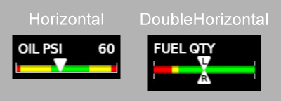
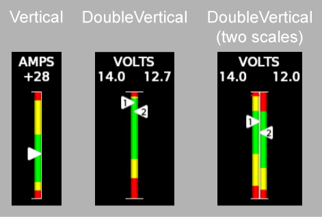
Linear Gauges
Linear gauges display values on a vertical or horizontal linear scale using a pointer.
Types
Horizontal: A gauge with a single horizontal scale.TwinHorizontal: A gauge with two horizontal scales arranged in a single row. The primary scale is on the left and the secondary scale is on the right.DoubleHorizontal: A gauge with two values that share a single horizontal scale. The pointer for the primary value is displayed above the scale and the pointer for the secondary value is displayed below the scale.Vertical: A gauge with a single vertical scale.DoubleVertical: A gauge with two values that either share a single vertical scale or use two scales stacked horizontally next to each other. The pointer for the primary value is displayed to the left of the scale and the pointer for the secondary value is displayed to the right of the scale.
Gauge Options
The TwinHorizontal gauge uses the <Value2> tag to define its secondary value, but uses the <Minimum>, <Maximum>, <ColorZone>, and <ColorLine> tags to define options for both scales.
The DoubleHorizontal gauge uses the <Value2> tag to define its secondary value.
The DoubleVertical gauge uses the <Value2> tag to define its secondary value. If the gauge has separate primary and secondary scales, it uses the <Minimum2>, <Maximum2>, <ColorZone2>, and <ColorLine2> tags to define options for the secondary scale.
Linear gauges use the following additional gauge options:
| Tag | Description |
|---|---|
<CursorText> | The text to display in the primary value's pointer. |
<CursorText2> | The text to display in the secondary value's pointer. |
<AllowPeakMode> | Whether to enable the peak mode function for the gauge. While peak mode is active, the gauge keeps track of the maximum observed (peak) value and displays a cyan tick mark on the scale corresponding to the peak. Additionally, while peak mode is active the gauge's text readouts display the difference between the current value and the peak. If the gauge has multiple values, then the peak is tracked separately for each value. |
<ReflectPeakModeInHeader> | Whether the gauge's title and/or text readout should be colored cyan when peak mode is active. |
<PeakModeTriggerBusEvent> | The event bus topic that controls when peak mode for the gauge is active. Data published to the topic should be of type boolean. |
Styling Options
Linear gauges use the following additional styling options:
| Tag | Description |
|---|---|
<UseDoubleZones> | Sets whether DoubleVertical gauges use separate scales for their primary and secondary values. Defaults to false. |
<ValuesTextRowWidth> | Sets the total width of the container that displays the DoubleVertical gauge's two text readouts. Accepts any valid HTML width style property string (e.g. 50px, 50%, calc(100% - 10px), etc.). |
Example
<Gauge>
  <Type>Horizontal</Type>
  <Title>OIL °F</Title>
  <Minimum>0</Minimum>
  <Maximum>278</Maximum>
  <ColorZone>
    <Color>green</Color>
    <Begin>0</Begin>
    <End>262</End>
  </ColorZone>
  <ColorZone>
    <Color>red</Color>
    <Begin>262</Begin>
    <End>278</End>
  </ColorZone>
  <Value>
    <Simvar name="GENERAL ENG OIL TEMPERATURE:1" unit="farenheit"/>
  </Value>
</Gauge>

<Gauge>
  <Type>DoubleVertical</Type>
  <Style>
    <Height>200px</Height>
    <ValuesTextRowWidth>64px</ValuesTextRowWidth>
  </Style>
  <Title>FUEL</Title>
  <Minimum>0</Minimum>
  <Maximum>20</Maximum>
  <Value>
    <Simvar name="FUEL TANK LEFT MAIN QUANTITY" unit="gallon"/>
  </Value>
  <Value2>
    <Simvar name="FUEL TANK RIGHT MAIN QUANTITY" unit="gallon"/>
  </Value2>
  <CursorText>L</CursorText>
  <CursorText2>R</CursorText2>
</Gauge>
Cylinder Gauges
Cylinder gauges display per-cylinder EGT (exhaust gas temperature) and CHT (cylinder head temperature) data for a multi-cylinder piston engine in a bar chart-like format.
Types
Cylinder: A gauge that displays data for a single engine. EGT and CHT are displayed on the same graph with the EGT scale on the right vertical axis and the CHT scale on the left vertical axis.TwinCylinder: A gauge that displays data for two engines on the same graph. Data for the first engine are displayed on the left and data for the second engine are displayed on the right.
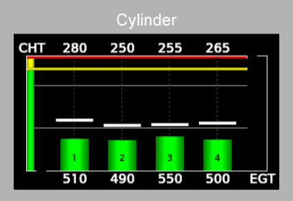
Gauge Options
The Cylinder gauge uses the <Value> tag to define the engine's EGT (the EGT averaged over all cylinders) and the <Value2> tag to define the engine's CHT (the CHT averaged over all cylinders). The TwinCylinder gauge uses the <Value> and <Value2> tags to define the first engine's EGT and CHT, respectively, and the <Value3> and <Value4> tags to define the second engine's EGT and CHT, respectively.
Both Cylinder and TwinCylinder gauges use the <Minimum> and <Maximum> tags to define the minimum and maximum EGT scale values and the <Minimum2> and <Maximum2> tags to define the minimum and maximum CHT scale values. The <ColorZone> tag defines scale ranges for the EGT scale. The <ColorLine> tag is ignored (the EGT scale does not support tick marks). The <ColorZone2> and <ColorLine2> tags define scale ranges and tick marks for the CHT scale.
Cylinder gauges use the following additional gauge options:
| Tag | Description |
|---|---|
<Columns> | The number of cylinders (per engine) displayed by the gauge. Must be a positive integer. Defaults to 4. |
<ChtMinimum> | The minimum value represented on the gauge's CHT scale, as a logic element. Overrides <Minimum2> if present. |
<ChtMaximum> | The maximum value represented on the gauge's CHT scale, as a logic element. Overrides <Maximum2> if present. |
<ChtColorZone> | Defines a scale range for the gauge's CHT scale. An alias for <ColorZone2>. |
<ChtColorLine> | Defines a scale tick mark for the gauge's CHT scale. An alias for <ColorLine2>. |
<PeakModeTriggerBusEvent> | The event bus topic that controls when lean assist is active. Data published to the topic should be of type boolean. |
Styling Options
Cylinder gauges use the following additional styling options:
| Tag | Description |
|---|---|
<PeakTemps> | Sets whether to display lean assist indications when lean assist is active. Defaults to false. |
<DisplayColorLinesOnTop> | Sets whether to display CHT scale tick marks on top of the EGT bars. Defaults to false. |
Example
<Gauge>
  <Style>
    <ShowPeak>true</ShowPeak>
  </Style>
  <Type>Cylinder</Type>
  <PeakModeTriggerBusEvent>engine_lean_assist_active</PeakModeTriggerBusEvent>
  <Title>°F</Title>
  <Columns>4</Columns>
  <Minimum>0</Minimum>
  <Maximum>1800</Maximum>
  <ChtMinimum>0</ChtMinimum>
  <ChtMaximum>640</ChtMaximum>
  <ChtColorZone>
    <Color>green</Color>
    <Begin>0</Begin>
    <End>550</End>
  </ChtColorZone>
  <ChtColorZone>
    <Color>yellow</Color>
    <Begin>550</Begin>
    <End>625</End>
  </ChtColorZone>
  <ChtColorZone>
    <Color>red</Color>
    <Begin>625</Begin>
    <End>640</End>
  </ChtColorZone>
  <Value>
    <Simvar name="GENERAL ENG EXHAUST GAS TEMPERATURE:1" unit="farenheit"/>
  </Value>
  <Value2>
    <Simvar name="ENG CYLINDER HEAD TEMPERATURE:1" unit="farenheit"/>
  </Value2>
</Gauge>
Button Gauges
Button gauges are touchscreen buttons.
Types
ToggleButton: A touchscreen button that publishes a cachedboolean-typed value to the event bus and displays the published value with a status indicator.
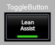
Gauge Options
Button gauges use the following additional gauge options:
| Tag | Description |
|---|---|
<Event> | The event bus topic to which to sync the button's state. When pressed, the button will publish to the topic a boolean-typed value that is the result of applying the not operator (!) on the topic's current value. |
<Sync> | Whether the data published by the button to the event bus should be synced to other instruments. Defaults to true. |
<Cached> | Whether the data published by the button to the event bus should be cached. Defaults to true. |
<Label> | The button's label. Enclose the label in quotes (") to include line-break characters. |
Example
<Gauge>
  <Type>ToggleButton</Type>
  <Event>engine_lean_assist_active</Event>
  <Label>"Lean\nAssist"</Label>
</Gauge>