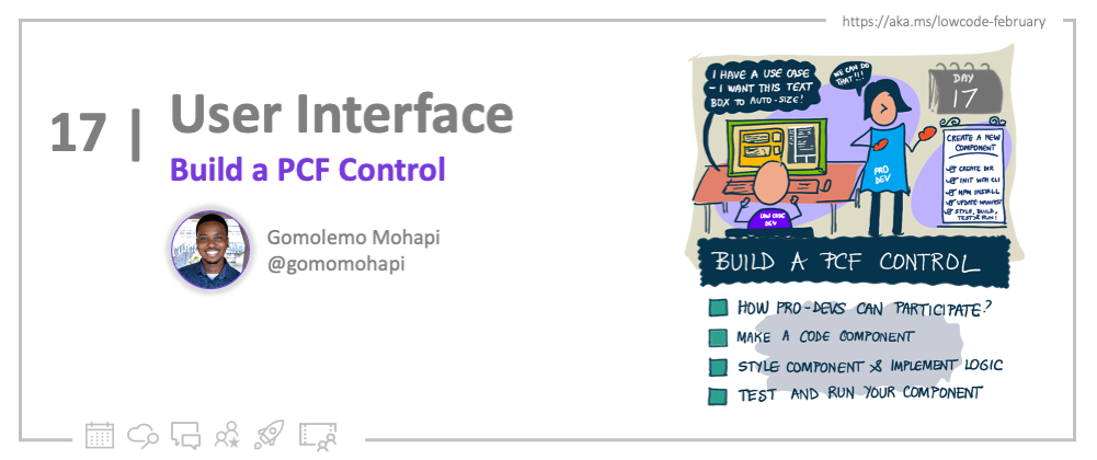
Welcome to Day 17 of #30DaysOfLowCode!
The theme for this week is User Interface and we're ending it off with a quick tutorial on PCF Components! Yesterday, I wrote about the Power Apps Component Framework and highlighted why you would want to use it, what the advantages are, as well as the composition of a PCF Component. Today, as promised, we'll be building a simple code component step-by-step.
What We'll Cover
- Power Apps Component Framework Recap
- What are we building today?
- Let's make a Code Component!
- Test and Run your component
- Where to from here?
- Exercise: Training - Use advanced features with Power Apps component framework
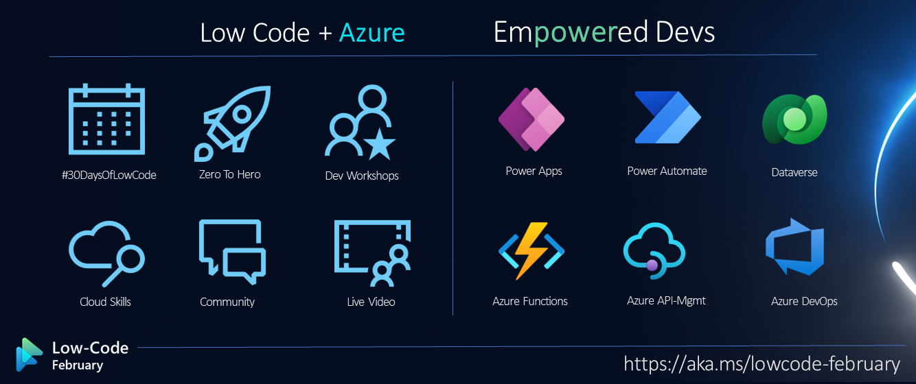
- Resources: Explore the Low Code February Collection
Power Apps Component Framework Recap
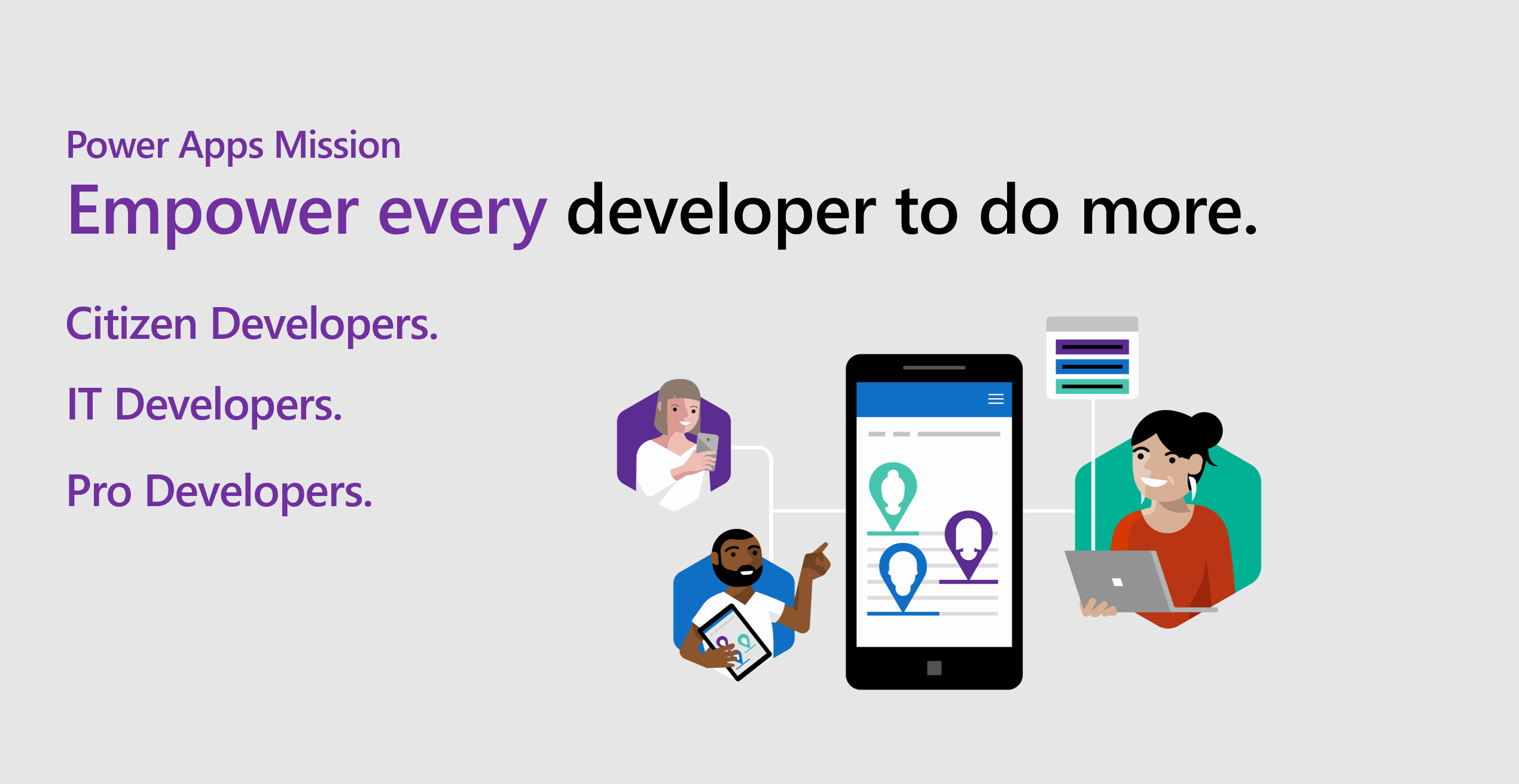
As mentioned in yesterday's blog, Power Apps Component Framework (PCF) empowers professional or traditional developers and app makers to create reusable code components for Canvas Apps and Model-Driven Apps. Sometimes, as app makers, we might reach certain limitations when it comes to building consistent, eye-catching but functional user experiences. The out-of-the-box controls within Power Apps might not fit all of our needs or maybe, we just want to stretch Power Apps' capabilities a little further. With PCF, you can build code components which are essentially visual controls that help you create a more customised user interface.
What are we building today?
So, with Power Apps, there is generally a large amount of data that end users input into the app via a Text Input control. However, as we can see in this reference page, there is no "auto height" property. What I mean is whenever you use a Text Input, and you have a lot of text, the text input does not inherently have the ability to increase its own height based on the amount of text that you have. The normal behaviour here is that the Text Input will have a scrollbar that you can use to navigate through the large amount of text.
This is the perfect opportunity for a professional developer to use their skills to solve this "low code" problem. And just to make sure, I'm not saying that a low code developer does not have the ability to create some sort of walkaround for this problem - we are just looking at this from the perspective of a professional developer and how they can contribute to Power Platform Solutions. Also, by creating a code component, app makers will be able to use this throughout all of their Power Apps.
Let's Make a Code Component!
Time to get started building with the Power Apps Component Framework, but first -
Pre-Requisites
Note: This tutorial was completed using a Windows 11 Machine.
Before we get started, we will need to install the following:
- Install Visual Studio Code (VS Code) and ensure that the "Add to PATH" option is selected during installation.
- Install Node.js (comes with npm). I recommend that you use a LTS (Long-Term Support) version.
- Once VS Code is installed, go ahead and download and install the Power Platform Tools VS Code extension.
Configure Power Apps Environment
Since we are building a code component for Power Apps, we need to make sure our Power Apps environment is prepared and configured.
If you don't have a Power Apps Developer Plan yet 👀, go ahead and sign up for one. It's FREE.
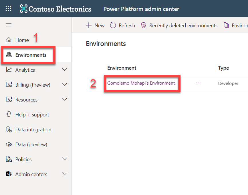
Once that's done, log into the Power Platform Admin Center
- Select "Environments" on the left-hand side
- Click on the development environment that you've just created above. This will usually have the name: *[Your Name]'s Environment.*
Select "Settings" from the top command bar and navigate to Product > Features > Power Apps component framework for canvas apps.
Activate the Toggle On setting for the Allow publishing of canvas apps with code components feature.
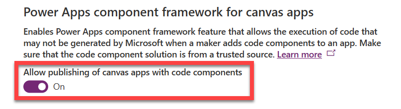
- Scroll down and select Save.
Now we're good to go! 😃
Create a Component Folder
We will need a working folder to store our Code Component solution. For ease of use, I usually create a folder in a place where I can easily access from a Command Prompt. On my computer, I've created a new folder called LowCodeFeb directly in the C:\ drive. So, I will be using C:\LowCodeFeb.
Create a New Component Project
- Start Visual Studio Code
- Select Terminal and select New Terminal.
- Change directory to your working folder.
cd C:\LowCodeFeb
- From your LowCodeFeb directory, create a directory named dynamicTextInput-pcf.
mkdir dynamicTextInput-pcf
- Change directory to dynamicTextInput-pcf.
cd dynamicTextInput-pcf
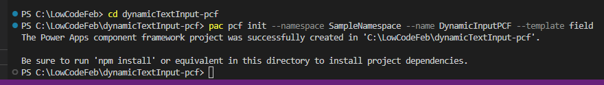
- Initialize your component project by using Power Platform CLI with the following command:
pac pcf init --namespace SampleNamespace --name DynamicInputPCF --template field
This image shows an example of the output you should see:
- Install the project build tools by using the command
npm install. Don't worry about any warnings you may see at this point.
npm install
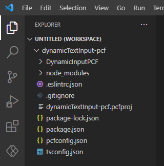
- Once completed, run the command below to open the component project in Visual Studio Code.
code -a .
Your opened project should look like this so far:
Update Code Component's Manifest
Remember, from yesterday's blog - we established that the manifest is an XML file that defines the metadata and configuration of a code component. The manifest is an important file for a PCF code component because it is used by the Power Apps authoring tools to register and manage the component. This also includes the kind of data which is to be configured (field or dataset) and any other properties that can be configured in the application when the component is added.
- Expand the DynamicInputPCF folder and open the ControlManifest.Input.xml file.
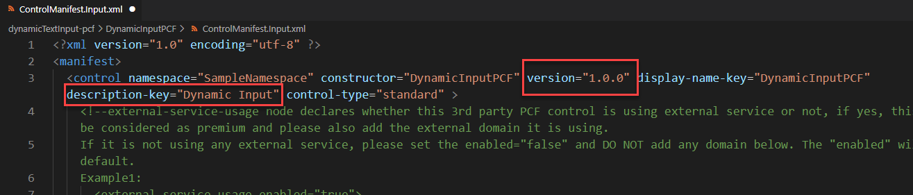
- Near the top of the file, Change the version to 1.0.0 and description-key to Dynamic Input.
- Locate the <property ... /> node and replace it with this:
<property name="TextValue" display-name-key="TextValue" description-key="TextValueDescription" of-type-group="strings" usage="bound" required="true" />
<property name="AutoHeightValue" display-name-key="AutoHeightValue" description-key="AutoHeightValueDescription" of-type="Whole.None" usage="bound" required="true" />

<type-group name="strings">
    <type>SingleLine.Text</type>
    <type>SingleLine.TextArea</type>
    <type>Multiple</type>
</type-group>
- Locate the <resources ... /> node and include a reference to a CSS file named DynamicInputPCF.css that you'll soon create.
<css path="css/DynamicInputPCF.css" order="1" />
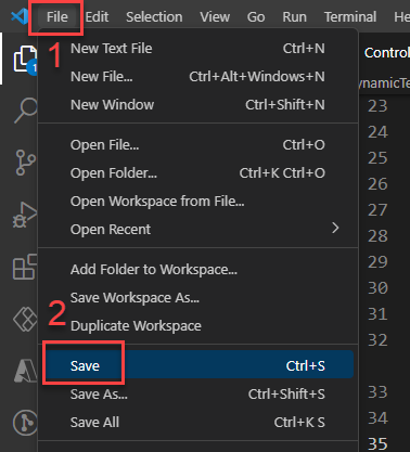
- Save your changes by selecting File and then Save.
Add styling to your code component
Now we're going to be adding some basic styling to our component. Just to get a feel of what the process is like and how you can further customise code components.
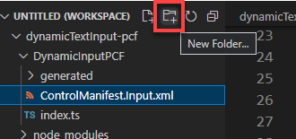
- Make sure you still have the ControlManifest.Input.xml file selected and then select New Folder.
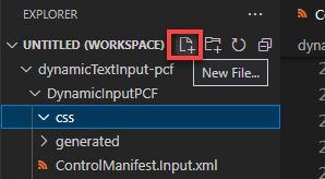
- Name the new folder css and then select the css folder you've created and select New File.
- Name the new file DynamicInputPCF.css
- Open DynamicInputPCF.css and paste the following CSS:
.DynamicInputPCF textarea {
    padding: 5px;
    box-sizing: border-box;
    width: 100%;
}

.DynamicInputPCF textarea:focus, .DynamicInputPCF textarea:enabled:hover {
    border: 2px solid black;
}
- Select File and select Save.
Build your code component
In order to ensure that the right TypeScript types are generated to match the properties in your ControlManifest.xml document, we need to run a build on our component.
Return to the terminal and perform a build b using the following command:
npm run build
Once the build is successful, you'll notice in the project folder, that the component is compiled into the out/controls/DynamicInputPCF directory. The results of this compilation are:
- css folder
- bundle.js - Bundled component source code
- and the ControlManifest.xml which is the actual component manifest file that is uploaded to the Microsoft Dataverse organization
With those artifacts generated, we can now start implementing our component logic.
Implement Component's Logic
Let's get straight into it.
- Open the index.ts file and insert the following variables above the constructor method.
// The PCF context object
private context: ComponentFramework.Context<IInputs>;

// The wrapper div element for the component
private container: HTMLDivElement;

/* The callback function to call whenever your code
has made a change to a bound or output property */
private notifyOutputChanged: () => void;

//Variable to track the height of the control
height: number;

textarea: HTMLTextAreaElement;
defaultLoaded = false;
- Find the init method and replace its contents with this:
//Track all elements
this.container = container;
this.context = context;
this.notifyOutputChanged = notifyOutputChanged;
this.textarea = document.createElement("textarea");
this.textarea.rows = 1;
this.textarea.style.resize = 'none';
this.textarea.style.overflowY = 'hidden';
this.textarea.oninput = this.onTextAreaInput;
this.textarea.onchange = this.onTextAreaChanged;
this.container.appendChild(this.textarea);
After pasting the code above, you may have a couple of errors. No need to worry - we'll be defining a few methods, in a moment, which will clear these errors.
- Underneath the init method, add the following:
/* These methods are responsible for telling the framework
that there is a new value in the text input and then it
starts calculating the new height */
onTextAreaInput = (): void => {
    this.autoSizeTextArea();
}

onTextAreaChanged = (): void => {
    this.notifyOutputChanged();
}

autoSizeTextArea(): void {
    this.textarea.style.height = 'auto';
    const newHeight = (this.textarea.scrollHeight) + 'px';
    const heightChanged = newHeight !== this.textarea.style.height;
    this.textarea.style.height = newHeight;
    if (heightChanged) { this.notifyOutputChanged(); }
}
- Look for the updateView method and add the following:
const value = context.parameters.TextValue;
    let disabled = context.mode.isControlDisabled;
    let masked = false;
    if (value && value.security) {
        masked = !value.security.readable;
        disabled = disabled || masked || !value.security.editable;
    }

// Update text value if input value changes
if (!this.defaultLoaded || context.updatedProperties.indexOf("TextValue") > -1) {
    this.defaultLoaded = true;
    const newValue = masked ? "****" : value.raw as string;
    this.textarea.value = newValue;
    this.autoSizeTextArea();
}
- And one of the last major things we need to do is find and update the getOutputs method with the following code:
/* This provides the output/bound properties back to
the PCF after notifyOutputChanged() has been called. */
const  height = Number.parseInt(this.textarea.style.height);
return {
    TextValue:  this.textarea.value,
    AutoHeightValue:  height
}
- Go ahead and Save everything.
Test and Run your Component
Now that we have configured and built out the component logic, let's give it a go! Now is a great time to test your component before you import it into Power Apps.
- Let's return to the Terminal and rebuild our component.
npm run build
If you've followed everything correctly, the build should succeed. If not, feel free to take some time and check if you've copied all code correctly.
Now we get to run and test our component in a test harness that simulates the Power Apps runtime, so you get to see how your component behaves.
- In the Terminal once more, run the following command:
npm start
A new browser window should automatically load the test harness.
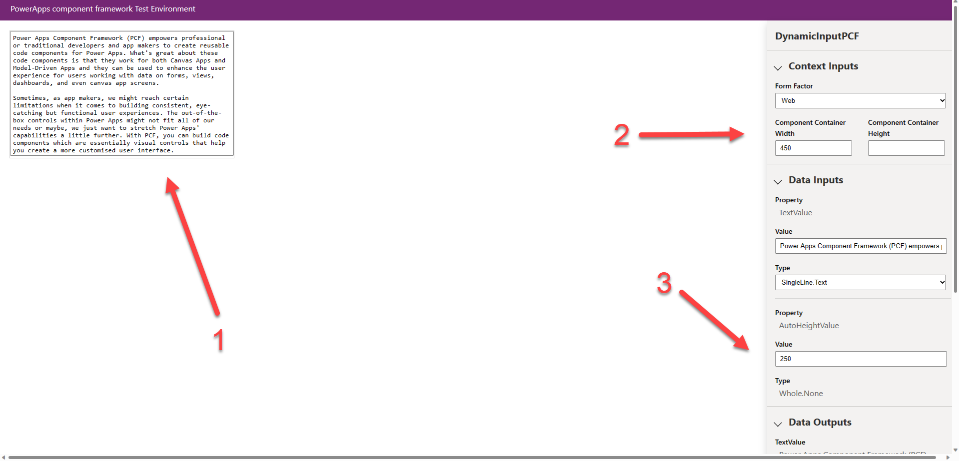
Go ahead and write some text directly into the text input (1) on the right. Be sure to press the Enter key a couple of times to see the text input automatically resizing. You can also play with the pre-set width and height properties (2) to find how the text input behaves under various conditions. Also, you'll notice that the AutoHeightValue (3) dynamically changes as you're writing as well.
Where to from here?
At face value, it doesnt seem like much however I wanted to give you a just a taste of what is possible when professional developers use their skills and their tools to contribute to Power Platform Solutions. Once a code component is built and you've verified that it works. The next step is to create a solution package and import that into the Power Apps Environment.
See this article for guidance on how to package a code component and then when you want to add your code component to a Power App, you can read the guidance for Canvas Apps and/or Model-Driven Apps.
Exercise
Try the exercise in this learn module where you will get to learn EVEN MORE about code components. You'll be able to get details on how to address more complex scenarios as it applies to the PCF. What makes this exciting is that it covers how to use client frameworks such as React and Angular within a component, along with how to address scenarios such as file upload, localization, and integration with the Microsoft Dataverse Web API.
Resources
- Exercise: Training - Use advanced features with Power Apps component framework
- Documentation: Power Apps Component Framework Overview
- Watch: The Low Code Revolution Show
- Watch all of the Powerful Devs Conference sessions on demand to learn from experts how you, as a developer, can leverage the Power Platform to build applications faster and with far less effort.
- Low Code February Learn Collection: Collection of resources to go from learning Power Platform Fundamentals, to understanding the Dataverse and working in Fusion Development teams.
Also consider -
- Signing up for the free Power Apps Developer Plan so you have access to the Power Platform.
- Enrolling in the Cloud Skills Challenge to skill up on key cloud technologies with free, self-guided learning courses, and start climbing the leaderboard!