
Welcome to Day 09 of #30DaysOfLowCode!
In the first part of the blog, Nitya showed you how to build a custom connector for the Forem v0 API. From now, I (Daniel) will take it over and show you what you can do with the custom connector in the Power Platform.
If you don't want to follow the whole tutorial, but you want to just see the solution, make sure to go the the bottom of the page for a link to the resources that you can import and explore on your own!
Join us Feb 15 at the #PowerfulDevs conference where Daniel and Nitya will walk through the steps of building the connector and application - and more! Register Here
What We'll Cover
- Custom Connectors in the Power Platform
- Build a front end with Power Apps
- Speed up development with the Creator Kit
- Add the Forem v0 connector to your app
- Add the Creator Kit components to your app
- Publish your app
- Completed solution
Custom connectors in the Power Platform
When custom connectors are deployed, you will find them in multiple places. And, because the Power Platform is not just a bunch of products together, but also really advocates the 'better together' story, it gives you the possibility to even use data from the custom connector in places where the connector doesn't appear.
Let me explain that: You can find custom connectors in Power Automate, where you can automate processes.
You can also find custom connectors in Power Apps. Power Apps is the product of the Power Platform where you build apps.
But, because the products work very well together, it's also possible to for instance:
- Trigger a Power Automate workflow from a Power BI visual
- Trigger a Power Automate workflow from a Power Virtual Agents chatbot
- Embed a Power App inside of a Power BI report/dashboard
Which gives you the possibility to use the connector in places even when they don't have a custom connector experience out of the box.
Build a front end with Power Apps
Power Apps consists of multiple types of apps: canvas apps and model-driven apps. Canvas apps are the apps that give you the possibility to design them how you want. You have the possibility to change everything on the screen. You can even build Power Apps Component Framework components if you want to build your own components with custom code.
Model-driven apps are a different type of app. It's based on data. First, you start building your data model, and when you're done with that, you start building the forms and views in your app. Lastly, you create the app to pull it all together. It doesn't offer the design freedom canvas apps have, but it gives you a bunch of functionality out of the box in exchange for that. You have responsive design out of the box and you don't have to think much about the controls and formula's that canvas has, because it will do a lot of the heavy lifting for you.
In this blog, I will focus on building a canvas app, but I wanted to make sure everyone knew about both types of apps.
Create a canvas app
In this blog, I'm not gonna talk about how to create a canvas app from scratch, because there is a great Microsoft Learn article about that. For this example, I created a canvas app in tablet mode.
When you have created your canvas app in tablet mode, you will see Power Apps Studio:
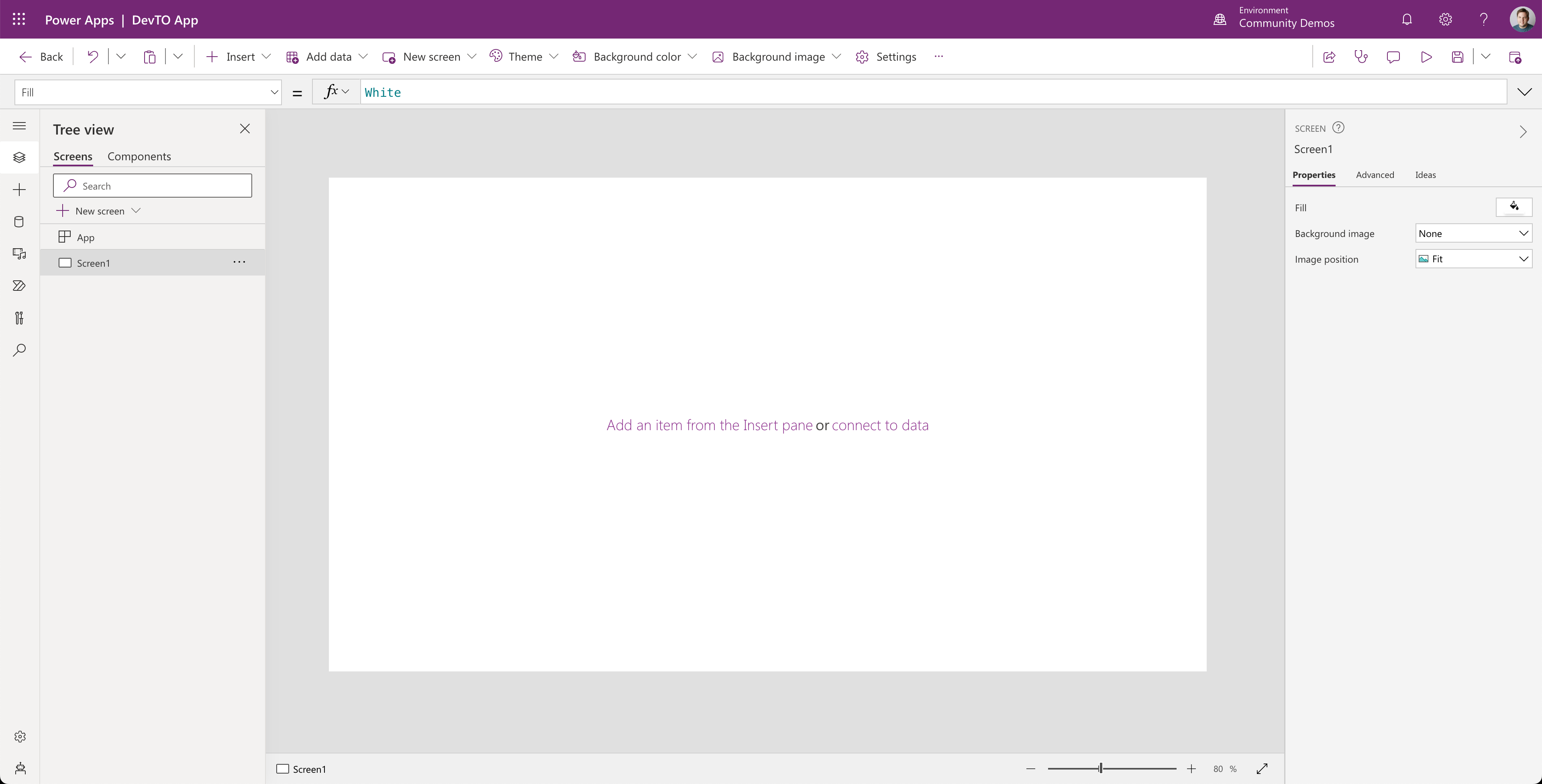
Power Apps Studio is the place where you can design, build and manage your canvas app. If you want to learn more about all that you see here, make sure to check out this article which gives you a great explanation about what all the parts of Power Apps Studio.
Speed up development with the Creator Kit
There are tons of components available out of the box, like text inputs, date pickers, camera controls, etc. These controls offer you a lot of flexibility, but, if you want to make it yourself really easy, it's a good idea to use the Creator Kit. The Creator Kit is a solution which you can import into your environment. The solution contains a set of components that are based on the Fluent UI framework.
There is excellent guidance on how to install the Creator Kit and how to add the code components to a canvas app.
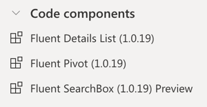
In the app, I use the following code components:
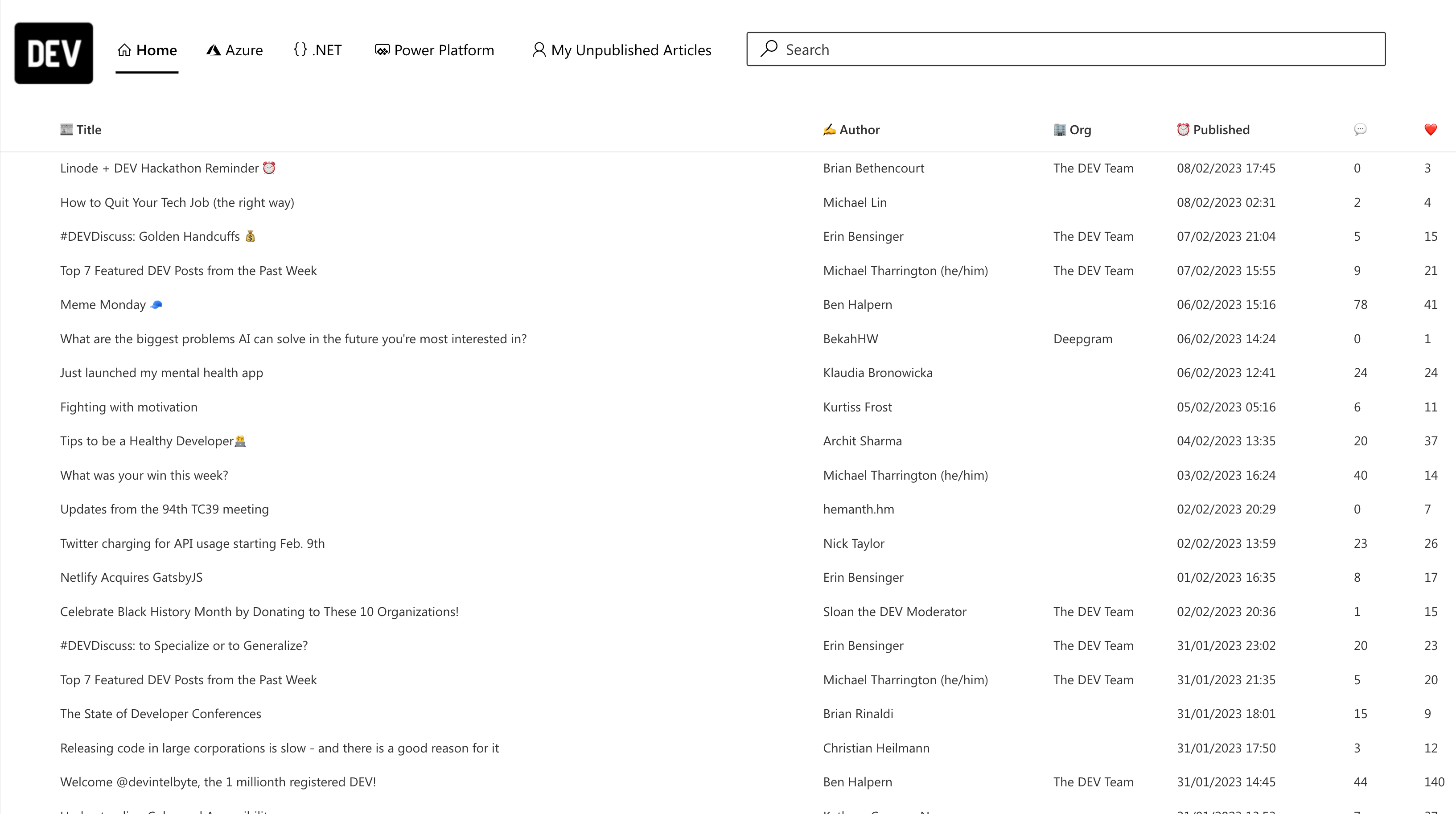
The end result will look like this:
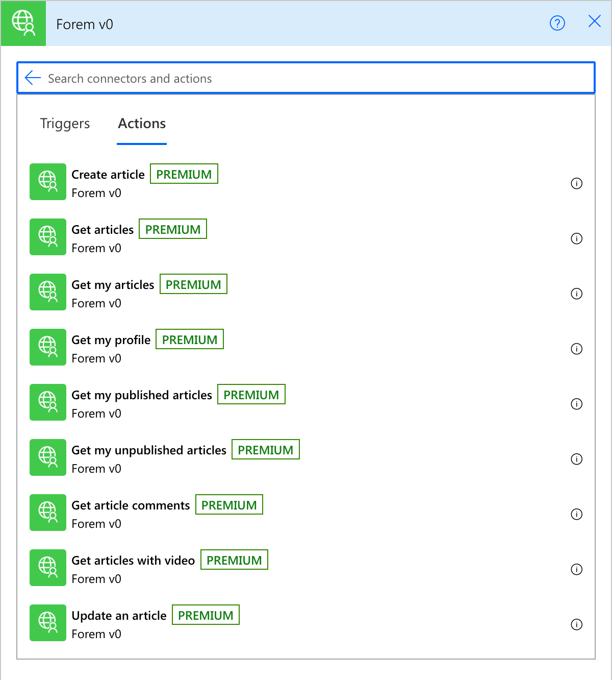
Add the Forem v0 connector to your app
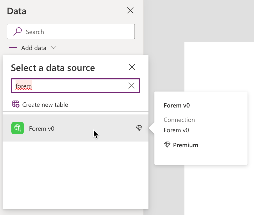
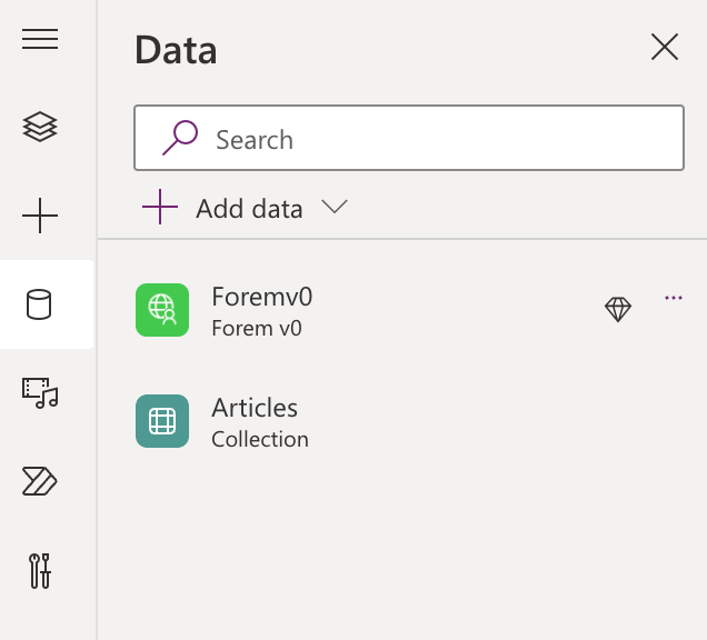
To work with the forem connector, you first need to add that to your app. Go to Power Apps Studio and select the Data icon in the left menu. Next, add the connector to your app by selecting the Add data button. Search for Forem and click on your custom connector. If you already have a connection, feel free to select that. If not, add a connection here by adding the API key you need for the Forem API.
After connecting the custom connector to your app, the data tab should look like this:
To test out if the connector works, we can easily create a collection (local data that's saved in the app) by going to the tree view (layers icon in the left menu), selecting App and changing the OnStart property to:
ClearCollect(
    Articles,
    Foremv0.GetArticles(
      {
        page: 1,
        per_page: 100
      }
    )
)
This ClearCollect formula will create a collection with the name Articles. The collection will be filled with whatever comes next. In this case, it's a call to the custom connector Foremv0 and specifically, a call to the GetArticles action in the connector. Inside of the call, the parameters page and per page are used to make sure we get 100 items returned.
Add the Creator Kit components to your app
In the earlier chapter, I already wrote about installing and using the Creator Kit. To build this app, you should have the following code components added to your app:
If you don't have those code components available make sure to add them like described in the documentation.
Let's start building the app!
First, let's make sure our app OnStart property has the right content. The OnStart property of the app should have a couple of formulas:
Set(
    AppTheme,
    {
        palette: {
            themePrimary: "#000000",
            themeLighterAlt: "#898989",
            themeLighter: "#737373",
            themeLight: "#595959",
            themeTertiary: "#373737",
            themeSecondary: "#2f2f2f",
            themeDarkAlt: "#252525",
            themeDark: "#151515",
            themeDarker: "#0b0b0b",
            neutralLighterAlt: "#faf9f8",
            neutralLighter: "#f3f2f1",
            neutralLight: "#edebe9",
            neutralQuaternaryAlt: "#e1dfdd",
            neutralQuaternary: "#d0d0d0",
            neutralTertiaryAlt: "#c8c6c4",
            neutralTertiary: "#595959",
            neutralSecondary: "#373737",
            neutralPrimaryAlt: "#2f2f2f",
            neutralPrimary: "#000000",
            neutralDark: "#151515",
            black: "#0b0b0b",
            white: "#ffffff"
        }
    }
);
The above formula sets the AppTheme variable we are going to use in the Creator Kit components. The last part of the OnStart property should be as follows:
ClearCollect(
    colArticles,
    SortByColumns(
        AddColumns(
            Foremv0.GetArticles(
                {
                    page: 1,
                    per_page: 1000,
                    tags:"powerplatform, powerapps, dotnet, azure"
                }
            ),
            "author_name",
            user.name,
            "org_name",
            organization.name,
            "formatted_date",
            Text(
                DateTimeValue(
                    Substitute(
                        published_at,
                        "Z",
                        ""
                    )
                ),
                ShortDateTime
            )
        ),
        "created_at",
        Descending
    )
)
The above ClearCollect formula creates a collection called colArticles. The GetArticles action of the custom connector will be used to grab the last 1000 articles with the tags powerplatform, powerapps, dotnet, azure. Wrapped around that call we have two other formulas: the Addcolumns formula to flatten the result of the API and add some columns, and the SortByColumns formula to sort the articles by created date.
That's it for our app OnStart formula. Next, let's create the header. The header consists of the following three parts:
- Logo (image)
- Pivot (pivot from the Creator Kit)
- SearchBox (search box from the Creator Kit)
Logo
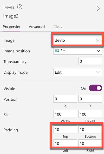
For the logo, click on the plus icon on the left side, which opens up the Insert menu. Search for image in the search box. Click on Image that shows up in the insert menu. At the right side of your screen you can see the properties of your control. This is where you can find properties, like in this case the property Image, which enables you to upload an image or choose one that's already added to your app. Click on the dropdown next to Image where it shows None and add an image file. I added the dev.to logo here, since this app will connect to dev.to.
Drag your image to the top-left of the screen and make sure to add a padding of 10 to the top, bottom, left & right of the image.
This should result in properties looking like this (changed properties in red):
Pivot
Next, add the Fluent Pivot component via the Insert menu. Set the X property to 100, the Height property to 50 and the Width property to 600. For the Y property, we will use a different way of changing a property. For this we have to:
- Press the
Yin the properties panel of the Pivot component - Change the value of the
Yproperty toSelf.Height/2in the formula bar.
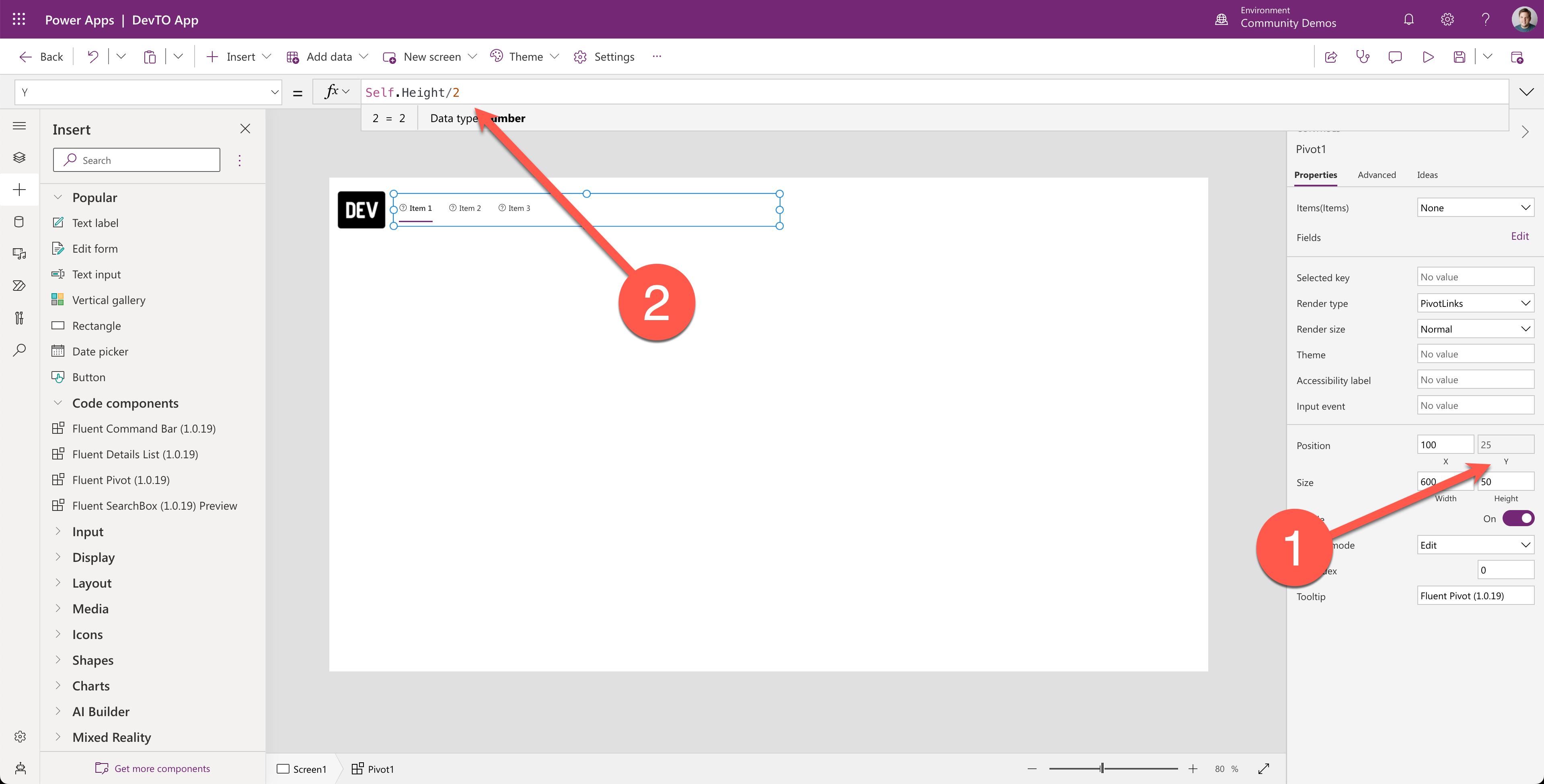
This will place the pivot on the right side of the dev.to logo you just added. Change the Theme property to AppThemeJson so that it will get the theme you have set in the app OnStart.
Now we have a pivot, but it doesn't do anything. To change this we need to change the following properties:
- Items:
Change this property to the following table:
Table(
    {
        ItemKey: "Home",
        ItemDisplayName: "Home",
        ItemIconName: "Home"
    },
    {
        ItemKey: "Azure",
        ItemDisplayName: "Azure",
        ItemIconName: "AzureLogo"
    },
    {
        ItemKey: "DotNet",
        ItemDisplayName: ".NET",
        ItemIconName: "Code"
    },
    {
        ItemKey: "PowerPlatform",
        ItemDisplayName: "Power Platform",
        ItemIconName: "PowerApps"
    },
    {
        ItemKey: "MyUnpublishedArticles",
        ItemDisplayName: "My Unpublished Articles",
        ItemIconName: "Contact"
    }
)
This table contains a couple of items, which all have three properties:
ItemKey- this is the internal key of the item, we will use it later on in the OnSelect to find out which item has been selected.ItemDisplayName- this is the name that will be displayed in the pivot.ItemIconName- this is the icon name that will be displayed in the pivot.
For more info on the workings of the pivot, go to the documentation.
- SelectedKey
Change this property in the formula bar to the following:
Self.Selected.ItemKey
This setting will make sure the pivot component will show a line below the currently selected item.
- OnSelect
Switch(
    Self.SelectedKey,
    "Azure",
    ClearCollect(
        colArticles,
        SortByColumns(
            AddColumns(
                Foremv0.GetArticles(
                    {
                        page: 1,
                        per_page: 1000,
                        username: "azure"
                    }
                ),
                "author_name",
                user.name,
                "org_name",
                organization.name,
                "formatted_date",
                Text(
                    DateTimeValue(
                        Substitute(
                            published_at,
                            "Z",
                            ""
                        )
                    ),
                    ShortDateTime
                )
            ),
            "created_at",
            Descending
        )
    ),
    "DotNet",
    ClearCollect(
        colArticles,
        SortByColumns(
            AddColumns(
                Foremv0.GetArticles(
                    {
                        page: 1,
                        per_page: 1000,
                        tag: "dotnet"
                    }
                ),
                "author_name",
                user.name,
                "org_name",
                organization.name,
                "formatted_date",
                Text(
                    DateTimeValue(
                        Substitute(
                            published_at,
                            "Z",
                            ""
                        )
                    ),
                    ShortDateTime
                )
            ),
            "created_at",
            Descending
        )
    ),
    "Home",
    ClearCollect(
        colArticles,
        SortByColumns(
            AddColumns(
                Foremv0.GetArticles(
                    {
                        page: 1,
                        per_page: 1000,
                        tags: "powerplatform, powerapps, dotnet, azure"
                    }
                ),
                "author_name",
                user.name,
                "org_name",
                organization.name,
                "formatted_date",
                Text(
                    DateTimeValue(
                        Substitute(
                            published_at,
                            "Z",
                            ""
                        )
                    ),
                    ShortDateTime
                )
            ),
            "created_at",
            Descending
        )
    ),
    "MyUnpublishedArticles",
    ClearCollect(
        colArticles,
        Foremv0.GetMyUnpublishedArticles()
    ),
    "PowerPlatform",
    ClearCollect(
        colArticles,
        SortByColumns(
            AddColumns(
                Foremv0.GetArticles(
                    {
                        page: 1,
                        per_page: 1000,
                        tag: "powerplatform"
                    }
                ),
                "author_name",
                user.name,
                "org_name",
                organization.name,
                "formatted_date",
                Text(
                    DateTimeValue(
                        Substitute(
                            published_at,
                            "Z",
                            ""
                        )
                    ),
                    ShortDateTime
                )
            ),
            "created_at",
            Descending
        )
    )
)
The above formula is very long, this is because here I use a Switch formula to have different behavior per selected item. In this case, you can see that when the item with the MyUnpublishedArticles key is selected, it's doing a different call (GetMyUnpublishedArticles) than when the item with the PowerPlatform key is selected (GetArticles, with tag parameter with the value powerplatform). The rest of the item selections are pretty much the same.
Search Box
Let's add the Fluent SearchBox component via the Insert menu. Set the following properties:
| Property | Value |
|---|---|
| Theme | AppThemeJson |
| X | 700 |
| Y | 30 |
| Width | 600 |
| Height | 30 |
Now, we are done with the header. Let's move on with the details list, which we'll use to show all the articles.
Details List
The details list is where all the articles are shown. Add the Fluent Details List. Set the following properties:
| Property | Value |
|---|---|
| Theme | AppThemeJson |
| X | 0 |
| Y | 140 |
| Width | 1366 |
| Height | 628 |
Now the details list has the right dimensions and position, but it doesn't have the right content and settings, for that we need to change the following properties:
- OnChange:
The following formula is documented in the documentation of the details list. This is to make sure the local collection can be sorted the way we want to sort it.
If(Self.EventName="Sort",
UpdateContext({
                ctxSortCol:Self.SortEventColumn,
                ctxSortAsc:If(Self.SortEventDirection='PowerCAT.FluentDetailsList.SortEventDirection'.Ascending,true,false)
 })
);
- Items:
In the Items property, use an if condition to make sure our search box works. In this case, the if condition checks if the length of the SearchText in the search box is greater than or equal than 3. If that's the case, a Search() formula will be kicked off, that will search within the colArticles collection for the title, tags and the author name. If a match is found, it will show it in the details list. If not, the details list will become empty.
If the condition is not met, it will show just the colArticles. In both cases it will perform sorting as well.
If(
    Len(SearchBox1.SearchText) >= 3,
    SortByColumns(
        Search(
            colArticles,
            SearchBox1.SearchText,
            "title",
            "tags",
            "author_name"
        ),
        ctxSortCol,
        If(
            ctxSortAsc,
            SortOrder.Ascending,
            SortOrder.Descending
        )
    ),
    SortByColumns(
        colArticles,
        ctxSortCol,
        If(
            ctxSortAsc,
            SortOrder.Ascending,
            SortOrder.Descending
        )
    )
)
- Fields:
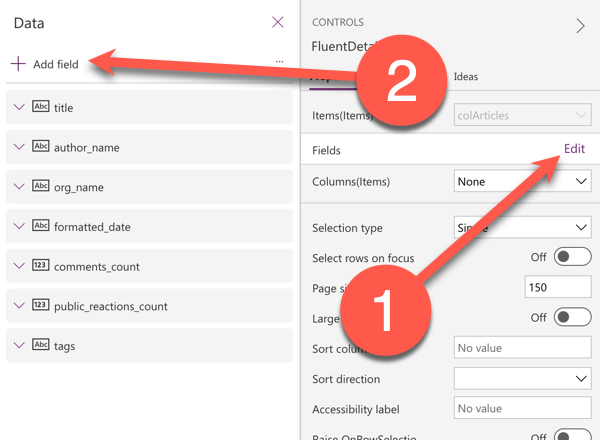
Select the edit button next to the Fields property and click Add field. Make sure to add the following fields:
- title
- author_name
- org_name
- formatted_date
- comments_count
- public_reactions_count
- tags
Now we have the fields available to us, but they don't show yet in the details list. For that, we need to change the Columns property.
- Columns:
Add the following formulas to the Columns property:
Switch(
    Pivot1.Selected.ItemKey,
    "MyUnpublishedArticles",
    Table(
        {
            ColDisplayName: "📰 Title",
            ColName: "title",
            ColBold: true,
            ColWidth: Parent.Width-100,
            ColRowHeader: true,
            ColResizable: true
        }
    ),
    Table(
        {
            ColDisplayName: "📰 Title",
            ColName: "title",
            ColBold: true,
            ColWidth: 700,
            ColRowHeader: true,
            ColResizable: true
        },
        {
            ColDisplayName: "✍️ Author",
            ColName: "author_name",
            ColResizable: true,
            ColWidth: 200,
            ColRowHeader: true
        },
        {
            ColDisplayName: "🏢 Org",
            ColName: "org_name",
            ColResizable: true,
            ColWidth: 100,
            ColRowHeader: true
        },
        {
            ColDisplayName: "⏰ Published",
            ColName: "formatted_date",
            ColResizable: true,
            ColWidth: 150,
            ColRowHeader: true
        },
        {
            ColDisplayName: "💬",
            ColName: "comments_count",
            ColResizable: true,
            ColSortable: true,
            ColWidth: 50,
            ColRowHeader: true
        },
        {
            ColDisplayName: "❤️",
            ColName: "public_reactions_count",
            ColResizable: true,
            ColSortable: true,
            ColWidth: 50,
            ColRowHeader: true
        },
        {
            ColDisplayName: "🏷️",
            ColName: "tags",
            ColWidth: 250,
            ColFirstMultiValueBold: true,
            ColMultiValueDelimiter: " "
        }
    )
)
The above formulas ensure that when the "MyUnpublishedArticles" item is selected in the pivot, it only shows the title column. If that item is not selected, it will show a lot more columns. All the columns are added to a table in both cases, and have properties like:
- ColDisplayName: the display name of the column
- ColName: the name of the field
- ColBold: if the column needs to be bold or not
- ColWidth: the width of the column
If you want to know all possible properties, make sure to check out the docs.
Publish your app
With that, our app is ready for publishing. Select the save icon on the top right corner of the screen or use the ctrl + S or cmd + S shortcut to save your app. Publish your app by selecting the icon in the top right corner of the screen or use the ctrl + shift + P or cmd + shift + P shortcut to save your app.
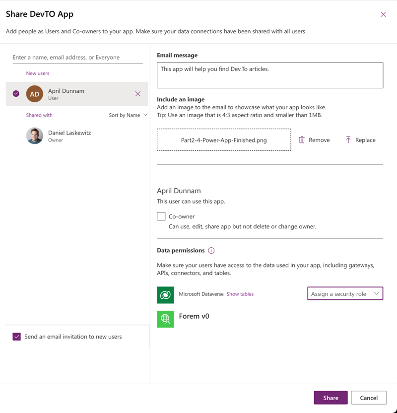
There's also a share icon in the same row as the save and publish icons. You can use that to share the app with your colleagues:
Completed solution
The custom connector and the canvas app are available as a solution via this link. You can import the solution via the import solution functionality that is described here.
And that also concludes this blog, hopefully this helps you when you start developing with Power Apps. Don't forget to check out the resources below!
Resources
- Create a canvas app from scratch
- Creator Kit
- Creator Kit components
- PowerfulDevs Session: Enable millions of low code devs by building custom connectors
- Learn Collection LowCode February