Introduction
So you're interested in using chart-parts for your application? Great choice! If you're unfamiliar with the concept of the Grammar of Graphics or Mark-Based Visualization, take a look at the introduction page...or not! Feel free to dive right in if you're up for it.
Prerequisites
To use chart-parts, you must be using webapp environment with a bundler present. If you're using create-react-app, or webpack directly you should be fine. To install the requisite client libraries, invoke the following command in your terminal. I'm using yarn, but feel free to use npm if you prefer.
> yarn add @chart-parts/react @chart-parts/react-svg-rendererThis will install the React component API and a target renderer for our webapp. If we were making a react-native application, you could install the @chart-parts/react-native-svg-renderer instead.
Establishing a Charting Context
To get started using chart-parts in our application, we'll need to put a
ChartingProvider component at the top-level of our app. This lets chart-parts
know how to translate chart scenegraphs into our UI layer (in this case, using
the browser's SVG capabilities).
import { render } from 'react-dom'
import { ChartingProvider } from '@chart-parts/react'
import { Renderer } from '@chart-parts/react-svg-renderer'
import './styles.css'

const renderer = new Renderer()

function App() {
  return (
    <ChartingProvider value={renderer}>
      <div className="App">
        <h1>Hello, World!</h1>
      </div>
    </ChartingProvider>
  )
}

const rootElement = document.getElementById('root')
render(<App />, rootElement)
Add Scales and Axes
Not let's define the skeleton of our chart and define some scales and axes.
// BarChart.js
import { memo } from 'react'
import { Chart, LinearScale, BandScale, Axis } from '@chart-parts/react'

export const BarChart = memo(({ data, height, width }) => {
  return (
    <Chart height={height} width={width} data={data}>
      <LinearScale name="y" domain="data.amount" range="height" />
      <BandScale name="x" domain="data.category" range="width" />
      <Axis orient="left" scale="y" />
      <Axis orient="bottom" scale="x" />
    </Chart>
  )
})
// App.js
import { render } from 'react-dom'
import { ChartingProvider } from '@chart-parts/react'
import { Renderer } from '@chart-parts/react-svg-renderer'
import './styles.css'
import { BarChart } from './BarChart'
const renderer = new Renderer()
const dataset = {
data: [
{ category: 'A', amount: 28 },
{ category: 'B', amount: 55 },
{ category: 'C', amount: 43 },
{ category: 'D', amount: 91 },
{ category: 'E', amount: 81 },
{ category: 'F', amount: 53 },
{ category: 'G', amount: 19 },
{ category: 'H', amount: 87 },
],
}
function App() {
return (
<div className="App">
<ChartingProvider value={renderer}>
<BarChart data={dataset} width={400} height={400} />
</ChartingProvider>
</div>
)
}
const rootElement = document.getElementById('root')
render(<App />, rootElement)And we should see the following:
Let's break this down a little bit:
<Chart height={height} width={width} data={data}>The chart component is the entry point of our chart instance. It must be rendered below a ChartingProvider component. It accepts a dataset, which is a plain object of table data. Each "table" is an array of plain objects. In this case, our dataset has a single table: data. It also requires a width and height value in pixels, which are passed along to the rendering target.
<LinearScale name="y" domain="data.amount" range="height" />
<BandScale name="x" domain="data.category" range="width" />
Here we define what scales are defined in the current space. In this case, we want to make a BarChart, so we want categorical bands across the width of the viewport, and we want the linear amount values in our data to be mapped to the height of our viewport. These must have names so that we can reference them in other marks.
<Axis orient="left" scale="y" />
<Axis orient="bottom" scale="x" />
Here we're defining some axes. The orient prop anchors the Axis instances to a side of the current view space. And the scale prop associates the axis with a scale to represent.
Add Data Marks
Now let's add some meaningful marks to our data. In our case, we want a rectangular bar per category.
import { memo } from 'react'
import { Chart, LinearScale, BandScale, Axis, Rect } from '@chart-parts/react'
export const BarChart = memo(({ data, height, width }) => {
return (
<Chart height={height} width={width} data={data}>
<LinearScale name="y" domain="data.amount" range="height" />
<BandScale name="x" domain="data.category" range="width" />
<Axis orient="left" scale="y" />
<Axis orient="bottom" scale="x" />
<Rect
table="data"
width={({ xWidth }) => xWidth()}
x={({ d, x }) => x(d.category)}
y={({ d, y }) => y(d.amount)}
y2={({ y }) => y(0)}
fill="steelblue"
/>
</Chart>
)
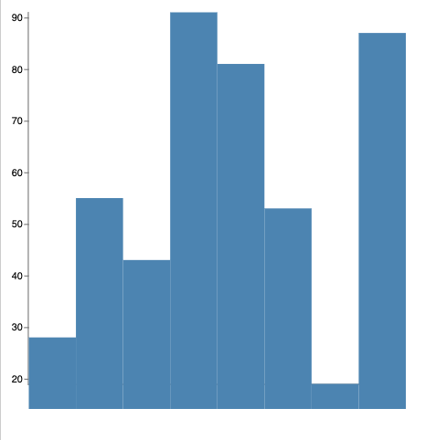
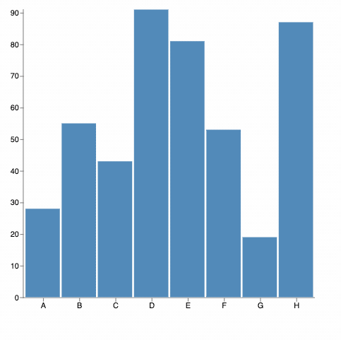
})Now we should see the following:
Let's break it down:
<Rect
  table="data"
  x={({ d, x }) => x(d.category)}
  y={({ d, y }) => y(d.amount)}
  width={({ xWidth }) => xWidth()}
  y2={({ y }) => y(0)}
  fill="steelblue"
/>
Let's talk about the Rect component. The first prop we see assigned is table. The table prop binds this visual mark to instances of rows in the named table. In this case, we will emit one rectangle per row of data in the data table.
Next up we see some attributes used to encode the parameters of each rectangle. In this case, we are encoding the width, x, y, y2, and fill attributes. Each of these attributes can either be a static value, or they could be data-bound to the row they are reflecting. In this case they are all given the same fill color, but their x and y locations are bound to specific attributes from the data. The argument passed to these encoding functions is an EncodingContext that contains the named tables, scales, d (the bound row), and index (the row index).
Two encodings are bound special ways. The first is width. The BandScale emits two scales to the scale context: <name> and <name>Width - in this case x and xWidth. The width scale can be customized using the bandWidth prop of the BandScale component. In this example, xWidth is used to acquire the width value the scale has determined for us.
The other special encoding is y2 which is bound to a specific value of zero. In this example that makes the rectangles bleed out of view since zero is not included in the scale. Let's fix that:
// BarChart.js
import { memo } from 'react'
import { Chart, LinearScale, BandScale, Axis, Rect } from '@chart-parts/react'
export const BarChart = memo(({ data, height, width }) => {
return (
<Chart height={height} width={width} data={data}>
<LinearScale name="y" domain="data.amount" range="height" zero />
<BandScale name="x" domain="data.category" range="width" padding={0.05} />
<Axis orient="left" scale="y" />
<Axis orient="bottom" scale="x" />
<Rect
table="data"
width={({ xWidth }) => xWidth()}
x={({ d, x }) => x(d.category)}
y={({ d, y }) => y(d.amount)}
y2={({ y }) => y(0)}
fill="steelblue"
/>
</Chart>
)
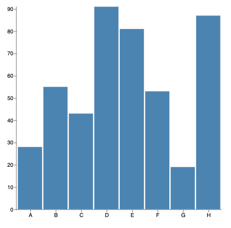
})Here we've added the zero prop to the y scale, indicating that the scale should include the zero value. We've also added some padding between the bands in the x scale. Our fixed chart should now look like this:
Adding Events
Now let's add some interactivity. Suppose we want to have a special color for a bar when it is being hovered over. To make this happen, let's define some event bindings:
// BarChart.js
import { memo, useState } from 'react'
import { Chart, LinearScale, BandScale, Axis, Rect } from '@chart-parts/react'
export const BarChart = memo(({ data, height, width }) => {
const [hoverIndex, setHoverIndex] = useState()
return (
<Chart height={height} width={width} data={data}>
<LinearScale name="y" domain="data.amount" range="height" zero />
<BandScale name="x" domain="data.category" range="width" padding={0.05} />
<Axis orient="left" scale="y" />
<Axis orient="bottom" scale="x" />
<Rect
table="data"
width={({ xWidth }) => xWidth()}
x={({ d, x }) => x(d.category)}
y={({ d, y }) => y(d.amount)}
y2={({ y }) => y(0)}
onMouseEnter={({ index }) => {
if (hoverIndex !== index) {
setHoverIndex(index)
}
}}
onMouseLeave={({ index }) => {
if (hoverIndex === index) {
setHoverIndex(undefined)
}
}}
fill={({ index }) => (hoverIndex === index ? 'firebrick' : 'steelblue')}
/>
</Chart>
)
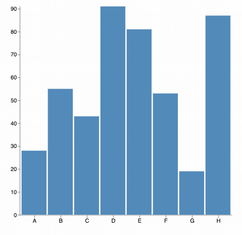
})This should now look like:
Let's break this part down:
const [hoverIndex, setHoverIndex] = useState()The first thing we do is introduce a piece of state into our component, hoverIndex, using a React hook.
onMouseEnter={({ index }) => {
  if (hoverIndex !== index) {
    setHoverIndex(index)
  }
}}
onMouseLeave={({ index }) => {
  if (hoverIndex === index) {
    setHoverIndex(undefined)
  }
}}
Next, we define mouse-event handlers on the mark to set and clear the state when they are interacted with.
fill={({ index }) => (hoverIndex === index ? 'firebrick' : 'steelblue')}Finally, we encode the fill color of the Rectangles based on whether they are being hovered over.
Conditional Marks
Finally, let's add a text mark onto the hovered rectangle so that we can view the value that is currently being hovered over.
// BarChart.js
import { memo, useState } from 'react'
import {
  Chart,
  LinearScale,
  BandScale,
  Axis,
  Rect,
  Text,
} from '@chart-parts/react'

export const BarChart = memo(({ data, height, width }) => {
  const [hoverIndex, setHoverIndex] = useState()

  return (
    <Chart height={height} width={width} data={data}>
      <LinearScale name="y" domain="data.amount" range="height" zero />
      <BandScale name="x" domain="data.category" range="width" padding={0.05} />
      <Axis orient="left" scale="y" />
      <Axis orient="bottom" scale="x" />
      <Rect
        table="data"
        width={({ xWidth }) => xWidth()}
        x={({ d, x }) => x(d.category)}
        y={({ d, y }) => y(d.amount)}
        y2={({ y }) => y(0)}
        onMouseEnter={({ index }) => {
          if (hoverIndex !== index) {
            setHoverIndex(index)
          }
        }}
        onMouseLeave={({ index }) => {
          if (hoverIndex === index) {
            setHoverIndex(undefined)
          }
        }}
        fill={({ index }) => (hoverIndex === index ? 'firebrick' : 'steelblue')}
      />
      {hoverIndex === undefined ? null : (
        <Text
          text={({ data }) => data[hoverIndex].amount}
          fill="black"
          x={({ data, x, xWidth }) =>
            x(data[hoverIndex].category) + xWidth() / 2
          }
          y={({ data, y }) => y(data[hoverIndex].amount) - 3}
          baseline="bottom"
          align="center"
        />
      )}
    </Chart>
  )
})
Now our chart should look like this:
Happy Charting!