Survival Curves with create_survival()
vivainsights
2026-04-29
Source:vignettes/survival-curves.Rmd
survival-curves.RmdOverview
create_survival() produces a Kaplan–Meier
survival curve — a non-parametric estimate of how quickly a
specific event occurs across a population. In a workforce analytics
context typical events include:
- First week of after-hours collaboration
- First week a collaboration or network metric crosses a threshold
- First observed use of a new tool
The function expects one row per person with a
pre-computed time (weeks until event or end of observation)
and event (1 = event occurred, 0 = censored) column. Use
create_survival_prep() to derive these from a Standard
Person Query panel dataset.
Reframing “survival” for workforce contexts
In classical survival analysis the event is typically something negative — death, equipment failure — and the y-axis probability represents “still alive / still working”. In workforce analytics the event is usually a positive milestone: first adoption of a tool, first week as a power user, first time a network or collaboration metric crosses a meaningful threshold.
The terminology inverts: “surviving” means not yet having reached the milestone, and the event (“death”) means success — the person converted. It can therefore be more intuitive to read the chart as a time-to-adoption curve, a conversion curve, or a graduation curve:
- A curve that drops steeply early → most people reached the milestone quickly.
- A curve that stays high → many people had not yet converted by the end of the observation window.
- The y-axis → the share of people who have not yet experienced the milestone.
The curve answers: “By week N, what fraction of the population had not yet crossed the threshold?”
Step 1 — Prepare person-level survival data
pq_data is a panel dataset with one row per person per
week. create_survival_prep() collapses it to one row per
person, recording:
-
time: the week number at which the event first occurred, or the total number of observed weeks if the event never occurred (censored). -
event: 1 if the condition was met in at least one week, 0 otherwise.
Here we define the event as a person’s first week with any
after-hours collaboration
(After_hours_collaboration_hours > 0):
surv_data <- create_survival_prep(
  data            = pq_data,
  metric          = "After_hours_collaboration_hours",
  event_condition = function(x) x > 0,
  hrvar           = "Organization"
)

glimpse(surv_data)
#> Rows: 300
#> Columns: 4
#> $ PersonId     <chr> "0023c8ce-6939-4188-a9ec-f5c205fc4426", "00a79c9a-639e-42…
#> $ time         <dbl> 1, 1, 1, 1, 1, 1, 1, 1, 1, 1, 1, 1, 1, 1, 1, 1, 1, 1, 1, …
#> $ event        <int> 1, 1, 1, 1, 1, 1, 1, 1, 1, 1, 1, 1, 1, 1, 1, 1, 1, 1, 1, …
#> $ Organization <chr> "Legal", "Finance", "Finance", "Finance", "Research", "Fi…
# Event rate and time distribution
cat("Total persons:  ", nrow(surv_data), "\n")
#> Total persons:   300
cat("Event rate:     ", round(mean(surv_data$event) * 100, 1), "%\n")
#> Event rate:      100 %
cat("Weeks observed: ", range(surv_data$time), "\n")
#> Weeks observed:  1 1

surv_data %>%
  count(event, name = "n") %>%
  mutate(pct = round(100 * n / sum(n), 1),
         label = ifelse(event == 1, "Had event", "Censored"))
#> # A tibble: 1 × 4
#>   event     n   pct label
#>   <int> <int> <dbl> <chr>
#> 1     1   300   100 Had event
The persons who never had any after-hours work during the observation
window appear as censored (event = 0). The survival curve
accounts for this: they contribute information up to their last observed
week.
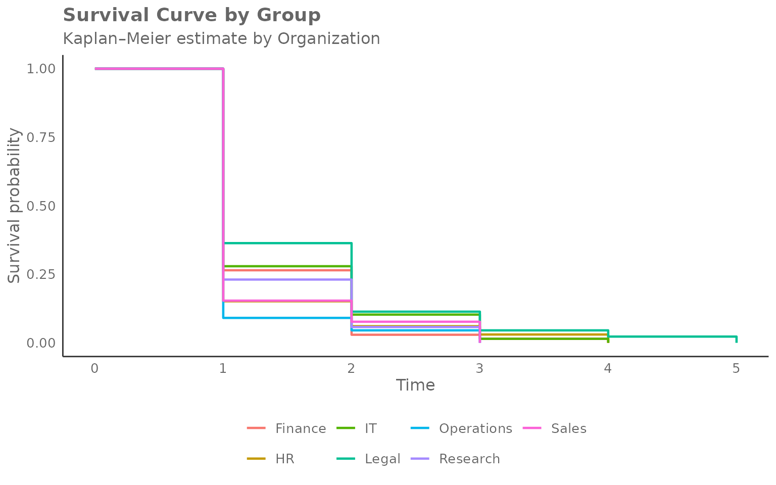
Step 2 — Plot the Kaplan–Meier curve
Pass the person-level data to create_survival(),
specifying the time and event columns and the grouping variable:
create_survival(
  data      = surv_data,
  time_col  = "time",
  event_col = "event",
  hrvar     = "Organization",
  mingroup  = 5
)
Reading the chart:
- Y-axis — probability of not yet having reached the milestone (the “survival” probability, or equivalently, the share yet to convert).
- X-axis — week number (time since the start of observation).
- Each step down marks one or more conversions (events) in that group at that week.
- Curves that drop quickly indicate groups where most people reached the milestone early (fast adoption).
- Curves that stay high indicate groups where many people had not yet converted by the end of the window (slow or incomplete adoption).
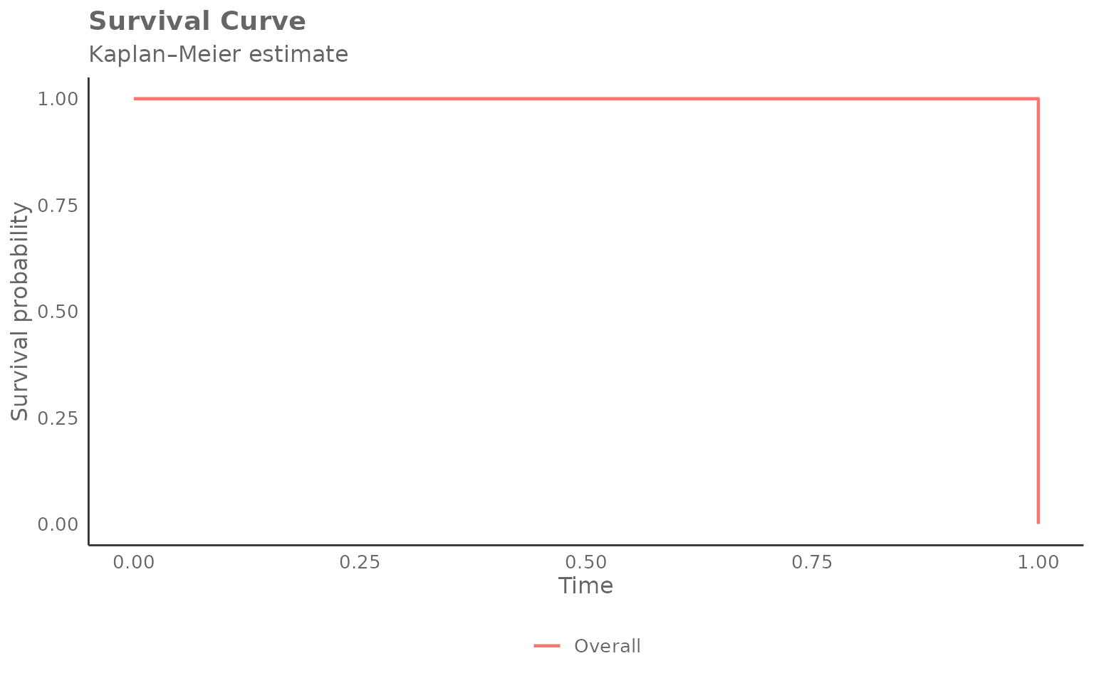
Overall curve (no grouping)
Set hrvar = NULL to estimate a single curve across the
whole population:
create_survival(
  data      = surv_data,
  time_col  = "time",
  event_col = "event",
  hrvar     = NULL,
  mingroup  = 5
)
Returning the survival table
Set return = "table" to get the underlying long-format
data frame. Each row represents one event time within one group:
surv_tbl <- create_survival(
  data      = surv_data,
  time_col  = "time",
  event_col = "event",
  hrvar     = "Organization",
  mingroup  = 5,
  return    = "table"
)

head(surv_tbl, 12)
#>    Organization  n time survival at_risk events
#> 1       Finance 68    0        1      68      0
#> 2       Finance 68    1        0      68     68
#> 3            HR 33    0        1      33      0
#> 4            HR 33    1        0      33     33
#> 5            IT 68    0        1      68      0
#> 6            IT 68    1        0      68     68
#> 7         Legal 44    0        1      44      0
#> 8         Legal 44    1        0      44     44
#> 9    Operations 22    0        1      22      0
#> 10   Operations 22    1        0      22     22
#> 11     Research 52    0        1      52      0
#> 12     Research 52    1        0      52     52
Columns:
| Column | Description |
|---|---|
Organization |
Group identifier |
n |
Total persons in group (after privacy filtering) |
time |
Week number |
survival |
Estimated survival probability at that time |
at_risk |
Persons still in the risk set (event not yet occurred) |
events |
Events occurring at this time point |
Extracting median event times
The median survival time is the week at which 50 % of the group has experienced the event:
surv_tbl %>%
  group_by(Organization) %>%
  filter(survival <= 0.5) %>%
  slice(1) %>%                         # first time survival crosses 0.5
  ungroup() %>%
  select(Organization, n, time, survival) %>%
  arrange(time)
#> # A tibble: 7 × 4
#>   Organization     n  time survival
#>   <chr>        <int> <dbl>    <dbl>
#> 1 Finance         68     1        0
#> 2 HR              33     1        0
#> 3 IT              68     1        0
#> 4 Legal           44     1        0
#> 5 Operations      22     1        0
#> 6 Research        52     1        0
#> 7 Sales           13     1        0
Groups with a smaller time value here reach the event
threshold faster on average.
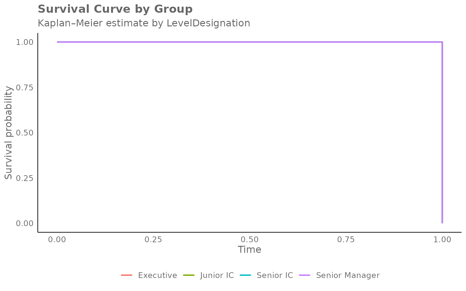
Grouping by a different HR variable
Any character column can be used as the grouping variable. Here we
compare after-hours adoption by LevelDesignation:
surv_level <- create_survival_prep(
  data            = pq_data,
  metric          = "After_hours_collaboration_hours",
  event_condition = function(x) x > 0,
  hrvar           = "LevelDesignation"
)

create_survival(
  data      = surv_level,
  time_col  = "time",
  event_col = "event",
  hrvar     = "LevelDesignation",
  mingroup  = 5
)
Changing the event definition
The event_condition argument in
create_survival_prep() accepts any function that returns a
logical vector. This makes it easy to explore different thresholds
without modifying your data.
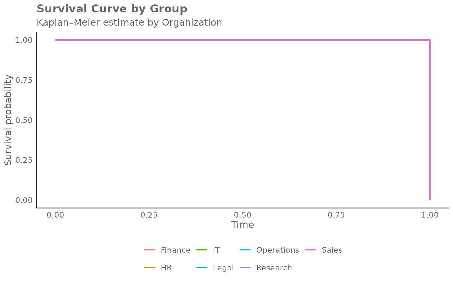
Higher after-hours threshold
# Event: first week with more than 2 hours of after-hours collaboration
surv_high <- create_survival_prep(
  data            = pq_data,
  metric          = "After_hours_collaboration_hours",
  event_condition = function(x) x > 2,
  hrvar           = "Organization"
)

cat("Event rate (> 2 h after-hours):", round(mean(surv_high$event) * 100, 1), "%\n")
#> Event rate (> 2 h after-hours): 100 %

create_survival(
  data      = surv_high,
  time_col  = "time",
  event_col = "event",
  hrvar     = "Organization",
  mingroup  = 5
)
Network growth milestone
# Event: first week where internal network size exceeds 10 contacts
surv_net <- create_survival_prep(
  data            = pq_data,
  metric          = "Internal_network_size",
  event_condition = function(x) x > 10,
  hrvar           = "Organization"
)

cat("Event rate (network > 10):", round(mean(surv_net$event) * 100, 1), "%\n")
#> Event rate (network > 10): 100 %

create_survival(
  data      = surv_net,
  time_col  = "time",
  event_col = "event",
  hrvar     = "Organization",
  mingroup  = 5
)
Privacy filtering
Groups below mingroup unique persons are removed before
the curve is estimated. Increase the threshold to be more
conservative:
surv_strict <- create_survival(
  data      = surv_data,
  time_col  = "time",
  event_col = "event",
  hrvar     = "Organization",
  mingroup  = 20,
  return    = "table"
)

# Which groups remained after stricter filtering?
surv_strict %>%
  distinct(Organization, n) %>%
  arrange(desc(n))
#>   Organization  n
#> 1      Finance 68
#> 2           IT 68
#> 3     Research 52
#> 4        Legal 44
#> 5           HR 33
#> 6   Operations 22
Handling missing values
na.rm = TRUE (the default) drops rows where
time_col or event_col are NA
before the curve is estimated. Set na.rm = FALSE to keep
them; any remaining NA values will be silently excluded
during coercion and a warning will be issued.
Using the lower-level helpers directly
Like create_radar(), the survival family exposes its
building blocks as exported functions:
-
create_survival_calc()— accepts person-level data and returns a list with$table(the long survival table) and$counts(group size table). -
create_survival_viz()— accepts the$tableoutput and returns aggplotobject.
library(ggplot2)

calc <- create_survival_calc(
  data      = surv_data,
  time_col  = "time",
  event_col = "event",
  hrvar     = "Organization",
  mingroup  = 5
)

# Inspect group sizes
calc$counts
#> # A tibble: 7 × 2
#>   Organization     n
#>   <chr>        <int>
#> 1 Finance         68
#> 2 HR              33
#> 3 IT              68
#> 4 Legal           44
#> 5 Operations      22
#> 6 Research        52
#> 7 Sales           13

# Render with extra annotation
create_survival_viz(
  data     = calc$table,
  hrvar    = "Organization",
  title    = "Time to first after-hours week",
  subtitle = "Kaplan\u2013Meier estimate by organisation"
) +
  geom_hline(yintercept = 0.5, linetype = "dashed", colour = "grey50") +
  annotate("text", x = 0, y = 0.52, label = "50 % threshold",
           hjust = 0, size = 3, colour = "grey50")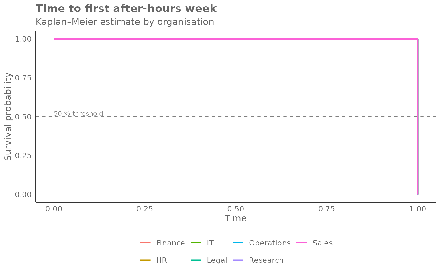
The dashed line at 0.5 makes it easy to read off the median time-to-event for each group.