
TIP
🔥 🔥 Download the FREE Azure Developer Guide eBook here (opens new window).
💡 Learn more : Azure Dashboards overview (opens new window).
📺 Watch the video : How to customize and pin charts to your Azure Dashboard (opens new window).
# How to customize and pin charts to your Azure Dashboard
# See how your services are doing
When you work with Azure, it's useful to see information about your services, like availability, number of failed requests and server response time. Most resources in Azure produce this information, which you can visualize in charts within the service, or within overarching services like Azure Monitor (opens new window). And you can also pin charts to Azure portal (opens new window) Dashboards (opens new window) and customize them. This enables you to instantly see how your services are doing, and act on that information, if needed.
In this post, we'll pin charts to a dashboard (opens new window) in the Azure portal (opens new window), and customize them.
# Prerequisites
If you want to follow along, you'll need the following:
- An Azure subscription (If you don't have an Azure subscription, create a free account (opens new window) before you begin)
# Pin charts to dashboards in the Azure portal
Let's pin a chart to a dashboard in the Azure portal.
- Go to the Azure portal (opens new window)
- It could be that your Azure portal is configured to show Home. If so, click on the menu in the top-left and select Dashboard
- In the dashboard, click on the Edit button. This puts the dashboard in customizing mode, and opens the Tile Gallery
- Pick the Metrics chart tile and click Add
- Click "Edit in Metrics". This opens the Azure Monitoring Metrics blade
- A metrics chart is a general chart that can visualize any kind of metric for any Azure resource. To start, select a scope that contains the service(s) that you want to use for a chart. For instance, select an Application Insights resource
- Next, pick a Metric to display. For instance, if you selected an Application Insights resource, pick "Process IO rate" as a metric
- You can now customize this chart by changing the time frame, chart type, adding filters or metrics and more
- When you are done customizing the chart, click "Save to dashboard"
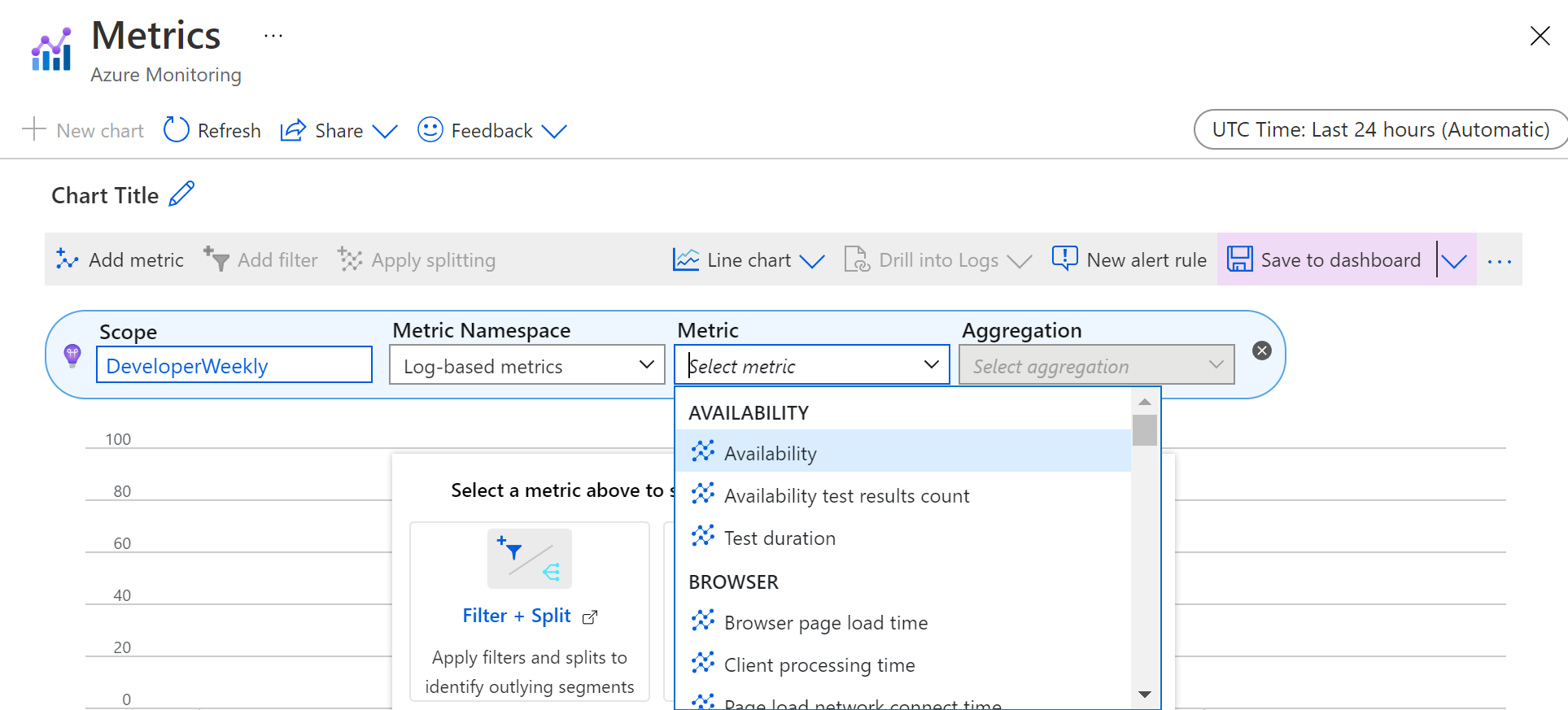
(Pick a metric for the chart)
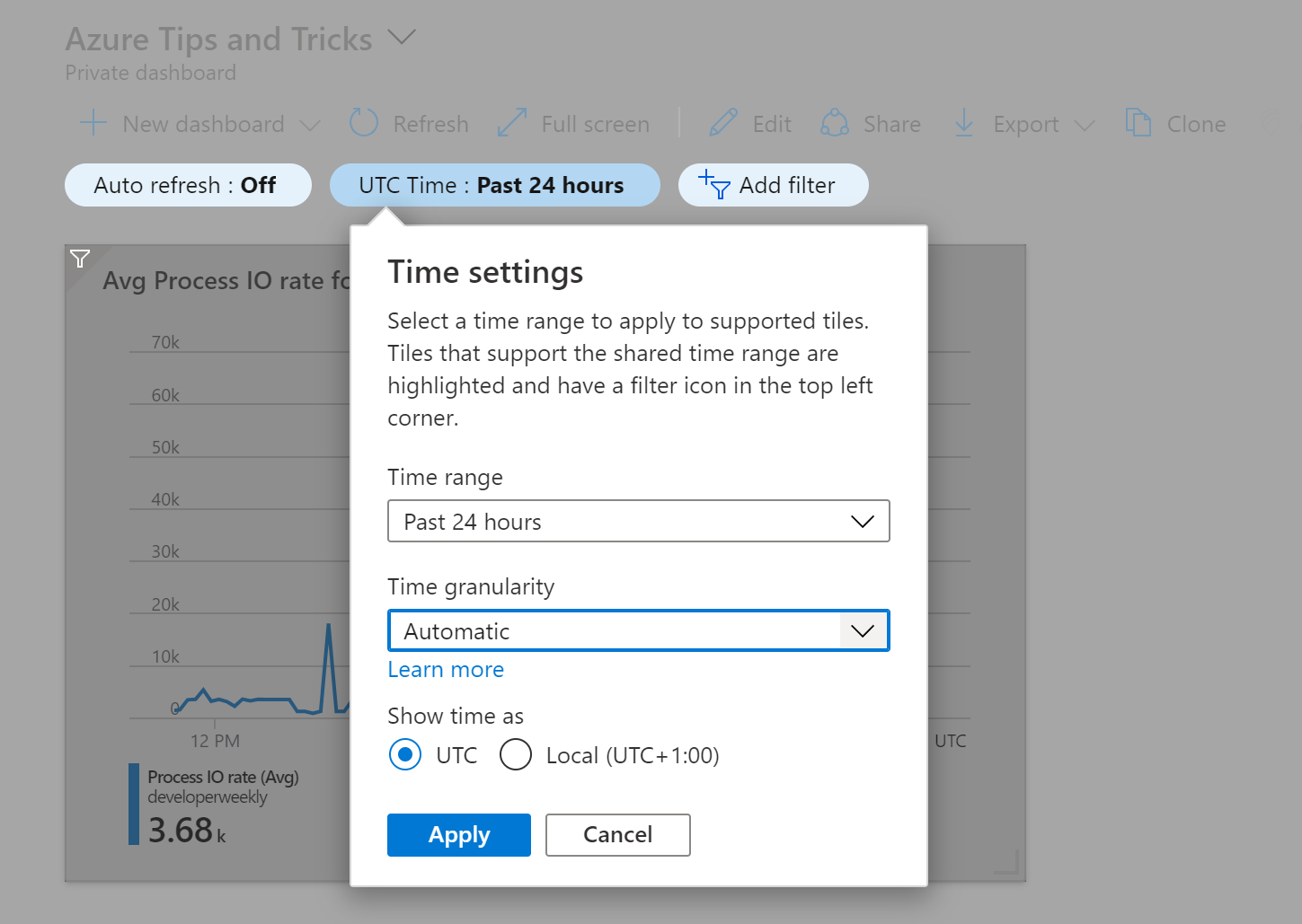
When the chart is saved to the dashboard, you can control it there. You can turn on Auto refresh. This reloads chart data every interval. For instance, every 5 minutes. You can also change the Time settings to see data for a different time frame and a different time granularity. These settings work for every chart that is pinned to the dashboard.
(Change dashboard time settings)
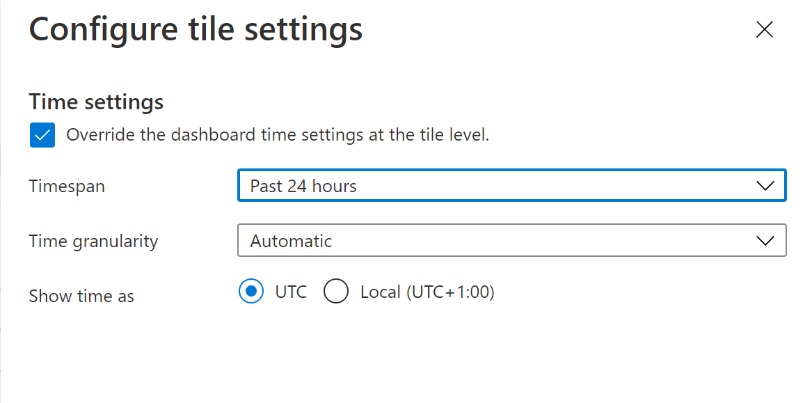
You can also configure individual chart settings directly from the dashboard. Click on the ... button of the chart tile to open the tile settings menu and click "Configure tile settings". You can now check "Override the dashboard time settings at the tile level" to change the time settings for this individual chart, without affecting other charts on the dashboards. If available, you can also override chart filters from here. This is a quick way to create the most useful dashboard for you.
(Change individual chart settings)
# Conclusion
Charts in Azure are essential to understand your Azure resources. And with dashboards (opens new window) in the Azure portal (opens new window), you can create a custom overview of the Azure information that matters to you. Go and check it out!