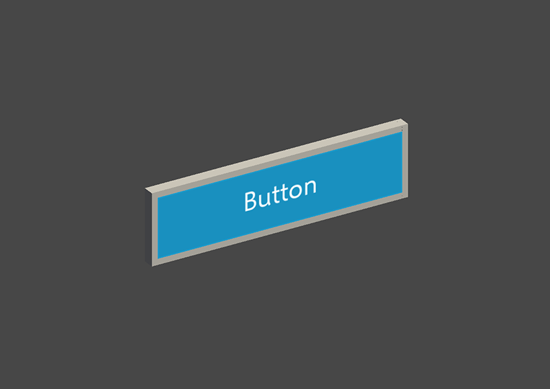
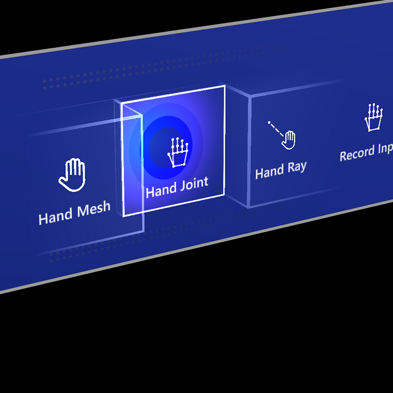
Button
A button gives the user a way to trigger an immediate action. It is one of the most foundational components in mixed reality. MRTK provides various types of button prefabs.
Button prefabs in MRTK
Examples of the button prefabs under MRTK/SDK/Features/UX/Interactable/Prefabs folder
Unity UI Image/Graphic based buttons
UnityUIInteractableButton.prefabPressableButtonUnityUI.prefabPressableButtonUnityUICircular.prefabPressableButtonHoloLens2UnityUI.prefab
Collider based buttons
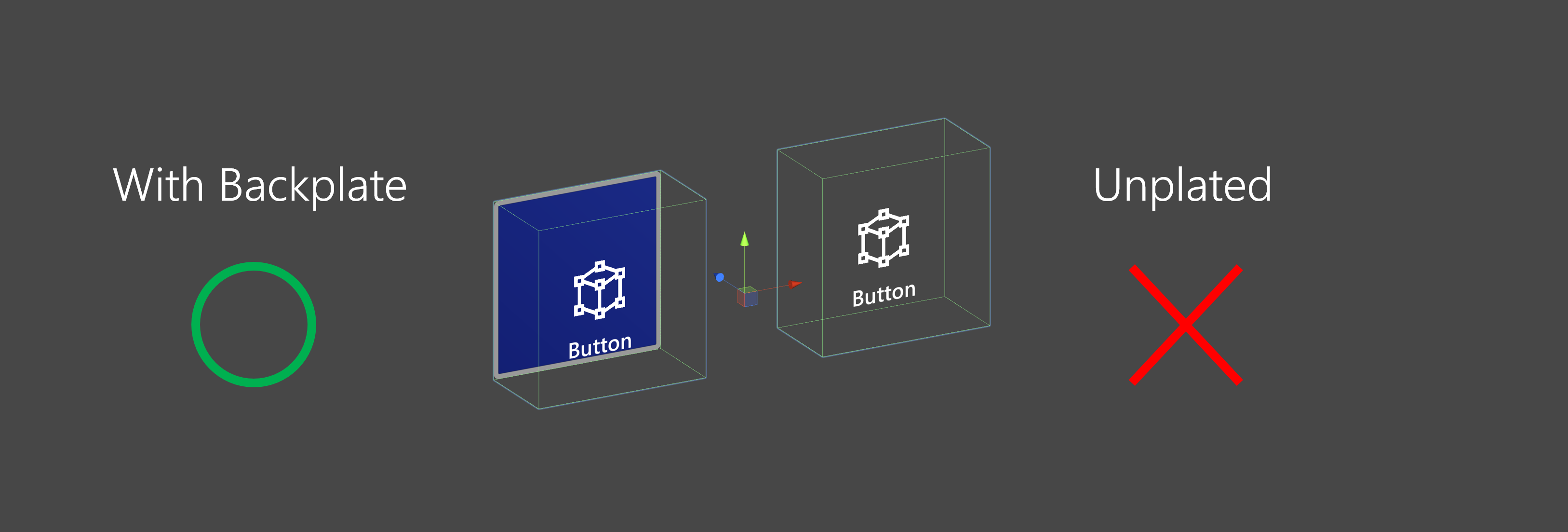
 PressableButtonHoloLens2 PressableButtonHoloLens2 |
 PressableButtonHoloLens2Unplated PressableButtonHoloLens2Unplated |
 PressableButtonHoloLens2Circular PressableButtonHoloLens2Circular |
|---|---|---|
| HoloLens 2's shell-style button with backplate which supports various visual feedback such as border light, proximity light, and compressed front plate | HoloLens 2's shell-style button without backplate | HoloLens 2's shell-style button with circular shape |
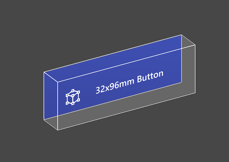 PressableButtonHoloLens2_32x96 PressableButtonHoloLens2_32x96 |
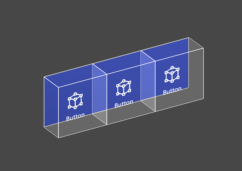 PressableButtonHoloLens2Bar3H PressableButtonHoloLens2Bar3H |
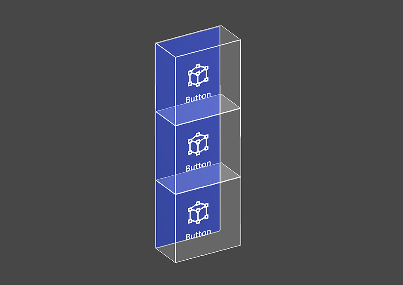 PressableButtonHoloLens2Bar3V PressableButtonHoloLens2Bar3V |
| Wide HoloLens 2's shell-style button 32x96mm | Horizontal HoloLens 2 button bar with shared backplate | Vertical HoloLens 2 button bar with shared backplate |
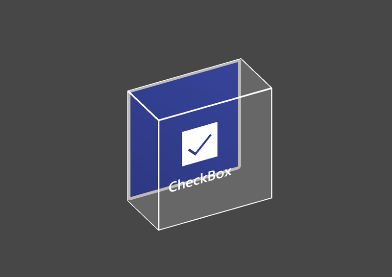 PressableButtonHoloLens2ToggleCheckBox_32x32 PressableButtonHoloLens2ToggleCheckBox_32x32 |
 PressableButtonHoloLens2ToggleSwitch_32x32 PressableButtonHoloLens2ToggleSwitch_32x32 |
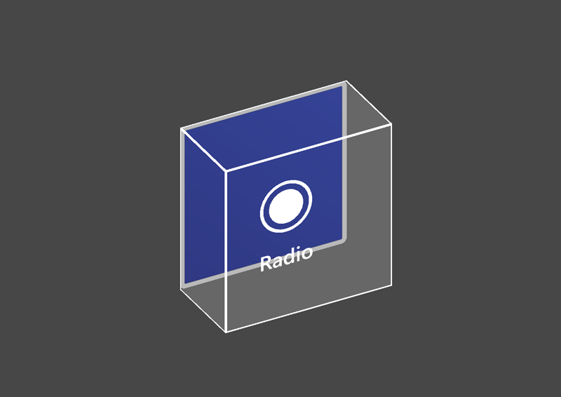 PressableButtonHoloLens2ToggleRadio_32x32 PressableButtonHoloLens2ToggleRadio_32x32 |
| HoloLens 2's shell-style checkbox 32x32mm | HoloLens 2's shell-style switch 32x32mm | HoloLens 2's shell-style radio 32x32mm |
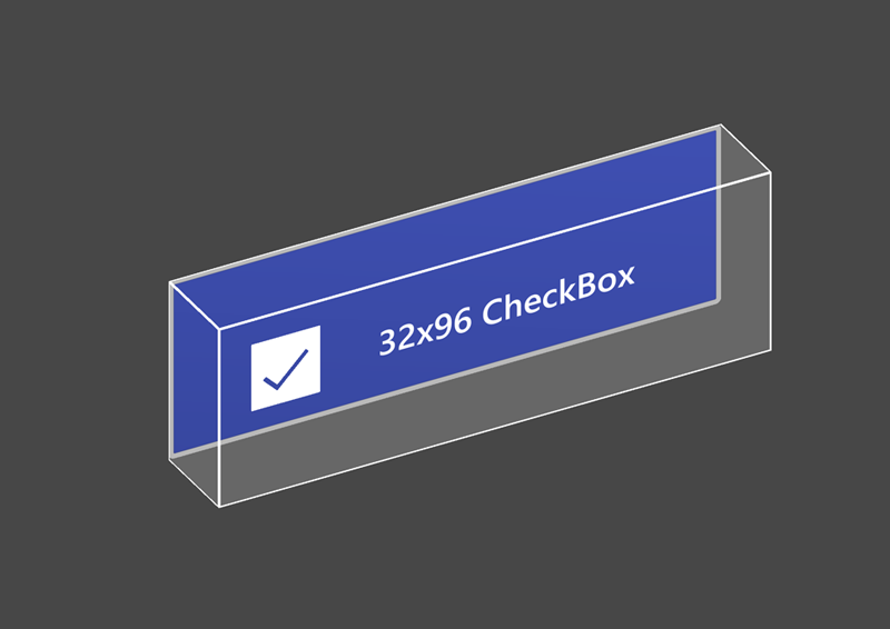 PressableButtonHoloLens2ToggleCheckBox_32x96 PressableButtonHoloLens2ToggleCheckBox_32x96 |
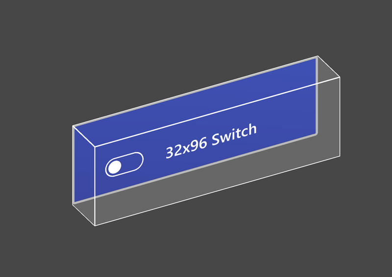 PressableButtonHoloLens2ToggleSwitch_32x96 PressableButtonHoloLens2ToggleSwitch_32x96 |
 PressableButtonHoloLens2ToggleRadio_32x96 PressableButtonHoloLens2ToggleRadio_32x96 |
| HoloLens 2's shell-style checkbox 32x96mm | HoloLens 2's shell-style switch 32x96mm | HoloLens 2's shell-style radio 32x96mm |
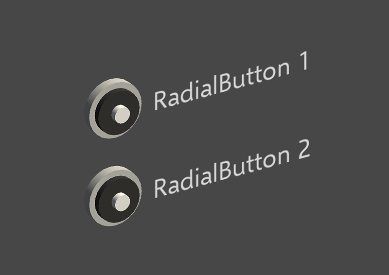 Radial Radial |
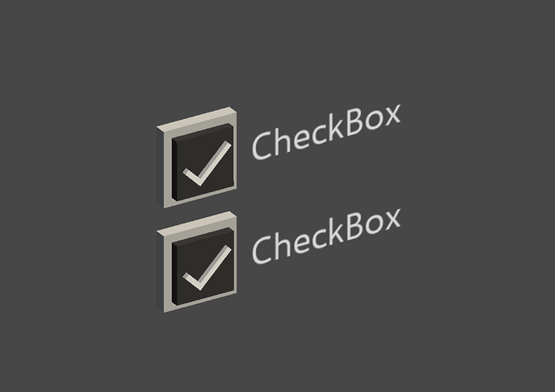 Checkbox Checkbox |
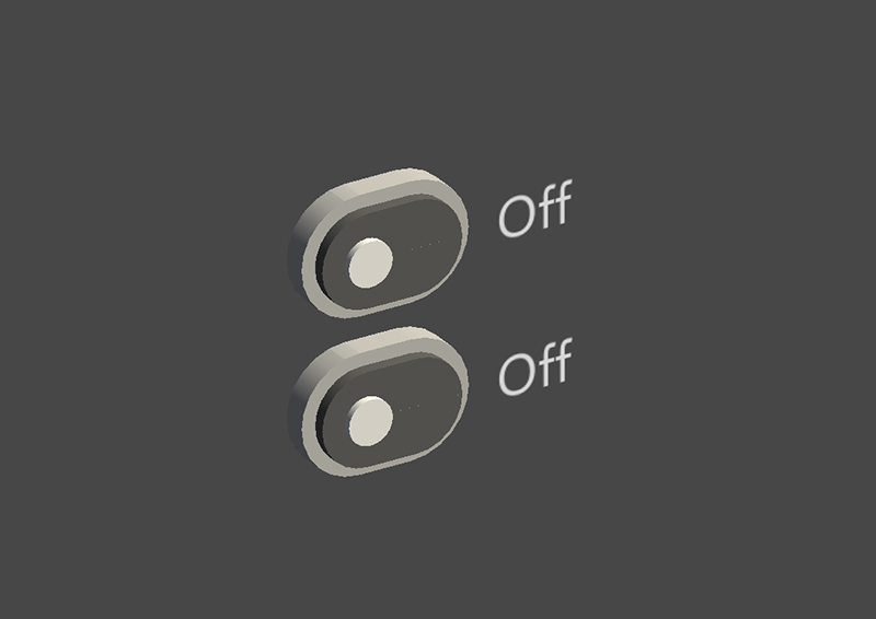 ToggleSwitch ToggleSwitch |
| Radial button | Checkbox | Toggle switch |
 ButtonHoloLens1 ButtonHoloLens1 |
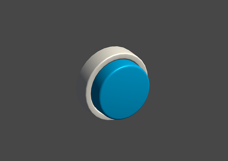 PressableRoundButton PressableRoundButton |
 Button Button |
| HoloLens 1st gen's shell style button | Round shape push button | Basic button |
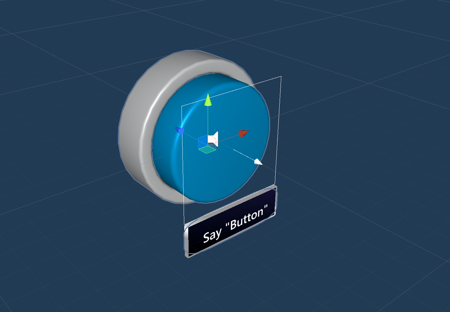
The Button (Assets/MRTK/SDK/Features/UX/Interactable/Prefabs/Button.prefab) is based on the Interactable concept to provide easy UI controls for buttons or other types of interactive surfaces. The baseline button supports all available input methods, including articulated hand input for the near interactions as well as gaze + air-tap for the far interactions. You can also use voice command to trigger the button.
PressableButtonHoloLens2 (Assets/MRTK/SDK/Features/UX/Interactable/Prefabs/PressableButtonHoloLens2.prefab) is HoloLens 2's shell style button that supports the precise movement of the button for the direct hand tracking input. It combines Interactable script with PressableButton script.
For HoloLens 2, it is recommended to use buttons with an opaque backplate. Transparent buttons are not recommended because of these usability and stability issues:
- Icon and text are difficult to read with the physical environment
- It is hard to understand when the event triggers
- Holograms that are displayed through a transparent plane can be unstable with HoloLens 2's Depth LSR stabilization
How to use pressable buttons
Unity UI based buttons
Create a Canvas in your scene (GameObject -> UI -> Canvas). In the Inspector panel for your Canvas:
- Click "Convert to MRTK Canvas"
- Click "Add NearInteractionTouchableUnityUI"
- Set the Rect Transform component's X, Y, and Z scale to 0.001
Then, drag PressableButtonUnityUI (Assets/MRTK/SDK/Features/UX/Interactable/Prefabs/PressableButtonUnityUI.prefab), PressableButtonUnityUICircular (Assets/MRTK/SDK/Features/UX/Interactable/Prefabs/PressableButtonUnityUICircular.prefab), or PressableButtonHoloLens2UnityUI (Assets/MRTK/SDK/Features/UX/Interactable/Prefabs/PressableButtonHoloLens2UnityUI.prefab) onto the Canvas.
Collider based buttons
Simply drag PressableButtonHoloLens2 (Assets/MRTK/SDK/Features/UX/Interactable/Prefabs/PressableButtonHoloLens2.prefab) or PressableButtonHoloLens2Unplated (Assets/MRTK/SDK/Features/UX/Interactable/Prefabs/PressableButtonHoloLens2Unplated.prefab) into the scene. These button prefabs are already configured to have audio-visual feedback for the various types of inputs, including articulated hand input and gaze.
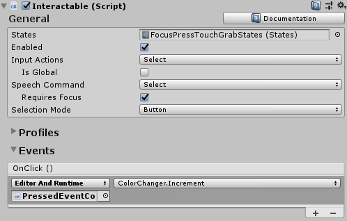
The events exposed in the prefab itself as well as the Interactable component can be used to trigger additional actions. The pressable buttons in the HandInteractionExample scene use Interactable's OnClick event to trigger a change in the color of a cube. This event gets triggered for different types of input methods such as gaze, air-tap, hand-ray, as well as physical button presses through the pressable button script.
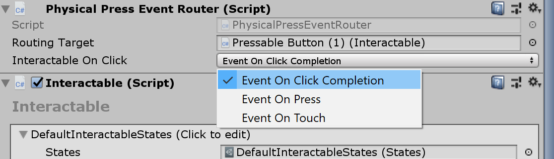
You can configure when the pressable button fires the OnClick event via the PhysicalPressEventRouter on the button. For example, you can set OnClick to fire when the button is first pressed, as opposed to being pressed and released, by setting Interactable On Click to Event On Press.
To leverage specific articulated hand input state information, you can use pressable buttons events - Touch Begin, Touch End, Button Pressed, Button Released. These events will not fire in response to air-tap, hand-ray, or eye inputs, however. To support both near and far interactions, it is recommended to use Interactable's OnClick event.
Interaction states
In the idle state, the button's front plate is not visible. As a finger approaches or a cursor from gaze input targets the surface, the front plate's glowing border becomes visible. There is additional highlighting of the fingertip position on the front plate surface. When pushed with a finger, the front plate moves with the fingertip. When the fingertip touches the surface of the front plate, it shows a subtle pulse effect to give visual feedback of the touch point.
In HoloLens 2 shell-style button, there are many visual cues and affordances to increase the user's confidence on interaction.
 |
 |
 |
 |
|---|---|---|---|
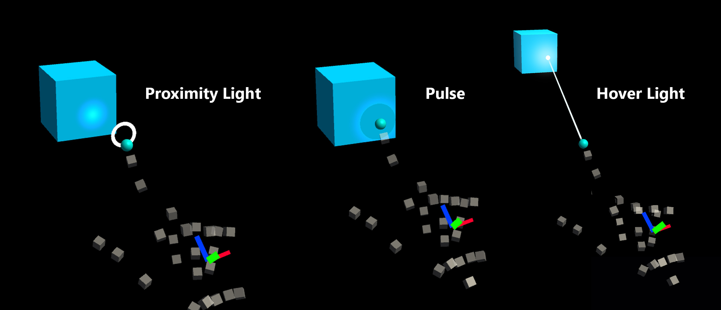
| Proximity light | Focus highlight | Compressing cage | Pulse on trigger |
The subtle pulse effect is triggered by the pressable button, which looks for ProximityLight(s) that live on the currently interacting pointer. If any proximity lights are found, the ProximityLight.Pulse method is called, which automatically animates shader parameters to display a pulse.
Inspector properties
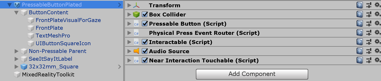
Box Collider
Box Collider for the button's front plate.
Pressable Button The logic for the button movement with hand press interaction.
Physical Press Event Router This script sends events from hand press interaction to Interactable.
Interactable Interactable handles various types of interaction states and events. HoloLens gaze, gesture, and voice input and immersive headset motion controller input are directly handled by this script.
Audio Source Unity audio source for the audio feedback clips.
NearInteractionTouchable.cs Required to make any object touchable with articulated hand input.
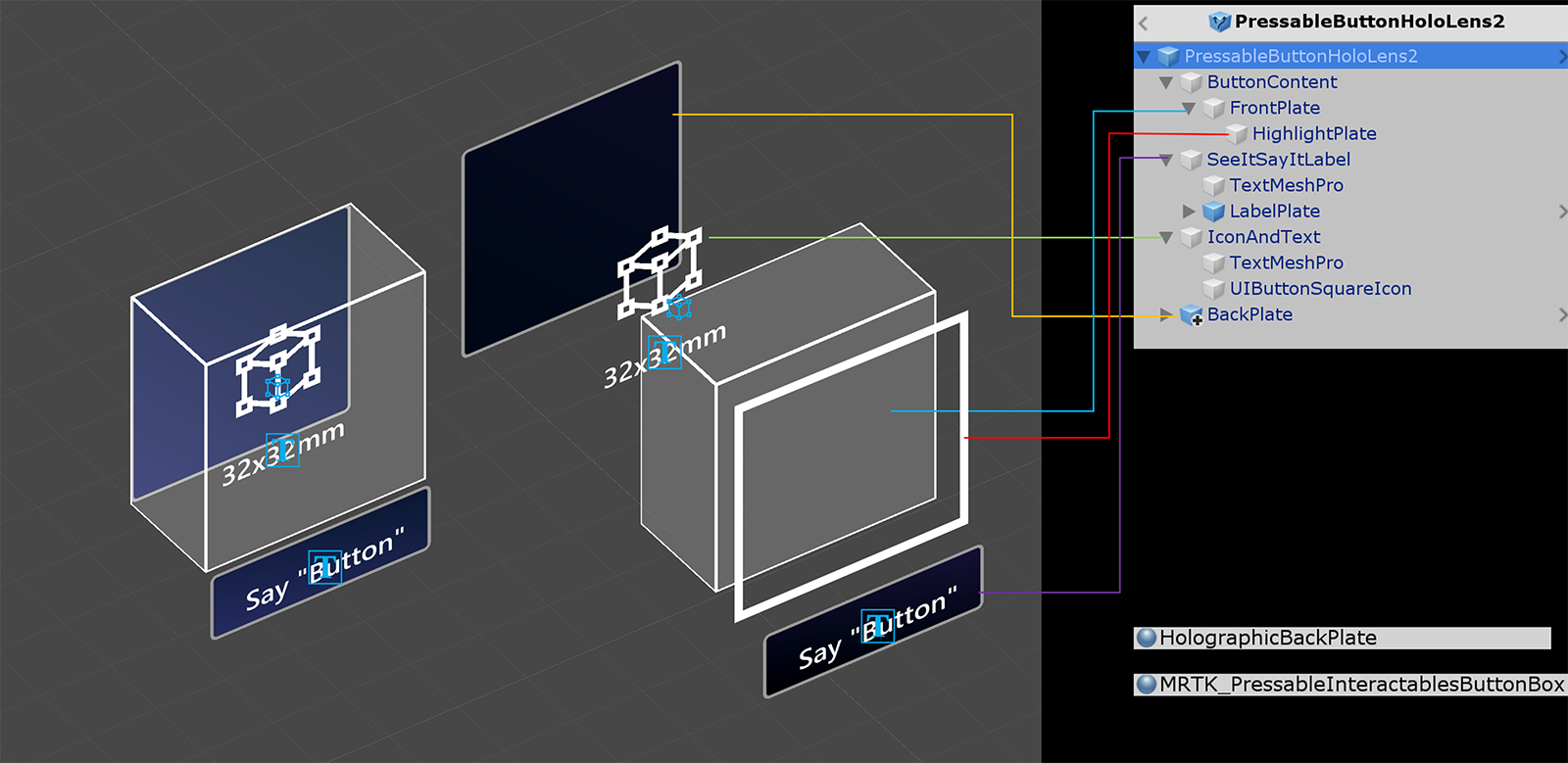
Prefab layout
The ButtonContent object contains front plate, text label and icon. The FrontPlate responds to the proximity of the index fingertip using the Button_Box shader. It shows glowing borders, proximity light, and a pulse effect on touch. The text label is made with TextMesh Pro. SeeItSayItLabel's visibility is controlled by Interactable's theme.
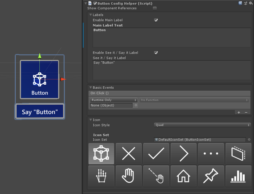
How to change the icon and text
MRTK buttons use a ButtonConfigHelper component to assist you in changing the button's icon, text and label. (Note that some fields may be absent if elements are not present on the selected button.)
Creating and Modifying Icon Sets
An Icon Set is a shared set of icon assets used by the ButtonConfigHelper component. Three icon styles are supported.
- Quad icons are rendered on a quad using a
MeshRenderer. This is the default icon style. - Sprite icons are rendered using a
SpriteRenderer. This is useful if you prefer to import your icons as a sprite sheet, or if you want your icon assets to be shared with Unity UI components. To use this style you will need to install the Sprite Editor package (Windows -> Package Manager -> 2D Sprite) - Char icons are rendered using a
TextMeshProcomponent. This is useful if you prefer to use an icon font. To use the HoloLens icon font you will need to create aTextMeshProfont asset.
To change which style your button uses, expand the Icons dropdown in the ButtonConfigHelper and select from the Icon Style dropdown.
You can create a new button icon set with the asset menu: Create > Mixed Reality Toolkit > Icon Set. To add quad and sprite icons, simply drag them into their respective arrays. To add Char icons, you must first create and assign a font asset.
In MRTK 2.4 and beyond, we recommend custom icon textures be moved into an IconSet. To upgrade the assets on all buttons in a project to the new recommended format, use the ButtonConfigHelperMigrationHandler. (Mixed Reality Toolkit -> Utilities -> Migration Window -> Migration Handler Selection -> Microsoft.MixedReality.Toolkit.Utilities.ButtonConfigHelperMigrationHandler)
Importing the Microsoft.MixedRealityToolkit.Unity.Tools package required to upgrade the buttons.

If an icon is not found in the default icon set during migration, a custom icon set will be created in MixedRealityToolkit.Generated/CustomIconSets. A dialog will indicate that this has taken place.

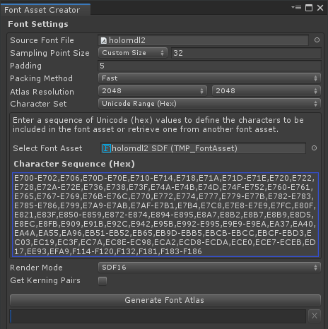
Creating a HoloLens Icon Font Asset
First, import the icon font into Unity. On Windows machines you can find the default HoloLens font in Windows/Fonts/holomdl2.ttf. Copy and paste this file into your Assets folder.
Next, open the TextMeshPro Font Asset Creator via Window > TextMeshPro > Font Asset Creator. Here are the recommended settings for generating a HoloLens font atlas. To include all icons, paste the following Unicode range into the Character Sequence field:
E700-E702,E706,E70D-E70E,E710-E714,E718,E71A,E71D-E71E,E720,E722,E728,E72A-E72E,E736,E738,E73F,E74A-E74B,E74D,E74F-E752,E760-E761,E765,E767-E769,E76B-E76C,E770,E772,E774,E777,E779-E77B,E782-E783,E785-E786,E799,E7A9-E7AB,E7AF-E7B1,E7B4,E7C8,E7E8-E7E9,E7FC,E80F,E821,E83F,E850-E859,E872-E874,E894-E895,E8A7,E8B2,E8B7,E8B9,E8D5,E8EC,E8FB,E909,E91B,E92C,E942,E95B,E992-E995,E9E9-E9EA,EA37,EA40,EA4A,EA55,EA96,EB51-EB52,EB65,EB9D-EBB5,EBCB-EBCC,EBCF-EBD3,EC03,EC19,EC3F,EC7A,EC8E-EC98,ECA2,ECD8-ECDA,ECE0,ECE7-ECEB,ED17,EE93,EFA9,F114-F120,F132,F181,F183-F186
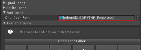
Once the font asset is generated, save it to your project and assign it to your Icon Set's Char Icon Font field. The Available Icons dropdown will now be populated. To make an icon available for use by a button, click it. It will be added to the Selected Icons dropdown and will now show up in the ButtonConfigHelper. You can optionally give the icon a tag. This enables setting the icon at runtime.
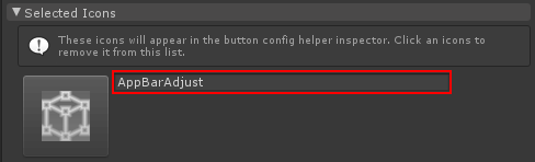
public void SetButtonToAdjust()
{
    ButtonConfigHelper buttonConfigHelper = gameObject.GetComponent<ButtonConfigHelper>();
    buttonConfigHelper.SetCharIconByName("AppBarAdjust");
}
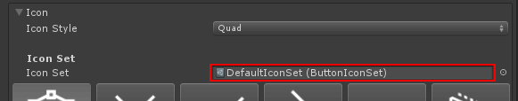
To use your Icon Set select a button, expand the Icons dropdown in the ButtonConfigHelper and assign it to the Icon Set field.
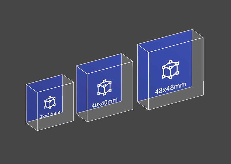
How to change the size of a button
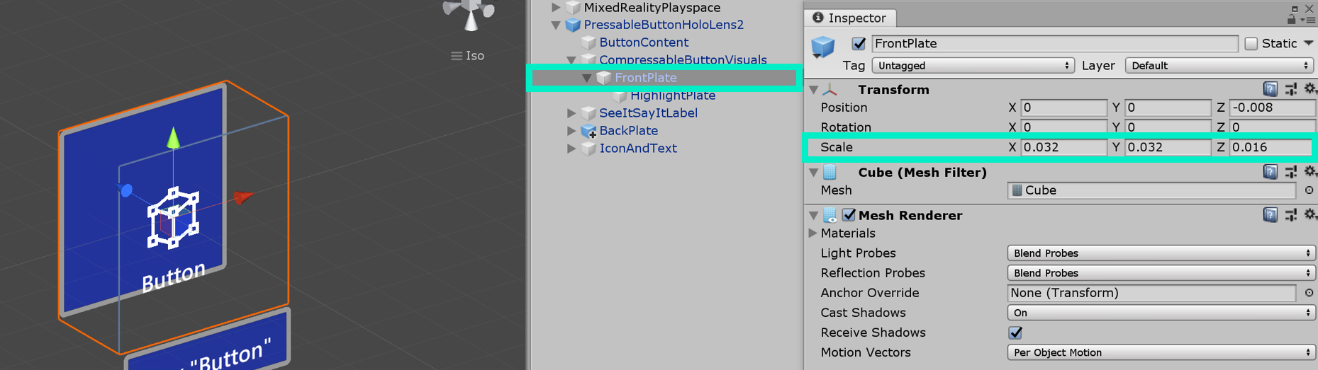
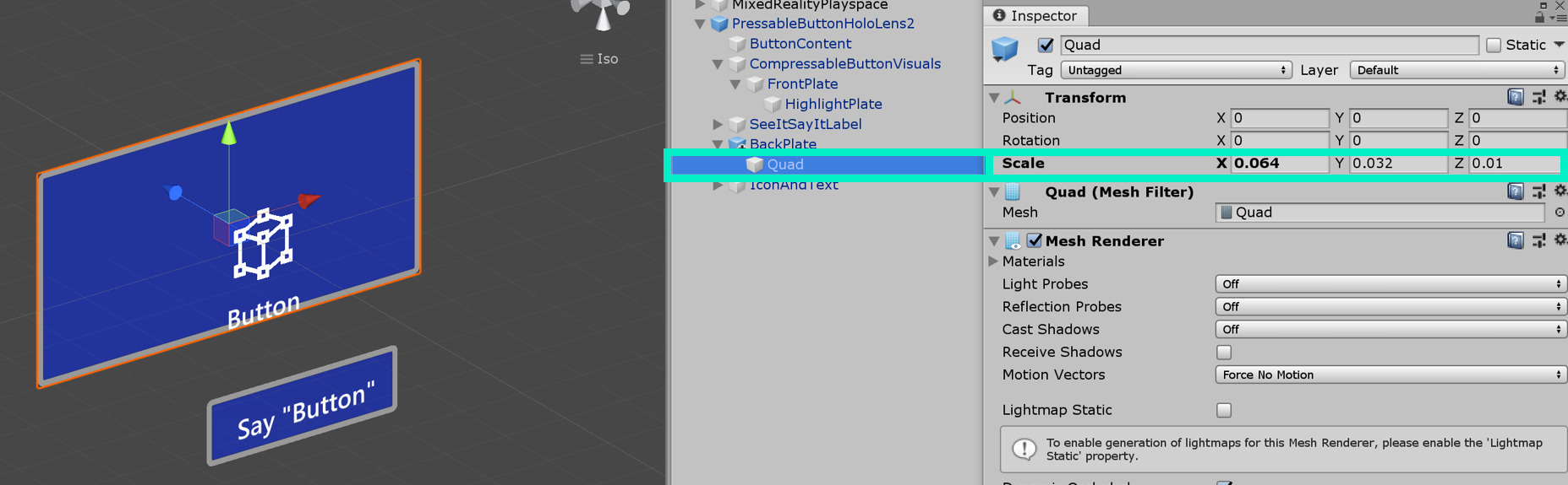
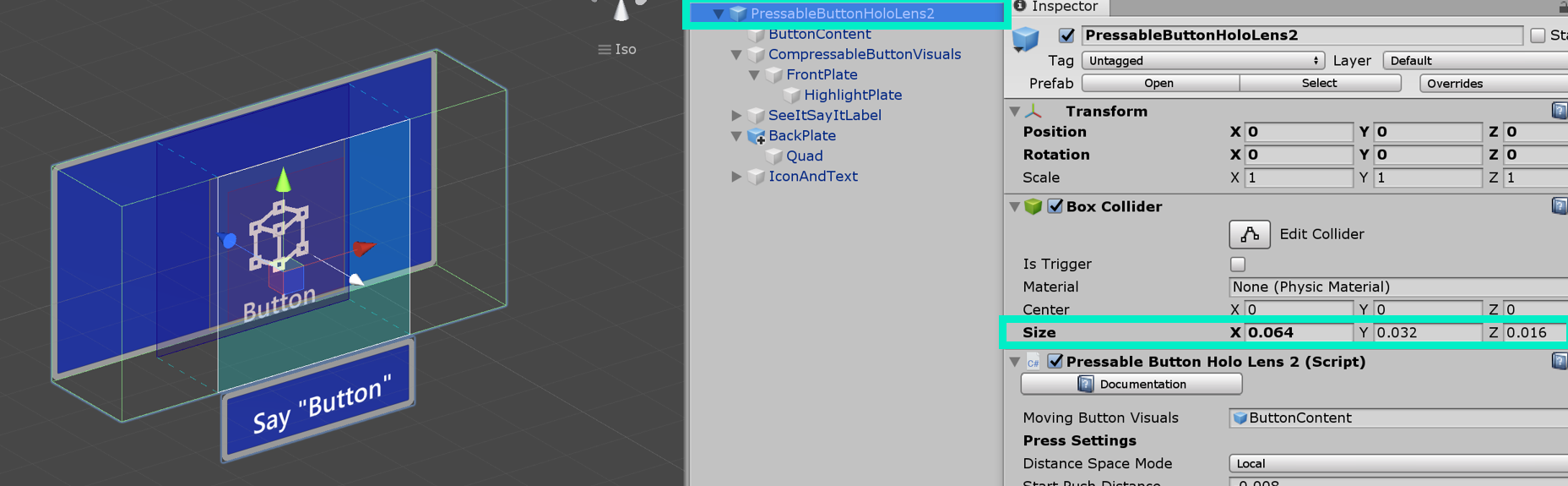
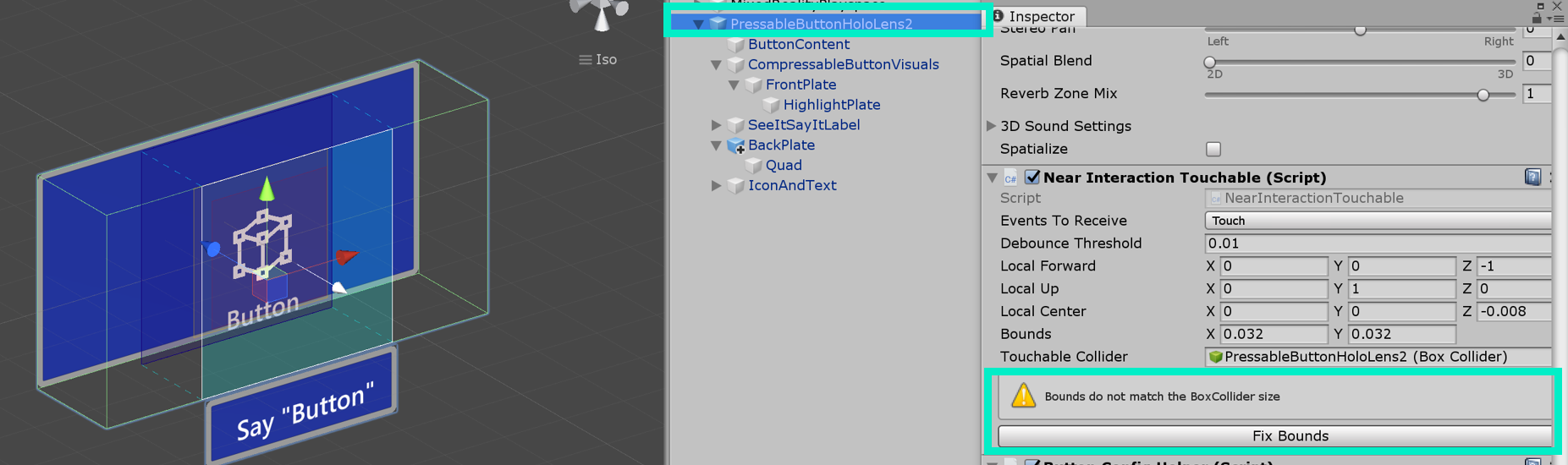
HoloLens 2's shell-style button's size is 32x32mm. To customize the dimension, change the size of these objects in the button prefab:
- FrontPlate
- Quad under BackPlate
- Box Collider on the root
Then, click Fix Bounds button in the NearInteractionTouchable script which is in the root of the button.
Update the size of the FrontPlate
Update the size of the Quad
Update the size of the Box Collider
Click 'Fix Bounds'
Voice command ('see-it, say-it')
Speech Input Handler
The Interactable script in Pressable Button already implements IMixedRealitySpeechHandler. A voice command keyword can be set here.

Speech Input Profile Additionally, you need to register the voice command keyword in the global Speech Commands Profile.
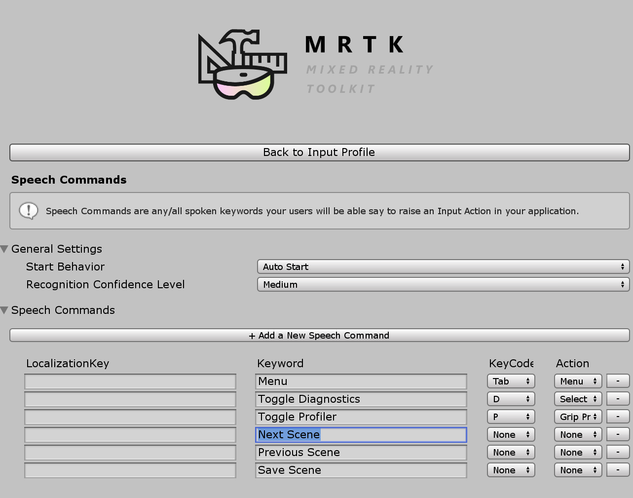
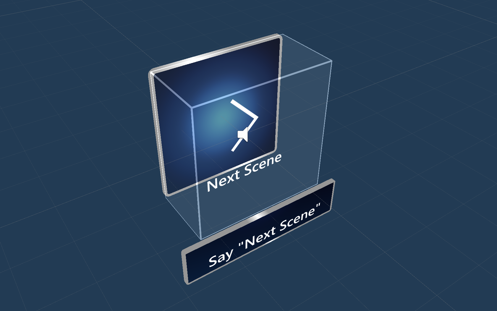
See-it, Say-it label The pressable button prefab has a placeholder TextMesh Pro label under the SeeItSayItLabel object. You can use this label to communicate the voice command keyword for the button to the user.
How to make a button from scratch
You can find the examples of these buttons in the PressableButtonExample scene.
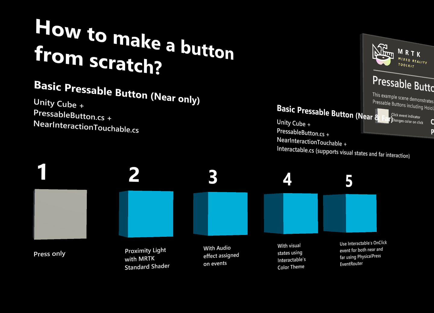
1. Creating a pressable button with cube (near interaction only)
- Create a Unity Cube (GameObject > 3D Object > Cube)
- Add
PressableButton.csscript - Add
NearInteractionTouchable.csscript
In the PressableButton's Inspector panel, assign the cube object to the Moving Button Visuals.
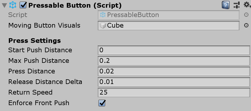
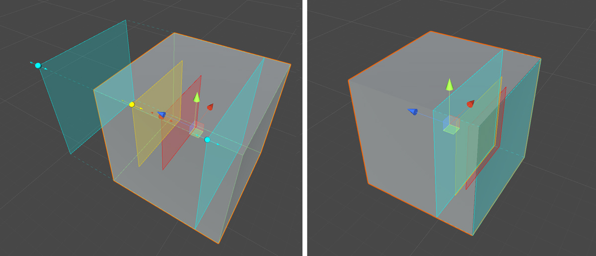
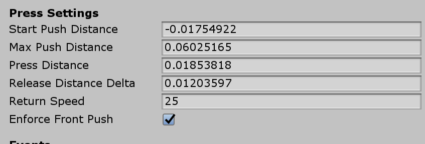
When you select the cube, you will see multiple colored layers on the object. This visualizes the distance values under Press Settings. Using the handles, you can configure when to start press (move the object) and when to trigger event.
When you press the button, it will move and generate proper events exposed in the PressableButton.cs script such as TouchBegin(), TouchEnd(), ButtonPressed(), ButtonReleased().
2. Adding visual feedback to the basic cube button
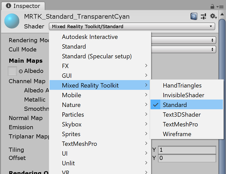
MRTK Standard Shader provides various features that makes it easy to add visual feedback. Create a material and select shader Mixed Reality Toolkit/Standard. Or you can use or duplicate one of the existing materials under /SDK/StandardAssets/Materials/ that uses MRTK Standard Shader.
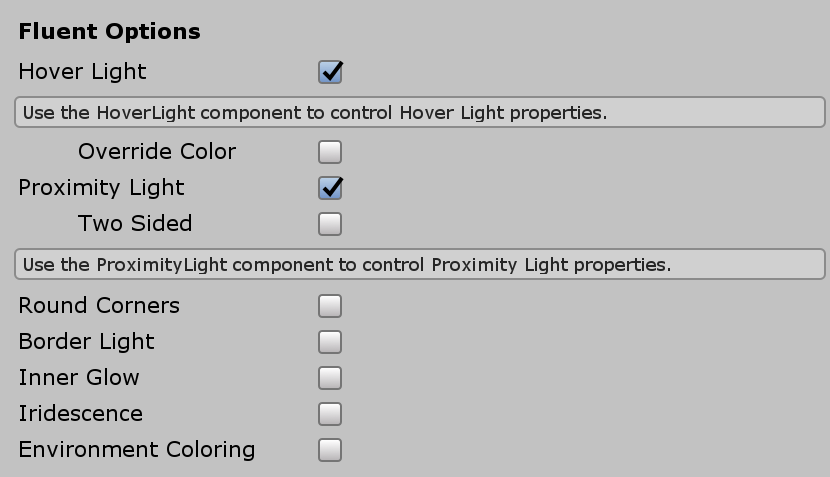
Check Hover Light and Proximity Light under Fluent Options. This enables visual feedback for both near hand(Proximity Light) and far pointer(Hover Light) interactions.
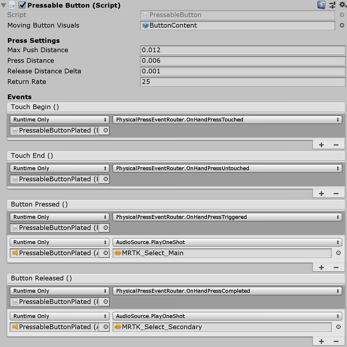
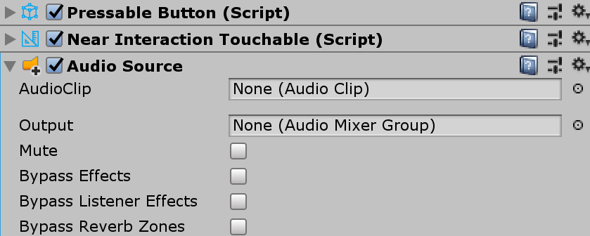
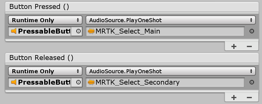
3. Adding audio feedback to the basic cube button
Since PressableButton.cs script exposes events such as TouchBegin(), TouchEnd(), ButtonPressed(), ButtonReleased(), we can easily assign audio feedback. Simply add Unity's Audio Source to the cube object then assign audio clips by selecting AudioSource.PlayOneShot(). You can use MRTK_Select_Main and MRTK_Select_Secondary audio clips under /SDK/StandardAssets/Audio/ folder.
4. Adding visual states and handle far interaction events
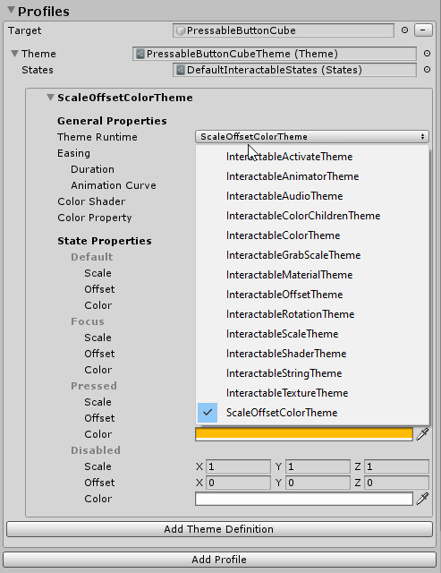
Interactable is a script that makes it easy to create a visual state for the various types of input interactions. It also handles far interaction events. Add Interactable.cs and drag and drop the cube object onto the Target field under Profiles. Then, create a new Theme with a type ScaleOffsetColorTheme. Under this theme, you can specify the color of the object for the specific interaction states, such as Focus and Pressed. You can also control Scale and Offset, as well. Check Easing and set duration to make the visual transition smooth.
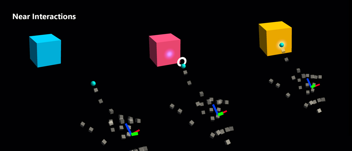
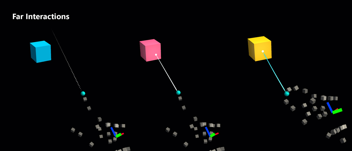
You will see the object respond to both far (hand ray or gaze cursor) and near(hand) interactions.
Custom button examples
In the HandInteractionExample scene, see the piano and round button examples which are both using PressableButton.
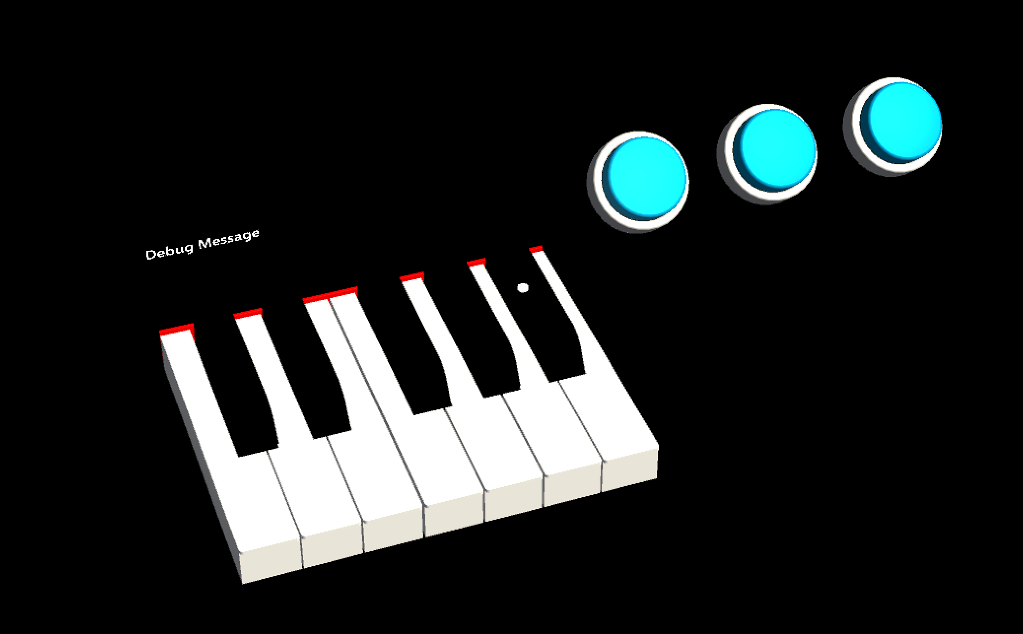
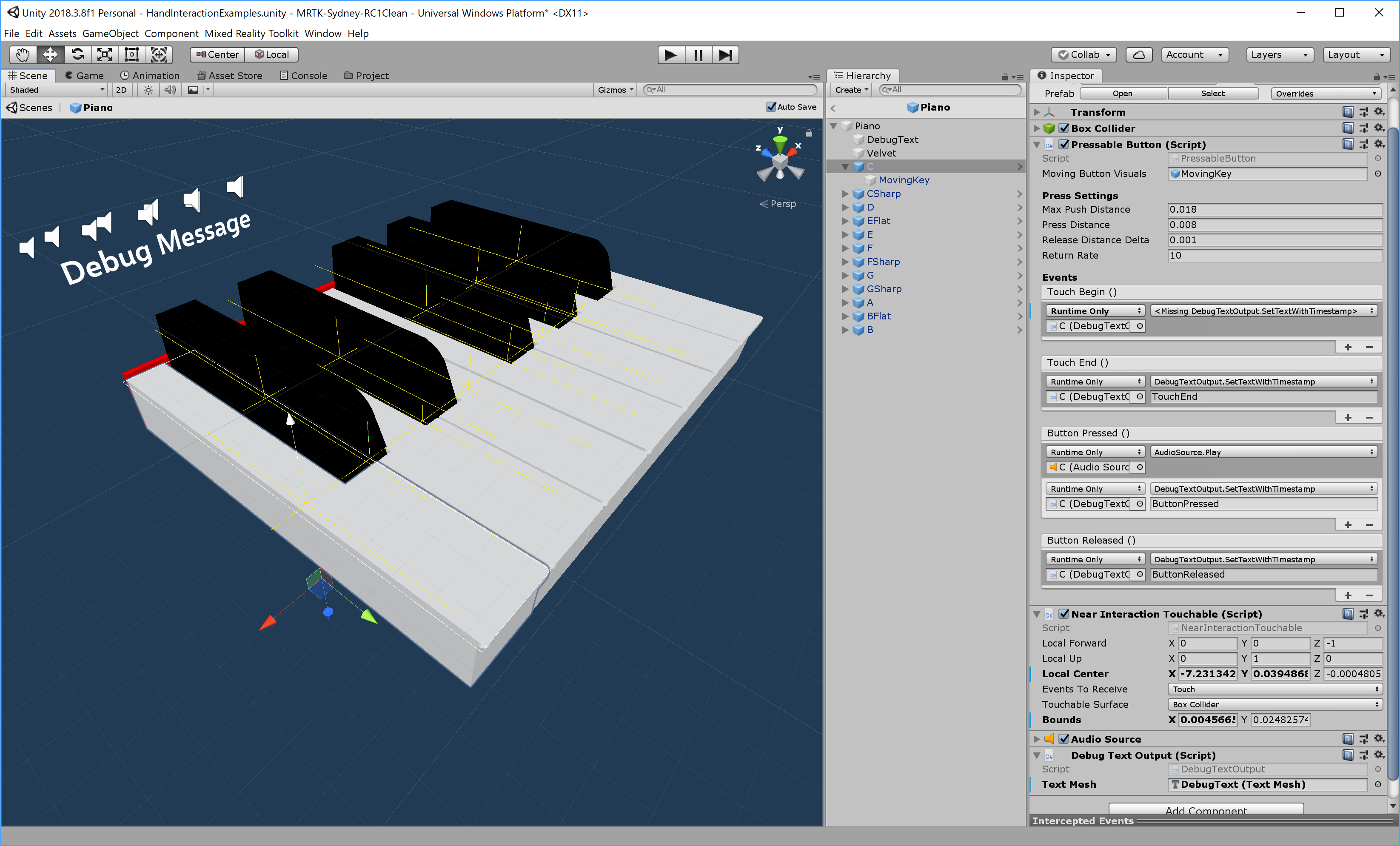
Each piano key has a PressableButton and a NearInteractionTouchable script assigned. It is important to verify that the Local Forward direction of NearInteractionTouchable is correct. It is represented by a white arrow in the editor. Make sure the arrow points away from the button's front face: