Networkplot: Visualizing 2D Layouts
This example provides how to visualize 2D layouts using networkplot.
[1]:
import graspologic

import numpy as np
import pandas as pd
%matplotlib inline
Visualizing 2D layout using networkplot
Simulate an adjacency matrix using a stochastic block model
The 2-block model is defined as below:
\begin{align*} P = \begin{bmatrix}0.25 & 0.05 \\ 0.05 & 0.25 \end{bmatrix} \end{align*}
More information on stochastic block models can be found here.
[2]:
from graspologic.simulations import sbm

n_communities = [50, 50]
p = [[0.25, 0.05], [0.05, 0.25]]

np.random.seed(1)
A, node_ids = sbm(n_communities, p, return_labels=True)
print(A.shape)
(100, 100)
Generate a 2D embedding using ASE
Adjacency Spectral Embed (ASE) reduces the dimensionality of the input adjacency matrix and estimates its latent positions, generating an embedding in a lower-dimensional space. In this example, ASE embeds the adjacency matrix generated by SBM to two-dimensional space and calculates its coordinates.
More information on ASE can be found here.
[3]:
from graspologic.embed import AdjacencySpectralEmbed

ase = AdjacencySpectralEmbed(n_components=2)
X = ase.fit_transform(A)

print(X.shape)
(100, 2)
Visualize 2D layout
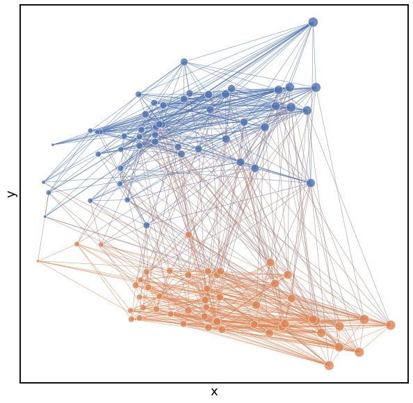
Note that node colors were determined by communities that were randomly assigned and the node sizes are determined by the number of edges connected to each node. The edge colors for the plot below are based on their source nodes.
[4]:
from graspologic.plot.plot import networkplot

x_pos = X[:,0]
y_pos = X[:,1]
degrees = np.sum(A, axis=0)

plot = networkplot(adjacency=A, x=x_pos, y=y_pos, node_hue=node_ids, palette='deep', node_size=degrees,
                   node_sizes=(20, 200), edge_hue='source', edge_alpha=0.5, edge_linewidth=0.5)
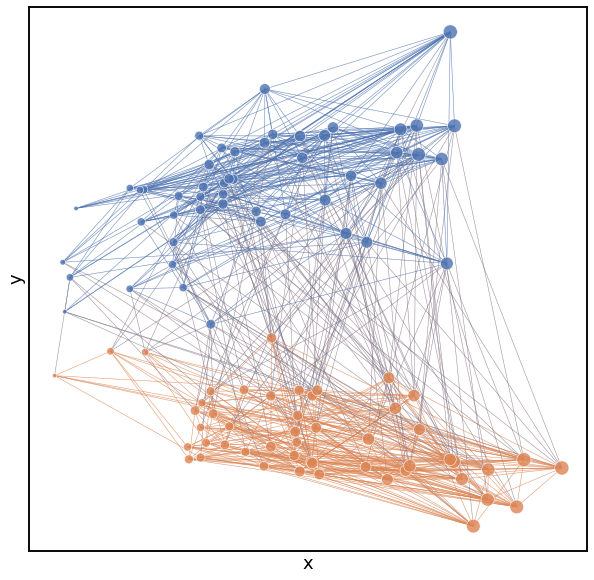
Alternatively, we can also use a pandas dataframe and use x, y, node_hue, and node_size as keys. Note that for the plot below, the edge colors are determined by their target nodes by assigning edge_hue as ‘target’.
[5]:
index = range(X.shape[0])
node_df = pd.DataFrame(index=index)
node_df.loc[:, 'x'] = X[:,0]
node_df.loc[:, 'y'] = X[:,1]
node_df.loc[:, 'id'] = node_ids
node_df.loc[:, 'degree'] = np.sum(A, axis=0)

plot = networkplot(adjacency=A, node_data=node_df, x='x', y='y', node_hue='id', palette='deep',
                   node_size='degree', node_sizes=(20, 200), edge_hue='target', edge_alpha=0.5, edge_linewidth=0.5)
[ ]: