Summary functions
This section describes the use of summary functions. These functions allow you to compare averages across the groups defined by an organizational attribute, for many Workplace Analytics metrics.
Exploring key metrics
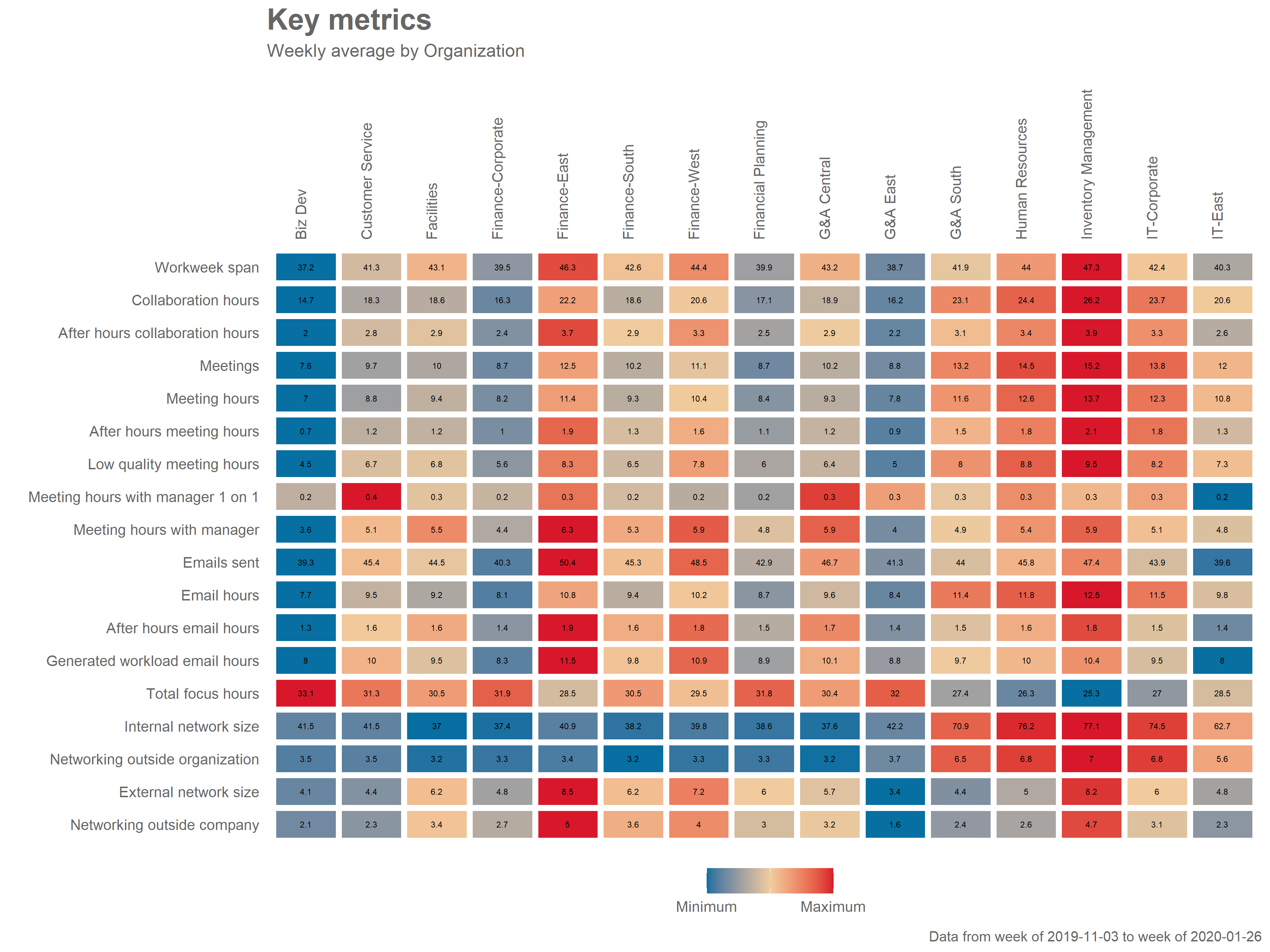
The keymetrics_scan() function allows you to produce a summary table with a wide range of metrics from an Standard Person Query. Just like in the function we studied in the previous section, you can specify which HR attribute/variable to use as a grouping variable with the hrvar argument, and what output to obtain (either “plot” or “table”) with the return argument.
sq_data %>% keymetrics_scan(hrvar = "Organization", return = "plot")
sq_data %>% keymetrics_scan(hrvar = "Organization", return = "table")
The resulting table, will provide a averages for 18 key Workplace Analytics Metrics. You can customised what specific indicators to include, with the metrics argument:
sq_data %>% keymetrics_scan(hrvar = "Organization", return = "plot",
    metrics= c("Workweek_span", "Collaboration_hours", "After_hours_collaboration_hours")
The keymetrics_scan() function is a great starting point for exploratory data analysis, before you dive deeper into particular metrics.
Average email and meeting hours
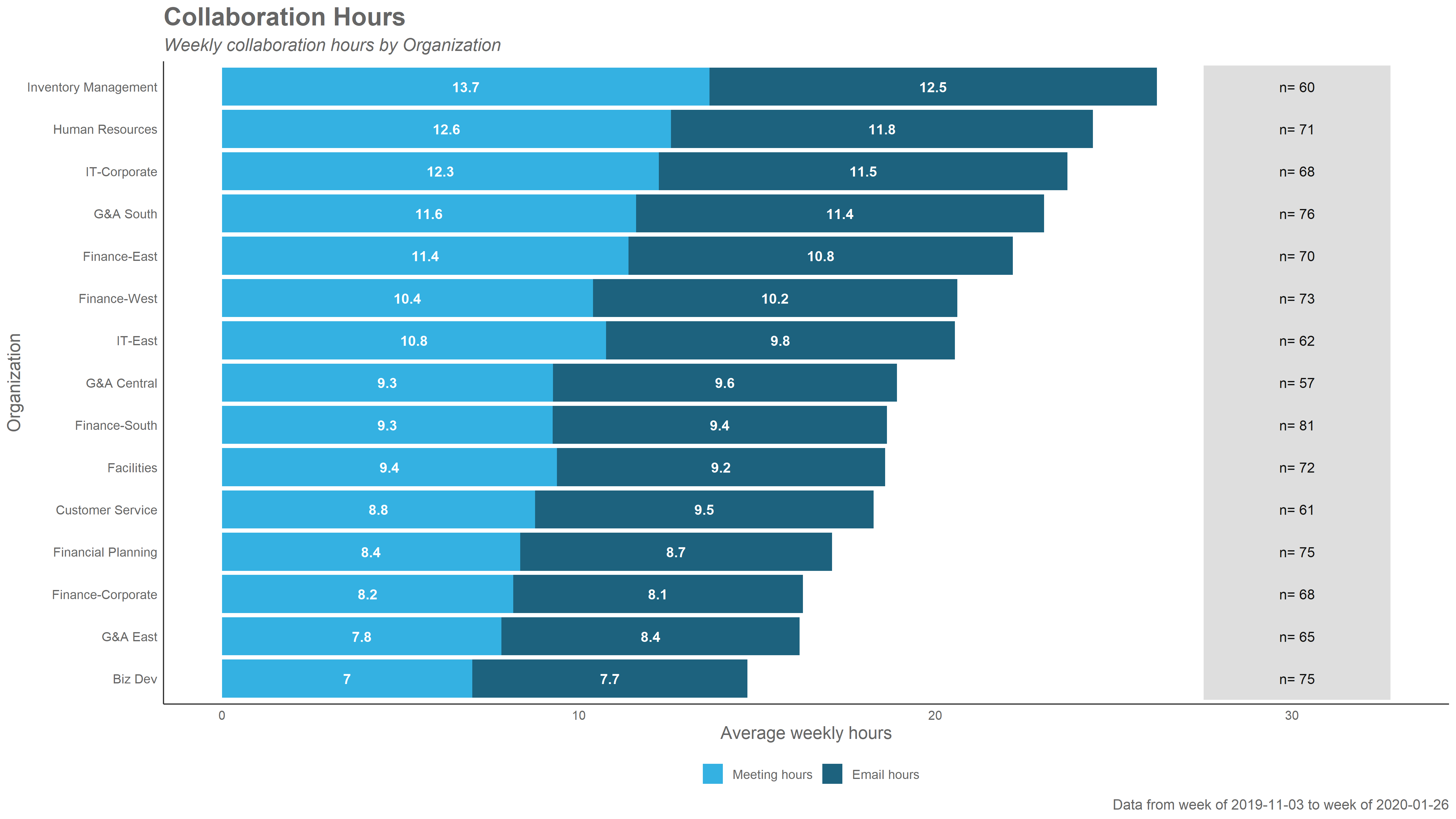
The collaboration_summary() function generates a stacked bar plot summarising the email and meeting hours by an HR attribute you specify. If no HR attribute is specified, “organization” will be used by default:
{r} sq_data %>% collaboration_summary()
By changing the hrvar() argument, you can change the groups being shown easily:
{r} sq_data %>% collaboration_summary(hrvar = "LevelDesignation")
By default, all summary functions exclude groups with less that five individuals. This is also something that can be adjusted, using the mingroup() argument:
sq_data %>% collaboration_summary(hrvar = "LevelDesignation", mingroup = 10)Finally, you can also use “table” in the return argument, to obtain summary table instead of a plot. The export() function will copy all contents to the clipboard.
{r} sq_data %>% collaboration_summary(hrvar = "LevelDesignation", return = "table")
Other summary functions
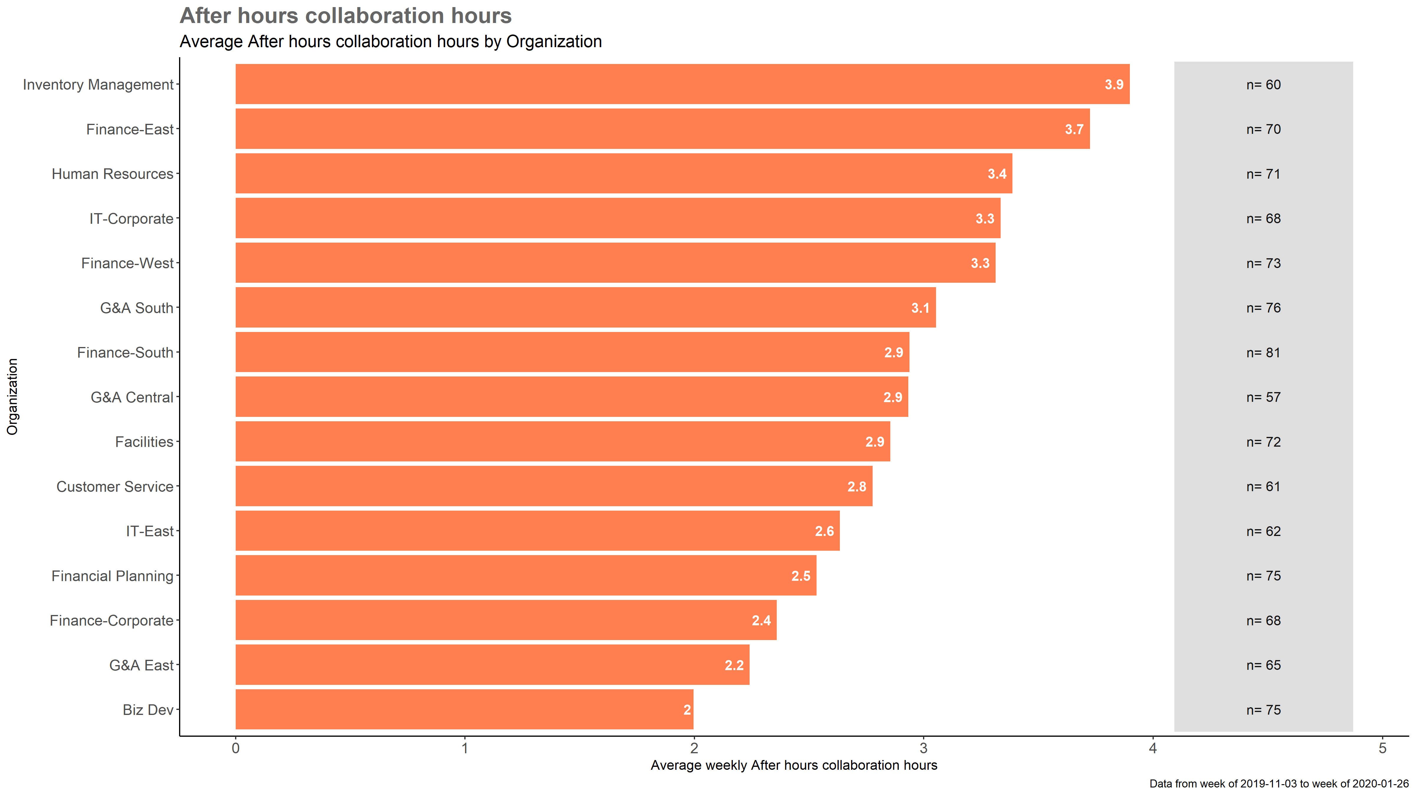
The package includes a wide range of summary functions, that create bar plots for specific metrics. These include:
-
email_summary(): Bar plot summarising email hours by an HR attribute. -
meeting_summary(): Bar plot summarising meeting hours by an HR attribute. -
one2one_summary(): Bar plot summarising manager one-to-one meeting hours, by an HR attribute. -
workloads_summary(): Bar plot summarising workweek span by an HR attribute. -
afterhours_summary(): Bar plot summarising after-hours collaboration hours by an HR attribute.
All of these functions work equivalently to the collaboration_summary() function: they use Standard Person Query data as an input, and accept hrvar, return and mingroup arguments.
For example,
sq_data %>% afterhours_summary()Custom bar charts and tables
For other metrics, the create_bar() function is a good way to obtain a summary bar chart for any metric. This function requires you to include a character string containing the name of the metric you want to analyze, e.g. “Generated_workload_email_hours”:
sq_data %>% create_bar(metric = "Generated_workload_email_hours")The create_bar() function also accepts hrvar, return and mingroup arguments.
Customizing plots
All plots in wpa are ggplot objects. This means you can customize them by adding ggplot arguments and layers. For instance, you can change the title of a collaboration_summary() plot:
sq_data %>% collaboration_summary() + ggtitle("This is a custom title")Going beyond averages
Let’s continue to Distribution Functions to explore how we can analyse distributions from different Workplace Analytics Metrics with unique functions.