Adding tooltips to custom visual
The article is outdated, read updated article about tooltips in official documentation of Power BI.
Visuals can now make use of PowerBI’s tooltip support. PowerBI tooltips handle the following interactions:
Show a tooltip. Hide a tooltip. Move a tooltip.
Tooltips can display a textual element with a title, a value at a given color and opacity at a specified set of coordinates. This data is provided to the API and the PowerBI host renders it the same way it renders tooltips for native visuals.
For example, tooltips in the sample BarChart .
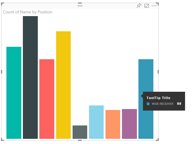
The tooltip above illustrates a single bar category and value. This can be extended to display multiple values within a single tooltip. This is totally at the developer’s control.
Handling Tooltips TooltipService
The interface through which you manage tooltips is the ‘ITooltipService’. This interface is used to notify the host that a tooltip needs to be displayed, removed or moved.
    interface ITooltipService {
        enabled(): boolean;
        show(options: TooltipShowOptions): void;
        move(options: TooltipMoveOptions): void;
        hide(options: TooltipHideOptions): void;
    }
Your visual will need to listen to the mouse events within your visual and call the show(), move() and hide() delegates as needed with the appropriate content populated in the Tooltip****Options objects.
TooltipShowOptions, TooltipMoveOptions and TooltipHideOptions would in turn define what to display and how to behave in these events.
Because the calling these methods would involve user events such as mouse moves or touch events, a good idea would be to create listeners for these events which would in turn invoke the TooltipService members.
Our sample aggregates this in a class called TooltipServiceWrapper
TooltipServiceWrapper
The basic idea behind this class is to hold the instance of the TooltipService, listen to D3 mouse events over relevant elements, and then make the calls to show(), move() and hide() when needed.
The class holds and manages any relevant state and logic for these events, mostly geared at interfacing with the underlying D3 code. The D3 interfacing and conversion is out of scope for this document.
You can find the full sample code at tooltips for the SampleBarChart
Creating the TooltipServiceWrapper
The BarChart contructor now has a tooltipServiceWrapper member which is instantiated in the constructor with the host tooltipService instance.
        private tooltipServiceWrapper: ITooltipServiceWrapper;

        this.tooltipServiceWrapper = createTooltipServiceWrapper(this.host.tooltipService, options.element);
The TooltipServiceWrapper class holds the tooltipService instance, as well as the root D3 element of the visual and touch parameters.
    class TooltipServiceWrapper implements ITooltipServiceWrapper {
        private handleTouchTimeoutId: number;
        private visualHostTooltipService: ITooltipService;
        private rootElement: Element;
        private handleTouchDelay: number;

        constructor(tooltipService: ITooltipService, rootElement: Element, handleTouchDelay: number) {
            this.visualHostTooltipService = tooltipService;
            this.handleTouchDelay = handleTouchDelay;
            this.rootElement = rootElement;
        }
        .
        .
        .
    }
The single entry point for this class to register event listeners is the addTooltip method.
addTooltip members
        public addTooltip<T>(
            selection: d3.Selection<Element>,
            getTooltipInfoDelegate: (args: TooltipEventArgs<T>) => VisualTooltipDataItem[],
            getDataPointIdentity: (args: TooltipEventArgs<T>) => ISelectionId,
            reloadTooltipDataOnMouseMove?: boolean): void {

            if (!selection || !this.visualHostTooltipService.enabled()) {
                return;
            }
        ...
        ...
        }
- **selection: d3.Selection
** - The d3 elements over which tooltips are handled
- **getTooltipInfoDelegate: (args: TooltipEventArgs
) => VisualTooltipDataItem[]** - Delegate for populating the tooltip content (what to display) per context
- **getDataPointIdentity: (args: TooltipEventArgs
) => ISelectionId** - Delegate for retreiving the datapoint Id - unused in this sample
- reloadTooltipDataOnMouseMove?: boolean
- boolean indicating wheather to refresh the tooltip data during a mouseMove event - unused in this sample
as you can see addTooltip will exit with no action if the tooltipService is disabled or there is no real selection.
addTooltip showing a tooltip
addTooltip next listens to the D3 mouseover event.
        ...
        ...
        selection.on("mouseover.tooltip", () => {
            // Ignore mouseover while handling touch events
            if (!this.canDisplayTooltip(d3.event))
                return;

            let tooltipEventArgs = this.makeTooltipEventArgs<T>(rootNode, true, false);
            if (!tooltipEventArgs)
                return;

            let tooltipInfo = getTooltipInfoDelegate(tooltipEventArgs);
            if (tooltipInfo == null)
                return;

            let selectionId = getDataPointIdentity(tooltipEventArgs);

            this.visualHostTooltipService.show({
                coordinates: tooltipEventArgs.coordinates,
                isTouchEvent: false,
                dataItems: tooltipInfo,
                identities: selectionId ? [selectionId] : [],
            });
        });
- makeTooltipEventArgs
- Extracts the context from the D3 selected elements into a tooltipEventArgs. This will calculate the coordinates as well.
- getTooltipInfoDelegate
- Then builds the tooltip content from the tooltipEventArgs. This is a call back to the BarChart class since this is the visual’s logic. This is the actual text content to display in th tooltip.
- getDataPointIdentity
- Unused in this sample
- this.visualHostTooltipService.show
- The call to displays the tooltip
Additional handling can be found in the sample for mouseout and mousemove events. Please see tooltips for the SampleBarChart for the full code sample.
Populating the tooltip content: getTooltipData
The BarChart was added with a member getTooltipData which simply extracts the category, value and color of the datapoint into a VisualTooltipDataItem[] element.
        private static getTooltipData(value: any): VisualTooltipDataItem[] {
            return [{
                displayName: value.category,
                value: value.value.toString(),
                color: value.color,
                header: 'ToolTip Title'
            }];
        }
In the above implementation the header member is constant but can be used for more complex implementations which require dynamic values. Please note that you can populate the VisualTooltipDataItem[] with more than one elements which will add multiple lines to the tooltip. This Can be useful in visuals such as stacked barcharts where the tooltip may display data from more than a single datapoint.
Calling addTooltip
The final step is to call addTooltip when the actual data may change. This would take place in the BarChart.update() method. So a call is made to monitor selection of all the ‘bar’ elements, passing only the BarChart.getTooltipData() as mentioned above.
        this.tooltipServiceWrapper.addTooltip(this.barContainer.selectAll('.bar'),
            (tooltipEvent: TooltipEventArgs<number>) => BarChart.getTooltipData(tooltipEvent.data),
            (tooltipEvent: TooltipEventArgs<number>) => null);