Adding High-Contrast Mode Support
The article is outdated, read updated article about high-contrast mode in official documentation of Power BI.
Windows High-Contrast setting makes text and apps easier to see by using more distinct colors. Read more about high-contrast support in Power BI.
Adding high-contrast support to your visual requires the following:
- On init: Detect whether Power BI is in high-contrast mode and if so, get current high-contrast colors.
- Every update: Change the way the visual renders to make it easier to see.
See this commit to learn how high-contrast was implemented in Sample Bar Chart, the files src/barChart.ts and capabilities.json contain the main changes.
On Init
The colorPalette member of options.host has several properties for high-contrast mode. Use these properties to determine whether high-contrast mode is active, and if so, what colors to use.
Detect that Power BI is in high-contrast mode
If host.colorPalette.isHighContrast is true, high-contrast mode is active and the visual should draw itself accordingly.
Get high-contrast colors
In high-contrast mode, your visual should limit itself to the following colors:
- Foreground color is used to draw any lines, icons, text and outline or fill of shapes.
- Background color is used for background, and as the fill color of outlined shapes.
- Foreground - selected color is used to indicate a selected or active element.
- Hyperlink color is used only for hyperlink text.
Note: If a secondary color is needed, foreground color may be used with some opacity (Power BI native visuals use 40% opacity). Use this sparingly to keep the visual details easy to see.
You can store these values during initialization:
    private isHighContrast: boolean;

    private foregroundColor: string;
    private backgroundColor: string;
    private foregroundSelectedColor: string;
    private hyperlinkColor: string;
    //...

    constructor(options: VisualConstructorOptions) {
        this.host = options.host;
        let colorPalette: ISandboxExtendedColorPalette = host.colorPalette;
        //...
        this.isHighContrast = colorPalette.isHighContrast;
        if (this.isHighContrast) {
            this.foregroundColor = colorPalette.foreground.value;
            this.backgroundColor = colorPalette.background.value;
            this.foregroundSelectedColor = colorPalette.foregroundSelected.value;
            this.hyperlinkColor = colorPalette.hyperlink.value;
        }
Alternatively, you can store the host object during initialization and access the relevant colorPalette properties during update.
On Update
The specific implementation of high-contrast support vary from visual to visual and depend on the details of the graphic design. Typically, high-contrast mode requires a slightly different design than the default, in order to keep the important details easy to distinguish with the limited colors. Here are some guidelines followed by Power BI native visuals:
- All data points use the same color (foreground).
- All text, axes, arrows, lines etc. use foreground color.
- Thick shapes are drawn as outlines, with thick strokes (at least 2 pixels) and background color fill.
- When relevant, data points are distinguished by different marker shapes, data lines are distinguished by different dashing.
- When a data element is highlighted, all other elements change their opacity to 40%.
- For slicers, active filter elements use foreground-selected color.
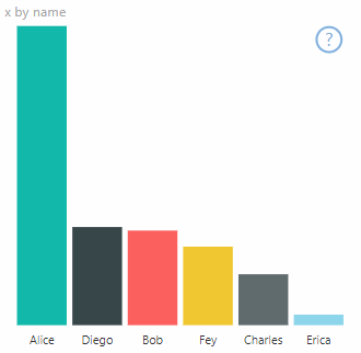
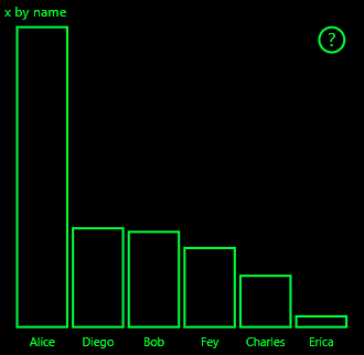
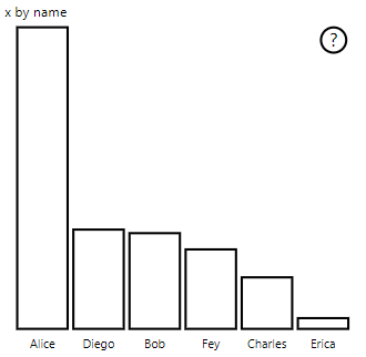
In Sample Bar Chart, for example, all bars are drawn with 2 pixels thick foreground outline and background fill. Compare the way it looks with default colors and with a couple of high-contrast themes:
Here is one place in the visualTransform function that was changed to support high-contrast, it is called as part of rendering during update:
before
    for (let i = 0, len = Math.max(category.values.length, dataValue.values.length); i < len; i++) {
        let defaultColor: Fill = {
            solid: {
                color: colorPalette.getColor(category.values[i] + '').value
            }
        };

        barChartDataPoints.push({
            category: category.values[i] + '',
            value: dataValue.values[i],
            color: getCategoricalObjectValue<Fill>(category, i, 'colorSelector', 'fill', defaultColor).solid.color,
            selectionId: host.createSelectionIdBuilder()
                .withCategory(category, i)
                .createSelectionId()
        });
    }
after
    for (let i = 0, len = Math.max(category.values.length, dataValue.values.length); i < len; i++) {
        const color: string = getColumnColorByIndex(category, i, colorPalette);

        const selectionId: ISelectionId = host.createSelectionIdBuilder()
            .withCategory(category, i)
            .createSelectionId();

        barChartDataPoints.push({
            color,
            strokeColor,
            strokeWidth,
            selectionId,
            value: dataValue.values[i],
            category: `${category.values[i]}`,
        });
    }

    //...

    function getColumnColorByIndex(
        category: DataViewCategoryColumn,
        index: number,
        colorPalette: ISandboxExtendedColorPalette,
    ): string {
        if (colorPalette.isHighContrast) {
            return colorPalette.background.value;
        }

        const defaultColor: Fill = {
            solid: {
                color: colorPalette.getColor(`${category.values[index]}`).value,
            }
        };

        return getCategoricalObjectValue<Fill>(category, index, 'colorSelector', 'fill', defaultColor).solid.color;
    }