Developing React component
Step by step guide how to build React-based Custom Visual
-
At first install required dependencies.
npm i react react-domWe also need to install React typings.
npm i @types/react @types/react-domReact 16 and corresponding versions of react-dom and typings are expected to be installed.
-
Let’s start with a simple react component class. Create
src/component.tsxand copy the following code:import * as React from "react"; export class ReactCircleCard extends React.Component<{}>{ render(){ return ( <div className="circleCard"> Hello, React! </div> ) } } export default ReactCircleCard; -
Open
src/visual.ts. Remove all the code except the following lines:"use strict"; import "@babel/polyfill"; import powerbi from "powerbi-visuals-api"; import DataView = powerbi.DataView; import VisualConstructorOptions = powerbi.extensibility.visual.VisualConstructorOptions; import VisualUpdateOptions = powerbi.extensibility.visual.VisualUpdateOptions; import IVisual = powerbi.extensibility.visual.IVisual; import "./../style/visual.less"; export class Visual implements IVisual { constructor(options: VisualConstructorOptions) { } public update(options: VisualUpdateOptions) { } } -
Import React dependencies and our component:
 import * as React from "react";
 import * as ReactDOM from "react-dom";
 ...
 import ReactCircleCard from "./component";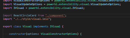
- As you see, default PowerBI typescript settings are not ready for react tsx files. We need to extend
tsconfig.jsonto use it.{ "compilerOptions": { "jsx": "react", "types": ["react", "react-dom"], //... } } -
Now all warnings disappear and we are ready to integrate our react component into Custom Visual. Let’s render our component. The target HTML element can be found as
elementinVisualConstructorOptionsobject, passing into constructor.private target: HTMLElement; private reactRoot: React.ComponentElement<any, any>; constructor(options: VisualConstructorOptions) { this.reactRoot = React.createElement(ReactCircleCard, {}); this.target = options.element; ReactDOM.render(this.reactRoot, this.target); } -
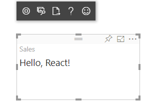
Finally, we can start our Custom Visual and see greetings from react component. Save the changes and run existing code before going to the next step.
pbiviz start
If pbiviz command has already been run, it must be restarted to apply changes in tsconfig.json
Now it’s time to configure visual capabilities.