Getting viewport properties
Step by step guide how to build React-based Custom Visual
-
Our component has fixed width and height.
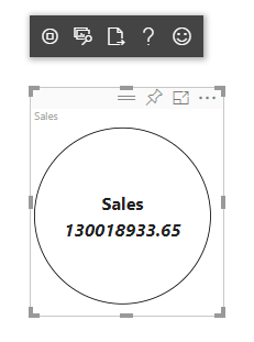 200px diameter circle
At this step we’re going to make it responsive. To do that, we will get current size of the Custom Visual viewport from
optionsobject. Let’s start with importing ofIViewportinterface atsrc/visual.tsand adding theviewportproperty to visual class.import IViewport = powerbi.IViewport; //... export class Visual implements IVisual { private viewport: IViewport; //... } -
Extend
updatemethod of the visual:if (options.dataViews && options.dataViews[0]) { const dataView: DataView = options.dataViews[0]; this.viewport = options.viewport; const { width, height } = this.viewport; const size = Math.min(width, height); ReactCircleCard.update({ size, //... }); } -
Add new properties to
Stateinterface insrc/component.tsx:export interface State { //... size: number } const initialState: State = { //... size: 200 } -
Make the following changes in
rendermethod:render() { const { textLabel, textValue, size } = this.state; const style: React.CSSProperties = { width: size, height: size }; return ( <div className="circleCard" style={style}> {/* ... */} </div> ) } -
Replace
widthandheightrules instyle/visual.lessmin-width: 200px; min-height: 200px;
Now you can resize the viewport and circle diameter will correspond to minimal size (width or height). The next step of this tutorial describes how to make a custom visual customizable.