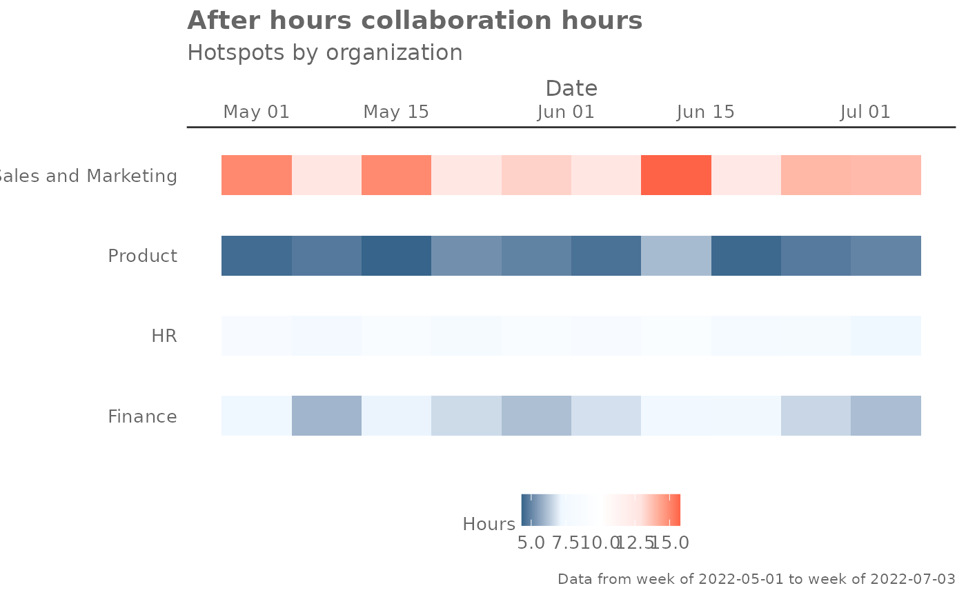
Provides a week by week view of after-hours collaboration time. By default returns a week by week heatmap, highlighting the points in time with most activity. Additional options available to return a summary table.
Arguments
- data
A Standard Person Query dataset in the form of a data frame. This must be a panel dataset where each row represents one employee per time period, with the columns
PersonIdandMetricDatepresent. If your data is already aggregated (e.g. one row per group), use the equivalent*_asis()variant of this function instead.- hrvar
String containing the name of the HR Variable by which to split metrics. Defaults to
"Organization". To run the analysis on the total instead of splitting by an HR attribute, supplyNULL(without quotes).- mingroup
Numeric value setting the privacy threshold / minimum group size. Defaults to 5.
- return
Character vector specifying what to return, defaults to
"plot". Valid inputs are "plot" and "table".
Value
Returns a 'ggplot' object by default, where 'plot' is passed in return.
When 'table' is passed, a summary table is returned as a data frame.
See also
Other Visualization:
afterhours_dist(),
afterhours_fizz(),
afterhours_line(),
afterhours_rank(),
afterhours_summary(),
collaboration_area(),
collaboration_dist(),
collaboration_fizz(),
collaboration_line(),
collaboration_rank(),
collaboration_sum(),
collaboration_trend(),
create_bar(),
create_bar_asis(),
create_boxplot(),
create_bubble(),
create_dist(),
create_fizz(),
create_inc(),
create_line(),
create_line_asis(),
create_period_scatter(),
create_radar(),
create_rank(),
create_rogers(),
create_sankey(),
create_scatter(),
create_stacked(),
create_survival(),
create_tracking(),
create_trend(),
email_dist(),
email_fizz(),
email_line(),
email_rank(),
email_summary(),
email_trend(),
external_dist(),
external_fizz(),
external_line(),
external_rank(),
external_sum(),
hr_trend(),
hrvar_count(),
hrvar_trend(),
keymetrics_scan(),
meeting_dist(),
meeting_fizz(),
meeting_line(),
meeting_rank(),
meeting_summary(),
meeting_trend(),
one2one_dist(),
one2one_fizz(),
one2one_freq(),
one2one_line(),
one2one_rank(),
one2one_sum(),
one2one_trend()
Other After-hours Collaboration:
afterhours_dist(),
afterhours_fizz(),
afterhours_line(),
afterhours_rank(),
afterhours_summary(),
external_rank()
Examples
# Run plot
afterhours_trend(pq_data)


# Run table
afterhours_trend(pq_data, hrvar = "LevelDesignation", return = "table")
#> # A tibble: 4 × 24
#>   group         `2024-04-28` `2024-05-05` `2024-05-12` `2024-05-19` `2024-05-26`
#>   <chr>                <dbl>        <dbl>        <dbl>        <dbl>        <dbl>
#> 1 Executive             5.94         7.67         7.06         5.83         6.87
#> 2 Junior IC             9.03         6.79         8.17         6.49         7.73
#> 3 Senior IC             6.23         7.84         5.69         6.36         7.54
#> 4 Senior Manag…         9.22         9.66         9.64         8.95         8.00
#> # ℹ 18 more variables: `2024-06-02` <dbl>, `2024-06-09` <dbl>,
#> #   `2024-06-16` <dbl>, `2024-06-23` <dbl>, `2024-06-30` <dbl>,
#> #   `2024-07-07` <dbl>, `2024-07-14` <dbl>, `2024-07-21` <dbl>,
#> #   `2024-07-28` <dbl>, `2024-08-04` <dbl>, `2024-08-11` <dbl>,
#> #   `2024-08-18` <dbl>, `2024-08-25` <dbl>, `2024-09-01` <dbl>,
#> #   `2024-09-08` <dbl>, `2024-09-15` <dbl>, `2024-09-22` <dbl>,
#> #   `2024-09-29` <dbl>
# Run table
afterhours_trend(pq_data, hrvar = "LevelDesignation", return = "table")
#> # A tibble: 4 × 24
#> group `2024-04-28` `2024-05-05` `2024-05-12` `2024-05-19` `2024-05-26`
#> <chr> <dbl> <dbl> <dbl> <dbl> <dbl>
#> 1 Executive 5.94 7.67 7.06 5.83 6.87
#> 2 Junior IC 9.03 6.79 8.17 6.49 7.73
#> 3 Senior IC 6.23 7.84 5.69 6.36 7.54
#> 4 Senior Manag… 9.22 9.66 9.64 8.95 8.00
#> # ℹ 18 more variables: `2024-06-02` <dbl>, `2024-06-09` <dbl>,
#> # `2024-06-16` <dbl>, `2024-06-23` <dbl>, `2024-06-30` <dbl>,
#> # `2024-07-07` <dbl>, `2024-07-14` <dbl>, `2024-07-21` <dbl>,
#> # `2024-07-28` <dbl>, `2024-08-04` <dbl>, `2024-08-11` <dbl>,
#> # `2024-08-18` <dbl>, `2024-08-25` <dbl>, `2024-09-01` <dbl>,
#> # `2024-09-08` <dbl>, `2024-09-15` <dbl>, `2024-09-22` <dbl>,
#> # `2024-09-29` <dbl>