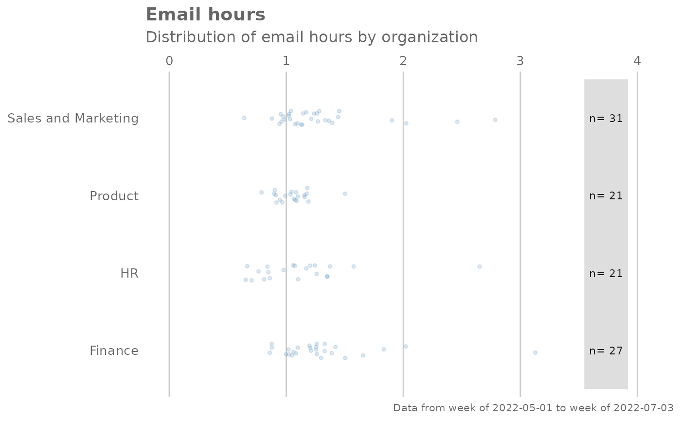
Analyze weekly email hours distribution, and returns a 'fizzy' scatter plot by default. Additional options available to return a table with distribution elements.
Arguments
- data
A Standard Person Query dataset in the form of a data frame. This must be a panel dataset where each row represents one employee per time period, with the columns
PersonIdandMetricDatepresent. If your data is already aggregated (e.g. one row per group), use the equivalent*_asis()variant of this function instead.- hrvar
String containing the name of the HR Variable by which to split metrics. Defaults to
"Organization". To run the analysis on the total instead of splitting by an HR attribute, supplyNULL(without quotes).- mingroup
Numeric value setting the privacy threshold / minimum group size. Defaults to 5.
- return
String specifying what to return. This must be one of the following strings:
"plot""table"
See
Valuefor more information.
Value
A different output is returned depending on the value passed to the return argument:
"plot": 'ggplot' object. A jittered scatter plot for the metric."table": data frame. A summary table for the metric.
See also
Other Visualization:
afterhours_dist(),
afterhours_fizz(),
afterhours_line(),
afterhours_rank(),
afterhours_summary(),
afterhours_trend(),
collaboration_area(),
collaboration_dist(),
collaboration_fizz(),
collaboration_line(),
collaboration_rank(),
collaboration_sum(),
collaboration_trend(),
create_bar(),
create_bar_asis(),
create_boxplot(),
create_bubble(),
create_dist(),
create_fizz(),
create_inc(),
create_line(),
create_line_asis(),
create_period_scatter(),
create_radar(),
create_rank(),
create_rogers(),
create_sankey(),
create_scatter(),
create_stacked(),
create_survival(),
create_tracking(),
create_trend(),
email_dist(),
email_line(),
email_rank(),
email_summary(),
email_trend(),
external_dist(),
external_fizz(),
external_line(),
external_rank(),
external_sum(),
hr_trend(),
hrvar_count(),
hrvar_trend(),
keymetrics_scan(),
meeting_dist(),
meeting_fizz(),
meeting_line(),
meeting_rank(),
meeting_summary(),
meeting_trend(),
one2one_dist(),
one2one_fizz(),
one2one_freq(),
one2one_line(),
one2one_rank(),
one2one_sum(),
one2one_trend()
Other Emails:
email_dist(),
email_line(),
email_rank(),
email_summary(),
email_trend()
Examples
# Return plot
email_fizz(pq_data, hrvar = "Organization", return = "plot")


# Return summary table
email_fizz(pq_data, hrvar = "Organization", return = "table")
#> # A tibble: 7 × 8
#>   group       mean median    sd   min   max range     n
#>   <chr>      <dbl>  <dbl> <dbl> <dbl> <dbl> <dbl> <int>
#> 1 Finance     8.79   8.81 0.509  7.80  9.82  2.02    68
#> 2 HR          8.80   8.81 0.462  7.68  9.50  1.82    33
#> 3 IT          8.70   8.68 0.582  7.51 10.2   2.72    68
#> 4 Legal       8.55   8.59 0.517  7.37  9.68  2.31    44
#> 5 Operations  8.92   8.88 0.671  7.68 10.2   2.50    22
#> 6 Research    8.89   8.84 0.547  7.71  9.97  2.26    52
#> 7 Sales       8.70   8.70 0.465  7.93  9.38  1.45    13
# Return summary table
email_fizz(pq_data, hrvar = "Organization", return = "table")
#> # A tibble: 7 × 8
#> group mean median sd min max range n
#> <chr> <dbl> <dbl> <dbl> <dbl> <dbl> <dbl> <int>
#> 1 Finance 8.79 8.81 0.509 7.80 9.82 2.02 68
#> 2 HR 8.80 8.81 0.462 7.68 9.50 1.82 33
#> 3 IT 8.70 8.68 0.582 7.51 10.2 2.72 68
#> 4 Legal 8.55 8.59 0.517 7.37 9.68 2.31 44
#> 5 Operations 8.92 8.88 0.671 7.68 10.2 2.50 22
#> 6 Research 8.89 8.84 0.547 7.71 9.97 2.26 52
#> 7 Sales 8.70 8.70 0.465 7.93 9.38 1.45 13