Create a bar chart without aggregation for any metric
Source:R/create_bar_asis.R
create_bar_asis.RdThis function creates a bar chart directly from the aggregated / summarised
data. Unlike create_bar() which performs a person-level aggregation, there
is no calculation for create_bar_asis() and the values are rendered as they
are passed into the function.
Usage
create_bar_asis(
  data,
  group_var,
  bar_var,
  title = NULL,
  subtitle = NULL,
  caption = NULL,
  ylab = group_var,
  xlab = bar_var,
  percent = FALSE,
  bar_colour = "default",
  rounding = 1
)
Arguments
- data
Aggregated or summarised data as a data frame. Unlike
create_bar(), this function does not require panel data and can accept any pre-aggregated data frame (i.e.PersonIdandMetricDateare not required).- group_var
String containing name of variable for the group.
- bar_var
String containing name of variable representing the value of the bars.
- title
Title of the plot.
- subtitle
Subtitle of the plot.
- caption
Caption of the plot.
- ylab
Y-axis label for the plot (group axis)
- xlab
X-axis label of the plot (bar axis).
- percent
Logical value to determine whether to show labels as percentage signs. Defaults to
FALSE.- bar_colour
String to specify colour to use for bars. In-built accepted values include "default" (default), "alert" (red), and "darkblue". Otherwise, hex codes are also accepted. You can also supply RGB values via
rgb2hex().- rounding
Numeric value to specify number of digits to show in data labels
See also
Other Visualization:
afterhours_dist(),
afterhours_fizz(),
afterhours_line(),
afterhours_rank(),
afterhours_summary(),
afterhours_trend(),
collaboration_area(),
collaboration_dist(),
collaboration_fizz(),
collaboration_line(),
collaboration_rank(),
collaboration_sum(),
collaboration_trend(),
create_bar(),
create_boxplot(),
create_bubble(),
create_dist(),
create_fizz(),
create_inc(),
create_line(),
create_line_asis(),
create_period_scatter(),
create_radar(),
create_rank(),
create_rogers(),
create_sankey(),
create_scatter(),
create_stacked(),
create_survival(),
create_tracking(),
create_trend(),
email_dist(),
email_fizz(),
email_line(),
email_rank(),
email_summary(),
email_trend(),
external_dist(),
external_fizz(),
external_line(),
external_rank(),
external_sum(),
hr_trend(),
hrvar_count(),
hrvar_trend(),
keymetrics_scan(),
meeting_dist(),
meeting_fizz(),
meeting_line(),
meeting_rank(),
meeting_summary(),
meeting_trend(),
one2one_dist(),
one2one_fizz(),
one2one_freq(),
one2one_line(),
one2one_rank(),
one2one_sum(),
one2one_trend()
Other Flexible:
create_bar(),
create_boxplot(),
create_bubble(),
create_density(),
create_dist(),
create_fizz(),
create_hist(),
create_inc(),
create_line(),
create_line_asis(),
create_period_scatter(),
create_radar(),
create_rank(),
create_sankey(),
create_scatter(),
create_stacked(),
create_survival(),
create_tracking(),
create_trend()
Examples
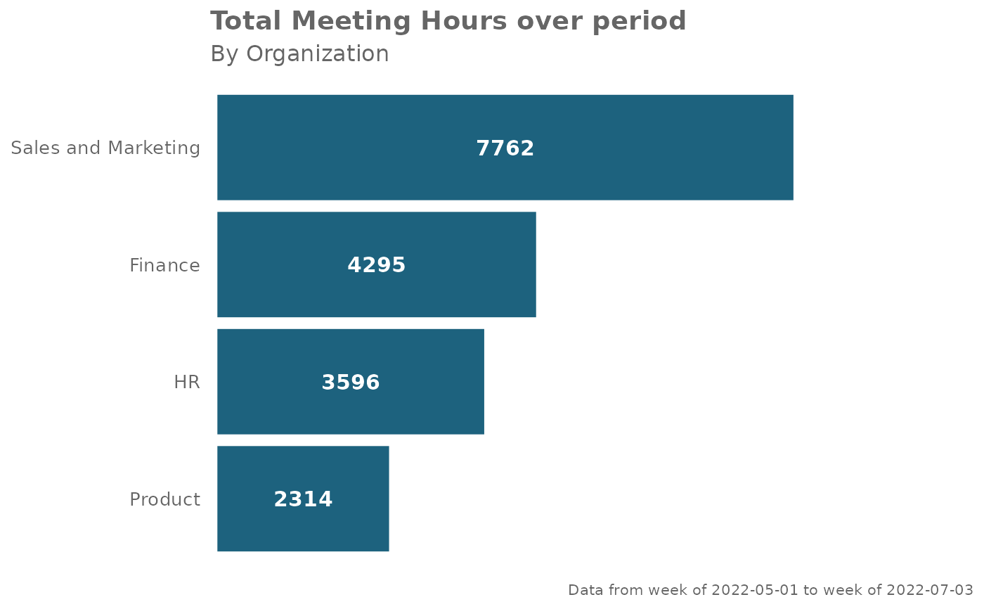
# Creating a custom bar plot without mean aggregation
library(dplyr)
#>
#> Attaching package: ‘dplyr’
#> The following objects are masked from ‘package:stats’:
#>
#> filter, lag
#> The following objects are masked from ‘package:base’:
#>
#> intersect, setdiff, setequal, union
pq_data %>%
group_by(Organization) %>%
summarise(across(.cols = Meeting_hours,
.fns = ~sum(., na.rm = TRUE))) %>%
create_bar_asis(group_var = "Organization",
bar_var = "Meeting_hours",
title = "Total Meeting Hours over period",
subtitle = "By Organization",
caption = extract_date_range(pq_data, return = "text"),
bar_colour = "darkblue",
rounding = 0)
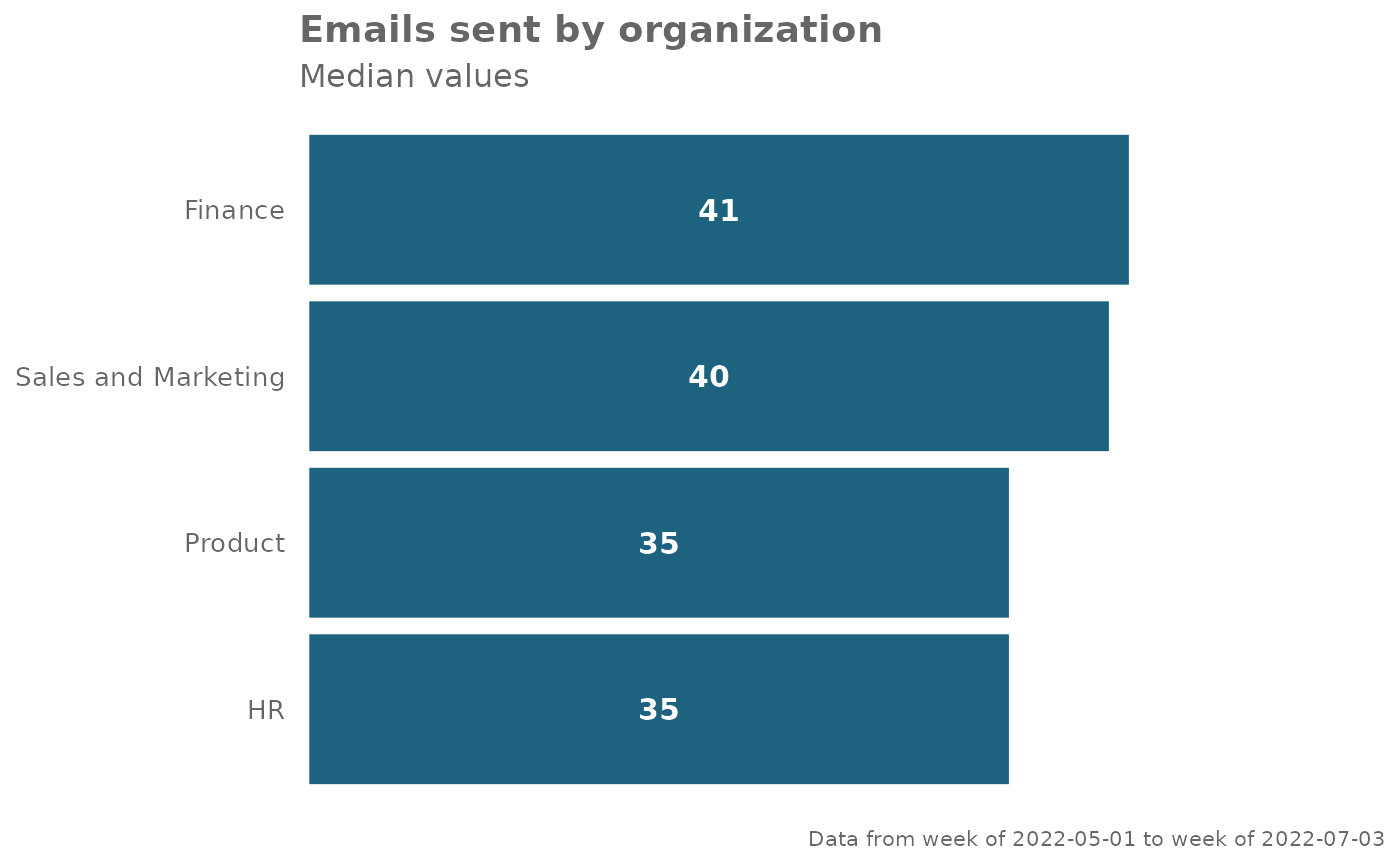
 library(dplyr)
# Summarise Non-person-average median `Emails_sent`
med_df <-
pq_data %>%
group_by(Organization) %>%
summarise(Emails_sent_median = median(Emails_sent))
med_df %>%
create_bar_asis(
group_var = "Organization",
bar_var = "Emails_sent_median",
title = "Emails sent by organization",
subtitle = "Median values",
bar_colour = "darkblue",
caption = extract_date_range(pq_data, return = "text")
)
library(dplyr)
# Summarise Non-person-average median `Emails_sent`
med_df <-
pq_data %>%
group_by(Organization) %>%
summarise(Emails_sent_median = median(Emails_sent))
med_df %>%
create_bar_asis(
group_var = "Organization",
bar_var = "Emails_sent_median",
title = "Emails sent by organization",
subtitle = "Median values",
bar_colour = "darkblue",
caption = extract_date_range(pq_data, return = "text")
)