Provides a week by week view of a selected metric, visualised as line charts. By default returns a line chart for the defined metric, with a separate panel per value in the HR attribute. Additional options available to return a summary table.
Usage
create_line(
  data,
  metric,
  hrvar = "Organization",
  mingroup = 5,
  ncol = NULL,
  label = FALSE,
  return = "plot"
)
Arguments
- data
A Standard Person Query dataset in the form of a data frame. This must be a panel dataset where each row represents one employee per time period, with the columns
PersonIdandMetricDatepresent. If your data is already aggregated (e.g. one row per group), use the equivalent*_asis()variant of this function instead.- metric
Character string containing the name of the metric, e.g. "Collaboration_hours"
- hrvar
String containing the name of the HR Variable by which to split metrics. Defaults to
"Organization". To run the analysis on the total instead of splitting by an HR attribute, supplyNULL(without quotes).- mingroup
Numeric value setting the privacy threshold / minimum group size. Defaults to 5.
- ncol
Numeric value setting the number of columns on the plot. Defaults to
NULL(automatic).- label
Logical value to determine whether to show data point labels on the plot. If
TRUE, bothgeom_point()andgeom_text()are added to display data labels rounded to 1 decimal place above each data point. Defaults toFALSE.- return
String specifying what to return. This must be one of the following strings:
"plot""table"
See
Valuefor more information.
Value
A different output is returned depending on the value passed to the return argument:
"plot": 'ggplot' object. A faceted line plot for the metric."table": data frame. A summary table for the metric.
Details
This is a general purpose function that powers all the functions in the package that produce faceted line plots.
See also
Other Visualization:
afterhours_dist(),
afterhours_fizz(),
afterhours_line(),
afterhours_rank(),
afterhours_summary(),
afterhours_trend(),
collaboration_area(),
collaboration_dist(),
collaboration_fizz(),
collaboration_line(),
collaboration_rank(),
collaboration_sum(),
collaboration_trend(),
create_bar(),
create_bar_asis(),
create_boxplot(),
create_bubble(),
create_dist(),
create_fizz(),
create_inc(),
create_line_asis(),
create_period_scatter(),
create_radar(),
create_rank(),
create_rogers(),
create_sankey(),
create_scatter(),
create_stacked(),
create_survival(),
create_tracking(),
create_trend(),
email_dist(),
email_fizz(),
email_line(),
email_rank(),
email_summary(),
email_trend(),
external_dist(),
external_fizz(),
external_line(),
external_rank(),
external_sum(),
hr_trend(),
hrvar_count(),
hrvar_trend(),
keymetrics_scan(),
meeting_dist(),
meeting_fizz(),
meeting_line(),
meeting_rank(),
meeting_summary(),
meeting_trend(),
one2one_dist(),
one2one_fizz(),
one2one_freq(),
one2one_line(),
one2one_rank(),
one2one_sum(),
one2one_trend()
Other Flexible:
create_bar(),
create_bar_asis(),
create_boxplot(),
create_bubble(),
create_density(),
create_dist(),
create_fizz(),
create_hist(),
create_inc(),
create_line_asis(),
create_period_scatter(),
create_radar(),
create_rank(),
create_sankey(),
create_scatter(),
create_stacked(),
create_survival(),
create_tracking(),
create_trend()
Other Time-series:
create_line_asis(),
create_period_scatter(),
create_trend()
Examples
# Return plot of Email Hours
pq_data %>% create_line(metric = "Email_hours", return = "plot")
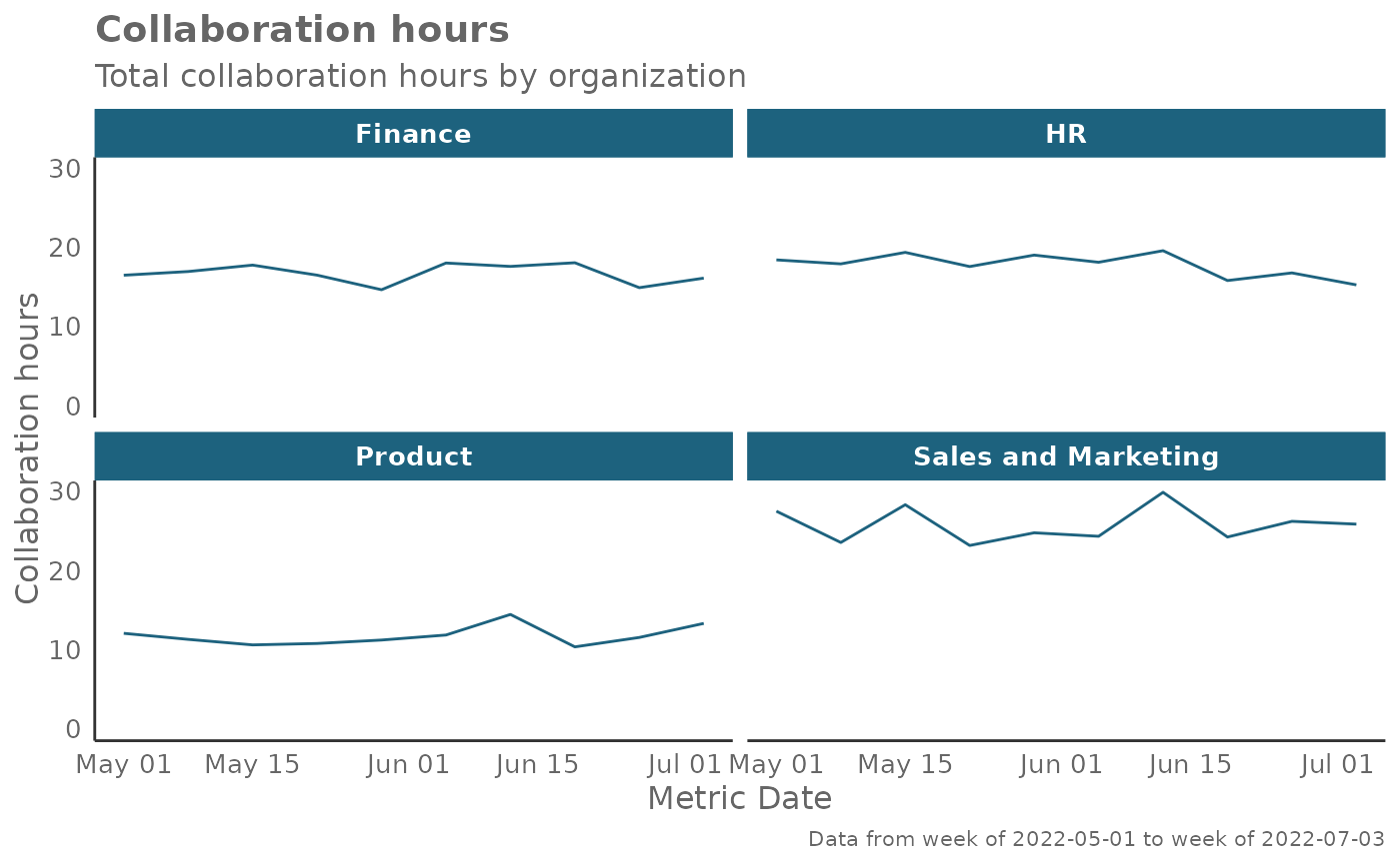
 # Return plot of Collaboration Hours
pq_data %>% create_line(metric = "Collaboration_hours", return = "plot")
# Return plot of Collaboration Hours
pq_data %>% create_line(metric = "Collaboration_hours", return = "plot")
 # Return plot but coerce plot to two columns
pq_data %>%
create_line(
metric = "Collaboration_hours",
hrvar = "Organization",
ncol = 2
)
# Return plot but coerce plot to two columns
pq_data %>%
create_line(
metric = "Collaboration_hours",
hrvar = "Organization",
ncol = 2
)
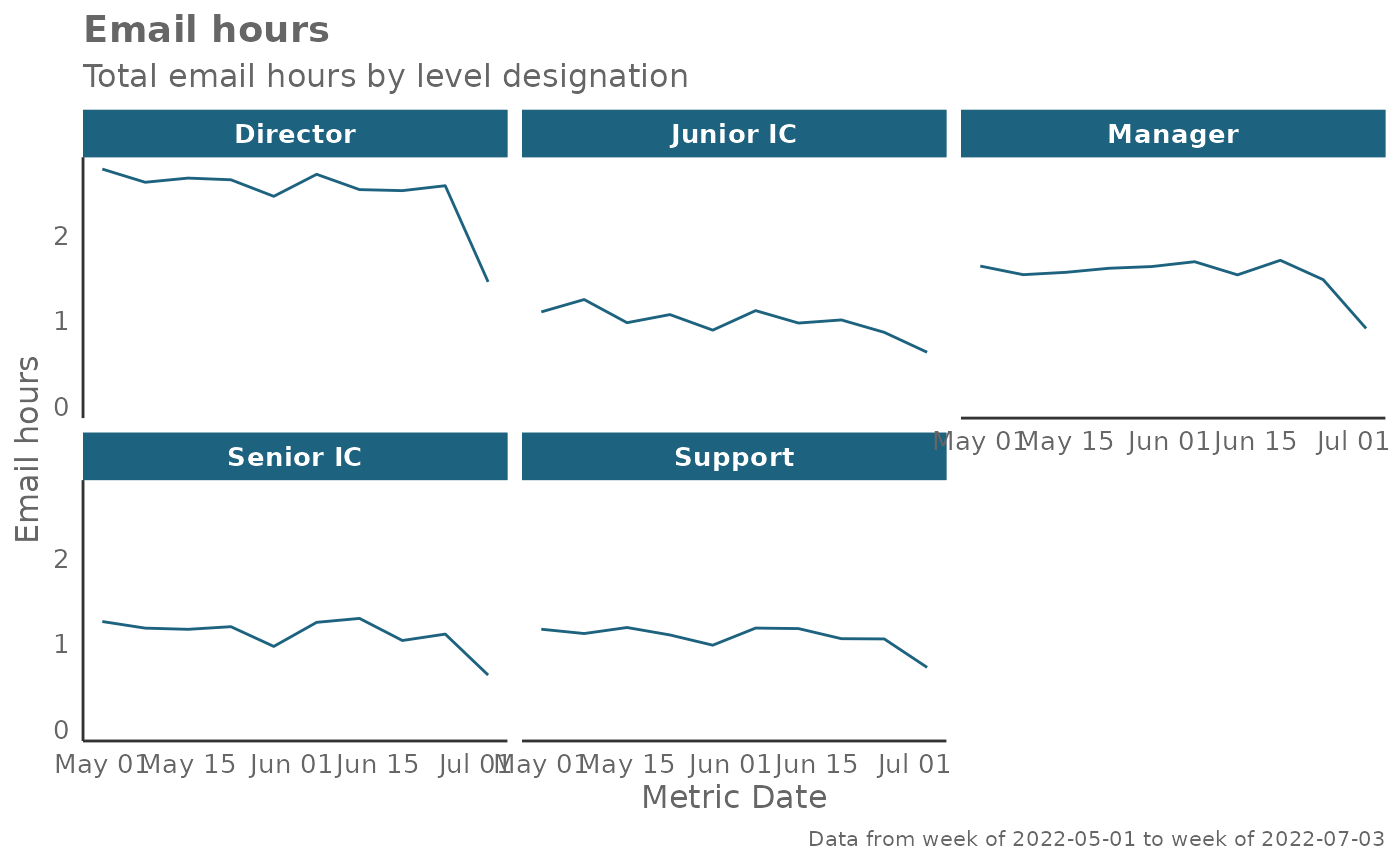
 # Return plot of email hours and cut by `LevelDesignation`
pq_data %>% create_line(metric = "Email_hours", hrvar = "LevelDesignation")
# Return plot of email hours and cut by `LevelDesignation`
pq_data %>% create_line(metric = "Email_hours", hrvar = "LevelDesignation")
 # Return plot with data point labels
pq_data %>% create_line(metric = "Email_hours", label = TRUE)
# Return plot with data point labels
pq_data %>% create_line(metric = "Email_hours", label = TRUE)
