Create a Scatter plot with two selected Viva Insights metrics (General Purpose)
Source:R/create_scatter.R
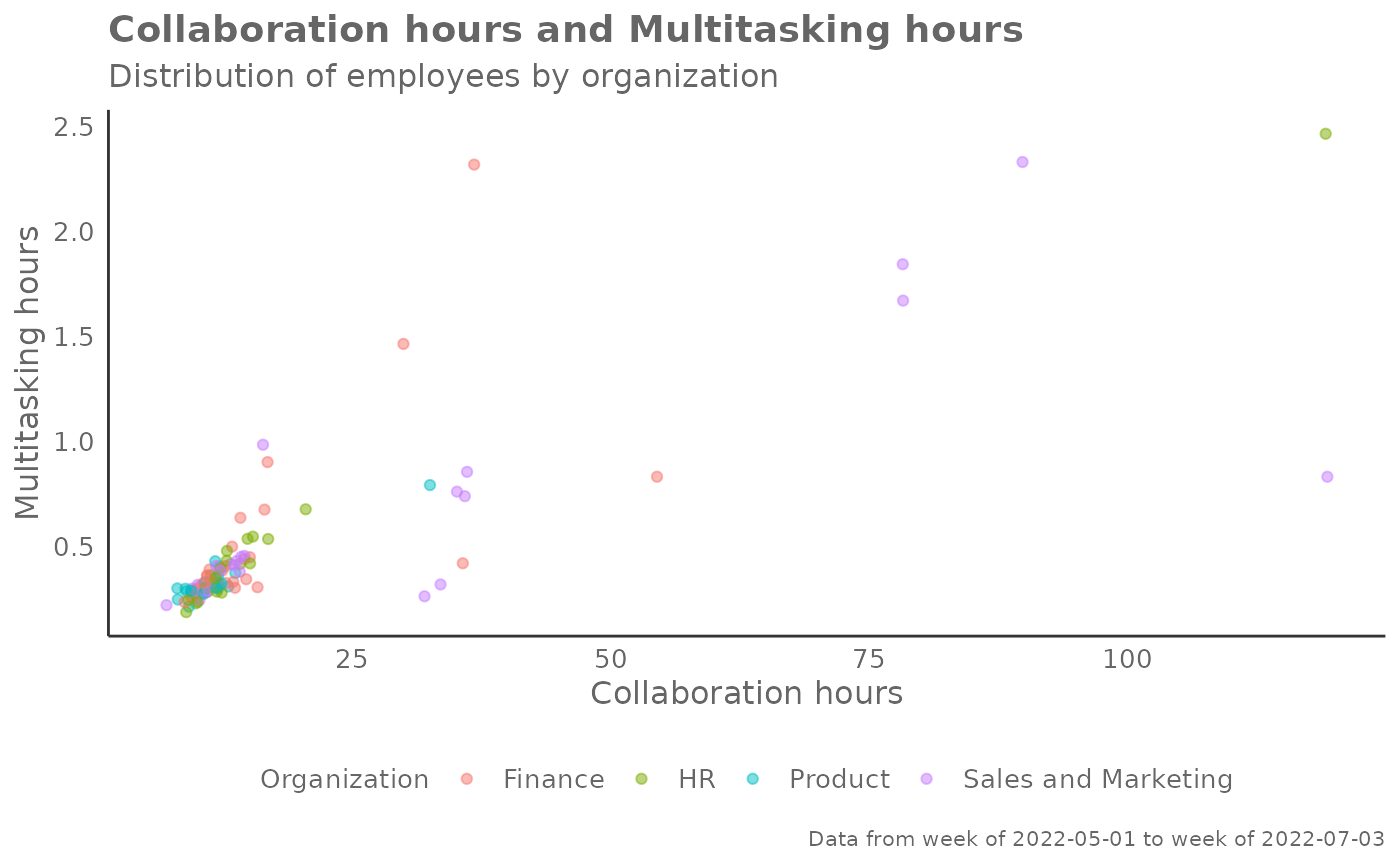
create_scatter.RdReturns a scatter plot of two selected metrics, using colour to map an HR attribute. Returns a scatter plot by default, with additional options to return a summary table.
Usage
create_scatter(
  data,
  metric_x,
  metric_y,
  hrvar = "Organization",
  mingroup = 5,
  return = "plot"
)
Arguments
- data
A Standard Person Query dataset in the form of a data frame. This must be a panel dataset where each row represents one employee per time period, with the columns
PersonIdandMetricDatepresent.- metric_x
Character string containing the name of the metric, e.g. "Collaboration_hours"
- metric_y
Character string containing the name of the metric, e.g. "Collaboration_hours"
- hrvar
HR Variable by which to split metrics, defaults to "Organization" but accepts any character vector, e.g. "LevelDesignation"
- mingroup
Numeric value setting the privacy threshold / minimum group size. Defaults to 5.
- return
Character vector specifying what to return, defaults to "plot". Valid inputs are "plot" and "table".
Value
Returns a 'ggplot' object by default, where 'plot' is passed in return.
When 'table' is passed, a summary table is returned as a data frame.
Details
This is a general purpose function that powers all the functions in the package that produce scatter plots.
See also
Other Visualization:
afterhours_dist(),
afterhours_fizz(),
afterhours_line(),
afterhours_rank(),
afterhours_summary(),
afterhours_trend(),
collaboration_area(),
collaboration_dist(),
collaboration_fizz(),
collaboration_line(),
collaboration_rank(),
collaboration_sum(),
collaboration_trend(),
create_bar(),
create_bar_asis(),
create_boxplot(),
create_bubble(),
create_dist(),
create_fizz(),
create_inc(),
create_line(),
create_line_asis(),
create_period_scatter(),
create_radar(),
create_rank(),
create_rogers(),
create_sankey(),
create_stacked(),
create_survival(),
create_tracking(),
create_trend(),
email_dist(),
email_fizz(),
email_line(),
email_rank(),
email_summary(),
email_trend(),
external_dist(),
external_fizz(),
external_line(),
external_rank(),
external_sum(),
hr_trend(),
hrvar_count(),
hrvar_trend(),
keymetrics_scan(),
meeting_dist(),
meeting_fizz(),
meeting_line(),
meeting_rank(),
meeting_summary(),
meeting_trend(),
one2one_dist(),
one2one_fizz(),
one2one_freq(),
one2one_line(),
one2one_rank(),
one2one_sum(),
one2one_trend()
Other Flexible:
create_bar(),
create_bar_asis(),
create_boxplot(),
create_bubble(),
create_density(),
create_dist(),
create_fizz(),
create_hist(),
create_inc(),
create_line(),
create_line_asis(),
create_period_scatter(),
create_radar(),
create_rank(),
create_sankey(),
create_stacked(),
create_survival(),
create_tracking(),
create_trend()