Creates either a single bar plot, of a stacked bar using selected metrics (where the typical use case is to create different definitions of collaboration hours). Returns a plot by default. Additional options available to return a summary table.
Usage
create_stacked(
  data,
  hrvar = "Organization",
  metrics = c("Meeting_hours", "Email_hours"),
  mingroup = 5,
  return = "plot",
  stack_colours = c("#1d627e", "#34b1e2", "#b4d5dd", "#adc0cb"),
  percent = FALSE,
  plot_title = "Collaboration Hours",
  plot_subtitle = paste("Average by", tolower(camel_clean(hrvar))),
  legend_lab = NULL,
  rank = "descending",
  xlim = NULL,
  text_just = 0.5,
  text_colour = "#FFFFFF"
)
Arguments
- data
A Standard Person Query dataset in the form of a data frame. This must be a panel dataset where each row represents one employee per time period, with the columns
PersonIdandMetricDatepresent. If your data is already aggregated (e.g. one row per group), use the equivalent*_asis()variant of this function instead.- hrvar
String containing the name of the HR Variable by which to split metrics. Defaults to
"Organization". To run the analysis on the total instead of splitting by an HR attribute, supplyNULL(without quotes).- metrics
A character vector to specify variables to be used in calculating the "Total" value, e.g. c("Meeting_hours", "Email_hours"). The order of the variable names supplied determine the order in which they appear on the stacked plot.
- mingroup
Numeric value setting the privacy threshold / minimum group size. Defaults to 5.
- return
Character vector specifying what to return, defaults to "plot". Valid inputs are "plot" and "table".
- stack_colours
A character vector to specify the colour codes for the stacked bar charts.
- percent
Logical value to determine whether to show labels as percentage signs. Defaults to
FALSE.- plot_title
String. Option to override plot title.
- plot_subtitle
String. Option to override plot subtitle.
- legend_lab
String. Option to override legend title/label. Defaults to
NULL, where the metric name will be populated instead.- rank
String specifying how to rank the bars. Valid inputs are:
"descending"- ranked highest to lowest from top to bottom (default)."ascending"- ranked lowest to highest from top to bottom.NULL- uses the original levels of the HR attribute.
- xlim
An option to set max value in x axis.
- text_just
![[Experimental]](figures/lifecycle-experimental.svg) A numeric value
controlling for the horizontal position of the text labels. Defaults to
0.5.
A numeric value
controlling for the horizontal position of the text labels. Defaults to
0.5.- text_colour
- String to specify
colour to use for the text labels. Defaults to
"#FFFFFF".
Value
Returns a 'ggplot' object by default, where 'plot' is passed in return.
When 'table' is passed, a summary table is returned as a data frame.
See also
Other Visualization:
afterhours_dist(),
afterhours_fizz(),
afterhours_line(),
afterhours_rank(),
afterhours_summary(),
afterhours_trend(),
collaboration_area(),
collaboration_dist(),
collaboration_fizz(),
collaboration_line(),
collaboration_rank(),
collaboration_sum(),
collaboration_trend(),
create_bar(),
create_bar_asis(),
create_boxplot(),
create_bubble(),
create_dist(),
create_fizz(),
create_inc(),
create_line(),
create_line_asis(),
create_period_scatter(),
create_radar(),
create_rank(),
create_rogers(),
create_sankey(),
create_scatter(),
create_survival(),
create_tracking(),
create_trend(),
email_dist(),
email_fizz(),
email_line(),
email_rank(),
email_summary(),
email_trend(),
external_dist(),
external_fizz(),
external_line(),
external_rank(),
external_sum(),
hr_trend(),
hrvar_count(),
hrvar_trend(),
keymetrics_scan(),
meeting_dist(),
meeting_fizz(),
meeting_line(),
meeting_rank(),
meeting_summary(),
meeting_trend(),
one2one_dist(),
one2one_fizz(),
one2one_freq(),
one2one_line(),
one2one_rank(),
one2one_sum(),
one2one_trend()
Other Flexible:
create_bar(),
create_bar_asis(),
create_boxplot(),
create_bubble(),
create_density(),
create_dist(),
create_fizz(),
create_hist(),
create_inc(),
create_line(),
create_line_asis(),
create_period_scatter(),
create_radar(),
create_rank(),
create_sankey(),
create_scatter(),
create_survival(),
create_tracking(),
create_trend()
Examples
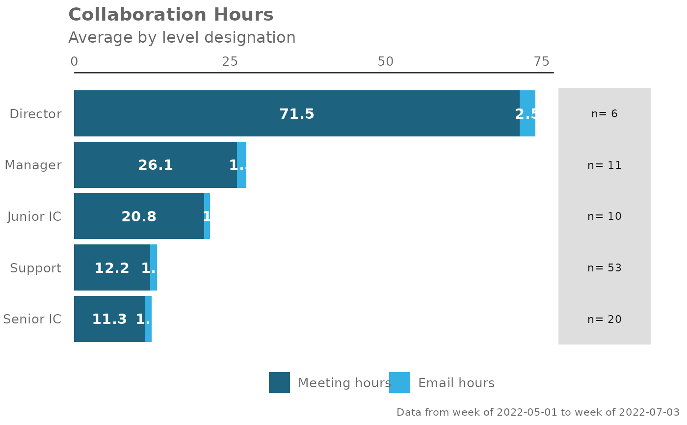
pq_data %>%
create_stacked(hrvar = "LevelDesignation",
metrics = c("Meeting_hours", "Email_hours"),
return = "plot")
 pq_data %>%
create_stacked(hrvar = "FunctionType",
metrics = c("Meeting_hours",
"Email_hours",
"Call_hours",
"Chat_hours"),
return = "plot",
rank = "ascending")
pq_data %>%
create_stacked(hrvar = "FunctionType",
metrics = c("Meeting_hours",
"Email_hours",
"Call_hours",
"Chat_hours"),
return = "plot",
rank = "ascending")
 pq_data %>%
create_stacked(hrvar = "FunctionType",
metrics = c("Meeting_hours",
"Email_hours",
"Call_hours",
"Chat_hours"),
return = "table")
#> # A tibble: 5 × 7
#> group Meeting_hours Email_hours Call_hours Chat_hours Total Employee_Count
#> <chr> <dbl> <dbl> <dbl> <dbl> <dbl> <int>
#> 1 Advisor 18.4 8.73 9.49 3.34 40.0 293
#> 2 Consulta… 19.3 8.81 10.2 3.12 41.4 288
#> 3 Manager 18.4 8.75 10.3 3.14 40.7 300
#> 4 Speciali… 19.1 8.75 10.3 2.95 41.1 300
#> 5 Technici… 18.8 8.88 11.6 2.98 42.2 274
pq_data %>%
create_stacked(hrvar = "FunctionType",
metrics = c("Meeting_hours",
"Email_hours",
"Call_hours",
"Chat_hours"),
return = "table")
#> # A tibble: 5 × 7
#> group Meeting_hours Email_hours Call_hours Chat_hours Total Employee_Count
#> <chr> <dbl> <dbl> <dbl> <dbl> <dbl> <int>
#> 1 Advisor 18.4 8.73 9.49 3.34 40.0 293
#> 2 Consulta… 19.3 8.81 10.2 3.12 41.4 288
#> 3 Manager 18.4 8.75 10.3 3.14 40.7 300
#> 4 Speciali… 19.1 8.75 10.3 2.95 41.1 300
#> 5 Technici… 18.8 8.88 11.6 2.98 42.2 274