ReactorD3 sits on two layers and you choose the level you author at.
The high-level DSL — LineChart, BarChart, AreaChart, PieChart,
plus TreeChart and ForceGraph — covers the cases dashboards keep
asking for: a series, an x accessor, a y accessor, and an opinionated
visual surface that the library wires up for you (axes, grids,
palettes, keyboard navigation, screen-reader summary). When the
opinionated surface doesn't fit — when you want a slice's percent
rendered inside the slice itself, when you want a heatmap, when you
want a bespoke parallel-coordinates view — the same library exposes
the D3 primitives that built the high-level shapes: LinearScale,
BandScale, D3Canvas, D3LinePath<T>, D3ArcPath, and the
*LabelView escape hatches on the high-level charts. This is the
same trade-off Recharts and Observable Plot draw — convenience first,
escape hatch beneath — except every D3 primitive renders as a WinUI
shape on the same Canvas the high-level charts use, so dropping a
level never means switching renderers. Pick the high level by default;
drop into D3 only when the higher-level surface refuses what you need.
Charting¶
ReactorD3 brings data visualization to Microsoft.UI.Reactor (Reactor). The chart DSL provides high-level
LineChart, BarChart, AreaChart, and PieChart factories that produce
standard Reactor elements. You bind data, configure appearance with a fluent
API, and the chart renders as native WinUI shapes on a Canvas.
Import the DSL alongside the standard Reactor factories. Charting ships in the
optional Microsoft.UI.Reactor.Advanced package (spec 062 §7), so add its
package reference first:
Line Chart¶
LineChart draws a continuous line through your data points. Pass a
collection and accessor functions for X and Y:
class LineChartDemo : Component
{
    private static readonly SalesPoint[] Data =
    [
        new(1, 120), new(2, 180), new(3, 150),
        new(4, 220), new(5, 310), new(6, 280),
        new(7, 350), new(8, 400), new(9, 380),
        new(10, 420), new(11, 460), new(12, 510)
    ];

    public override Element Render()
    {
        return VStack(12,
            SubHeading("Line Chart"),
            LineChart(Data, d => d.Month, d => d.Revenue)
                .Title("Monthly Revenue — Line")
                .SeriesName("Revenue")
                .Units("months", "USD")
                .AxisLabel(ChartAxisType.X, "Month")
                .AxisLabel(ChartAxisType.Y, "Revenue (USD)")
                .Width(600).Height(250)
                .Stroke("#0078D4").StrokeWidth(2.5)
                .ShowGrid(true).ShowAxes(true)
        ).Padding(24);
    }
}
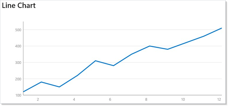
The chart auto-scales axes to fit your data with .Nice() rounding. Toggle
grid lines with .ShowGrid() and axis labels with .ShowAxes().
Bar Chart¶
BarChart renders vertical bars. Each data point becomes a bar whose height
maps to the Y value:
class BarChartDemo : Component
{
    private static readonly SalesPoint[] Data =
    [
        new(1, 340), new(2, 420), new(3, 510), new(4, 380)
    ];

    public override Element Render()
    {
        return VStack(12,
            SubHeading("Bar Chart"),
            BarChart(Data, d => d.Month, d => d.Revenue)
                .Title("Quarterly Revenue — Bar")
                .SeriesName("Revenue")
                .Units("quarters", "USD")
                .AxisLabel(ChartAxisType.X, "Quarter")
                .AxisLabel(ChartAxisType.Y, "Revenue (USD)")
                .Width(600).Height(250)
                .Fill("#50C878")
                .ShowGrid(true).ShowAxes(true)
        ).Padding(24);
    }
}
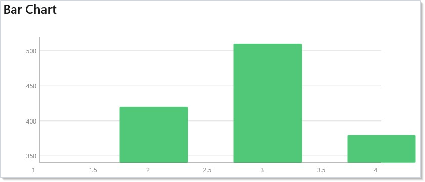
Bar width is calculated automatically based on the number of data points.
Use .Fill() to set the bar color and .FillOpacity() to control
transparency.
Area Chart¶
AreaChart fills the region between the data line and the baseline. It
combines a filled area with a line overlay:
class AreaChartDemo : Component
{
    private static readonly SalesPoint[] Data =
    [
        new(1, 50), new(2, 120), new(3, 200),
        new(4, 350), new(5, 480), new(6, 600),
        new(7, 720), new(8, 850), new(9, 1020),
        new(10, 1150), new(11, 1300), new(12, 1500)
    ];

    public override Element Render()
    {
        return VStack(12,
            SubHeading("Area Chart"),
            AreaChart(Data, d => d.Month, d => d.Revenue)
                .Title("Monthly Revenue — Area")
                .SeriesName("Revenue")
                .Units("months", "USD")
                .AxisLabel(ChartAxisType.X, "Month")
                .AxisLabel(ChartAxisType.Y, "Revenue (USD)")
                .Width(600).Height(250)
                .Stroke("#9B59B6").Fill("#9B59B6")
                .FillOpacity(0.2)
                .ShowGrid(true).ShowAxes(true)
        ).Padding(24);
    }
}
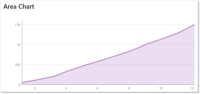
Use .FillOpacity() to control area transparency. A low value (0.15--0.3)
lets grid lines show through while still filling the shape.
Pie Chart¶
PieChart divides data into proportional arcs. Set .InnerRadius() > 0
for a donut chart:
class PieChartDemo : Component
{
    private static readonly CategoryData[] Data =
    [
        new("Engineering", 42),
        new("Marketing", 18),
        new("Sales", 25),
        new("Support", 15)
    ];

    public override Element Render()
    {
        return VStack(12,
            SubHeading("Pie Chart"),
            PieChart(Data, d => d.Value, d => d.Name)
                .Title("Team Distribution")
                .Description("Pie chart showing team size across Engineering, Marketing, Sales, and Support.")
                .Width(300).Height(300)
                .InnerRadius(60)
                .PadAngle(0.03)
        ).Padding(24);
    }
}
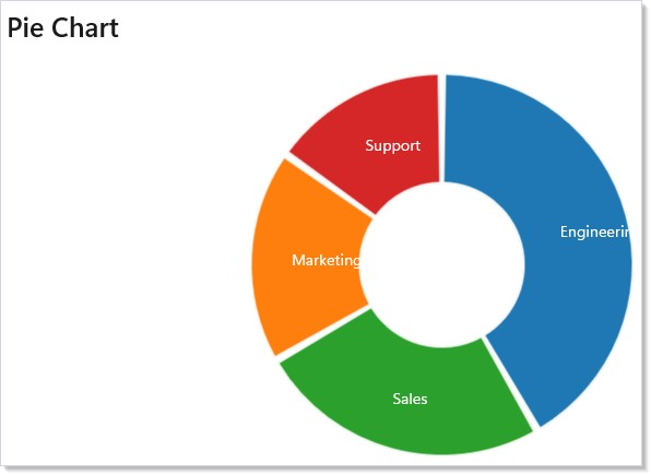
Pass a label accessor to display text at each arc's centroid. Colors cycle
through the Category10 palette by default — override with .SetColors().
Chart Configuration¶
All chart types share a common set of builder methods:
| Method | Default | Purpose |
|---|---|---|
.Width(n) |
400 | Canvas width in pixels |
.Height(n) |
300 | Canvas height in pixels |
.Margin(l, t, r, b) |
40, 20, 20, 30 | Axis/label margins, in left, top, right, bottom order |
.Stroke(color) |
#4285f4 |
Line/border color |
.Fill(color) |
#4285f4 |
Fill color |
.StrokeWidth(n) |
2 | Line thickness |
.FillOpacity(n) |
0.3 | Fill transparency (0--1) |
.ShowAxes(bool) |
true | Show axis lines and labels |
.ShowGrid(bool) |
true | Show horizontal grid lines |
Colors accept any CSS-style string: #RGB, #RRGGBB, rgb(r,g,b), or
named colors like steelblue. For palette-aware colors that adapt to
dark mode, see styling and the
.Palette(...) accessibility modifier below.
Binding Data to State¶
Charts are standard Reactor elements. When state changes, the chart re-renders with the new data:
class CombinedChartDemo : Component
{
    private static readonly SalesPoint[] Data2024 =
    [
        new(1, 100), new(2, 140), new(3, 180),
        new(4, 200), new(5, 260), new(6, 300)
    ];

    private static readonly SalesPoint[] Data2025 =
    [
        new(1, 160), new(2, 220), new(3, 280),
        new(4, 320), new(5, 390), new(6, 450)
    ];

    private static readonly string[] Years = ["2024", "2025"];

    public override Element Render()
    {
        var (year, setYear) = UseState(0);
        var data = year == 0 ? Data2024 : Data2025;

        return VStack(12,
            SubHeading("Interactive Chart"),
            ComboBox(Years, year, setYear),
            AreaChart(data, d => d.Month, d => d.Revenue)
                .Title("Revenue by Year")
                .SeriesName("Revenue")
                .Units("months", "USD")
                .Interactive()
                .Width(600).Height(250)
                .Stroke("#0078D4").Fill("#0078D4")
                .FillOpacity(0.15)
                .ShowGrid(true).ShowAxes(true)
        ).Padding(24);
    }
}
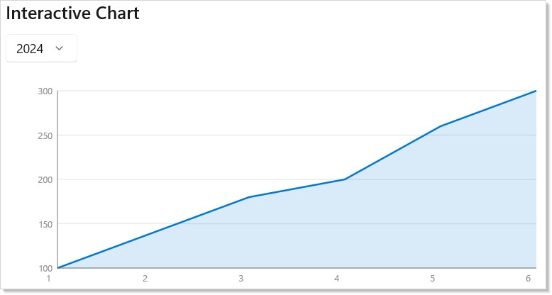
Use hooks like UseState to drive data selection. The chart
rebuilds on every render — keep datasets small (under ~1000 points) for
smooth interaction.
Dynamic Data Updates¶
Charts are native Reactor elements, so changing state is all you need. Use
UseState, UseReducer, or any hook to update the data — the reconciler
diffs the old and new element trees and patches only what changed:
class DynamicDataDemo : Component
{
    private static readonly List<SalesPoint> InitialPoints =
        Enumerable.Range(1, 8)
            .Select(i => new SalesPoint(i, Random.Shared.Next(50, 500)))
            .ToList();

    public override Element Render()
    {
        var (points, updatePoints) = UseReducer(InitialPoints);

        return VStack(12,
            SubHeading("Dynamic Data"),
            Button("Randomize", () => updatePoints(_ =>
                Enumerable.Range(1, 8)
                    .Select(i => new SalesPoint(i, Random.Shared.Next(50, 500)))
                    .ToList())),
            BarChart<SalesPoint>(points, d => d.Month, d => d.Revenue)
                .Title("Dynamic Revenue Data")
                .SeriesName("Revenue")
                .Units("months", "USD")
                .Width(600).Height(250)
                .Fill("#E74C3C")
                .ShowGrid(true).ShowAxes(true)
        ).Padding(24);
    }
}
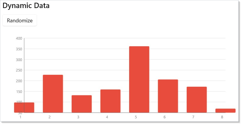
For high-frequency updates (60fps streaming), use OnReady to get a
handle that exposes the underlying Canvas for direct manipulation.
This is the same compositor-property escape hatch the
animation pipeline uses — render the static
geometry through Reactor, then mutate the live values directly.
Custom Label Elements¶
Most charts only need the string-based label APIs (AxisLabel,
LabelAccessor, DataLabel). Reach for the *View extensions only when
plain text isn't enough — for icon-plus-text ticks, multi-line labels with
mixed typography, or rendering a slice's percent inside the slice itself.
Pie slice labels¶
LabelView replaces the built-in text label on each pie slice. The delegate
receives the slice's data item plus a PieSliceLayout describing its
geometry, and returns any Element:
// Percent rendered inside the slice. The string label accessor
// is still passed so screen readers describe the slice.
PieChart(Data, d => d.Value, d => d.Name)
    .Title("Team Distribution")
    .Width(300).Height(300)
    .InnerRadius(50).PadAngle(0.02)
    .LabelView((d, layout) =>
        TextBlock($"{layout.Fraction:P0}")
            .FontSize(12).Bold().Foreground(Theme.AccentText))
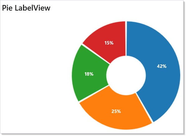
PieSliceLayout exposes the slice's Index, Value, Fraction,
CentroidX/CentroidY, StartAngle/EndAngle, InnerRadius/OuterRadius,
and the resolved palette Color so a label can echo slice geometry without
recomputing it.
Axis tick labels¶
XTickLabelView and YTickLabelView replace the numeric tick labels with
any Element. Each delegate receives the tick's domain value:
// X axis ticks: render month name plus a caption per tick.
LineChart(Data, d => d.Month, d => d.Revenue)
    .Title("Revenue by Month")
    .SeriesName("Revenue")
    .Width(600).Height(220)
    .Stroke("#0078D4").StrokeWidth(2.5)
    .ShowGrid(true).ShowAxes(true)
    .XTickLabelView(t => VStack(2,
        TextBlock(Months[Math.Clamp((int)t - 1, 0, Months.Length - 1)])
            .FontSize(11).SemiBold(),
        TextBlock("month").FontSize(8).Opacity(0.6)))
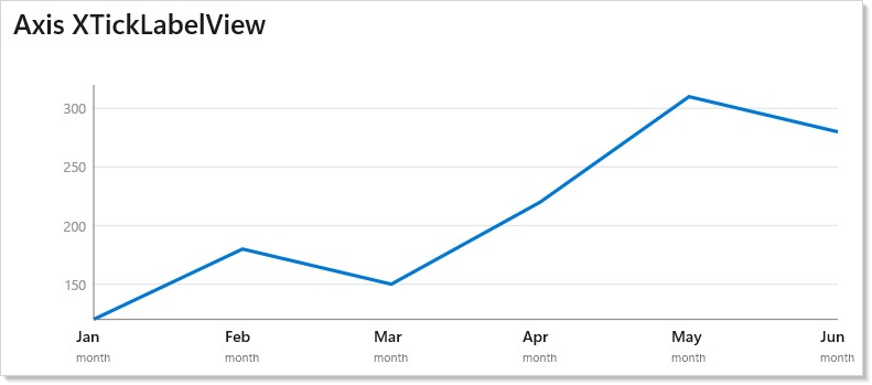
| Method | Purpose |
|---|---|
PieChartElement<T>.LabelView(Func<T, PieSliceLayout, Element>, Func<T, string>? name = null, bool interactive = false) |
Replace the built-in slice text with any Element, anchored on the slice centroid |
ChartElement<T>.XTickLabelView(Func<double, Element>, Func<double, string>? name = null, bool interactive = false) |
Replace the X-axis tick label, horizontally centered on the tick |
ChartElement<T>.YTickLabelView(Func<double, Element>, Func<double, string>? name = null, bool interactive = false) |
Replace the Y-axis tick label, right-anchored to the axis edge |
By default the element you return is rendered non-interactive: the chart
force-applies AccessibilityView.Raw to the entire realized subtree (not
just the outer wrapper) and clears IsTabStop on every inner control, so no
inner peer surfaces to assistive tech and nothing inside the label joins the
keyboard tab order. The chart's structured accessibility description (see
below) therefore stays the single source of truth. The element is also
auto-anchored — you don't need a known size at construction time, and the
chart re-positions on layout.
Two optional parameters refine this:
namesupplies an accessible-name projection for cases where you use a*Viewoverride without a stringLabelAccessor(pie) /DataLabel(line/bar/area). For pie slices the projection feeds the chart's own slice descriptor, so the announced name matches the visible label instead of falling back toSlice {n}. For axis ticks it setsAutomationNameon the realized tick element (ticks have no per-tick descriptor). Prefer the stringLabelAccessor/DataLabelwhen you have one; reach fornameonly when the visual lives entirely in the*View.interactive: trueis an opt-in escape hatch: it leaves the subtree's peers and tab stops intact so focusable children inside your label remain reachable. When you set it, you own the label's accessibility — the chart no longer hides it. Togglinginteractiveat runtime remounts the label so the hide/un-hide takes effect immediately.
Chart Accessibility¶
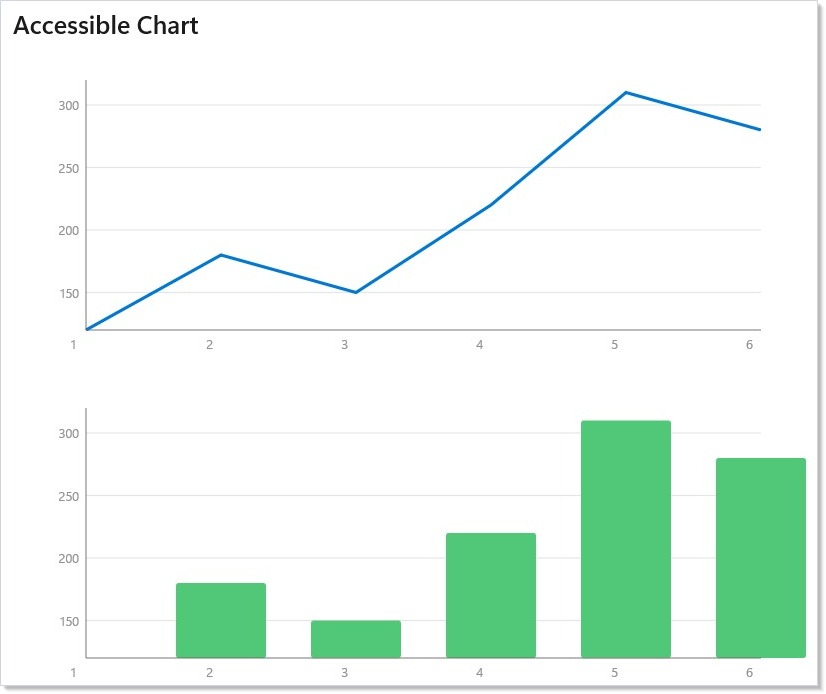
Charts are fully accessible out of the box. Add .Title() and
.SeriesName() for screen-reader identification, .Units() for axis
annotations, and .Interactive() for keyboard navigation:
/// <summary>
/// Canonical accessible chart pattern — demonstrates all recommended accessibility
/// modifiers for both static and interactive charts. Follow this pattern to ensure
/// charts are fully accessible to screen readers, keyboard users, and users who
/// need forced-colors or reduced-motion.
/// </summary>
class AccessibleChartDemo : Component
{
    private static readonly SalesPoint[] Data =
    [
        new(1, 120), new(2, 180), new(3, 150),
        new(4, 220), new(5, 310), new(6, 280)
    ];

    public override Element Render()
    {
        return VStack(12,
            SubHeading("Accessible Chart"),

            // Static accessible chart: Title + SeriesName + Units
            LineChart(Data, d => d.Month, d => d.Revenue)
                .Title("Monthly Revenue 2024")
                .SeriesName("Revenue")
                .Units("months", "USD")
                .AxisLabel(ChartAxisType.X, "Month")
                .AxisLabel(ChartAxisType.Y, "Revenue (USD)")
                .Width(600).Height(250)
                .Stroke("#0078D4").StrokeWidth(2.5)
                .ShowGrid(true).ShowAxes(true),

            // Interactive accessible chart: adds keyboard nav and point invocation
            BarChart(Data, d => d.Month, d => d.Revenue)
                .Title("Monthly Revenue — Interactive")
                .SeriesName("Revenue")
                .Units("months", "USD")
                .Interactive()
                .Width(600).Height(250)
                .Fill("#50C878")
                .ShowGrid(true).ShowAxes(true)
        ).Padding(24);
    }
}
Accessibility Modifiers¶
| Method | Purpose |
|---|---|
.Title(str) |
Visible title and accessible name |
.Description(str) |
Override auto-generated summary |
.SeriesName(str) |
Name the data series |
.Units(x, y) |
Axis unit annotations (e.g., "months", "USD") |
.AxisLabel(axis, str) |
Explicit axis label |
.Interactive() |
Enable keyboard navigation and virtual focus |
.OnPointInvoke(handler) |
Callback when Enter/Space pressed on a point |
.AlternateView(element) |
Toggle between chart and data table (T key) |
.Palette(palette) |
Curated colorblind-safe palette |
.SeriesColors(colors) |
Custom series colors (scanner-validated) |
.SetColors(colors) |
Custom pie-slice colors (scanner-validated; pie counterpart to .SeriesColors) |
.RawColors(colors) |
Raw series colors — escape hatch, no validation (Tier 4) |
.ChartBackground(color) |
Declare the rendered background so palette-contrast (A11Y_CHART_011) is checked against that single active background (warning) instead of either fixed light/dark background (info) |
.SeriesShapes(shapes) |
Marker shapes for double-encoding |
.SeriesDashes(dashes) |
Dash patterns for double-encoding |
Screen readers announce the chart type, series count, data range, and
individual point values. Keyboard users navigate with arrow keys, invoke
points with Enter, and toggle an alternate data-table view with T. The
full a11y story for the framework is in accessibility;
the chart-specific contract is that color is never the only encoding —
combine .Palette(...) with .SeriesShapes(...) or .SeriesDashes(...)
for any multi-series chart that ships to forced-colors users.
Low-Level Drawing¶
For custom visualizations, ReactorD3 provides shape generators and a Canvas
DSL. Import using static Microsoft.UI.Reactor.Charting.D3Charts; for:
D3Canvas(w, h, children)— create a drawing surfaceD3Rect,D3Circle,D3Line,D3Path— primitive shapesText,TextRight,TextCenter— positioned textD3LinePath<T>,D3AreaPath<T>,D3ArcPath— generator helpersD3Axes,D3Grid,D3Legend— axis/legend compositesBrush(color),Palette— brushes and the default categorical palette
These three are positional: Text(x, y, text, …) takes canvas
coordinates and is unrelated to the core TextBlock(...) factory. Reactor has
no core Text(...) element factory — the Text(...) members that exist
elsewhere are the DataGrid cell-renderer and editor helpers, which return
Func<object, Element>, not an Element.
The scales are types, not D3Charts members — they live one namespace deeper.
Add using Microsoft.UI.Reactor.Charting.D3; to reach them.
Scale Types¶
Every scale exposes .Map(value) to project a domain value into range space —
scales are objects, not delegates, so scale(v) does not compile. Construct
one with new LinearScale(domain, range) or configure it fluently with
.SetDomain(...) / .SetRange(...).
| Scale | Purpose |
|---|---|
LinearScale |
Continuous numeric mapping with .Nice() and .Ticks() |
BandScale<T> |
Categorical mapping with bandwidth (bar charts) |
LogScale |
Logarithmic mapping for exponential data |
PowScale |
Power/sqrt mapping |
OrdinalScale<T> |
Discrete-to-discrete mapping |
Caveat: Recreate the data array inside
Render()only at your own peril. Charts compare incoming data by reference on the fast path — a new array on every render means the chart re-derives scales, re-runs the pie layout, and re-allocates the WinUI shape pool every frame, even when nothing changed. The symptom is a chart that flickers when an unrelated piece of state updates. The fix is the same shape Reactor uses everywhere: wrap the data inUseMemo(() => …, deps)keyed on whatever actually changes. The pattern is most obvious withPieChart— a freshnew[] { … }on every render makes each slice remount, the.Transition()enter/exit fires for slices that haven't moved, and the chart "redraws itself" on every keystroke into an unrelatedTextBox.
Patterns¶
Live-updating chart from a ticking source¶
A streaming chart — a price feed, a sensor reading — drives a sliding
window of points. Hold the window in UseReducer (each tick derives the
next window from the previous one), append on tick, drop the head once
Count exceeds the window size. UseEffect takes a synchronous
Action/Func<Action>, never an async lambda, so start the pump from
the effect and cancel it from the returned cleanup:
record Sample(DateTime Time, double Value);

class LiveChartDemo : Component
{
    public override Element Render()
    {
        var (samples, updateSamples) = UseReducer<IReadOnlyList<Sample>>(Array.Empty<Sample>());

        // UseEffect takes a synchronous Action/Func<Action> — never an async lambda.
        // Start the pump from the effect and cancel it from the returned cleanup.
        UseEffect(() =>
        {
            var cts = new CancellationTokenSource();
            _ = PumpAsync(cts.Token);
            return () => { cts.Cancel(); };
        }, Array.Empty<object>());

        return VStack(12,
            SubHeading("Live feed"),
            LineChart(samples, s => s.Time.Ticks, s => s.Value)
                .Title("Live feed")
                .SeriesName("Value")
                .Width(600).Height(220)
                .Stroke("#0078D4")
        ).Padding(24);

        async Task PumpAsync(CancellationToken token)
        {
            using var timer = new PeriodicTimer(TimeSpan.FromMilliseconds(200));
            try
            {
                while (await timer.WaitForNextTickAsync(token))
                {
                    updateSamples(prev =>
                    {
                        var next = prev.Append(new Sample(DateTime.Now, Random.Shared.Next(0, 100))).ToList();
                        return next.Count > 60 ? next.Skip(next.Count - 60).ToList() : next;
                    });
                }
            }
            catch (OperationCanceledException)
            {
                // Expected on unmount.
            }
        }
    }
}
The chart redraws on every tick. For sub-100ms cadence, drop into
OnReady and mutate the Canvas directly — the reconciler is fast
but it isn't free. See effects-scheduling for
the timer-cleanup pattern.
Switching chart type without losing the data binding¶
The same data feeds a line, a bar, or an area chart — let users pick
the shape. Hold the selected ComboBox index in state and switch the
factory call on it:
class ChartSwitchDemo : Component
{
    private static readonly SalesPoint[] Data =
    [
        new(1, 120), new(2, 180), new(3, 150), new(4, 220), new(5, 310), new(6, 280)
    ];

    public override Element Render()
    {
        // ComboBox reports the selected *index*, so hold an int and branch on it.
        var (kind, setKind) = UseState(0);
        var kinds = new[] { "line", "bar", "area" };

        // Each factory returns ChartElement<T>, so the switch has one common type
        // and the modifier chain below is shared.
        ChartElement<SalesPoint> chart = kind switch
        {
            0 => LineChart(Data, d => d.Month, d => d.Revenue),
            1 => BarChart(Data, d => d.Month, d => d.Revenue),
            _ => AreaChart(Data, d => d.Month, d => d.Revenue),
        };

        return VStack(8,
            SubHeading("Switch chart type"),
            ComboBox(kinds, kind, setKind),
            chart
                .Title("Revenue")
                .SeriesName("Revenue")
                .Width(600).Height(250)
                .Stroke("#0078D4")
        ).Padding(24);
    }
}
Because each factory returns a ChartElement<T>, the modifier chain is
identical — the only branching is the constructor.
Dropping into D3 for a custom shape¶
When the high-level surface doesn't fit (heatmap, parallel coordinates,
swarm plot), render D3Canvas directly and compose D3 shape generators.
The LinearScale / BandScale types are the same ones the high-level
charts use internally, so behavior matches — .Nice(), .Ticks(), and
the domain/range setters work identically. D3Axes and D3Grid return
Element[], so spread them into the canvas children with ..:
class D3CustomDemo : Component
{
    public override Element Render()
    {
        const double w = 600, h = 240;
        const double left = 50, top = 20, right = 20, bottom = 40;
        double plotW = w - left - right, plotH = h - top - bottom;

        var data = Enumerable.Range(0, 40)
            .Select(i => (x: (double)i, y: 40 + 30 * Math.Sin(i / 4.0) + i))
            .ToArray();

        var (yMin, yMax) = D3Extent.Extent(data.Select(d => d.y));

        // Scales are plain objects: Set* mutates fluently, Map projects a value.
        var xs = new LinearScale([0, 39], [left, left + plotW]);
        var ys = new LinearScale([yMax, yMin], [top, top + plotH]).Nice();

        var line = D3Charts.Brush("#0078D4");

        return VStack(12,
            SubHeading("Custom D3 canvas"),
            D3Charts.D3Canvas(w, h,
                [.. D3Charts.D3Grid(ys, left, plotW),
                 .. D3Charts.D3Axes(xs, ys, left, top, plotW, plotH),
                 D3Charts.D3LinePath(data, x: d => xs.Map(d.x), y: d => ys.Map(d.y),
                     stroke: line, strokeWidth: 2),
                 .. data.Select(d => (Element)(D3Charts.D3Circle(xs.Map(d.x), ys.Map(d.y), 3)
                     with { Fill = line }))])
        ).Padding(24);
    }
}
This is the same composition strategy Observable Plot uses — geometric
primitives over scales — except the primitives render as WinUI shapes,
not SVG. For a heatmap, swap D3LinePath for nested
D3Rects; for parallel coordinates, repeat the line-path call per axis.
Common Mistakes¶
Constructing the data array in Render¶
// Don't:
public override Element Render()
{
    var data = new SalesPoint[] { new(1, 120), new(2, 180), /* … */ };
    return LineChart(data, d => d.Month, d => d.Revenue);
}
class DynamicDataDemo : Component
{
    private static readonly List<SalesPoint> InitialPoints =
        Enumerable.Range(1, 8)
            .Select(i => new SalesPoint(i, Random.Shared.Next(50, 500)))
            .ToList();

    public override Element Render()
    {
        var (points, updatePoints) = UseReducer(InitialPoints);

        return VStack(12,
            SubHeading("Dynamic Data"),
            Button("Randomize", () => updatePoints(_ =>
                Enumerable.Range(1, 8)
                    .Select(i => new SalesPoint(i, Random.Shared.Next(50, 500)))
                    .ToList())),
            BarChart<SalesPoint>(points, d => d.Month, d => d.Revenue)
                .Title("Dynamic Revenue Data")
                .SeriesName("Revenue")
                .Units("months", "USD")
                .Width(600).Height(250)
                .Fill("#E74C3C")
                .ShowGrid(true).ShowAxes(true)
        ).Padding(24);
    }
}
Every render allocates a new array, so the chart's reference-equality
check fails, scales re-derive, and shape pools reset — even though
nothing visible changed. Hoist the static data into a static readonly
field or wrap dynamic data in UseMemo(() => BuildData(...), deps).
Using color as the only series encoding¶
// Don't:
LineChart(serverA, ...).Stroke("red"),
LineChart(serverB, ...).Stroke("green"),
LineChart(serverC, ...).Stroke("blue")
In forced-colors mode (Windows High Contrast), every stroke collapses
to the active accent color and the user can't tell the series apart.
Pair color with
.SeriesShapes(MarkerShape.Circle, MarkerShape.Square, MarkerShape.Triangle)
or .SeriesDashes(DashStyle.Solid, DashStyle.Dash4_2, DashStyle.Dash2_2)
so the series is identifiable without color. Same principle as charts in
WCAG 2.2 SC 1.4.1.
Animating individual D3 shapes by hand¶
// Don't:
D3Circle(xs.Map(d.X), ys.Map(d.Y), 3)
    .Set(c =>
    {
        var anim = c.Compositor.CreateScalarKeyFrameAnimation();
        anim.InsertKeyFrame(0f, 0.0f);
        anim.InsertKeyFrame(1f, 1.0f);
        anim.Target = "Opacity";
        c.StartAnimation(anim);
    })
Inline composition animation duplicates what .OpacityTransition()
and .Transition(Transition.Fade) already do, and it bypasses the
reduced-motion preference Reactor honors at the
animation pipeline level. Use the Reactor
animation modifiers on the D3 shape — they work the same way they do
on a Border or TextBlock.
Tips¶
Start with the high-level DSL. LineChart, BarChart, AreaChart, and
PieChart cover most dashboard needs without touching scales or generators.
Use .ShowGrid(true) for readability. Grid lines make it much easier
to read values from a chart, especially line and area charts.
Keep datasets under 1000 points. Each data point creates WinUI shapes on a Canvas. For larger datasets, aggregate or sample before charting.
Just change state for live data. Charts diff efficiently — updating
state triggers the reconciler to patch only what changed. For 60fps
escape hatches, use OnReady to access the underlying Canvas directly.
Use donut charts (InnerRadius > 0) for proportional data. The center
space works well for displaying a total or label.
Next Steps¶
- Animation — Previous: transitions, keyframes, interaction states
- Advanced Patterns — Next: error boundaries, memoization, and performance tuning
- Collections — Bind chart data from virtualized lists and observable collections
- Effects and Lifecycle — Load chart data asynchronously with UseEffect
- Styling and Theming — Use theme tokens for chart colors that adapt to dark mode
- Accessibility — Screen reader, keyboard navigation, and forced-colors guidance