WinUI reference: For the full property surface and design guidance, see Colors.
A Microsoft.UI.Reactor (Reactor) theme token is a name for a color that the system resolves at render
time. The same token (Theme.Accent) emits a different Brush
depending on whether the app is in light mode, dark mode, or high
contrast — and switches without a re-render when the user flips
themes. The alternative — a literal like "#0066CC" baked into a
modifier — locks the value to a single visual mode and silently
breaks dark theme the moment a user opens settings. Tokens exist so
the styling layer can hand a brush to a control without
caring which theme is active. The most common mistake is reaching for
a literal because "I'll just hardcode this one"; the
REACTOR_THEME_001 analyzer catches that at
build time so it cannot ship.
Theming Tokens
Reactor exposes 36 named theme tokens on the static
Theme class plus a Theme.Ref(string) escape hatch
for any XAML resource key. Tokens resolve through WinUI's resource
system (XamlControlsResources + the app's ThemeDictionaries), so
the values they produce match the design system Microsoft ships in
WinUI Fluent colors.
Lead snippet
class SwatchGrid : Component
{
    public override Element Render() => ScrollView(
        VStack(16,
            Heading("Theme tokens"),
            SwatchSection("Accent", new[] {
                ("Accent", Theme.Accent),
                ("AccentSecondary", Theme.AccentSecondary),
                ("AccentTertiary", Theme.AccentTertiary),
                ("AccentDisabled", Theme.AccentDisabled),
            }),
            SwatchSection("Text", new[] {
                ("PrimaryText", Theme.PrimaryText),
                ("SecondaryText", Theme.SecondaryText),
                ("TertiaryText", Theme.TertiaryText),
                ("DisabledText", Theme.DisabledText),
                ("AccentText", Theme.AccentText),
            }),
            SwatchSection("Surfaces", new[] {
                ("SolidBackground", Theme.SolidBackground),
                ("CardBackground", Theme.CardBackground),
                ("SmokeFill", Theme.SmokeFill),
                ("SubtleFill", Theme.SubtleFill),
                ("LayerFill", Theme.LayerFill),
            }),
            SwatchSection("Control fill", new[] {
                ("ControlFill", Theme.ControlFill),
                ("ControlFillSecondary", Theme.ControlFillSecondary),
                ("ControlFillTertiary", Theme.ControlFillTertiary),
                ("ControlFillDisabled", Theme.ControlFillDisabled),
                ("ControlFillInputActive", Theme.ControlFillInputActive),
            }),
            SwatchSection("Stroke", new[] {
                ("CardStroke", Theme.CardStroke),
                ("SurfaceStroke", Theme.SurfaceStroke),
                ("DividerStroke", Theme.DividerStroke),
                ("ControlStroke", Theme.ControlStroke),
                ("ControlStrokeSecondary", Theme.ControlStrokeSecondary),
            }),
            SwatchSection("Signal", new[] {
                ("SystemAttention", Theme.SystemAttention),
                ("SystemSuccess", Theme.SystemSuccess),
                ("SystemCaution", Theme.SystemCaution),
                ("SystemCritical", Theme.SystemCritical),
                ("SystemNeutral", Theme.SystemNeutral),
                ("SystemSolidNeutral", Theme.SystemSolidNeutral),
                ("SystemSolidAttention", Theme.SystemSolidAttention),
                ("SystemAttentionBackground", Theme.SystemAttentionBackground),
                ("SystemSuccessBackground", Theme.SystemSuccessBackground),
                ("SystemCautionBackground", Theme.SystemCautionBackground),
                ("SystemCriticalBackground", Theme.SystemCriticalBackground),
                ("SystemNeutralBackground", Theme.SystemNeutralBackground),
            })
        ).Padding(20)
    );

    private static Element SwatchSection(string title, (string Name, ThemeRef Ref)[] tokens) =>
        VStack(8,
            SubHeading(title),
            VStack(4, tokens.Select(t => Row(t.Name, t.Ref).WithKey(t.Name)).ToArray())
        );

    private static Element Row(string name, ThemeRef token) => HStack(12,
        new BorderElement(Empty())
            .Background(token)
            .Size(40, 24)
            .WithBorder(Theme.ControlStroke),
        TextBlock(name).Width(220),
        TextBlock(token.ResourceKey).Opacity(0.6)
    );
}
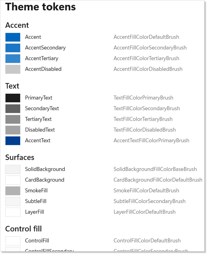
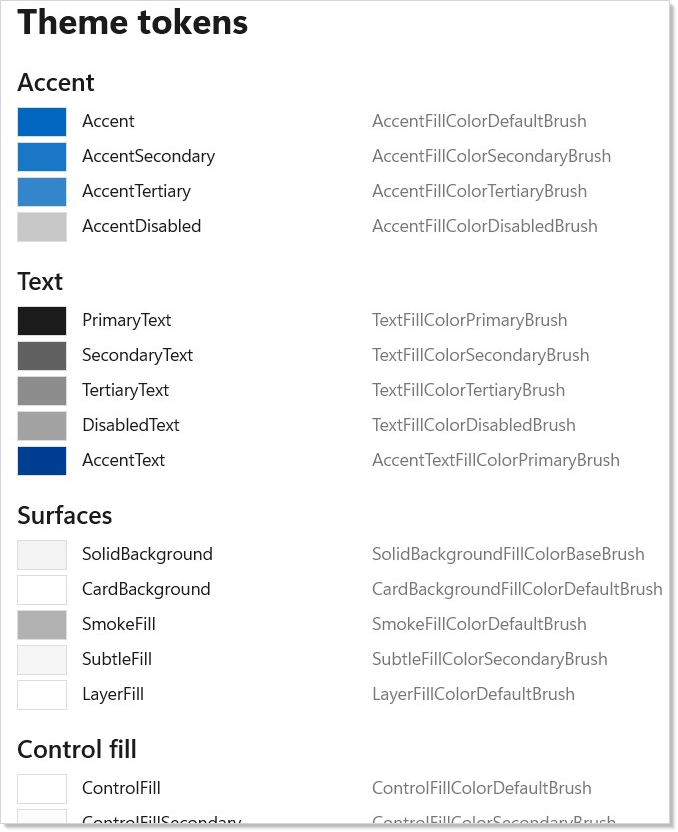
The same grid, both themes. Every cell is the result of ThemeRef
resolution against the active ThemeDictionary; switching themes is a
property update on the host, not a re-render of the component.
Caveat: A hardcoded color string in
.Background("#0066CC")skips the theme swap entirely. The button stays blue when the user flips to dark mode, and white text on a now-still-blue background still satisfies WCAG against light's neutral — but the dark-mode neutral behind it makes the page look broken. UseTheme.Accent(or the matchingTheme.Ref(key)) on.Background/.Foreground/.WithBorder; REACTOR_THEME_001 flags the literal at build time so the regression never reaches review.
How resolution works
ThemeRef is a readonly record struct holding the
resource key. When a modifier like .Background(token) reaches the
reconciler, the framework walks from the materialized
FrameworkElement up the visual tree looking for the
nearest RequestedTheme, falls back to ActualTheme, then
Application.RequestedTheme. The brush for the chosen theme name
comes from Application.Resources.ThemeDictionaries[name] (or the
nearest merged dictionary).
class ThemeRefGood : Component
{
    public override Element Render() =>
        Button("Click me", () => { }).Background(Theme.Accent);
}
When the user flips the system theme, WinUI raises
ActualThemeChanged; Reactor subscribes and updates
the brush on every element that referenced a ThemeRef. Components
that branch on the scheme use UseColorScheme:
// UseColorScheme reads the current scheme (Light / Dark) reactively so a
// component can branch on the value without re-implementing the resolver.
class SchemeAwareBadge : Component
{
    public override Element Render()
    {
        var scheme = UseColorScheme();
        var label = scheme == ColorScheme.Dark ? "Dark mode" : "Light mode";
        return TextBlock(label).Foreground(Theme.PrimaryText);
    }
}
UseColorScheme() returns the app-global ColorScheme (Light or Dark) and
re-runs render when the value changes. Reach for it
only when the branch can't be expressed as a token (e.g. a
non-color decision like which icon to render). It does not report forced
colors — use UseHighContrast() for that.
Token catalog
36 named tokens across 6 groups, plus the Theme.Ref(string) escape
hatch. The list below mirrors src/Reactor/Core/Theme.cs exactly.
Accent (4 tokens)
| Token | WinUI key | Where to use |
|---|---|---|
Theme.Accent |
AccentFillColorDefaultBrush |
Primary action button background. |
Theme.AccentSecondary |
AccentFillColorSecondaryBrush |
Pressed / hover accent variants. |
Theme.AccentTertiary |
AccentFillColorTertiaryBrush |
Subtle accent surfaces. |
Theme.AccentDisabled |
AccentFillColorDisabledBrush |
Disabled state on an accent control. |
Text (5 tokens)
| Token | WinUI key | Where to use |
|---|---|---|
Theme.PrimaryText |
TextFillColorPrimaryBrush |
Headlines and body. |
Theme.SecondaryText |
TextFillColorSecondaryBrush |
Supporting copy. |
Theme.TertiaryText |
TextFillColorTertiaryBrush |
Captions and timestamps. |
Theme.DisabledText |
TextFillColorDisabledBrush |
Disabled labels. |
Theme.AccentText |
AccentTextFillColorPrimaryBrush |
Inline accent text (links, badges). |
Surfaces (5 tokens)
| Token | WinUI key | Where to use |
|---|---|---|
Theme.SolidBackground |
SolidBackgroundFillColorBaseBrush |
Page background. |
Theme.CardBackground |
CardBackgroundFillColorDefaultBrush |
Card / panel container. |
Theme.SmokeFill |
SmokeFillColorDefaultBrush |
Modal scrim. |
Theme.SubtleFill |
SubtleFillColorSecondaryBrush |
Hover wash for list rows. |
Theme.LayerFill |
LayerFillColorDefaultBrush |
Stacked-card layer. |
Control fill (5 tokens)
| Token | WinUI key | Where to use |
|---|---|---|
Theme.ControlFill |
ControlFillColorDefaultBrush |
Default neutral control surface. |
Theme.ControlFillSecondary |
ControlFillColorSecondaryBrush |
Hover state. |
Theme.ControlFillTertiary |
ControlFillColorTertiaryBrush |
Pressed state. |
Theme.ControlFillDisabled |
ControlFillColorDisabledBrush |
Disabled. |
Theme.ControlFillInputActive |
ControlFillColorInputActiveBrush |
Active TextBox / NumberBox fill. |
Stroke (5 tokens)
| Token | WinUI key | Where to use |
|---|---|---|
Theme.CardStroke |
CardStrokeColorDefaultBrush |
Card outline. |
Theme.SurfaceStroke |
SurfaceStrokeColorDefaultBrush |
Page-level dividers. |
Theme.DividerStroke |
DividerStrokeColorDefaultBrush |
Inline list separators. |
Theme.ControlStroke |
ControlStrokeColorDefaultBrush |
Default control border. |
Theme.ControlStrokeSecondary |
ControlStrokeColorSecondaryBrush |
Focus / pressed border. |
Signal (12 tokens)
| Token | WinUI key | Where to use |
|---|---|---|
Theme.SystemAttention |
SystemFillColorAttentionBrush |
Attention call-out. |
Theme.SystemSuccess |
SystemFillColorSuccessBrush |
Success state. |
Theme.SystemCaution |
SystemFillColorCautionBrush |
Warning state. |
Theme.SystemCritical |
SystemFillColorCriticalBrush |
Error state. |
Theme.SystemNeutral |
SystemFillColorNeutralBrush |
Info / neutral. |
Theme.SystemSolidNeutral |
SystemFillColorSolidNeutralBrush |
Solid neutral surface. |
Theme.SystemSolidAttention |
SystemFillColorSolidAttentionBackgroundBrush |
Solid attention surface. |
Theme.SystemAttentionBackground |
SystemFillColorAttentionBackgroundBrush |
Attention banner background. |
Theme.SystemSuccessBackground |
SystemFillColorSuccessBackgroundBrush |
Success banner background. |
Theme.SystemCautionBackground |
SystemFillColorCautionBackgroundBrush |
Warning banner background. |
Theme.SystemCriticalBackground |
SystemFillColorCriticalBackgroundBrush |
Error banner background. |
Theme.SystemNeutralBackground |
SystemFillColorNeutralBackgroundBrush |
Info banner background. |
That is the complete set: 4 + 5 + 5 + 5 + 5 + 12 = 36 typed tokens,
plus Theme.Ref(key) for anything else in the resource tree.
Custom keys
// Reference any XAML resource by string key — covers app-level overrides
// and any token Reactor doesn't surface as a typed accessor.
Button("Custom", () => { })
    .Background(Theme.Ref("MyAppTitleBarBackground"));
Patterns
Theming an InfoBar by severity
The signal-background tokens pair with the foreground signal tokens
to produce inline status banners that read correctly in either theme.
Use WinUI's InfoBarSeverity for the discriminator — Reactor's own
Severity enum (Microsoft.UI.Reactor.Controls.Validation) is for
form-validation messages and has different members
(Info / Warning / Error).
// Map a severity onto the Signal token pair (foreground + matching
// background) so the banner tracks the theme in both light and dark.
class StatusBannerDemo : Component
{
    public override Element Render() => VStack(8,
        StatusBanner("Saved", InfoBarSeverity.Success),
        StatusBanner("Disk almost full", InfoBarSeverity.Warning),
        StatusBanner("Upload failed", InfoBarSeverity.Error),
        StatusBanner("Sync scheduled", InfoBarSeverity.Informational)
    ).Padding(16);

    internal static Element StatusBanner(string text, InfoBarSeverity severity) => HStack(8,
        TextBlock(text).Foreground(severity switch
        {
            InfoBarSeverity.Success => Theme.SystemSuccess,
            InfoBarSeverity.Warning => Theme.SystemCaution,
            InfoBarSeverity.Error => Theme.SystemCritical,
            _ => Theme.SystemNeutral,
        })
    ).Background(severity switch
    {
        InfoBarSeverity.Success => Theme.SystemSuccessBackground,
        InfoBarSeverity.Warning => Theme.SystemCautionBackground,
        InfoBarSeverity.Error => Theme.SystemCriticalBackground,
        _ => Theme.SystemNeutralBackground,
    }).Padding(12).CornerRadius(4);
}
Pair this with commanding to render the same banner
on success / failure of a Command<T>.
App-level token override
When the design system needs a brand color not in the WinUI palette,
define it once in Application.Resources (or a merged dictionary) and
reach for it through Theme.Ref:
<!-- App.xaml -->
<Application.Resources>
  <ResourceDictionary>
    <ResourceDictionary.ThemeDictionaries>
      <ResourceDictionary x:Key="Light">
        <SolidColorBrush x:Key="BrandPrimaryBrush" Color="#005FB8" />
      </ResourceDictionary>
      <ResourceDictionary x:Key="Dark">
        <SolidColorBrush x:Key="BrandPrimaryBrush" Color="#60AAFA" />
      </ResourceDictionary>
    </ResourceDictionary.ThemeDictionaries>
  </ResourceDictionary>
</Application.Resources>
The brand color participates in theme swap because the override has a
light and dark variant. Defining it without ThemeDictionaries
freezes it to one theme — exactly the trap Theme.Ref is built to
prevent.
Per-element theme override
A single sub-tree can opt out of the app theme via
RequestedTheme — useful for a video player surface or
a print-preview pane that should always look light:
The walk in Theme.Resolve picks up the local override first, so
every ThemeRef inside that sub-tree resolves against the light
dictionary even when the rest of the app is dark.
Common Mistakes
Hardcoded color literal
// Don't:
Button("Save", () => { }).Background("#0066CC");
//                                    ^^^^^^^^^^
// REACTOR_THEME_001 — hardcoded color literal on a theme-aware modifier.
// The button stays blue when the user flips to dark mode.
class ThemeRefGood : Component
{
    public override Element Render() =>
        Button("Click me", () => { }).Background(Theme.Accent);
}
The literal locks the value to one theme; the token participates in the swap. The analyzer surfaces this at build time so a regression can't ship; treat the warning as an error in CI.
Light-only test missing the dark regression
A common review mistake: the screenshot in the PR is light-mode, the reviewer signs off, and the dark-mode breakage lands on main.
The trap is reaching for a headless test to cover it. This one looks like it checks both themes and cannot:
[Theory]
[InlineData(ElementTheme.Light)]
[InlineData(ElementTheme.Dark)]
public void StatusBanner_renders_in_both_themes(ElementTheme theme)
{
    var tree = StatusBanner("Saved", InfoBarSeverity.Success)
        .RequestedTheme(theme);

    // Vacuous: the scanner inspects accessibility metadata — names,
    // roles, labels — and never resolves a brush. Both cases return
    // the same findings, so a banner hardcoded to a light-only colour
    // passes just as happily as a correct one. The `theme` parameter
    // does not reach anything this assertion reads.
    Assert.Empty(AccessibilityScanner.Scan(tree));
}
A colour regression is only observable once the tree is materialized and the resource lookup runs against the effective theme, so it needs a selftest against real WinUI controls — a headless test cannot construct them at all. Assert on the resolved brush under each theme, or snapshot the rendered control; asserting on the element record proves only that you built the element you built.
Resolving a non-themed key as a ThemeRef
Theme.Ref("MyAppHeaderBackground") against a resource that exists
only in Application.Resources (not in a ThemeDictionaries entry)
returns a single brush regardless of theme. The page renders, but the
color doesn't swap. If the goal is theme-aware, the resource must live
in ThemeDictionaries; otherwise hardcode the color in app code and
mark it intentional with a comment.
Tips
Reach for a typed token first, the Theme.Ref escape hatch
second. Typed tokens land with IntelliSense and a doc comment; the
string keys do not. If a color is missing from the typed surface and
it's a stable WinUI brush, add it to Theme.cs rather than
proliferating Theme.Ref("…") calls.
Treat REACTOR_THEME_001 and REACTOR_THEME_004 as errors in CI. The cost of fixing a hardcoded color is one line; the cost of a dark-theme regression landing on main is a customer report.
Don't burn cycles re-resolving on every render. ThemeRef is a
record struct — a stack allocation. The resolver is called once per
modifier application; UseColorScheme only re-runs render when the
scheme actually changes.
Reference
| Concept | API | Notes |
|---|---|---|
| Token | Theme.<Name> |
36 typed accessors in src/Reactor/Core/Theme.cs. |
| Escape hatch | Theme.Ref(key) |
Any XAML resource key, including app-level overrides. |
| Reactive read | UseColorScheme() |
Returns ColorScheme; triggers re-render on swap. |
| Per-element override | .RequestedTheme(ElementTheme) |
Walks visual tree, resolves nearest override. |
| Analyzer | REACTOR_THEME_001, REACTOR_THEME_004 |
Flags hardcoded literals and Brush/Color objects on theme-aware modifiers. |
| WinUI surface | XamlControlsResources |
Owning ThemeDictionary for every named token. |
Next Steps
- Styling — Previous in the styling chain: the
modifier surface that consumes
ThemeRefvalues. - Animation — Next: animating between themed values; how the brush transitions through a theme swap.
- Accessibility — Contrast budgets that determine which token to reach for in each surface.
- Devtools Internals — How the dev-menu's theme-swap toggle drives the same resolver this page documents.
- Rules of Reactor — Where the REACTOR_THEME_001 analyzer is listed alongside the rest of the enforced idioms.