WinUI reference: For the full property surface and design guidance, see Items Collections.
Collections are the highest-leverage primitive in any non-trivial app —
a contacts list, a feed, a settings tree, an editor's gutter. Microsoft.UI.Reactor (Reactor)
ships typed bound collections (ListView<T>, GridView<T>,
LazyVStack<T> / LazyHStack<T>, ItemsRepeater<T>, ItemsView<T>,
TreeView<T>) and one count-based virtualization primitive
(VirtualList), plus the inline ForEach helper for non-scrolling
maps over data. The decision tree starts with two questions: how big is
the data, and how is it shaped. For a few dozen items in a list, reach
for ListView<T>. For thousands of items with the same row template,
reach for LazyVStack<T> (virtualizes by default). For millions of
items or count-known-but-items-not-loaded scenarios, reach for
VirtualList. For a tiled grid, GridView<T>. For hierarchical data,
TreeView<T>. For inline maps inside a VStack,
ForEach. Every collection takes a
key selector so reconciliation can
match items across renders; that is the single most important thing to
get right. Skim the comparison table first, then jump to your control.
Collections¶
When you need to render a list of data, Reactor provides three typed collection
elements and a simple ForEach helper. Each takes your data, a key selector,
and a view builder function that returns an element.
Sample Data¶
The examples on this page use a shared Contact record and sample data
generator:
record Contact(string Id, string Name, string Email);

static class SampleData
{
    public static readonly List<Contact> Contacts =
        Enumerable.Range(1, 50).Select(i =>
            new Contact($"c{i}", $"Contact {i}",
                $"user{i}@example.com")
        ).ToList();
}
ListView¶
ListView<T> renders a scrollable vertical list. Pass your data, a function
that returns a unique key for each item, and a builder that turns each item
into an element:
class ListViewDemo : Component
{
    public override Element Render()
    {
        var contacts = SampleData.Contacts.Take(10).ToList();

        return VStack(12,
            SubHeading("ListView"),
            ListView<Contact>(
                contacts,
                c => c.Id,
                (contact, index) =>
                    HStack(12,
                        TextBlock(contact.Name).Bold(),
                        TextBlock(contact.Email).Opacity(0.6)
                    ).Padding(8)
            ).Height(300)
        ).Padding(24);
    }
}
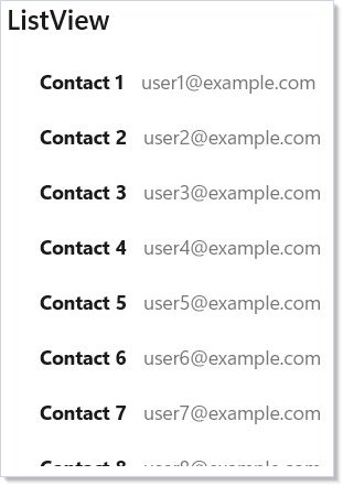
The keySelector parameter (c => c.Id) tells Reactor how to identify each
item. When your data changes, Reactor uses keys to match old items to new ones
and update only what changed — no full-list rebuild.
Keyed reconciliation, in one paragraph¶
When you replace the list (immutable state in, immutable state out), Reactor
walks the old and new key sequences and emits the minimum set of
Insert / Move / RemoveAt operations to the underlying WinUI
ListView / GridView / ItemsRepeater. A single insert at the front of
a 100-item list animates one row instead of re-realizing 100 containers.
You get this for free as long as keySelector returns a value that is:
- Stable across re-renders for the lifetime of the item — using a row index defeats reconciliation and produces the same churn as having no key.
- Unique within the list — duplicate keys trigger a bulk-replace bailout and a one-shot diagnostic in the dev log.
- Non-null — null keys bail out the diff for the affected list.
IReactorKeyed — identity on the data¶
When a model type owns its identity, implement IReactorKeyed (its single
member is string Key { get; }) to drop the keySelector boilerplate at
every call site:
record Person(string Id, string Name, string Email) : IReactorKeyed
{
    string IReactorKeyed.Key => Id;
}

static class KeyedUsage
{
    // keySelector is inferred from IReactorKeyed.Key:
    public static Element List(IReadOnlyList<Person> people) =>
        ListView<Person>(people, (person, index) => TextBlock(person.Name));

    public static Element Lazy(IReadOnlyList<Person> people) =>
        LazyVStack<Person>(people, (person, index) => TextBlock(person.Name));

    public static Element Grid(IReadOnlyList<Person> people) =>
        GridView<Person>(people, (person, index) => TextBlock(person.Name));
}
The explicit-keySelector overload remains the right choice for types you
do not own (interop / third-party POCOs without a natural identity
property) — for those, keep c => c.Id at the call site.
.WithKey(item) for hand-built children¶
For hand-built keyed children — FlexColumn(items.Select(…)) and
similar — .WithKey<TKey>(TKey item) where TKey : IReactorKeyed is the
ergonomic peer of .WithKey(item.Key):
static class HandBuiltKeyedChildren
{
    public static Element Column(IReadOnlyList<Person> people) =>
        FlexColumn(
            people.Select(p =>
                TextBlock(p.Name).WithKey(p)   // identity-on-data
            ).ToArray<Element?>()
        );
}
Both shapes route through the same incremental diff, so a hand-built
FlexColumn of people animates inserts and reorders just like the
templated ListView<Person>.
LazyVStack (Virtualized)¶
LazyVStack<T> looks like ListView<T> but only creates elements for items
currently visible on screen. Use it for large datasets:
class LazyVStackDemo : Component
{
    public override Element Render()
    {
        var contacts = SampleData.Contacts;

        return VStack(12,
            SubHeading($"LazyVStack ({contacts.Count} items)"),
            LazyVStack<Contact>(
                contacts,
                c => c.Id,
                (contact, index) =>
                    HStack(12,
                        TextBlock($"{index + 1}.").Width(30),
                        TextBlock(contact.Name).Bold(),
                        TextBlock(contact.Email).Opacity(0.6)
                    ).Padding(8)
            ).Height(300)
        ).Padding(24);
    }
}
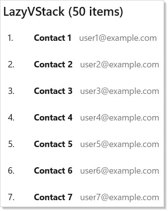
Even with 50 items in the list, LazyVStack only materializes the rows
you can see. As you scroll, it creates new rows and recycles old ones. This
keeps memory usage constant regardless of list size.
Per-item Component state resets on recycle¶
When a row builder returns a stateful Component<T> — one that holds its own
UseState / UseEffect (an inline editor's "dirty" flag, an expand/collapse
toggle, a per-row animation) — that state is per logical item, not per
recycled control. LazyVStack<T> (and LazyHStack<T>, ItemsRepeater<T>,
ItemsView<T>) propagate your keySelector projection onto each row's
top-level Element.Key. When a realized row is recycled for a different
item while scrolling, the new key forces a clean remount of the row, so the
inner component starts from its initial state instead of inheriting the
previous item's:
static class RowStateReset
{
    // Each row owns edit state. Scrolling row 5 (dirty) onto row 12 must NOT
    // carry the dirty flag — keySelector identity guarantees a fresh mount.
    public static Element Default(IReadOnlyList<Note> notes) =>
        LazyVStack<Note>(notes, n => n.Id, (note, i) =>
            Component<NoteEditor, Note>(note));
}
Re-rendering the same item in place (its data changed but its key did not)
preserves that state — the row diffs in place rather than remounting. If you
deliberately want a hand-picked identity, an explicit .WithKey(...) on the
row element always wins over the implicit keySelector key:
static class RowStateExplicitKey
{
    public static Element RemountPerRevision(IReadOnlyList<Note> notes) =>
        LazyVStack<Note>(notes, n => n.Id, (note, i) =>
            Component<NoteEditor, Note>(note)
                .WithKey($"{note.Id}:{note.Revision}")); // remount on every revision
}
Conversely, if you want a row's component state to survive recycling — a deliberately durable cache, a long-running per-row animation, or state you've hoisted so it should outlive any single logical item — opt out by giving every row the same constant key so the recycle reuse never trips a remount:
static class RowStateConstantKey
{
    // Durable carry-over: a constant key disables the per-item reset, so the
    // recycled control keeps its component state across logical items.
    public static Element Durable(IReadOnlyList<Note> notes) =>
        LazyVStack<Note>(notes, n => n.Id, (note, i) =>
            Component<NoteEditor, Note>(note).WithKey("note-row"));
}
The more common way to keep state across recycles is to hoist it above the row — store it in the parent component (keyed by item id) and pass it down as props — so the row stays a pure function of its data and recycling never loses anything.
ListView<T>/GridView<T>already mount each container fresh on realization, so per-item state resets there without any extra keying.
When to use which:
| Collection | Virtualized | Best for |
|---|---|---|
ListView<T> |
No | Small lists (< 50 items) |
LazyVStack<T> |
Yes | Large lists with known items |
VirtualList |
Yes | Count-based / async-loaded lists |
GridView¶
GridView<T> lays items out in a wrapping grid. The framework determines
column count based on item width and available space:
class GridViewDemo : Component
{
    public override Element Render()
    {
        var contacts = SampleData.Contacts.Take(12).ToList();

        return VStack(12,
            SubHeading("GridView"),
            GridView<Contact>(
                contacts,
                c => c.Id,
                (contact, index) =>
                    VStack(4,
                        TextBlock(contact.Name).Bold(),
                        TextBlock(contact.Email).FontSize(12).Opacity(0.6)
                    ).Padding(12)
                     .Background(Theme.CardBackground)
                     .CornerRadius(8)
                     .Width(160).Height(80)
            ).Height(300)
        ).Padding(24);
    }
}
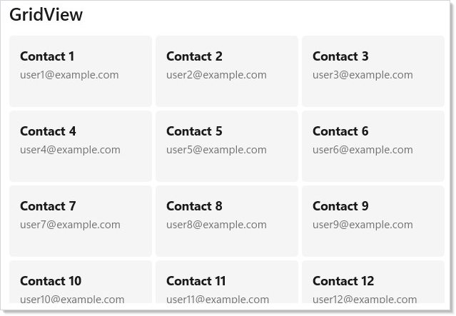
Each item is sized by the element you return from the view builder. The grid automatically wraps items into rows based on the container width.
VirtualList (Count-Based)¶
VirtualList provides count-based virtualization — you tell it how many
items exist and it calls your render function only for visible indices.
Use it when items are loaded asynchronously or your data source provides
a count but not all items upfront:
class VirtualListDemo : Component
{
    public override Element Render()
    {
        return VStack(12,
            SubHeading("VirtualList (10,000 items)"),
            VirtualList(
                itemCount: 10_000,
                renderItem: index =>
                    HStack(12,
                        TextBlock($"{index + 1}.").Width(50),
                        TextBlock($"Item {index + 1}").Bold(),
                        TextBlock($"data-{index}@example.com").Opacity(0.6)
                    ).Padding(8),
                getItemKey: index => $"item-{index}",
                itemHeight: 40
            ).Height(300)
        ).Padding(24);
    }
}
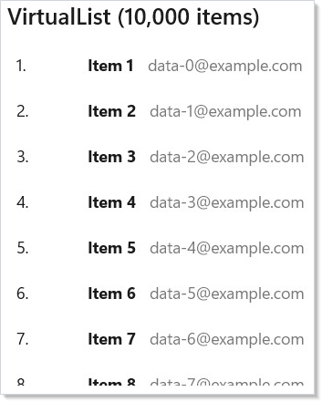
Unlike LazyVStack<T> which takes a full list, VirtualList takes an
itemCount and a renderItem(index) callback. This makes it ideal for
paginated data sources where items load on demand.
VirtualListRef provides imperative control over the virtualized list:
class VirtualListRefDemo : Component
{
    public override Element Render()
    {
        var listRef = UseRef<VirtualListRef?>(null);
        var (targetIndex, setTargetIndex) = UseState("5000");

        return VStack(12,
            SubHeading("VirtualListRef — Imperative Scroll"),
            HStack(8,
                TextBox(targetIndex, setTargetIndex,
                    placeholderText: "Index")
                    .AutomationName("Target index"),
                Button("Scroll To", () =>
                {
                    if (int.TryParse(targetIndex, out var idx))
                        listRef.Current?.ScrollToIndex(idx);
                })
            ),
            VirtualList(
                itemCount: 10_000,
                renderItem: index =>
                    TextBlock($"Row {index + 1}").Padding(8),
                getItemKey: index => $"row-{index}",
                itemHeight: 36,
                @ref: r => listRef.Current = r
            ).Height(250)
        ).Padding(24);
    }
}
| Member | Purpose |
|---|---|
ScrollToIndex(index) |
Jump to a specific item |
ScrollOffset |
Current scroll position |
RestoreScrollOffset(offset) |
Restore a saved scroll position |
Repeater |
Access the underlying WinUI ItemsRepeater |
Set itemHeight for a fixed-height fast path (O(1) offset calculation) or
estimatedItemHeight for variable-height rows with automatic measurement.
Use onVisibleRangeChanged to load data blocks as the user scrolls.
Memoizing rows across recycles¶
Virtualized lists recycle containers as you scroll. On a variable-height
list the ItemsRepeater recycles aggressively, and by default each recycle
rebuilds that row's element tree and diffs it — even when the row's data
didn't change. When a row is a pure function of a stable key, Memo<TKey>
removes that rebuild:
static class RowMemo
{
    public static Element Rows(IReadOnlyList<Note> notes) =>
        LazyVStack<Note>(notes, n => n.Id, (note, i) =>
            Memo(note.Id, () =>                 // ← key, then the row factory
                Border(
                    VStack(4,
                        TextBlock(note.Title).SemiBold(),
                        Caption(note.Body).Foreground(Theme.SecondaryText)
                    )
                ).Padding(12)));
}
Memo(key, factory) caches the element factory returns in a bounded,
per-list cache keyed by key. When a recycle re-asks for a key still in the
cache it returns the same element instance, so the reconciler's
ReferenceEquals shortcut fires and the row's diff is skipped entirely
(sub-µs) instead of walking the subtree. It is opt-in — lists you don't
wrap behave exactly as before — and works on every ElementFactory-backed
collection: VirtualList, LazyVStack<T>, LazyHStack<T>, ItemsView<T>,
ItemsRepeater<T>, and DataGrid rows.
Keep modifiers (and attached state) inside the factory. The cache only kicks
in for a bare Memo(key, …) returned by the row builder — no fluent modifiers,
no .WithKey(…), and no attached props / .Provide(…) / theme bindings on the
wrapper. Decorating the wrapper (Memo(id, () => …).Padding(8)) opts that row out
of the cache and silently loses the perf benefit. Put them on the element the
factory returns instead: Memo(id, () => Border(…).Padding(8)) (as above).
Purity contract — the key must capture every input the factory reads. The cache cannot see through your closure. If the factory reads anything not folded into the key — a selection flag, the current theme, an expand toggle — a cached instance is served and the change is silently lost. That is the author's responsibility, not the framework's. Widen the key to a tuple so it changes whenever any input does:
class RowMemoTupleKey : Component<Note>
{
    Element RowBody(Note note, bool isSelected) =>
        TextBlock(note.Title).SemiBold().Opacity(isSelected ? 1.0 : 0.6);

    public override Element Render()
    {
        var note = Props;
        var (isSelected, _) = UseState(true);
        var isDark = UseIsDarkTheme();

        // Row chrome depends on selection AND theme, so both belong in the key.
        return Memo((note.Id, isSelected, isDark), () => RowBody(note, isSelected));
    }
}
Keying on the whole item record (Memo(note, …)) is the simplest safe choice
when the row is a pure function of the item — records compare by value, so any
field change is a new key.
Memo(key, …) is not Memo(ctx => …). They share a name but the compiler
picks by argument shape. Memo(key, factory) is the cross-recycle row cache
here. Memo(ctx => …, deps) is the render-time subtree
skip — it freezes a subtree across a parent re-render. They also compose
with UseMemoCells: UseMemoCells skips
cell-builds when the parent re-renders, while Memo(key, …) additionally
skips them on pure scroll recycles, where no re-render runs at all.
Cache policy. A bounded LRU, default capacity 128 (a few× a typical realized window), so it never grows with list length — scrolling a million-row list keeps at most 128 entries warm and evicts the least-recently-used beyond that. It is cleared automatically whenever the list's items or row builder is replaced (the same boundary that invalidates Reactor's internal view cache), so a new builder closure can never serve an instance the old one built.
Outside a virtualized list, Memo(key, factory) is a transparent but keyed
wrapper: a re-render with the same key is a no-op (the factory is not re-invoked
and the subtree is not diffed), and a changed key replaces the inner (unmount +
fresh mount of a new factory() result). The cross-recycle cache only happens
when a virtualized list's factory owns the cache; as a plain child (say, a
VStack child) it is a safe, keyed no-op.
Escape hatch without the API¶
Memo<TKey> is the supported path, but the same idea works today with a plain
dictionary you own — handy on a Reactor build without the API, or when you
want full control over the cache's lifetime. Cache the element instance by
key yourself and return the cached one on a hit, so the reconciler's
ReferenceEquals skip still fires:
class ManualRowCache : Component<IReadOnlyList<Note>>
{
    public override Element Render()
    {
        // Held in the parent component via UseRef so it survives re-renders.
        var cache = UseRef(new Dictionary<string, Element>()).Current;

        Element Row(Note note)
        {
            if (!cache.TryGetValue(note.Id, out var el))
                cache[note.Id] = el = Border(TextBlock(note.Title)); // build once per id
            return el;                                              // same instance on reuse
        }

        return LazyVStack<Note>(Props, n => n.Id, (note, i) => Row(note));
    }
}
You then own the parts Memo handles for you: bound the dictionary (evict so
it can't grow without limit) and drop or rebuild an entry when the data behind
its key changes — the purity contract above, enforced by hand.
ForEach¶
For small, non-virtualized inline lists, use ForEach. It maps a collection
to elements without creating a scrollable container:
class ForEachDemo : Component
{
    public override Element Render()
    {
        var colors = new[]
        {
            ("Primary", Theme.Accent), ("Secondary", Theme.AccentSecondary),
            ("Tertiary", Theme.AccentTertiary), ("Subtle", Theme.SubtleFill)
        };

        return VStack(12,
            SubHeading("ForEach (non-virtualized)"),
            HStack(8,
                ForEach(colors, ((string Name, ThemeRef Brush) color) =>
                    Border(
                        TextBlock(color.Name)
                            .Padding(horizontal: 8, vertical: 16)
                    )
                        .Background(color.Brush)
                        .CornerRadius(4)
                        .WithKey(color.Name)
                )
            )
        ).Padding(24);
    }
}
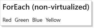
ForEach is a convenience for items.Select(render).ToArray() that works
directly inside element trees. Use it when you want to inline a small list
of items inside a larger layout.
Multi-Select with SelectionChanged¶
ListView, GridView, ListBox, and the typed peers (ItemsView<T>,
TemplatedListView<T>, TemplatedGridView<T>) all expose a universal
SelectionChanged fluent for multi-select scenarios. Set
SelectionMode = Multiple (or Extended) and the handler fires with a
snapshot of the full selection on every change — not added/removed deltas:
class MultiSelectDemo : Component
{
    public override Element Render()
    {
        var contacts = SampleData.Contacts.Take(10).ToList();
        var initialSelectedIds = UseMemo(() => new List<string>());
        var (selectedIds, setSelectedIds) = UseState(initialSelectedIds);

        return VStack(12,
            SubHeading($"{selectedIds.Count} selected"),
            ListView<Contact>(
                contacts,
                c => c.Id,
                (contact, index) =>
                    HStack(12,
                        TextBlock(contact.Name).Bold(),
                        TextBlock(contact.Email).Opacity(0.6)
                    ).Padding(8)
            )
            .Set(lv => lv.SelectionMode =
                Microsoft.UI.Xaml.Controls.ListViewSelectionMode.Multiple)
            .SelectionChanged(selected =>
                setSelectedIds(selected.Select(c => c.Id).ToList()))
            .Height(300)
        ).Padding(24);
    }
}
The handler signature varies by element type:
| Element | Handler |
|---|---|
ListView, GridView, ListBox |
Action<IReadOnlyList<int>> (selected indices) |
ItemsView<T>, TemplatedListView<T>, TemplatedGridView<T> |
Action<IReadOnlyList<T>> (selected items) |
Snapshot semantics match CalendarView.SelectedDatesChanged — the list you
receive is the full current selection, not the change since the last call.
Passing null to the fluent clears any previously-set handler.
TreeViewmulti-select is intentionally deferred — see spec 039 §5.8 for the rationale. Use single-selectOnItemInvokeduntil then.
Stable Identity with WithKey¶
When rendering dynamic lists, always give each item a stable key with
.WithKey(). Without keys, Reactor matches items by position — adding or
removing an item causes every subsequent item to be rebuilt:
class WithKeyDemo : Component
{
    record FruitItem(string Id, string Name);

    public override Element Render()
    {
        var initialItems = UseMemo(() => new List<FruitItem>
        {
            new("fruit-1", "Apple"),
            new("fruit-2", "Banana"),
            new("fruit-3", "Cherry")
        });
        var (items, updateItems) = UseReducer(
            initialItems);
        var (newItem, setNewItem) = UseState("");
        var (nextId, setNextId) = UseState(4);

        return VStack(12,
            SubHeading("Stable Identity with WithKey"),
            HStack(8,
                TextBox(newItem, setNewItem, placeholderText: "New item")
                    .AutomationName("New item"),
                Button("Add", () => {
                    if (!string.IsNullOrWhiteSpace(newItem)) {
                        var name = newItem.Trim();
                        updateItems(l => [.. l, new FruitItem($"fruit-{nextId}", name)]);
                        setNextId(nextId + 1);
                        setNewItem("");
                    }
                })
            ),
            VStack(4, items.Select((item, _) =>
                HStack(8,
                    TextBlock(item.Name),
                    Button("Remove", () => updateItems(
                        l => l.Where(x => x.Id != item.Id).ToList()))
                        .AutomationName($"Remove {item.Name}")
                ).WithKey(item.Id)
            ).ToArray())
        ).Padding(24);
    }
}
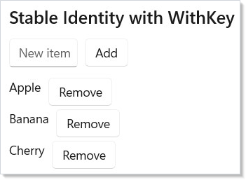
The typed collections (ListView<T>, LazyVStack<T>, GridView<T>) handle
keying automatically through their keySelector parameter, and ForEach
does the same for items that implement IReactorKeyed. You only need
.WithKey() manually for Select().ToArray(), for ForEach over items
that carry no identity, or when you want a key other than item.Key.
Rules for good keys:
- Use a stable identifier from your data (database ID, unique name). Avoid using the array index as a key — it defeats the purpose.
- Keys must be unique within their sibling list. Duplicates cause undefined reconciliation behavior.
- Keys should be strings.
WithKey(string)is the base modifier. For types that implementIReactorKeyedthere is alsoWithKey<TKey>(TKey item), which readsitem.Keyfor you.
Grouping¶
Reactor doesn't ship a built-in grouped-list control. The composition
recipe is straightforward: group the data with LINQ, then render a
VStack of header + items per group. Each group's body is its own
typed collection, so virtualization still applies inside a section if
you swap ForEach for LazyVStack<T>:
class GroupingDemo : Component
{
    public override Element Render()
    {
        var grouped = SampleData.Contacts
            .Take(24)
            .GroupBy(c => c.Name[0])
            .OrderBy(g => g.Key)
            .ToList();

        // Reactor doesn't ship a built-in grouped-list control; instead,
        // compose a VStack of header + items per group. The render
        // function for each group hands back its own typed collection,
        // so virtualization still applies inside each section if you
        // swap LazyVStack for ListView.
        return VStack(8,
            SubHeading($"Grouped: {grouped.Count} sections"),
            ScrollView(
                VStack(16,
                    ForEach(grouped, group =>
                        VStack(4,
                            TextBlock($"— {group.Key} —").Bold()
                                .Opacity(0.7),
                            ForEach(group.ToArray(), c =>
                                HStack(8,
                                    TextBlock(c.Name).Bold(),
                                    TextBlock(c.Email).Opacity(0.6))
                                    .WithKey(c.Id))
                        ).WithKey($"group-{group.Key}"))
                ).Padding(8)
            ).Height(300)
        ).Padding(24);
    }
}
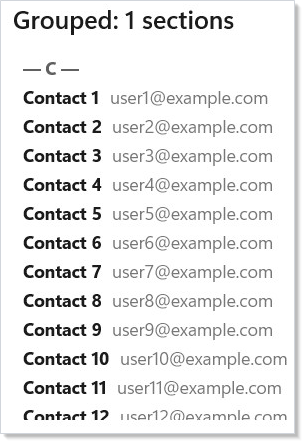
The shape generalizes to two-level grouping (city → country), sticky
headers (set Position via a Border modifier), and collapsible
sections (wrap each group's body in When(expanded[key], ...)).
Because every group's collection has its own keyed render, items can
move between groups across renders without remounting — the keys
travel with the items.
Drag-to-reorder¶
WinUI ListView and GridView ship drag-reorder, and Reactor exposes
the relevant properties through the .Set passthrough until a
first-class fluent ships. Three properties switch the surface on —
CanReorderItems, AllowDrop, and CanDragItems. The compact snippet
below shows those WinUI switches; for a state-backed list, mirror the
new order back into your state via the underlying ItemsSource
collection or a DragItemsCompleted handler:
class DragReorderDemo : Component
{
    public override Element Render()
    {
        var initialItems = UseMemo(() => new List<string> { "Alpha", "Bravo", "Charlie",
            "Delta", "Echo", "Foxtrot" });
        var (items, setItems) = UseState(initialItems);

        // Reactor surfaces drag-reorder through the underlying WinUI
        // ListView's CanReorderItems / AllowDrop / CanDragItems. The
        // .Set passthrough is the supported escape hatch until a
        // first-class fluent ships. The recipe linked below shows
        // how to mirror a drop back into app state.
        return VStack(8,
            SubHeading("Drag to reorder"),
            ListView<string>(
                items,
                s => s,
                (item, _) =>
                    HStack(8,
                        TextBlock("☰").Opacity(0.4),
                        TextBlock(item).Bold()
                    ).Padding(8))
                .Set(lv =>
                {
                    lv.CanReorderItems = true;
                    lv.AllowDrop = true;
                    lv.CanDragItems = true;
                })
                .Height(260)
        ).Padding(24);
    }
}
| Property | Effect |
|---|---|
CanDragItems |
The user can start a drag from a row. |
AllowDrop |
The list accepts drops. |
CanReorderItems |
Drops inside the list reorder; drops outside fire DragItemsCompleted. |
GridView and ItemsView<T> expose the same three properties. For
free-form drag-and-drop between two lists (move item from A to B),
subscribe to DragItemsStarting on the source and Drop on the
destination, then update both states. The
recipes/drag-reorder recipe walks the
single-list case end-to-end.
Lazy loading¶
For data sources where the total count is known but the items are
loaded incrementally (paged APIs, large local stores), the
onVisibleRangeChanged callback on VirtualList is the load
trigger. The callback fires whenever the visible window changes;
compare the trailing edge to your high-water mark and request the
next page when the user scrolls past it:
class LazyLoadingDemo : Component
{
    public override Element Render()
    {
        // Pretend "loaded" up to a high-water mark; new items fetch
        // when the visible range crosses into unloaded territory.
        var (loadedTo, setLoadedTo) = UseState(50);
        var totalCount = 1_000;

        return VStack(8,
            SubHeading($"Lazy-load — fetched {loadedTo} of {totalCount}"),
            VirtualList(
                itemCount: totalCount,
                renderItem: index =>
                    index < loadedTo
                        ? HStack(8,
                            TextBlock($"{index + 1}.").Width(50),
                            TextBlock($"Row {index + 1}").Bold(),
                            TextBlock($"loaded").Opacity(0.6))
                            .Padding(8)
                        // Skeleton for not-yet-loaded indices.
                        : HStack(8,
                            TextBlock($"{index + 1}.").Width(50),
                            TextBlock("loading…").Opacity(0.4))
                            .Padding(8),
                getItemKey: index => $"lazy-{index}",
                itemHeight: 40,
                // Watcher fires whenever the visible range changes —
                // bump the high-water mark when the bottom passes the
                // current limit.
                onVisibleRangeChanged: (first, last) =>
                {
                    if (last >= loadedTo - 5 && loadedTo < totalCount)
                        setLoadedTo(Math.Min(loadedTo + 50, totalCount));
                }
            ).Height(300)
        ).Padding(24);
    }
}
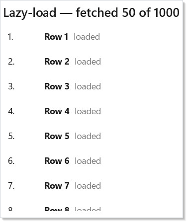
Pair this with UseResource to manage the
async fetch state — Pending becomes the skeleton row, Loaded
becomes the populated row, Error becomes a retry inline. The full
shape lives in the recipes/paginated-list
recipe.
Caveat:
itemHeightvs.estimatedItemHeightis the single most expensive decision inVirtualList. WithitemHeightset, scrollbar position is O(1) — multiply the index by the height. Without it, the list measures every row that has been seen and maintains a cumulative offset table; the scrollbar approximation drifts and large jumps can cause measure-storms. SetitemHeightwhenever your rows are the same fixed height — it is almost always the right choice for paginated data, message lists, and table-shaped UIs. Fall back toestimatedItemHeightonly when the row heights genuinely vary (masonry feeds, chat with rich attachments). The defaultestimatedItemHeight: 40is a guess; tune it to within ±25% of your real row heights to keep scroll-bar drift under control.
Patterns¶
Virtualized contacts with letter-jump¶
Combine grouping (section per letter) with VirtualListRef imperative
scroll: the user clicks a letter, the list calls ScrollToIndex for
the first row in that group. This is the canonical "A-Z scrubber"
pattern from contacts apps:
class LetterJump : Component<IReadOnlyList<Person>>
{
    static IReadOnlyDictionary<char, int> ComputeStartIndices(
        IReadOnlyList<Person> people) =>
        people
            .Select((p, i) => (Letter: p.Name[0], Index: i))
            .GroupBy(x => x.Letter)
            .ToDictionary(g => g.Key, g => g.First().Index);

    public override Element Render()
    {
        var contacts = Props;
        var listRef = UseRef<VirtualListRef?>(null);
        var groupStarts = UseMemo(() => ComputeStartIndices(contacts), contacts);

        Element RenderRow(int i) => TextBlock(contacts[i].Name).Padding(8);

        return HStack(0,
            VirtualList(contacts.Count, RenderRow,
                getItemKey: i => contacts[i].Id,
                itemHeight: 60,
                @ref: r => listRef.Current = r).Width(360),
            VStack(2,
                ForEach("ABCDEFGHIJKLMNOPQRSTUVWXYZ".ToCharArray(), letter =>
                    Button(letter.ToString(), () =>
                    {
                        if (groupStarts.TryGetValue(letter, out var start))
                            listRef.Current?.ScrollToIndex(start);
                    }).AutomationName($"Jump to {letter}")
                        .WithKey(letter.ToString())))
        );
    }
}
Lift state for selection across remounts¶
Selection state belongs to the parent, never to the collection. The
parent owns the HashSet<TKey> of selected IDs; the row template
checks membership on every render to set IsSelected. This pattern
survives data refresh, sort changes, filter changes, and remounts —
all of which would lose selection if it lived inside the list. Same
shape as form state from forms.md.
Common Mistakes¶
Using array index as key¶
class WithKeyDemo : Component
{
    record FruitItem(string Id, string Name);

    public override Element Render()
    {
        var initialItems = UseMemo(() => new List<FruitItem>
        {
            new("fruit-1", "Apple"),
            new("fruit-2", "Banana"),
            new("fruit-3", "Cherry")
        });
        var (items, updateItems) = UseReducer(
            initialItems);
        var (newItem, setNewItem) = UseState("");
        var (nextId, setNextId) = UseState(4);

        return VStack(12,
            SubHeading("Stable Identity with WithKey"),
            HStack(8,
                TextBox(newItem, setNewItem, placeholderText: "New item")
                    .AutomationName("New item"),
                Button("Add", () => {
                    if (!string.IsNullOrWhiteSpace(newItem)) {
                        var name = newItem.Trim();
                        updateItems(l => [.. l, new FruitItem($"fruit-{nextId}", name)]);
                        setNextId(nextId + 1);
                        setNewItem("");
                    }
                })
            ),
            VStack(4, items.Select((item, _) =>
                HStack(8,
                    TextBlock(item.Name),
                    Button("Remove", () => updateItems(
                        l => l.Where(x => x.Id != item.Id).ToList()))
                        .AutomationName($"Remove {item.Name}")
                ).WithKey(item.Id)
            ).ToArray())
        ).Padding(24);
    }
}
Index keys defeat the purpose of keys. When the list reorders or an item is removed, every subsequent item gets a new key, every row remounts, every text input inside a row loses focus, and animations restart. Use a stable identifier from your data.
Not setting itemHeight on a uniform-height VirtualList¶
// Don't:
VirtualList(itemCount, RenderItem, getItemKey: GetKey)
// estimatedItemHeight defaults to 40 — drift accumulates for any
// row whose actual height differs.
class VirtualListDemo : Component
{
    public override Element Render()
    {
        return VStack(12,
            SubHeading("VirtualList (10,000 items)"),
            VirtualList(
                itemCount: 10_000,
                renderItem: index =>
                    HStack(12,
                        TextBlock($"{index + 1}.").Width(50),
                        TextBlock($"Item {index + 1}").Bold(),
                        TextBlock($"data-{index}@example.com").Opacity(0.6)
                    ).Padding(8),
                getItemKey: index => $"item-{index}",
                itemHeight: 40
            ).Height(300)
        ).Padding(24);
    }
}
If your rows are all the same height (the common case), tell the list. The O(1) offset math is dramatically faster than the cumulative measure table, and the scrollbar tracks the true position rather than the estimate.
Tips¶
Use keySelector wisely. The key must uniquely identify each item across
re-renders. A database ID or GUID is ideal. Avoid index-based keys like
i.ToString() — they break when items are reordered or removed.
Prefer LazyVStack<T> for anything beyond a handful of items. The
virtualization overhead is negligible, but the memory savings with large lists
are significant.
Keep view builders simple. The function you pass to ListView<T> runs
for every visible item on every render. Extract complex item layouts into
their own Component<TProps> to get automatic memoization.
Use ForEach for inline lists, typed collections for scrollable lists.
ForEach does not create a scroll container — it just maps data to elements.
For scrollable content, use ListView<T> or LazyVStack<T>.
Remember the index parameter. All view builders receive (T item, int index).
Use the index for display (row numbers) but not for keys.
Next Steps¶
- Forms and Input — controlled input controls and validation patterns
- Navigation — stack-based routing, NavigationView, and tabs
- Data System — DataGrid with sort, filter, search, and inline editing
- Flex Layout — wrapping grids and proportional sizing for collection items
- Components — extract item templates into reusable memoized components