WinUI reference: For the full property surface and design guidance, see Forms.
Forms are the Microsoft.UI.Reactor (Reactor) surface most apps spend most of their UI time inside.
Every input control on this page follows the same controlled-input
contract: you own the current value, you provide a change handler, the
control renders what you pass and calls your handler when the user edits.
There is no two-way Binding, no INotifyPropertyChanged, no
DependencyProperty.SetValue — the value flows one direction
(state → control) and edits flow one direction back
(handler → state). That shape comes from
hooks and components, and it makes every
form testable: the form is whatever the
UseState snapshot says it is. Validation layers on top
through UseValidationContext and the .Validate(...)
modifier — the validators run on every render, the
FormField wrapper handles label / required marker /
error display, and the ValidationContext tracks touched/dirty per
field so errors only appear when the user has interacted. Read the
controlled-input section first; everything else on this page is a
specialization.
Forms and Input¶
Every form control in Reactor follows the controlled-input pattern: you own the value, you provide the change handler, and the control reflects your state. There is no two-way binding. The data always flows one direction.
The Controlled-Input Pattern¶
Pass the current value and a setter. When the user types, onChange fires
with the new value. You call the setter, Reactor re-renders, and the control
shows the updated text:
class ControlledInputDemo : Component
{
    public override Element Render()
    {
        var (name, setName) = UseState("");

        return VStack(12,
            SubHeading("Controlled Input"),
            TextBox(name, setName, placeholderText: "Type your name",
                header: "Name"),
            TextBlock($"You typed: {name}").Opacity(0.6)
        ).Padding(24);
    }
}
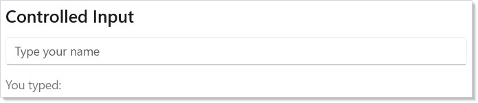
This is the same UseState pattern from Getting Started,
applied to form inputs. The control never holds its own state — your component
is the single source of truth.
Input Control Types¶
Reactor provides controls for every common input type. Each follows the same pattern: current value in, change handler out.
class InputTypesDemo : Component
{
    public override Element Render()
    {
        var (text, setText) = UseState("");
        var (password, setPassword) = UseState("");
        var (volume, setVolume) = UseState(50.0);
        var (count, setCount) = UseState(1.0);
        var (agree, setAgree) = UseState(false);
        var (notify, setNotify) = UseState(true);
        var (role, setRole) = UseState(0);
        var (priority, setPriority) = UseState(0);

        return VStack(12,
            TextBox(text, setText, placeholderText: "Email",
                header: "Email"),
            PasswordBox(password, setPassword,
                placeholderText: "Enter password")
                .Header("Password"),
            Slider(volume, 0, 100, setVolume).Header("Volume"),
            NumberBox(count, setCount, header: "Quantity"),
            CheckBox(agree, setAgree, label: "I agree to the terms"),
            ToggleSwitch(notify, setNotify,
                header: "Notifications"),
            ComboBox(["Admin", "Editor", "Viewer"],
                role, setRole).Header("Role"),
            (RadioButtons(["Low", "Medium", "High"],
                priority, setPriority) with { Header = "Priority" })
        ).Padding(24);
    }
}
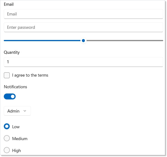
| Control | Value type | Change handler |
|---|---|---|
TextBox |
string |
Action<string> |
PasswordBox |
string |
Action<string> |
Slider |
double |
Action<double> |
NumberBox |
double |
Action<double> |
CheckBox |
bool |
Action<bool> |
ToggleSwitch |
bool |
Action<bool> |
ComboBox |
int (index) |
Action<int> |
RadioButtons |
int (index) |
Action<int> |
All controls accept optional parameters for labels, headers, and placeholder text. Check the API reference for each control's full signature.
Configuring TextBox¶
TextBox covers the common WinUI TextBox knobs through dedicated fluents
so you rarely need .Set(...). The named-input shapes set the appropriate
InputScope for soft-keyboard and IME hinting:
class TextBoxConfigDemo : Component
{
    public override Element Render()
    {
        var (qty, setQty) = UseState("");
        var (email, setEmail) = UseState("");
        var (url, setUrl) = UseState("");
        var (phone, setPhone) = UseState("");
        var (search, setSearch) = UseState("");
        var (note, setNote) = UseState("");

        return VStack(12,
            TextBox(qty, setQty, header: "Quantity")
                .NumericInput(),
            TextBox(email, setEmail, header: "Email")
                .EmailInput(),
            TextBox(url, setUrl, header: "URL")
                .UrlInput(),
            TextBox(phone, setPhone, header: "Phone")
                .PhoneInput(),
            TextBox(search, setSearch, placeholderText: "Search…",
                header: "Search")
                .SearchInput(),
            TextBox(note, setNote, header: "Reference code")
                .MaxLength(8)
                .CharacterCasing(CharacterCasing.Upper)
                .TextAlignment(TextAlignment.Center)
                .IsSpellCheckEnabled(false)
                .Description("Eight characters, automatically uppercased.")
        ).Padding(24);
    }
}
| Fluent | Effect |
|---|---|
.NumericInput() |
InputScope = Number — numeric soft keyboard |
.EmailInput() |
InputScope = EmailSmtpAddress |
.UrlInput() |
InputScope = Url |
.PhoneInput() |
InputScope = TelephoneNumber |
.SearchInput() |
InputScope = Search |
.MaxLength(n) |
Caps input length at n characters |
.IsSpellCheckEnabled(bool) |
Toggles the squiggle underline |
.CharacterCasing(casing) |
Normal / Upper / Lower |
.TextAlignment(alignment) |
Aligns text within the field |
.Description(text) |
Helper text rendered below the field |
These fluents chain freely; the named-input shapes are the canonical way to
hint mobile / touch keyboards instead of reaching for .Set(c => c.InputScope = ...).
See spec 039 §2.3 and §4.7 for the
rationale.
Simple Validation¶
For quick forms, derive validation from state. Compute booleans on every render, show inline error messages, and re-check the booleans inside the submit handler:
class ValidationDemo : Component
{
    public override Element Render()
    {
        var (email, setEmail) = UseState("");
        var (age, setAge) = UseState(0.0);
        var (showErrors, setShowErrors) = UseState(false);

        var emailValid = email.Contains('@') && email.Contains('.');
        var ageValid = age >= 18 && age <= 120;
        var formValid = emailValid && ageValid
            && !string.IsNullOrWhiteSpace(email);

        return VStack(12,
            SubHeading("Simple Validation"),
            TextBox(email, setEmail, placeholderText: "user@example.com",
                header: "Email"),
            When(!string.IsNullOrEmpty(email) && !emailValid, () =>
                TextBlock("Enter a valid email address")
                    .Foreground(Theme.SystemCritical).FontSize(12)),
            NumberBox(age, setAge, header: "Age"),
            When((showErrors || age > 0) && !ageValid, () =>
                TextBlock("Age must be between 18 and 120")
                    .Foreground(Theme.SystemCritical).FontSize(12)),
            Button("Submit", () =>
            {
                setShowErrors(true);
                if (!formValid) return;
                // submit...
            }).Margin(0, 8, 0, 0)
        ).Padding(24);
    }
}
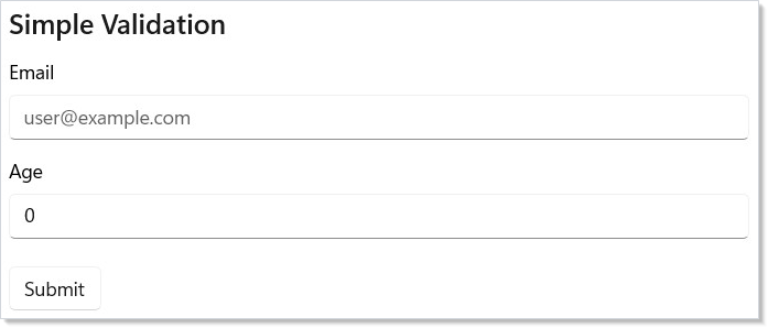
This works well for small forms. For larger forms with cross-field rules, touched/dirty tracking, and error display policies, use the validation framework described next.
Keeping Submit Reachable¶
A common form pattern — disable the Submit button until the form is valid —
is a keyboard accessibility trap when combined with controls like NumberBox,
DatePicker, and CalendarDatePicker, which commit their value on blur
rather than per keystroke. The user fixes the last invalid field, presses
Tab to reach Submit, and focus skips the still-disabled button. By the time
the field commits and Submit becomes enabled, focus has already moved on.
The user is stranded with no keyboard route to a button they can now press.
Reactor offers two opt-in fixes for this. They compose:
class KeepSubmitReachableDemo : Component
{
    public override Element Render()
    {
        var (email, setEmail) = UseState("");
        var (age, setAge) = UseState(0.0);

        var emailValid = email.Contains('@') && email.Contains('.');
        var ageValid = age >= 18 && age <= 120;
        var formValid = emailValid && ageValid;

        return VStack(12,
            SubHeading("Keeping Submit Reachable"),
            TextBox(email, setEmail, header: "Email",
                placeholderText: "user@example.com"),

            // .Immediate() switches NumberBox from commit-on-blur to
            // commit-on-keystroke, so validation reacts as the user types.
            NumberBox(age, setAge, header: "Age").Immediate(),

            // .IsDisabledFocusable() keeps the button tab-reachable and
            // visually dimmed while preventing invocation. Pattern mirrors
            // Fluent UI's `disabledFocusable` and ARIA `aria-disabled`.
            Button("Submit", () => { /* submit */ })
                .IsDisabledFocusable(!formValid)
                .Margin(0, 8, 0, 0)
        ).Padding(24);
    }
}
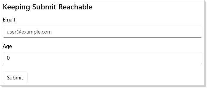
.IsDisabledFocusable(bool) on Button keeps the button keyboard-focusable
and tab-reachable while presenting it as disabled (dimmed; the click is
suppressed). Mirrors Fluent UI React's disabledFocusable and ARIA's
aria-disabled. Use it for any Submit gated on validation, busy state, or
other derived conditions.
.Immediate() on NumberBox (in Microsoft.UI.Reactor.Controls.Validation)
switches the control from commit-on-blur to commit-on-keystroke, so
validation reacts to every parseable digit instead of waiting for focus to
leave the field. Opt-in by design — commit-on-blur is the WinUI default and
the right choice when an intermediate value would be expensive or surprising
(snapping 2.50 to 2.5 mid-edit). Apply when validation gates UI state
and you want it to feel live.
Use .IsDisabledFocusable() whenever a button is conditionally disabled in a
form — even if you've also applied .Immediate() to every commit-on-blur
input. The two cover different failure modes: .Immediate() keeps validity
in sync with typing; .IsDisabledFocusable() keeps the button discoverable
when validity is gated on async checks, required-but-untouched fields,
cross-field rules, or any derived condition that can't be made instantaneous.
Where not to use
.IsDisabledFocusable(): only buttons. For data-entry controls (TextBox,NumberBox,CheckBox, etc.),IsEnabled=falseusually means "this field isn't part of your current task" (cascading from another input), and tab-skipping is the correct UX. UseIsReadOnlyif you need a visible-but-non-editable text control.
Validation Context¶
UseValidationContext() creates a ValidationContext that tracks messages,
touched/dirty state, and field registration. Attach validators to controls
with .Validate():
class ValidationContextDemo : Component
{
    public override Element Render()
    {
        var ctx = this.UseValidationContext();
        var (email, setEmail) = UseState("");
        var (password, setPassword) = UseState("");
        var (submitted, setSubmitted) = UseState(false);

        return VStack(12,
            SubHeading("Validation Context"),
            TextBox(email, v => { setEmail(v); ctx.NotifyValueChanged("email", v); },
                placeholderText: "user@example.com", header: "Email")
                .Validate("email", email,
                    Validate.Required(),
                    Validate.Email()),
            When(ctx.IsTouched("email") && ctx.HasError("email"), () =>
                TextBlock(ctx.GetMessages("email").First().Text)
                    .Foreground(Theme.SystemCritical).FontSize(12)),
            PasswordBox(password, v => { setPassword(v); ctx.NotifyValueChanged("password", v); },
                placeholderText: "Min 8 characters")
                .Header("Password")
                .Validate("password", password,
                    Validate.Required(),
                    Validate.MinLength(8)),
            When(ctx.IsTouched("password") && ctx.HasError("password"), () =>
                TextBlock(ctx.GetMessages("password").First().Text)
                    .Foreground(Theme.SystemCritical).FontSize(12)),
            Button("Register", () =>
            {
                ctx.MarkAllTouched();
                if (ctx.IsValid()) setSubmitted(true);
            }).IsEnabled(!submitted),
            When(submitted, () =>
                TextBlock("Registration successful!")
                    .Foreground(Theme.SystemSuccess).SemiBold())
        ).Padding(24);
    }
}
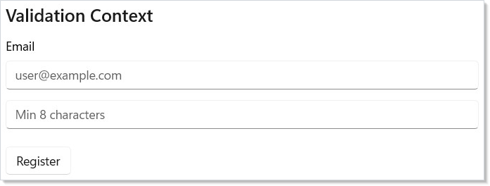
Key pieces:
UseValidationContext()creates or retrieves the nearest validation context..Validate(fieldName, value, validators...)attaches validators to a control.Validate.Required(),Validate.Email(), etc. are the 11 built-in validators.ctx.IsValid()returnstruewhen no error-severity messages exist.ctx.MarkAllTouched()reveals all errors on submit attempt.
FormField Helper¶
FormField() wraps a control with a label, required indicator, description
text, and inline error display:
class FormFieldDemo : Component
{
    public override Element Render()
    {
        var ctx = this.UseValidationContext();
        var (name, setName) = UseState("");
        var (email, setEmail) = UseState("");

        return VStack(12,
            SubHeading("FormField Helper"),
            FormField(
                TextBox(name, v => { setName(v); ctx.NotifyValueChanged("name", v); })
                    .AutomationName("Full Name")
                    .Validate("name", name, Validate.Required()),
                label: "Full Name",
                required: true,
                description: "As it appears on your ID"),
            FormField(
                TextBox(email, v => { setEmail(v); ctx.NotifyValueChanged("email", v); })
                    .AutomationName("Email Address")
                    .Validate("email", email,
                        Validate.Required(), Validate.Email()),
                label: "Email Address",
                required: true)
        ).Padding(24);
    }
}
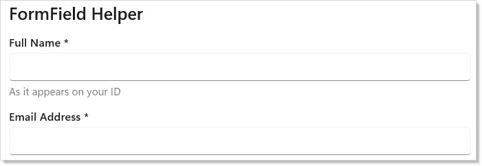
FormField auto-detects the field name from the .Validate() attachment on
its content. Errors appear below the field after the field is touched (focus
then blur). The ShowWhen parameter controls when errors become visible:
WhenTouched (default), WhenDirty, AfterFirstSubmit, Always, or Never.
Built-in Validators¶
| Validator | Purpose |
|---|---|
Validate.Required() |
Non-null, non-empty, non-default |
Validate.MinLength(n) |
String length >= n |
Validate.MaxLength(n) |
String length <= n |
Validate.Range(min, max) |
Numeric value in range |
Validate.Match(regex) |
Regex pattern match |
Validate.Email() |
Valid email address |
Validate.Url() |
Valid URL (http/https) |
Validate.Must<T>(predicate, message) |
Custom predicate |
Validate.MustAsync<T>(predicate, message) |
Async predicate |
Validate.MustBeTrue() |
Boolean is true (checkboxes) |
Validate.EqualTo<T>(value) |
Equality check (password confirm) |
Every validator accepts an optional custom error message as its last parameter.
Masked Input¶
MaskEngine applies input masks with auto-inserted literals. Use the built-in
presets or define your own pattern:
class MaskedInputDemo : Component
{
    public override Element Render()
    {
        var phoneMask = UseMemo(() => new MaskEngine(MaskPreset.PhoneUS));
        var dateMask = UseMemo(() => new MaskEngine(MaskPreset.Date));
        var (phone, setPhone) = UseState("");
        var (date, setDate) = UseState("");

        return VStack(12,
            SubHeading("Masked Input"),
            TextBox(phoneMask.Apply(phone), v => setPhone(phoneMask.GetRawValue(v)),
                placeholderText: "(___) ___-____", header: "Phone"),
            TextBlock($"Raw: {phone}").FontSize(12).Opacity(0.6),
            TextBox(dateMask.Apply(date), v => setDate(dateMask.GetRawValue(v)),
                placeholderText: "__/__/____", header: "Date"),
            TextBlock($"Raw: {date}").FontSize(12).Opacity(0.6)
        ).Padding(24);
    }
}
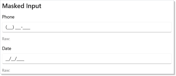
Mask tokens: 0 = required digit, 9 = optional digit, A = required
letter, a = optional letter, * = required alphanumeric. All other
characters are literals inserted automatically.
| Preset | Pattern |
|---|---|
MaskPreset.PhoneUS |
(000) 000-0000 |
MaskPreset.SSN |
000-00-0000 |
MaskPreset.CreditCard |
0000 0000 0000 0000 |
MaskPreset.Date |
00/00/0000 |
MaskPreset.ZipCode |
00000 |
MaskPreset.IPv4 |
099.099.099.099 |
Input Formatters¶
InputFormatter transforms text as the user types. Chain formatters into a
pipeline for complex formatting:
class InputFormattersDemo : Component
{
    public override Element Render()
    {
        var (currency, setCurrency) = UseState("");
        var (upper, setUpper) = UseState("");

        var currencyFmt = UseMemo(() => InputFormatter.Currency());
        var upperFmt = UseMemo(() => InputFormatter.UpperCase);

        return VStack(12,
            SubHeading("Input Formatters"),
            TextBox(currencyFmt.Format(currency, 0).Output,
                v => setCurrency(currencyFmt.Parse(v)),
                placeholderText: "$0.00", header: "Amount"),
            TextBox(upperFmt.Format(upper, 0).Output,
                v => setUpper(upperFmt.Parse(v)),
                placeholderText: "UPPERCASE", header: "Code")
        ).Padding(24);
    }
}
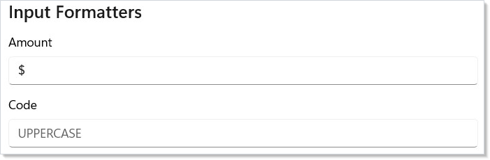
Built-in formatters: PhoneUS, Currency(), UpperCase, LowerCase,
TitleCase, TrimWhitespace, MaxLength(n), AllowOnly(regex),
DenyOnly(regex), and Custom(format, parse).
AutoSuggestBox¶
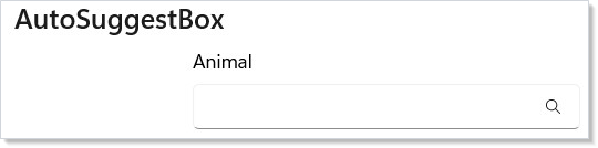
AutoSuggestBox is the search-with-suggestions input — type a prefix,
see a filtered list, pick one or submit free-form. The factory takes
the text value, an onTextChanged handler, and an optional
onQuerySubmitted handler that fires on Enter or suggestion pick:
class AutoSuggestDemo : Component
{
    static readonly string[] Catalog =
    [
        "Aardvark", "Albatross", "Antelope", "Badger",
        "Beaver", "Buffalo", "Camel", "Capybara"
    ];

    public override Element Render()
    {
        var (text, setText) = UseState("");

        var matches = string.IsNullOrEmpty(text)
            ? Array.Empty<string>()
            : Catalog.Where(c =>
                c.StartsWith(text, StringComparison.OrdinalIgnoreCase))
                .ToArray();

        return VStack(8,
            SubHeading("AutoSuggestBox"),
            AutoSuggestBox(text, setText,
                onQuerySubmitted: q => setText(q))
                .Header("Animal")
                .QueryIcon(SymbolIcon("Find"))
                .Width(280),
            // Suggestion list — bind to AutoSuggestBox.ItemsSource via .Set
            // when you need the in-control dropdown; the inline list below
            // is a custom presentation that gives full styling control.
            When(matches.Length > 0, () =>
                VStack(2,
                    ForEach(matches, m =>
                        TextBlock(m).Padding(8, 4).WithKey(m))
                ).Background(Theme.CardBackground).Width(280))
        ).Padding(24);
    }
}
| Fluent | Effect |
|---|---|
.Header(string) |
Label rendered above the box. |
.QueryIcon(IconData) |
Trailing icon (a search glyph is typical). |
.IsSuggestionListOpen(bool) |
Force the dropdown open/closed. |
.SuggestionChosen(Action<string>) |
Fires when the user picks an item from the underlying dropdown. |
.Set(b => b.ItemsSource = ...) |
Bind to the WinUI suggestion list. |
The snippet above renders an inline suggestion list as a custom presentation — more layout freedom than the built-in dropdown, at the cost of writing the visual surface yourself. For the canonical search-results recipe see recipes/search-with-suggestions.
WinUI design page: Auto-suggest box.
Date and time controls¶
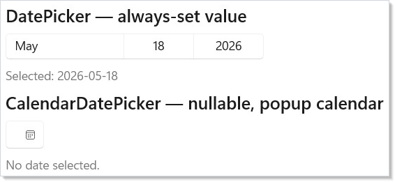
Reactor exposes three date/time inputs and a calendar surface, each covering a different shape of the same problem:
| Control | Value | Shape | Use when |
|---|---|---|---|
DatePicker |
DateTimeOffset (non-null) |
Inline three-spinner picker | The date is always required and inline real estate is available. |
CalendarDatePicker |
DateTimeOffset? |
Button that opens a popup calendar | Date is optional; you want a compact trigger. |
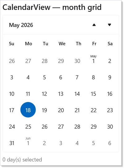
CalendarView |
IReadOnlyList<DateTimeOffset> |
Full month grid | Single, multiple, or range selection from a grid. |
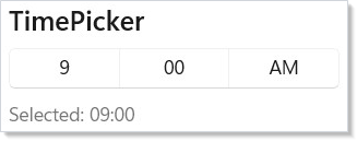
TimePicker |
TimeSpan |
Hours / minutes / am-pm spinner | Time-of-day independent of a date. |
class DatePickerDemo : Component
{
    public override Element Render()
    {
        var (date, setDate) = UseState(DateTimeOffset.Now);
        var (optionalDate, setOptionalDate) = UseState<DateTimeOffset?>(null);

        return VStack(8,
            SubHeading("DatePicker — always-set value"),
            DatePicker(date, setDate)
                .DayFormat("{day.integer(2)}")
                .MonthFormat("{month.abbreviated}")
                .YearFormat("{year.full}"),
            TextBlock($"Selected: {date:yyyy-MM-dd}").Opacity(0.6),
            SubHeading("CalendarDatePicker — nullable, popup calendar"),
            CalendarDatePicker(optionalDate, setOptionalDate)
                .DateFormat("{month.abbreviated} {day.integer(2)}, {year.full}")
                .IsTodayHighlighted(),
            TextBlock(optionalDate is null
                ? "No date selected."
                : $"Selected: {optionalDate:yyyy-MM-dd}").Opacity(0.6)
        ).Padding(24);
    }
}
class TimePickerDemo : Component
{
    public override Element Render()
    {
        var (time, setTime) = UseState(TimeSpan.FromHours(9));

        return VStack(8,
            SubHeading("TimePicker"),
            TimePicker(time, setTime),
            TextBlock($"Selected: {time:hh\\:mm}").Opacity(0.6)
        ).Padding(24);
    }
}
class CalendarViewDemo : Component
{
    public override Element Render()
    {
        var (dates, setDates) = UseState<IReadOnlyList<DateTimeOffset>>(
            Array.Empty<DateTimeOffset>());

        return VStack(8,
            SubHeading("CalendarView — month grid"),
            CalendarView()
                .MinDate(DateTimeOffset.Now.AddYears(-1))
                .MaxDate(DateTimeOffset.Now.AddYears(1))
                .NumberOfWeeksInView(6)
                .SelectedDatesChanged(setDates)
                .SelectedDates(dates),
            TextBlock($"{dates.Count} day(s) selected").Opacity(0.6)
        ).Padding(24);
    }
}
DatePicker / TimePicker / CalendarDatePicker share their format strings
with the underlying WinUI DateTimeFormatter — "{day.integer(2)}",
"{month.abbreviated}", "{year.full}", and friends. CalendarView
exposes .MinDate / .MaxDate for range constraint and
.NumberOfWeeksInView to compress the grid. For multi-day selection,
pair .SelectedDates(...) with .SelectedDatesChanged(...) — the
event hands you the full snapshot of the current selection, not
add/remove deltas (same shape as
ListView multi-select).
WinUI design pages: Date picker, Time picker, Calendar view.
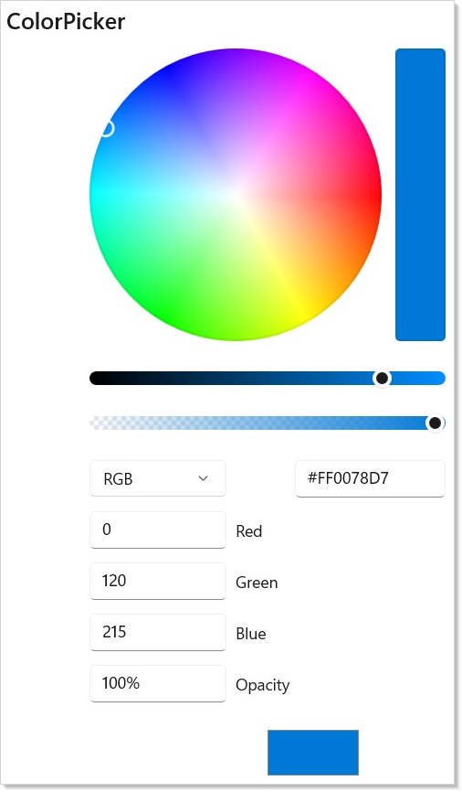
ColorPicker¶
ColorPicker takes a Windows.UI.Color and a change handler — same
controlled pattern as Slider. Its surface is the largest of any input
on this page; configure it for the shape of the chooser you need:
class ColorPickerDemo : Component
{
    public override Element Render()
    {
        var (color, setColor) = UseState(
            global::Windows.UI.Color.FromArgb(255, 0, 120, 215));

        return VStack(8,
            SubHeading("ColorPicker"),
            ColorPicker(color, setColor)
                .AlphaEnabled()
                .HexInputVisible(true)
                .ColorSpectrumShape(
                    Microsoft.UI.Xaml.Controls.ColorSpectrumShape.Ring),
            TextBlock($"Selected: #{color.A:X2}{color.R:X2}{color.G:X2}{color.B:X2}")
                .FontSize(12)
                .Foreground(Theme.SecondaryText)
        ).Padding(24);
    }
}
| Fluent | Effect |
|---|---|
.AlphaEnabled(bool) |
Show the alpha slider and pre-multiply by the alpha value. |
.ColorSpectrumShape(shape) |
Box (default) or Ring. |
.HexInputVisible(bool) |
Toggle the hex-input field. |
.ColorSpectrumVisible(bool) |
Toggle the main 2D spectrum. |
.ColorSliderVisible(bool) |
Toggle the hue slider. |
.ColorChannelTextInputVisible(bool) |
Toggle RGB number inputs. |
.HueRange(min, max) / .SaturationRange(min, max) / .ValueRange(min, max) |
Constrain pickable hue / sat / value. |
.MoreButtonVisible(bool) |
"More" chevron that expands the picker. |
For palette pickers (Material-style swatch grids), build the surface
out of Buttons and Background(color) rather than this control —
ColorPicker is the right shape only when the user needs continuous
selection from the full color space.
WinUI design page: Color picker.
Caveat: Commit-on-blur inputs (
NumberBox,DatePicker,CalendarDatePicker,TimePicker) do not fire their change handlers per keystroke — they fire when focus leaves the field. Validation derived from these controls' values is therefore stale until the user tabs out. The classic failure mode: a Submit button disabled until the form is valid stays disabled while the user is still inside aNumberBoxthat already contains a valid value. The user fixes the last field, presses Tab to reach Submit, focus skips the still-disabled button, and the user is stranded. Two fixes compose:.Immediate()on the input switches it to per-keystroke commit (see Keeping Submit Reachable), and.IsDisabledFocusable()on the Submit button keeps it keyboard-focusable while it's gated.
Patterns¶
Multi-step form with shared ValidationContext¶
A wizard-style form spans multiple pages but the validation lives in
one place. Hoist UseValidationContext() to the wizard component and
pass it down via context — every step's
.Validate(...) writes to the same store, and the final Submit checks
ctx.IsValid() across all steps. The
recipes/multi-step-form recipe walks
the full pattern; the key shape is one context per form, not one
per page.
Submit on Enter¶
For a single-field form (search box, comment input), wire submission
to Enter rather than a Submit button. AutoSuggestBox does this
automatically via onQuerySubmitted. For TextBox, route through
.OnKeyDown and check for VirtualKey.Enter; see
input-and-gestures for the routed-events
surface.
Validating async (uniqueness checks)¶
Validate.MustAsync<T>(...) runs a predicate that returns
Task<bool>. The ValidationContext tracks the in-flight async work
and reports IsValidating per field, so the Submit button can disable
while async validation runs. Pair with .IsDisabledFocusable() so the
button stays in tab order while validating — same accessibility
concern as Keeping Submit Reachable.
Common Mistakes¶
Letting the control hold its own state¶
// Don't — there is no `initial:` parameter. The bare string binds a value
// with no `onChanged`, so it seeds the box and then nothing reads it back:
// the user's typing lives only in the native control:
TextBox("default value")
class ControlledInputDemo : Component
{
    public override Element Render()
    {
        var (name, setName) = UseState("");

        return VStack(12,
            SubHeading("Controlled Input"),
            TextBox(name, setName, placeholderText: "Type your name",
                header: "Name"),
            TextBlock($"You typed: {name}").Opacity(0.6)
        ).Padding(24);
    }
}
The distinction that matters is not "controlled vs. uncontrolled" but
whether the binding is complete. Omit the value entirely and the
control owns its own state, which the parent cannot read, reset, or
pre-fill. Pass a value without onChanged — as above — and you get a
half binding: the value is pre-filled and the parent can still replace
it by passing a different one, but nothing flows back. The user's edits
stay in the native control and never reach application state, so a later
read of your state returns the original string as if nothing was typed.
Note this does not fight the user keystroke-by-keystroke: the element
is unchanged between renders, so the reconciler's shallow-equality skip
fires and never re-writes the box. That is what makes the bug quiet — the
text looks accepted and is simply never collected. If the text really is
fixed, say so with .IsReadOnly(true); otherwise supply both halves.
Reactor inputs take (value, onChanged) together; supply
both and the control is a passive view of state.
Validating in the click handler¶
// Don't:
Button("Submit", () =>
{
    if (string.IsNullOrEmpty(email)) { setError("…"); return; }
    if (!email.Contains('@'))         { setError("…"); return; }
    if (age < 18)                      { setError("…"); return; }
    // submit…
})
Imperative checks duplicate every field's validation in the submit
handler, drift from the inline error display, and fall out of date
when fields are added. Use UseValidationContext
+ .Validate(...) so each field carries its rules with it; the
submit handler becomes one ctx.IsValid() call.
Tips¶
Always use controlled inputs. Never let a control manage its own state.
Your Render() method is the single source of truth — if you need to
pre-fill, validate, or reset a field, you just set the state value.
Use FormField for production forms. It handles labels, required
indicators, and error display with consistent styling. Avoid building your
own field wrapper.
Use Validate.Must<T>() for custom rules. When built-in validators
don't cover your case, Must takes any Func<T, bool> predicate.
Call ctx.MarkAllTouched() on submit. This reveals all validation errors
at once, so the user sees everything that needs fixing.
Reset forms with ctx.ResetAll(). It returns all fields to their initial
values, clears touched/dirty state, and removes all messages.
Next Steps¶
- Flex Layout — Previous: flexible box layout for adaptive UIs
- Collections — Next: render lists, grids, and virtualized data sets
- Hooks — UseState, UseMemo, and other hooks that power form logic
- Commanding — wire submit buttons to async commands with busy/error handling
- Styling and Theming — theme your forms with tokens and lightweight styling