WinUI reference: For the full property surface and design guidance, see Layout.
Every Microsoft.UI.Reactor (Reactor) layout is a composition of single-responsibility panels —
you pick by direction (HStack for a row, VStack for a column),
wrap behavior (WrapGrid when items should flow into new rows), or
grid axes (Grid when you want explicit rows × columns). The panels
do not overlap each other's job: a Stack is for one axis, a Grid is
for two, a Canvas is for absolute coordinates, and a FlexPanel (see
flex-layout) is for the CSS-Flexbox feature set
including flex-grow, flex-shrink, and flex-basis. The reason this
matters: the right panel keeps the layout cost linear in the child
count. The wrong panel — say, a VStack of HStacks where a Grid
would do — forces every nested measure-and-arrange pass through
multiple panels' code paths, which both costs more and reads worse.
Start with VStack for a screen's top-level scaffold; switch to Grid
the moment you have row-and-column alignment; switch to
FlexRow/FlexColumn when you need ratio-based
sizing or multi-line wrapping with gaps.
Layout¶
Reactor provides a small set of layout primitives that compose to build any screen structure. Every layout element accepts children and optional spacing.
Decision table¶
| Shape | Panel | Why |
|---|---|---|
| Items in one direction | VStack(spacing, children) / HStack(spacing, children) |
Single-axis stacking with built-in spacing. |
| Items in rows × columns | Grid(columns, rows, children) |
Two-axis with explicit track sizing (Auto, Star, Px). |
| Items that should wrap | WrapGrid(maxRowsOrColumns, children) |
Auto-flow after a row fills. |
| Items that need ratio sizing or multi-line wrap with gaps | FlexRow(...) / FlexColumn(...) (see flex-layout) |
CSS-Flexbox semantics: grow/shrink/basis. |
| Absolute positioning | Canvas(children) |
Free-form Canvas.SetLeft / SetTop. |
| Visual container | Border(child) / Card(child) |
Background, corner radius, padding around a single child. |
| Overflow handling | ScrollView(child) |
Wraps anything that may exceed its allotted space. |
| Collapsible group | Expander(header, content) |
Header that toggles its content panel. |
VStack and HStack¶
The two most common layouts. VStack stacks children vertically, HStack horizontally. The first argument is the pixel spacing between children:
class StackDemo : Component
{
    public override Element Render()
    {
        return VStack(16,
            SubHeading("VStack and HStack"),
            VStack(4,
                TextBlock("VStack: items top to bottom"),
                TextBlock("Item A"), TextBlock("Item B"), TextBlock("Item C")
            ),
            HStack(8,
                TextBlock("HStack:"),
                Button("One"), Button("Two"), Button("Three")
            )
        );
    }
}
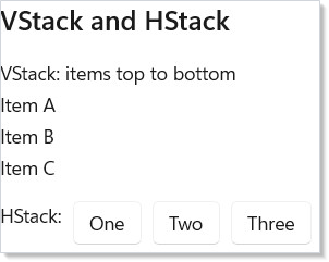
VStack(16, ...) puts 16 pixels between each child, top to bottom.
HStack(8, ...) puts 8 pixels between each child, left to right. Omit
the spacing argument for zero spacing: VStack(child1, child2).
Nest them freely — an HStack inside a VStack, VStacks inside HStacks,
as deep as you need. But the moment you find yourself nesting more
than two deep, reach for Grid instead (see
Common Mistakes for why).
Grid¶
For row-and-column layouts, use Grid. Define columns and rows with
GridSize helpers, then place children with the .Grid() modifier:
class GridDemo : Component
{
    public override Element Render()
    {
        return VStack(8,
            SubHeading("Grid"),
            Grid(
                columns: [GridSize.Px(120), GridSize.Star(), GridSize.Auto],
                rows: [GridSize.Auto, GridSize.Auto],
                TextBlock("Label").Bold().Grid(row: 0, column: 0),
                TextBox("", _ => { }, placeholderText: "Input...")
                    .AutomationName("Input")
                    .Grid(row: 0, column: 1),
                Button("Go").Grid(row: 0, column: 2),
                TextBlock("Status").Grid(row: 1, column: 0),
                TextBlock("Ready").Foreground(Theme.Accent)
                    .Grid(row: 1, column: 1, columnSpan: 2)
            ).Height(80)
        );
    }
}

| Helper | Meaning |
|---|---|
GridSize.Px(200) |
Fixed 200 pixels |
GridSize.Star() |
Proportional — fills available space (weight 1) |
GridSize.Star(2) |
Proportional — twice the space of GridSize.Star() |
GridSize.Auto |
Sizes to content |
Place children with .Grid(row: 0, column: 1). Use columnSpan or
rowSpan to span multiple cells: .Grid(row: 1, column: 0, columnSpan: 2).
The former
Grid(["120", "1*", "Auto"], ...)string-form overload was removed — use the typed helpers (GridSize.Px(120)/GridSize.Star(1)/GridSize.Auto), which catch typos at compile time.
Card¶
Card(child) wraps any element in the canonical WinUI card chrome — 8px
corner radius, 16px padding, theme-aware background and 1px stroke. Use
it instead of hand-rolling a
Border(...).Background(Theme.CardBackground).WithBorder(...) pipeline:
class CardDemo : Component
{
    public override Element Render()
    {
        return VStack(12,
            SubHeading("Card"),
            Card(
                VStack(8,
                    TextBlock("Recent activity").SemiBold(),
                    TextBlock("3 new messages, 2 mentions")
                        .Foreground(Theme.SecondaryText)
                )
            ).Width(240)
        );
    }
}
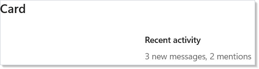
Override any preset by chaining further fluents:
Card(child).Padding(24).CornerRadius(16). The background and stroke
resolve through ThemeRef, so light/dark/contrast switches re-paint
without code changes — see styling.
Type-Ramp Factories¶
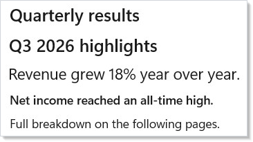
For headings and body copy that match the WinUI 3 type ramp, use the
named factories instead of repeating .FontSize(...).Bold() chains:
class TypeRampDemo : Component
{
    public override Element Render()
    {
        return VStack(8,
            Title("Quarterly results"),
            Subtitle("Q3 2026 highlights"),
            BodyLarge("Revenue grew 18% year over year."),
            BodyStrong("Net income reached an all-time high."),
            Body("Full breakdown on the following pages.")
        ).Padding(24);
    }
}
| Factory | WinUI style |
|---|---|
Display(text) |
DisplayTextBlockStyle — 68px Semibold |
TitleLarge(text) |
TitleLargeTextBlockStyle — 40px Semibold |
Title(text) |
TitleTextBlockStyle — 28px Semibold |
Subtitle(text) |
SubtitleTextBlockStyle — 20px Semibold |
BodyLarge(text) |
BodyLargeTextBlockStyle — 18px regular |
BodyStrong(text) |
BodyStrongTextBlockStyle — 14px Semibold |
Body(text) |
BodyTextBlockStyle — 14px regular |
Display and TitleLarge sit above the range the screenshot shows; reserve
Display for a hero banner (at most one per page) and TitleLarge for a
primary title on a feature or landing page.
These are factories (not fluents) by design — see
spec 039 §17.6. Layer
further modifiers on the result (Title("…").Foreground(Theme.Accent))
when you need to deviate.
ScrollView and Border¶
ScrollView wraps content that might overflow. Border adds a visual
container with background, corner radius, and padding:
class ScrollBorderDemo : Component
{
    public override Element Render()
    {
        return VStack(8,
            SubHeading("ScrollView and Border"),
            Border(
                ScrollView(
                    VStack(4,
                        ForEach(
                            Enumerable.Range(1, 20),
                            i => TextBlock($"Scrollable item {i}").WithKey(i.ToString()))
                    ).Padding(8)
                ).Height(120)
            ).CornerRadius(4).Background(Theme.CardBackground)
        );
    }
}
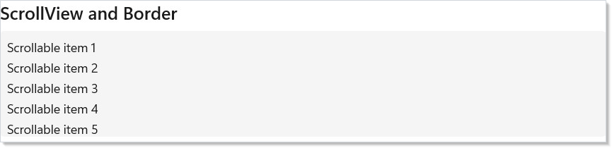
ScrollView takes a single child element. Wrap a VStack to scroll a
vertical list. Border is purely visual — it renders a rounded
rectangle behind its child and is useful for cards, panels, and
grouping.
For long lists, prefer VirtualList over
ScrollView(VStack(...)). A ScrollView lays out every child even
when off-screen, which is fast for ≤100 items and visibly slow above
~500; VirtualList materializes only the items in view.
Expander and Canvas¶
Expander shows a header and collapses/expands its content on click.
Canvas positions children at absolute coordinates:
class ExpanderCanvasDemo : Component
{
    public override Element Render()
    {
        return VStack(12,
            SubHeading("Expander"),
            Expander("Click to expand", VStack(8,
                TextBlock("Hidden content revealed!"),
                TextBlock("Expanders are great for optional details.")
            )),
            SubHeading("Canvas"),
            Border(
                Canvas(
                    TextBlock("Top-left").Set(c => {
                        Microsoft.UI.Xaml.Controls.Canvas.SetLeft((UIElement)c, 10);
                        Microsoft.UI.Xaml.Controls.Canvas.SetTop((UIElement)c, 10);
                    }),
                    TextBlock("Center").Set(c => {
                        Microsoft.UI.Xaml.Controls.Canvas.SetLeft((UIElement)c, 120);
                        Microsoft.UI.Xaml.Controls.Canvas.SetTop((UIElement)c, 40);
                    })
                ).Height(90).Width(300)
            ).Background(Theme.CardBackground).CornerRadius(4)
        );
    }
}
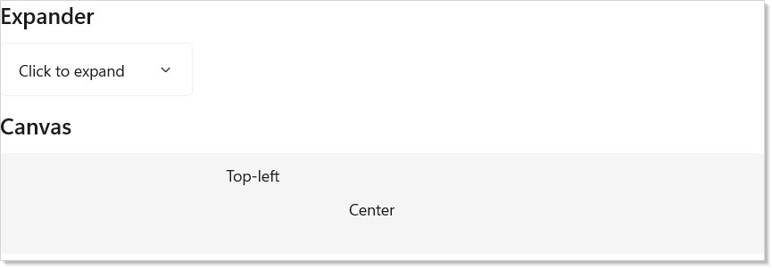
Expander(header, content) handles the expand/collapse state
internally. Pass isExpanded: true to start expanded, or use
onExpandedChanged to track the state yourself.
Canvas positions children using the .Set() modifier to call
Canvas.SetLeft and Canvas.SetTop. Use it for overlays, diagrams, or
any layout that doesn't follow a stack or grid pattern.
Responsive Layout¶
Switch between layouts based on window width. Use a state toggle or
UseBreakpoint to swap between HStack and VStack:
class ResponsiveDemo : Component
{
    public override Element Render()
    {
        var (wide, setWide) = UseState(true);

        var content = new Element[]
        {
            Border(TextBlock("Panel A").Padding(16))
                .Background(Theme.SystemNeutralBackground).CornerRadius(4),
            Border(TextBlock("Panel B").Padding(16))
                .Background(Theme.SystemCautionBackground).CornerRadius(4),
            Border(TextBlock("Panel C").Padding(16))
                .Background(Theme.SystemSuccessBackground).CornerRadius(4),
        };

        return VStack(8,
            SubHeading("Responsive Layout"),
            HStack(8,
                TextBlock("Simulate wide screen:"),
                ToggleSwitch(wide, setWide)
            ),
            If(wide,
                () => HStack(12, content),
                () => VStack(8, content))
        );
    }
}
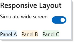
For real responsive layouts, use UseBreakpoint
(minWidth) (or (window, minWidth) for an explicit host window), which returns true when the window is at least
minWidth pixels wide. Pair it with If() to swap layouts:
var wide = UseBreakpoint(800);
return If(wide,
    () => HStack(12, panelA, panelB),
    () => VStack(8, panelA, panelB));
UseWindowSize(window) returns (Width, Height) if you need exact
dimensions for more granular control.
Alignment and Sizing¶
Every element supports sizing and alignment modifiers:
class AlignmentSizingDemo : Component
{
    public override Element Render() => VStack(8,
        SubHeading("Alignment and sizing"),

        TextBlock("Centered").HAlign(HorizontalAlignment.Center),
        Border(TextBlock("Fixed width"))
            .Width(200).Height(40)
            .Background(Theme.ControlFillSecondary),

        VStack(8,
            TextBlock("Item A"),
            TextBlock("Item B")
        ).Margin(24).Padding(16).Background(Theme.ControlFillSecondary)
    );
}
| Modifier | Effect |
|---|---|
.Width(n) |
Fixed width in pixels |
.Height(n) |
Fixed height in pixels |
.Margin(n) |
Outer spacing (all sides) |
.Padding(n) |
Inner spacing (all sides) |
.HAlign(alignment) |
Horizontal alignment (Left, Center, Right, Stretch) |
.VAlign(alignment) |
Vertical alignment (Top, Center, Bottom, Stretch) |
.HorizontalContentAlignment(alignment) |
Horizontal child/content alignment inside a Control |
.VerticalContentAlignment(alignment) |
Vertical child/content alignment inside a Control |
Use the content-alignment fluents when the control itself should stretch, but its child content also needs an explicit placement contract. A common case is a full-width button whose inner row should also stretch:
class ContentAlignmentDemo : Component
{
    public override Element Render() => VStack(8,
        SubHeading("Content alignment"),

        // The Button stretches to fill the row, and its inner content
        // stretches too — without HorizontalContentAlignment the label
        // would stay centered in an otherwise full-width button.
        Button(TextBlock("Open"), () => { })
            .AutomationName("Open")
            .HAlign(HorizontalAlignment.Stretch)
            .HorizontalContentAlignment(HorizontalAlignment.Stretch)
    ).Width(320);
}
See modifier-system for how these chain internally.
Caveat:
Gridpanels with*(star) sizing measure their children twice on the first layout pass — once withAvailable = Infinityto determine the natural content size, and once withAvailable = ActualWidthto resolve the star tracks. The double pass is fast for ≤100 children and visible above ~500. For large lists rendered into a star-sized cell, wrap the content inVirtualListorLazyVStackso the panel only materializes the visible window; the host star track measures the viewport size once. Fixed (Px) andAutotracks do not pay the double-measure cost.
Patterns¶
App-shell scaffold¶
The canonical admin-style app shell — title bar, sidebar, main content,
status bar. One Grid declaration; one measure-and-arrange pass:
// App shell scaffold: title bar + sidebar + content using a single Grid
// declaration. The two-column / three-row layout is the canonical
// shape for an admin-style app and replaces hand-rolled nested
// HStacks/VStacks.
class AppShellExample : Component
{
    public override Element Render()
    {
        return Grid(
            columns: [GridSize.Px(220), GridSize.Star()],
            rows:    [GridSize.Px(44),  GridSize.Star(), GridSize.Px(28)],
            // Top bar — spans both columns.
            Border(TextBlock("My App").Bold().Padding(12))
                .Background(Theme.LayerFill)
                .Grid(row: 0, column: 0, columnSpan: 2),
            // Sidebar.
            Border(VStack(4,
                    TextBlock("Dashboard"),
                    TextBlock("Reports"),
                    TextBlock("Settings"))
                .Padding(12))
                .Background(Theme.CardBackground)
                .Grid(row: 1, column: 0),
            // Main content.
            ScrollView(VStack(8,
                    Title("Welcome"),
                    Body("Stack -> Grid for the shell, VStack inside the panes.")))
                .Padding(16)
                .Grid(row: 1, column: 1),
            // Status bar.
            TextBlock("Ready").Padding(6)
                .Grid(row: 2, column: 0, columnSpan: 2)
        ).Width(560).Height(360);
    }
}
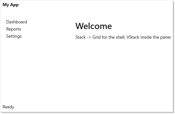
A naive version with nested HStack/VStack panels works but couples
the rows to the column widths — resizing the sidebar requires editing
every row that intersects it. The Grid keeps the axes independent.
Auto-grid¶
A photo gallery, a tile dashboard, a chip cloud — anything that should
flow into rows as the container width allows — uses WrapGrid:
// Auto-grid: WrapGrid wraps a sequence of items into columns once a
// row fills, no manual row/column placement. Picks "max 4 per row".
class AutoGridExample : Component
{
    public override Element Render()
    {
        return WrapGrid(maxRowsOrColumns: 4,
            children: Enumerable.Range(1, 11)
                .Select(i =>
                    Border(TextBlock($"Tile {i}").Padding(12))
                        .Background(Theme.CardBackground)
                        .CornerRadius(6)
                        .Width(110).Height(60))
                .Cast<Element?>()
                .ToArray()
        );
    }
}
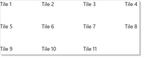
maxRowsOrColumns caps the major axis; the panel wraps once that
count is reached. For content that should wrap by available pixel
width (rather than item count), use FlexRow(...)
with Wrap = FlexWrap.Wrap.
Responsive switcher¶
The minimum responsive recipe — different shape at narrow vs. wide:
// Responsive switcher: the same content renders as HStack at wide
// widths, VStack when the window narrows past 480px. UseBreakpoint is
// the canonical hook for this pattern.
class ResponsiveSwitcherExample : Component
{
    public override Element Render()
    {
        var (simulated, setSimulated) = UseState(true);  // toy demo without a window handle

        var panels = new Element[]
        {
            Border(TextBlock("Panel A").Padding(16))
                .Background(Theme.CardBackground).CornerRadius(4),
            Border(TextBlock("Panel B").Padding(16))
                .Background(Theme.CardBackground).CornerRadius(4),
            Border(TextBlock("Panel C").Padding(16))
                .Background(Theme.CardBackground).CornerRadius(4),
        };

        return VStack(8,
            HStack(8,
                TextBlock("Simulate wide window:"),
                ToggleSwitch(simulated, setSimulated)),
            If(simulated,
                () => HStack(12, panels),
                () => VStack(8, panels))
        ).Padding(24);
    }
}
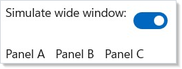
The same panels array drops into either container. The real
production version reads UseBreakpoint(window, 480) rather than a
manual toggle — see the Responsive Layout section
above.
Common Mistakes¶
Nesting deep stack hierarchies where Grid would suffice¶
// BAD — deeply nested VStack/HStack hierarchies obscure intent and
// produce a layout cost that Grid would absorb in one measure pass.
class DontDeepStack : Component
{
    public override Element Render()
    {
        return HStack(8,
            VStack(4,
                TextBlock("Label").Bold(),
                TextBlock("Sublabel").Foreground(Theme.SecondaryText)),
            VStack(0,
                HStack(4, TextBlock("First:"), TextBlock("Value 1")),
                HStack(4, TextBlock("Second:"), TextBlock("Value 2")),
                HStack(4, TextBlock("Third:"), TextBlock("Value 3")))
        ).Padding(24);
    }
}
Three levels of HStack/VStack to lay out a label-value list is
harder to read than the row × column shape it really is. The same
shape as a Grid:
// GOOD — same shape as a 2-column Grid. Labels in column 0 are auto-
// sized to their content; column 1 stretches.
class DoGridForForms : Component
{
    public override Element Render()
    {
        return Grid(
            columns: [GridSize.Auto, GridSize.Star()],
            rows:    [GridSize.Auto, GridSize.Auto, GridSize.Auto],
            TextBlock("First:").Margin(4).Grid(row: 0, column: 0),
            TextBlock("Value 1").Margin(4).Grid(row: 0, column: 1),
            TextBlock("Second:").Margin(4).Grid(row: 1, column: 0),
            TextBlock("Value 2").Margin(4).Grid(row: 1, column: 1),
            TextBlock("Third:").Margin(4).Grid(row: 2, column: 0),
            TextBlock("Value 3").Margin(4).Grid(row: 2, column: 1)
        ).Padding(24).Width(300);
    }
}
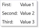
The Auto column hugs the label width; the Star column stretches.
Adding a row is one declaration. The nested-Stack version requires
re-indenting every sibling. As a rule: if any two items in your
layout need to align across rows or columns, use Grid.
Missing * sizing in templates that should fill¶
// Don't:
Grid(
    columns: [GridSize.Px(220), GridSize.Auto],   // content column is auto-sized
    rows: [GridSize.Star()],
    Sidebar(), Content())  // Content shrinks to its intrinsic width
Auto is "measure my content and use that"; Star is "take what's
left". A main-content cell that should fill the remaining horizontal
space must declare GridSize.Star() — otherwise it shrinks to its
intrinsic size and the surrounding empty cell appears. The
analyzer's REACTOR_GRID_001 (when enabled) flags the common
"unused column" symptom.
Mixing Flex and Stack on the same axis¶
// Don't:
FlexRow(
    HStack(8, leftA, leftB),    // Stack inside Flex on the same axis
    HStack(8, rightA, rightB)
)
FlexRow/FlexColumn (backed by FlexPanel) and Stack both lay out
along an axis, but the flex panel applies CSS-Flexbox semantics
(flex-grow, flex-shrink, flex-basis) and Stack applies a simpler
"give every child its natural size with fixed gaps" rule. Mixing them on
the same axis means the outer flex panel's grow/shrink calculations
operate on opaque Stack measurements — predictable enough for trivial
cases, surprising for anything dynamic. Pick one per axis. See
flex-layout for when each shape is right.
HStack/VStack in a Grid Auto track collapses to nothing¶
// Don't:
Grid(
    columns: [GridSize.Auto, GridSize.Star()],
    rows: [GridSize.Star()],
    HStack(SaveButton(), CancelButton()).Grid(column: 0))  // row vanishes — measures 0×0
A Grid Auto track measures its content with infinite available
space on that axis. A StackPanel (HStack/VStack) measures its
children sequentially and accumulates their desired size — so any child
that relies on stretch sizing reports 0, the stack accumulates 0,
and the whole column (or row) silently collapses to 0×0. The action
row just disappears with no error.
Wrapping the stack in a Border does not help — the Border sizes
to its 0-sized child. The real fixes are:
- Use a
Startrack (GridSize.Star()) so the cell hands the stack a finite width to stretch into, or - Set an explicit
.Width(...)(forHStack) /.Height(...)(forVStack) — or a.MinWidth(...)/.MinHeight(...)— on the stack, or - Give the stack's children explicit (or minimum) sizes so they don't depend on stretch.
// Do:
Grid(
    columns: [GridSize.Star(), GridSize.Star()],   // Star, not Auto
    rows: [GridSize.Star()],
    HStack(SaveButton(), CancelButton()).Grid(column: 0, columnSpan: 2));
Reactor surfaces this footgun at debug time: when
ReactorFeatureFlags.WarnLayoutFootguns is set (always on in DEBUG
builds), the reconciler emits a one-time warning naming the offending
stack and its Auto track so you don't have to bisect the collapse.
Tips¶
Start with VStack. Most screens are a vertical stack of sections.
Add HStack for side-by-side content within those sections; reach for
Grid when two items need to align across rows or columns.
Use Grid for forms. A two-column grid with
[GridSize.Auto, GridSize.Star()] columns gives you aligned labels on
the left and stretching inputs on the right — see the
do-grid-for-forms snippet.
Wrap long content in ScrollView; use VirtualList past ~500 items.
A ScrollView(VStack(...)) lays out every child even when off-screen.
VirtualList materializes only the visible window.
Prefer spacing over margin. VStack(12, ...) gives consistent
spacing between children. Adding .Margin(12) to each child
individually is harder to maintain and creates double-spacing at
boundaries.
Use Card over hand-rolled Border for grouping. Card(content) is
8px corner radius, 16px padding, theme-aware background, and a 1px
stroke — the canonical WinUI surface. Reach for Border only when you
need a non-card chrome (a colored accent, a single-side border, a
non-standard radius).
Next Steps¶
- Hooks — Previous:
UseState,UseMemo, and the rest of the hook surface - Flex Layout — Next:
FlexRow/FlexColumnfor grow/shrink/basis and multi-line wrap with gaps - Styling and Theming — Apply colors, typography, and themes to your layouts
- Collections —
VirtualListfor large data sets that overflowScrollView - Forms and Input — Build data entry forms with text fields, checkboxes, and validation
- Modifier System — How
.Width(),.Margin(), and friends chain internally