Recipe: Settings page
A settings page is many small persisted prefs side-by-side. Each
preference is its own UsePersisted call with its own key — there's
no central settings object that needs migration when one preference
moves. The row layout is a single helper.
Primitives
| Concern | API |
|---|---|
| Per-pref storage | UsePersisted<T>(key, initial, scope) |
| Scope | PersistedScope.Window / Application |
| Toggle | ToggleSwitch(isOn, setOn) |
| Choice | ComboBox(items, index, setIndex) |
| Range | Slider(value, min, max, setValue) |
| Row layout helper | static Element SettingsRow(...) |
Persisted state
// Each preference is a separate UsePersisted call with its own key.
// The window scope ties the values to the host's lifetime; flip to
// PersistedScope.Application when the prefs should survive across
// windows.
var (notify, setNotify) = UsePersisted("prefs/notify", true,
    PersistedScope.Window);
var (theme, setTheme) = UsePersisted("prefs/theme", 0,
    PersistedScope.Window);
var (volume, setVolume) = UsePersisted("prefs/volume", 60.0,
    PersistedScope.Window);
Three preferences, three keys. Each pref persists independently, so
adding a fourth is one line in Render() + one matching control. The
PersistedScope.Window scope keeps the values
inside the host window — flip to PersistedScope.Application for
process-wide preferences (auth, locale, theme) per the
persistence page.
Render
return VStack(16,
    Heading("Settings"),
    SettingsRow("Notifications",
        ToggleSwitch(notify, setNotify)),
    SettingsRow("Theme",
        ComboBox(["System", "Light", "Dark"], theme, setTheme)),
    SettingsRow("Volume",
        Slider(volume, 0, 100, setVolume).Width(200))
).Padding(20);
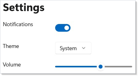
A VStack of SettingsRows; each row is a label + control. The page
re-renders from the changed hook state, and the reconciler patches the
existing controls in place — the slider doesn't re-mount when you toggle
notifications.
Row helper
// A `SettingsRow` is a label + control — two slots in an HStack with a
// fixed-width label so the controls line up across rows.
private static Element SettingsRow(string label, Element control) =>
    HStack(16,
        TextBlock(label).Width(120),
        control.AutomationName(label)
    );
A fixed-width label keeps the controls aligned across rows, and the
control receives the same text as its automation name. The helper is a
private static method, not a Component — it has no state, so a function
returning an Element is the right shape.
Tips
Use one key per pref, not one big record. The single-key approach
avoids the versioned-shape migration story for
the common case of adding a pref. If two prefs are genuinely
correlated (e.g. theme + accentColor), keep them in one record;
otherwise let them live alone.
Don't reach for UseReducer here. The Redux-style reducer is the
right shape for state with cross-field invariants; a settings page is
the opposite case — each pref is independent.
Promote to Application scope only when prefs need to outlive the
window. Window scope is the safer default; an Application-scoped
key shared across windows is a coordination problem the
persistence page covers in detail.
Next Steps
- Persistence — Scope choice, migration story, and the disk-bridge pattern when prefs must survive a restart.
- Forms — Validation surface to apply to settings with constraints (port numbers, file paths).
- Styling — Wire the "Theme" pref to actual theme
switching via
ApplicationTheme. - Recipe: Login — Sibling recipe for input-driven forms.
- Recipes index — Back to the gallery.