Recipe: Modal dialog
The modal is an element you return conditionally. There is no special
"open dialog" API — when open is true the tree includes the modal
panel layered over the page; when it's false the modal element is
absent and the page renders alone.
Primitives
| Concern | API |
|---|---|
| Open/closed state | UseState<bool> |
| Conditional layer | open ? Group(page, modal) : page |
| Scrim | Outer Border with semi-transparent fill |
| Buttons | Button(label, onClick) |
| Production wrapper | ContentDialog |
State
Two booleans — one for the open/closed flag, one for the recorded
outcome. The Delete branch flips both; the Cancel branch flips only
open.
Page
// The page renders normally; the modal is just another element
// returned conditionally based on `open`.
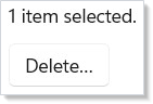
var page = VStack(12,
    TextBlock(deleted ? "Item deleted." : "1 item selected."),
    Button("Delete…", () => setOpen(true))
).Padding(20);
The page renders normally. The button updates open, which triggers
a re-render that includes the modal.
Modal panel
// Pair the dialog with a scrim (SmokeFill) so clicks outside the
// dialog don't reach the page underneath.
Element modal = Border(
    VStack(16,
        Heading("Delete this item?"),
        TextBlock("This action cannot be undone.").Opacity(0.8),
        HStack(8,
            Button("Cancel", () => setOpen(false)),
            Button("Delete", () => { setDeleted(true); setOpen(false); })
        ).HAlign(Microsoft.UI.Xaml.HorizontalAlignment.Right)
    ).Padding(20).Background(Theme.CardBackground).CornerRadius(8)
).Background(Theme.SmokeFill).Padding(40);
The panel is a Border with a colored scrim background. The two
buttons close over the same setOpen and setDeleted setters, so
"Cancel" reverts cleanly and "Delete" commits the action and dismisses
the modal in the same render.
For a real app, swap the Border for a ContentDialog from
dialogs-and-flyouts so the focus trap,
escape-to-cancel, and screen-reader semantics come for free; the
recipe above is the same shape with explicit primitives so the
composition is visible.
Tips
Render the modal as a sibling, not a child of the trigger.
Putting the modal under the button gives it the button's bounding box
for layout; rendering it via Group(page, modal) lets the modal
span the full host window the way modals are expected to.
Trap focus on the modal Border in real apps. The recipe above
omits focus management for readability — production code should call
.FocusTrap(...) on the panel so Tab cycles within the dialog. See
accessibility for the full pattern.
Don't conflate "open" with "saving". A confirm + commit modal has
three states: closed, open, committing. Add a third UseState<bool>
for the in-flight bit when the commit is async — pattern is the same
as the login recipe.
Next Steps
- Dialogs & Flyouts — Production
ContentDialog/MenuFlyoutcontrols. - Accessibility — Focus traps and the screen-reader contract for modals.
- Commanding — Wire the Delete branch to a
reusable
Command<T>shared with menu and keyboard. - Recipe: Login — Sibling recipe — same pattern for in-flight state.
- Recipes index — Back to the gallery.