TIP
💡 Learn more : Cloudyn service overview (opens new window).
# Optimize what you spend on the cloud with Cloudyn
With your personal finances, if you’ve ever wondered where all your money goes or exactly what you are spending your money on, you may have purchased an application such a Quicken. Quicken connects with your bank and credit card accounts to show you exactly where your money is going with different charts, graphs, and detailed tables of data. Once you know where your money is going, you can start to optimize what you spend your money on.
Cloudyn is like Quicken on steroids for your cloud costs on Azure.
Note Cloudyn is related to, but separate from native Azure Cost Management (opens new window). Cost Management has no onboarding, ~8-hour data latency, and is integrated into the Azure portal (opens new window). Cost Management is recommended for individiuals and organizations with Enterprise Aggreement (EA), pay-as-you-go, dev/test, and free/trial subscriptions. Cloud Solution Provider (CSP) customers should start with Cloudyn.
# How to set up Cloudyn
To use Cloudyn, first you need to register your subscription to get the billing information shared with the Cloudyn portal.
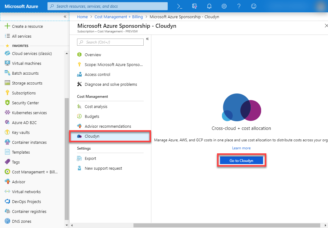
In the Azure Portal, select Cost Management + Billing, select Cost Management (opens new window) (if available), then Cloudyn and finally click the Go to Cloudyn button.
You will now be on the Cloudyn portal registration (Cloudyn is a Microsoft subsidiary), fill out the registration steps and then you’ll need to wait a good 24 hours until the billing data has been pulled into the Cloudyn portal.
# Cloudyn views that I’ve found useful
Once you’ve waited a day or so for Cloudyn to connect with billing, you can start learning where you are spending your money.
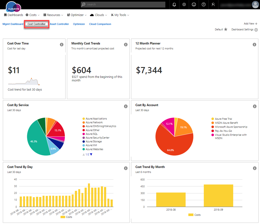
######## Cost Controller
The Cost Controller view is available by selecting it in the tabs across the top of the dashboards. This dashboard shows the following:
- Cost Over Time – a line chart and the last day’s cost.
- Monthly Cost Trends – shows a projected amortized cost and your actual spend for the month.
- 12 Month Planner – shows the projected costs over the next 12 months.
- Cost By Service – shows the costs by service for the past 30 days in a pie chart. If you hover over the slices you see the costs.
- Cost By Account – shows the costs by account for the past 30 days in a pie chart. Also if you hover over the slices you see the costs.
- Cost Trend By Day – a bar chart of cost over the last 30 days
- Cost Trend By Month – a bar chart cost over the last 6 months (once you have 6 months of data)
You can also create your own dashboard. Check out the documentation to find out more about other dashboards available.
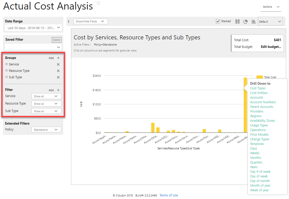
######## Actual Cost Analysis The Actual Cost Analysis view can be found by using the Costs menu at the top.
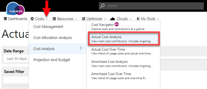
On the Cost Controller dashboard, I could see my Azure Web App cost was more than I thought it should be. With this view, I can drill down into my costs, by right-clicking on the bar chart or adding filters on the left side. If you look at all Services, Resource Types, and Sub Types you’ll be able to see where your costs are coming from. Now I can clearly see that I must have left a demo web app or two running that I need to remove.
######## Azure Resource Explorer The Azure Resource Explorer view can be found by using the Resources mentioned at the top.
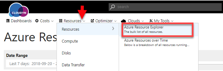
On the last view, I could clearly see my Web Apps were costing me more than I thought. This view shows all your resources and their costs—just like a credit card bill.
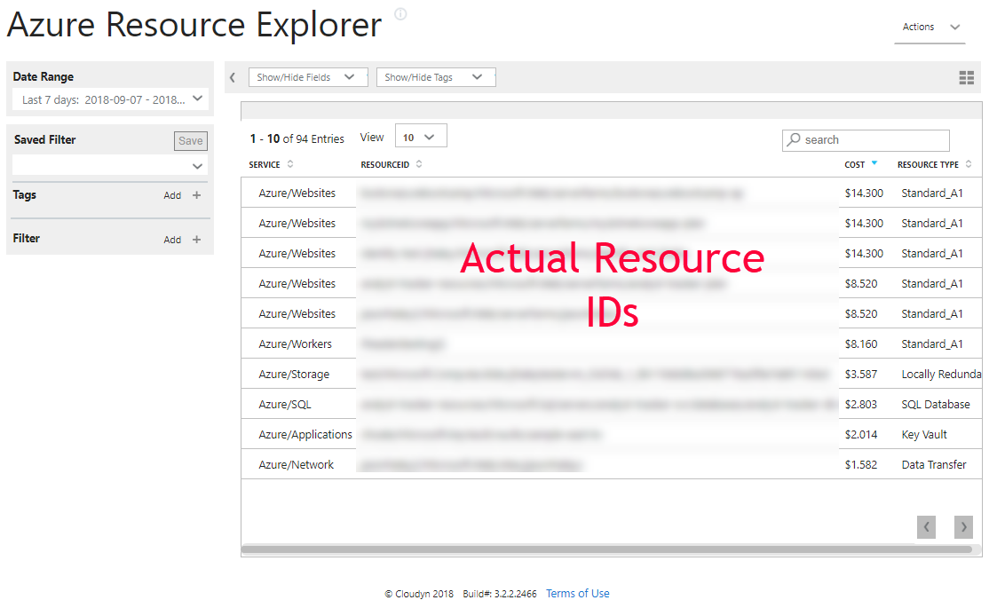
By using these three views, I identified that my app services were costing me more than I thought they should, drilled into the detail to see it was some web apps and then found the exact resource names of those Web Apps so I could remove them. This saved me money in just took a few moments of my time!
Plus, I only scratched the surface of how Cloudyn can help you uncover other hidden costs.
Now you can know where all your cloud cost is coming from!