This page was generated from
docs/examples/DataSet/Offline Plotting Tutorial.ipynb.
Interactive online version:
![]() .
.
Offline Plotting Tutorial
The dataset comes with a tool for offline (i.e. not live as the data are coming in) plotting. This notebook explains how to use it and what it is capable of plotting. NOTE: This notebook only covers the plotting of numerical data. For categorical (string-valued) data, please see Offline plotting with categorical data.
The function that is going to be used in this tutorial is the plot_dataset. For convenience it is also possible to directly plot the dataset from the captured_run_id. Apart from the first argument plot_by_id behaves exactly like the plot_dataset. All customizations shown below can also be applied to plot_by_id.
[1]:
%matplotlib inline
from pathlib import Path

import matplotlib
import matplotlib.pyplot as plt
import numpy as np

from qcodes.dataset import (
    Measurement,
    initialise_or_create_database_at,
    load_or_create_experiment,
    plot_dataset,
)
from qcodes.parameters import Parameter
Let us first initialise our database and create an experiment which shall produce the data to be visualise.
[2]:
initialise_or_create_database_at(
    Path.cwd().parent / "example_output" / "offline_plotting_example.db"
)
exp = load_or_create_experiment("offline_plotting_experiment", "nosample")
Next we make a handful of parameters to be used in the examples of this notebook.
For those curious, setting set_cmd=None and get_cmd=None makes the Parameters settable and gettable without them being hooked up to any external/auxiliary action (in old QCoDeS versions, this was known as a ManualParameter).
[3]:
# Make a handful of parameters to be used in the examples

x = Parameter(name="x", label="Voltage", unit="V", set_cmd=None, get_cmd=None)
t = Parameter(name="t", label="Time", unit="s", set_cmd=None, get_cmd=None)
y = Parameter(name="y", label="Voltage", unit="V", set_cmd=None, get_cmd=None)
y2 = Parameter(name="y2", label="Current", unit="A", set_cmd=None, get_cmd=None)
z = Parameter(
    name="z", label="Majorana number", unit="Anyonic charge", set_cmd=None, get_cmd=None
)
A single, simple 1D sweep
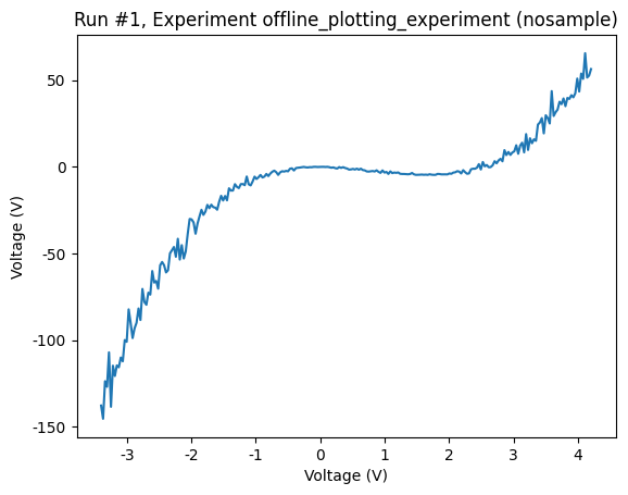
For the sake of simplicity, let us perform a single, 1D sweep:
[4]:
rng = np.random.default_rng()
meas = Measurement(exp=exp)
meas.register_parameter(x)
meas.register_parameter(y, setpoints=(x,))

xvals = np.linspace(-3.4, 4.2, 50)

# Randomly shuffle the values in order to test the plot
# that is to be created for this data is a correct line
# that does not depend on the order of the data.
rng.shuffle(xvals)

with meas.run() as datasaver:
    for xnum in xvals:
        noise = rng.standard_normal() * 0.1  # multiplicative noise yeah yeah
        datasaver.add_result(
            (x, xnum), (y, 2 * (xnum + noise) ** 3 - 5 * (xnum + noise) ** 2)
        )

dataid = datasaver.run_id
dataset = datasaver.dataset
Starting experimental run with id: 1.
Now let us plot that run. The function plot_dataset takes the dataset created by the run to plot as a positional argument. Furthermore, the user may specify the matplotlib axis object (or list of axis objects) to plot on.
If no axes are specified, the function creates new axis object(s). The function returns a tuple of a list of the axes and a list of the colorbar axes (just Nones if there are no colorbars).
[5]:
axes, cbaxes = plot_dataset(dataset)
Using the returned axis, we can change, among other things, the plot linewidth and color. We refer to the matplotlib documentation for details on matplotlib plot customization.
[6]:
my_ax = axes[0]
line = my_ax.lines[0]
line.set_color("#223344")
line.set_linewidth(3)
Rescaling units and ticks
The plot_dataset function can conveniently rescale the units and ticks of the plot. For example, if one of the axes is voltage in units of V, but the values are in the range of millivolts, then plot_dataset will rescale the ticks of the axis to show 5 instead of 0.005, and the unit in the axis label will be adjusted from V to mV.
This feature works with the relevant SI units, and some others. In case the units of the parameter are not from that list, or are simply not specified, ticks and labels are left intact.
The feature can be explicitly turned off by passing rescale_axes=False to the function.
The following plot demontrates the feature.
[7]:
rng = np.random.default_rng()
meas = Measurement(exp=exp)
meas.register_parameter(t)
meas.register_parameter(y, setpoints=(t,))

with meas.run() as datasaver:
    for tnum in np.linspace(-3.4, 4.2, 50):
        noise = rng.standard_normal() * 0.1
        datasaver.add_result(
            (t, tnum * 1e-6),
            (y, (2 * (tnum + noise) ** 3 - 5 * (tnum + noise) ** 2) * 1e3),
        )

dataset = datasaver.dataset
Starting experimental run with id: 2.
[8]:
plot_dataset(dataset)
[8]:
([<Axes: title={'center': 'Run #2, Experiment offline_plotting_experiment (nosample)'}, xlabel='Time (μs)', ylabel='Voltage (kV)'>],
 [None])
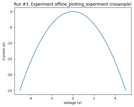
Two interleaved 1D sweeps
Now we make a run where two parameters are measured as a function of the same parameter.
[9]:
meas = Measurement(exp=exp)
meas.register_parameter(x)
meas.register_parameter(y, setpoints=[x])
meas.register_parameter(y2, setpoints=[x])

xvals = np.linspace(-5, 5, 50)

with meas.run() as datasaver:
    for xnum in xvals:
        datasaver.add_result((x, xnum), (y, xnum**2))
        datasaver.add_result((x, xnum), (y2, -(xnum**2)))

dataset = datasaver.dataset
Starting experimental run with id: 3.
In such a situation, the plot_dataset by default creates a new axis for each dependent parameter. Sometimes this is not desirable; we’d rather have both plots on the same axis. If this is the case, then, we might pass the same axis twice to the plot_dataset.
[10]:
axes, cbaxes = plot_dataset(dataset)
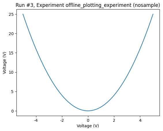
Let’s do that now
[11]:
fig, ax = plt.subplots(1)
axes, cbaxes = plot_dataset(dataset, axes=[ax, ax])
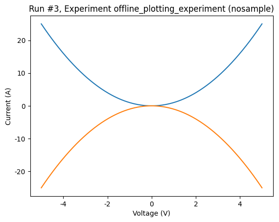
Alternatively, we might want to only create the plot for one dependent parameter, rather than all. To do this, we can pass the parameters argument to plot_dataset specifying which parameters to plot. Parameters are specified by the name that was assigned when they were registered to the measurement. For example:
[12]:
plot_dataset(dataset, parameters="y2")
[12]:
([<Axes: title={'center': 'Run #3, Experiment offline_plotting_experiment (nosample)'}, xlabel='Voltage (V)', ylabel='Current (A)'>],
 [None])

Regular 2D rectangular sweep scan
For 2D plots, a colorbar is usually present. As mentioned above, the plot_dataset function returns a colorbar.
[13]:
meas = Measurement(exp=exp)

meas.register_parameter(x)
meas.register_parameter(t)
meas.register_parameter(z, setpoints=(x, t))

xvals = np.linspace(-4, 5, 50)
tvals = np.linspace(-500, 1500, 25)

with meas.run() as datasaver:
    for xv in xvals:
        for tv in tvals:
            # just some arbitrary semi good looking function
            zv = np.sin(2 * np.pi * xv) * np.cos(2 * np.pi * 0.001 * tv) + 0.001 * tv
            datasaver.add_result((x, xv), (t, tv), (z, zv))

dataset = datasaver.dataset
Starting experimental run with id: 4.
[14]:
axes, colorbars = plot_dataset(dataset)

A fairly normal situation is that the colorbar was somehow mislabelled. Using the returned colorbar, the label can be overwritten.
[15]:
colorbar = colorbars[0]
colorbar.set_label("Correct science label")
Customisations
In addition to tweaking the returned axes and colorbars, it is possible to customise the plot directly via the call to the plot_dataset. This is done by the plot_dataset via passing on the keyword arguments to the corresponding matplotlib function that runs under the hood.
A few examples:
Changing the colormap
Any matplotlib colormap can be used. The relevant keyword argument is cmap.
[16]:
cmap = matplotlib.colormaps.get_cmap("hot")
axes, colorbars = plot_dataset(dataset, cmap=cmap)
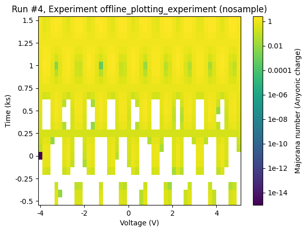
Setting the colorscale to logarithmic
To set the colorscale to logarithmic, we can use the keyword argument norm along with a matplotlib Norm.
[17]:
from matplotlib.colors import LogNorm

norm = LogNorm()
axes, colorbars = plot_dataset(dataset, norm=norm)
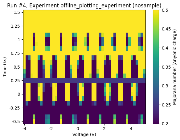
Setting limits on the colorscale
The keyword arguments vmin and vmax come in handy, if we need to set limits on the colorscale.
[18]:
axes, colorbars = plot_dataset(dataset, vmin=0.2, vmax=0.5)

Warped 2D rectangular sweep scan
A nice feature of the plot_dataset is that the grid may be warped; it makes no difference. Here we warp the x axis of the previous scan to increase the resolution in the right half plane.
[19]:
xvals = np.linspace(-4, 5, 50) + np.cos(-1 / 6 * np.pi * xvals)
tvals = np.linspace(-500, 1500, 25)

with meas.run() as datasaver:
    for xv in xvals:
        for tv in tvals:
            zv = np.sin(2 * np.pi * xv) * np.cos(2 * np.pi * 0.001 * tv) + 0.001 * tv
            datasaver.add_result((x, xv), (t, tv), (z, zv))

dataset = datasaver.dataset
Starting experimental run with id: 5.
[20]:
axes, cbaxes = plot_dataset(dataset)

Interrupted 2D scans (a hole in the cheese)
In case a sweep in interrupted, the entire grid will not be filled out. This is also supported, in fact, any single rectangular hole is allowed.
[21]:
xvals = np.linspace(-4, 5, 50) + np.cos(2 / 9 * np.pi * xvals + np.pi / 4)
tvals = np.linspace(-500, 1500, 25)

# define two small forbidden range functions


def no_x(xv):
    if xv > 0 and xv < 3:
        return True
    else:
        return False


def no_t(tv):
    if tv > 0 and tv < 450:
        return True
    else:
        return False


with meas.run() as datasaver:
    for xv in xvals:
        for tv in tvals:
            if no_x(xv) and no_t(tv):
                continue
            else:
                zv = (
                    np.sin(2 * np.pi * xv) * np.cos(2 * np.pi * 0.001 * tv) + 0.001 * tv
                )
                datasaver.add_result((x, xv), (t, tv), (z, zv))

dataset = datasaver.dataset
Starting experimental run with id: 6.
[22]:
axes, colorbars = plot_dataset(dataset)

Fancy plotting
As a final example, let us combine several plots in one window.
We first make a little grid of axes.
[23]:
fig, figaxes = plt.subplots(2, 2)

Next, we make some runs (shamelessly copy-pasting from above).
[24]:
rng = np.random.default_rng()
# First run
meas = Measurement(exp=exp)
meas.register_parameter(x)
meas.register_parameter(y, setpoints=(x,))

xvals = np.linspace(-3.4, 4.2, 50)

with meas.run() as datasaver:
    for xnum in xvals:
        noise = rng.standard_normal() * 0.1  # multiplicative noise yeah yeah
        datasaver.add_result(
            (x, xnum), (y, 2 * (xnum + noise) ** 3 - 5 * (xnum + noise) ** 2)
        )

ds1 = datasaver.dataset

# Second run

meas = Measurement(exp=exp)

meas.register_parameter(x)
meas.register_parameter(t)
meas.register_parameter(z, setpoints=(x, t))

xvals = np.linspace(-4, 5, 50)
tvals = np.linspace(-500, 1500, 25)

with meas.run() as datasaver:
    for xv in xvals:
        for tv in tvals:
            # just some arbitrary semi good looking function
            zv = np.sin(2 * np.pi * xv) * np.cos(2 * np.pi * 0.001 * tv) + 0.001 * tv
            datasaver.add_result((x, xv), (t, tv), (z, zv))

ds2 = datasaver.dataset
Starting experimental run with id: 7.
Starting experimental run with id: 8.
And then we put them just where we please.
[25]:
axes, colorbars = plot_dataset(ds1, figaxes[0, 0])
[26]:
axes, colorbars = plot_dataset(ds2, figaxes[1, 1], colorbars)
Note that if we want to replot on an axis with a colorbar we probably also want to reuse the colorbar.
[27]:
axes, colorbars = plot_dataset(ds2, figaxes[1, 1], colorbars)
[28]:
fig.tight_layout()
Rasterizing
By default matplotlib renders each individual data point as a separate square in 2D plots when storing in a vector format (pdf, svg). This is not a problem for small data sets, but the time needed to generate a pdf increases rapidly with the number of data points. Therefore, the plot_dataset will automatically raster the data (lines, ticks and labels are still stored as text) if more than 5000 data points are plotted. The particular value of the rasterization threshold can be set in the
qcodesrc.json config file.
Alternatively the rasterized keyword can be passed to the plot_dataset function.
[29]:
meas = Measurement(exp=exp)

meas.register_parameter(x)
meas.register_parameter(t)
meas.register_parameter(z, setpoints=(x, t))

xvals = np.linspace(-4, 5, 25)
tvals = np.linspace(-500, 1500, 50)

with meas.run() as datasaver:
    for xv in xvals:
        for tv in tvals:
            # just some arbitrary semi good looking function
            zv = np.sin(2 * np.pi * xv) * np.cos(2 * np.pi * 0.001 * tv) + 0.001 * tv
            datasaver.add_result((x, xv), (t, tv), (z, zv))

dataset = datasaver.dataset
Starting experimental run with id: 9.
To get a feeling for the time difference between rasterzing and not, we time the two approaches here.
[30]:
%%time
axeslist, _ = plot_dataset(dataset)
axeslist[0].figure.savefig(
    Path.cwd().parent / "example_output" / f"test_plot_dataset_{dataid}.pdf"
)
CPU times: user 246 ms, sys: 13 ms, total: 258 ms
Wall time: 262 ms

[31]:
%%time
axeslist, _ = plot_dataset(dataset, rasterized=False)
axeslist[0].figure.savefig(
    Path.cwd().parent / "example_output" / f"test_plot_dataset_{dataid}.pdf"
)
CPU times: user 151 ms, sys: 11 ms, total: 162 ms
Wall time: 162 ms
